8 Developing the Dashboard Page
Update and add new regions to the Dashboard page with Page Designer.
About This Lesson
In this lesson, you modify the regions of an existing page without the aid of a wizard.
You develop the Dashboard page generated by the Create App Wizard by deleting all but one of the existing chart regions. You update the series, attributes, and Template Options of the remaining chart region to improve usability and appearance.
You add a new report region from scratch using the Gallery instead of a wizard. Reconfigure the report's SQL query and Template Options.
Starting from here:
8 - DashboardIf you have not completed the previous lessons, you can use the appendix "Importing an Application into a Workspace" to import the above SQL script into your workspace and continue working from this lesson forward. You can find this script in the /files subdirectory of where you unzipped the .zip file accompanying this tutorial.
8.1 Deleting Regions in Page Designer
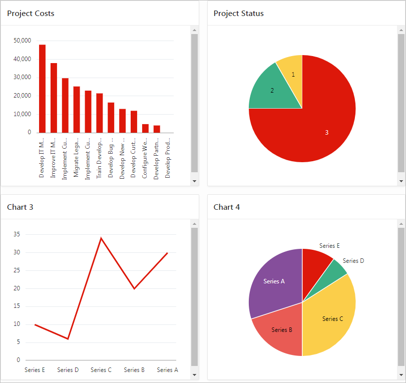
You created multiple charts for the Dashboard in the Create App Wizard. Review the output in the runtime.
To view the runtime:
Note the four charts on the page. You decide that the bar chart is the best way to present Costs info rather than a line or pie chart (Chart 3 and Chart 4). You also decide to replace one chart (Project Status) with a report later.
Start by deleting the charts you no longer want, then update the remaining chart with another series to display more budget information.
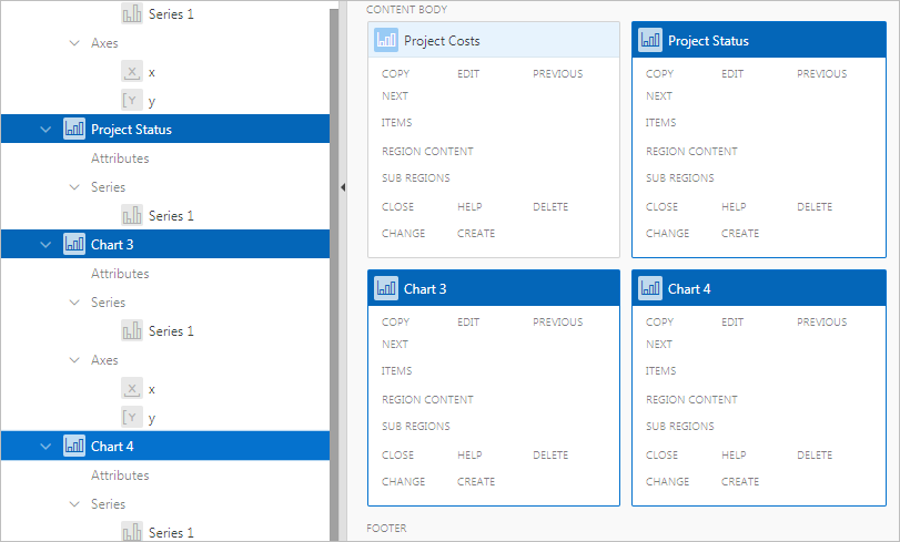
To delete multiple regions in Page Designer:
8.2 Updating the Series in the Project Costs Chart
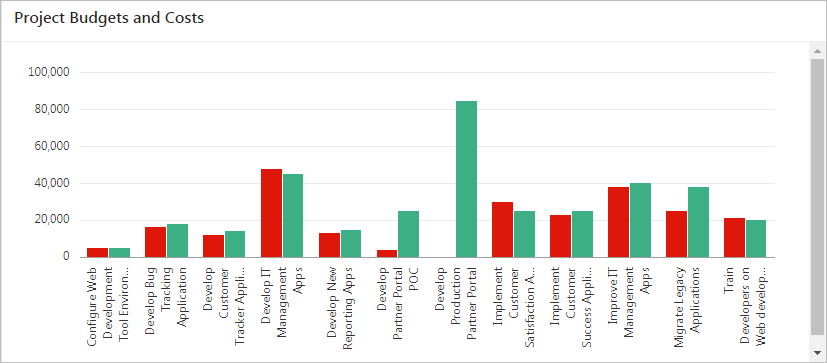
The Project Costs chart only displays costs. This chart would be more meaningful if it also displayed project budgets for comparison.
First, update the SQL for the existing series in the chart to change the display order of the columns (among other updates), then create a new series in the chart to display project budgets.
To update the first series:
To add a series to a chart:
8.3 Updating the Appearance of the Dashboard Chart
-
The labels are too constrained by the space.
-
The chart lacks a legend to indicate which column represents which value (cost or budget).
-
The chart does not fit vertically in the region (note the scroll bar).
-
The cost and budget values lack a dollar sign.
These changes are in the region attributes and axis properties for the chart.
To change the attributes of a region:
- Click Edit Page 2 on the Runtime Developer toolbar.
- In the Rendering tab, under Project Budgets and Costs, click Attributes.
- In Property Editor:
- Layout: Height - enter 600
- Legend: Show - click Yes
- Legend: Position - select Top
- Legend: Hide and Show Behavior - select No Rescaling
To change the properties of an axis:
- In the Rendering tab, under Axes, click y.
- In Property Editor:
- Value: Format - select Currency
- Value: Currency - enter $
- Click Save and Run Page.
8.4 Updating the Live Template Options for the Dashboard Chart
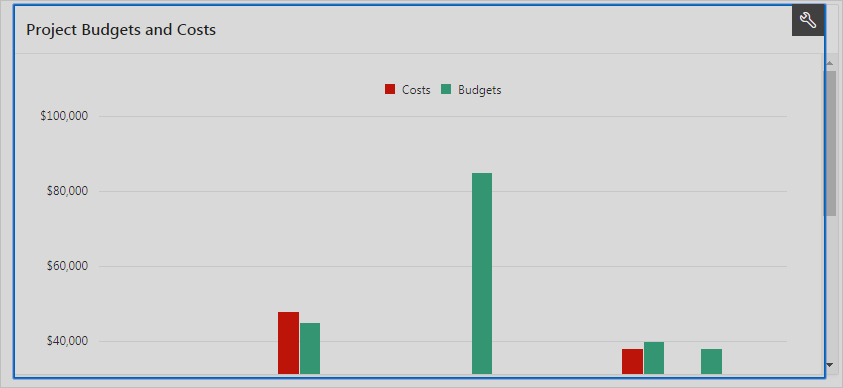
If you scroll down the chart region in the runtime, you can see your changes. (You may need to maximize your window to view all the labels properly.) The individual elements look good, but obviously you must alter the way the region displays on the page.
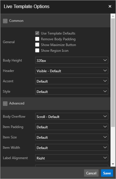
The final changes you need to make are in the Live Template Options, which you access using Quick Edit on the Runtime Developer toolbar.
To open Live Template Options:
The dashboard chart is complete.
Next, add a report region to replace the Project Status chart you deleted.
8.5 Adding a Classic Report Region from Gallery
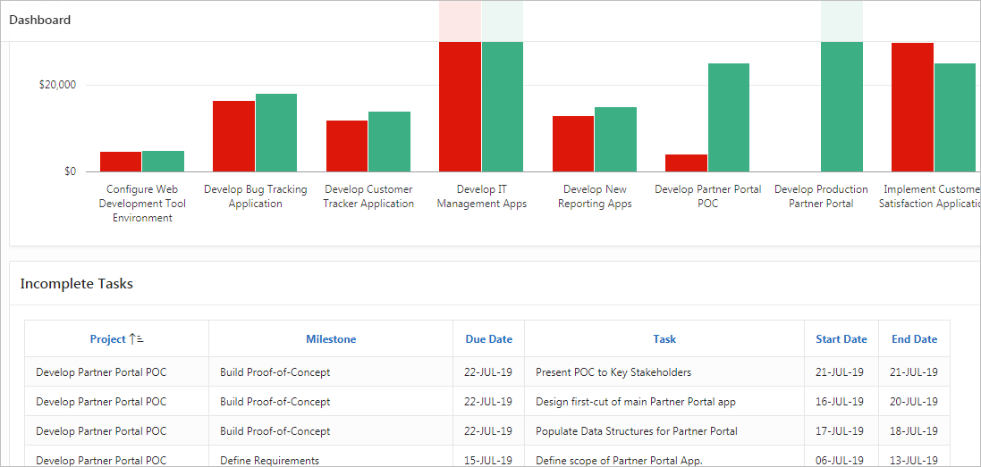
Add a report to the page to display incomplete tasks.
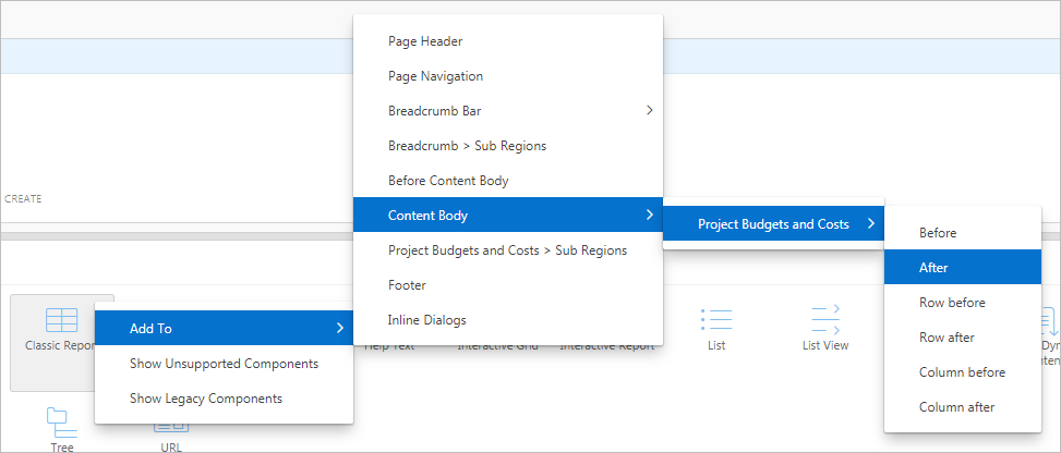
Located beneath the central Layout tab, the Gallery is a quick way to peruse your options for a variety of elements.
To add a classic report region from the Gallery:
The report displays an the appropriate amount of information and columns, but it has some residual layout problems. You can change this value in Live Template Options.
To open Live Template Options in the runtime:
The report is finished. Your application is complete. Congratulations!
