12.3.9 Breadcrumb Templates
Breadcrumb templates control the display of breadcrumb entries.
See also:
- About Breadcrumb Style Navigation
Breadcrumbs provide users with hierarchical navigation and can be displayed as a list of links or as a breadcrumb path. - Breadcrumb Template Attributes
This section describes common breadcrumb template attributes.
Parent topic: Creating Custom Themes
12.3.9.1 About Breadcrumb Style Navigation
Breadcrumbs provide users with hierarchical navigation and can be displayed as a list of links or as a breadcrumb path.
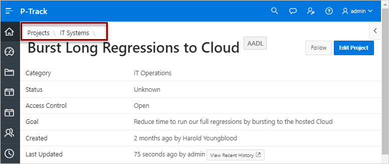
You select a breadcrumb template when you create a region. Breadcrumbs usually indicate where the current page is relative to other pages in the application. Users can click a specific page to instantly view it. The following is an example of breadcrumb navigation in Sample Database Application.
See Also:
Parent topic: Breadcrumb Templates
12.3.9.2 Breadcrumb Template Attributes
This section describes common breadcrumb template attributes.
Parent topic: Breadcrumb Templates
12.3.9.2.1 Name
Name identifies the name of the template. Use the Translatable check box to indicate that the template contains text strings that require translation. Theme indicates the theme to which the template is a member. Template Class identifies a specific use for the template. When you switch to a theme, all templates in one theme are mapped to corresponding templates in another theme. App Builder accomplishes this template mapping through the assignment of a template class.
Parent topic: Breadcrumb Template Attributes
12.3.9.2.2 Definition
Definition attributes control how a breadcrumb displays Table 12-8 describes Definition attributes.
Table 12-8 Definition attributes
| Attribute | Description |
|---|---|
|
Before First |
Defines text that displays before the first breadcrumb entry. Use the substitution string See Also: "Editing Region Attributes" |
|
Current Page Breadcrumb Entry |
Defines the look of a breadcrumb entry that corresponds to the current page. |
|
Non Current Page Breadcrumb Entry |
Defines the look of a breadcrumb entry that does not correspond to the current page. |
|
After Last |
Defines text that displays after the last breadcrumb entry. |
|
Between Level |
Defines text that displays between levels of breadcrumb entries. |
|
Maximum Levels |
Specifies the number of levels that appear when displaying breadcrumbs in a breadcrumb style. |
Parent topic: Breadcrumb Template Attributes
12.3.9.2.3 Substitution Strings
Substitution strings are used within subtemplates to reference component values.Table 12-9 describes the available button template substitution strings.
Tip:
All template substitution strings must be in uppercase letters and begin and end with a number sign (#). To view a report of substitution strings supported by a given template, see the Substitution Stings section of the Edit Breadcrumb Template page.
Table 12-9 Breadcrumb Template Substitution Strings
| Referenced From | Substitution String | Description |
|---|---|---|
|
Before First |
|
Component CSS classes. The |
|
Current Entry |
URL Link. |
|
|
Current Entry |
Breadcrumb Long Name. |
|
|
Current Entry |
Breadcrumb Label. |
|
|
Current Entry |
Breadcrumb Label (escaping HTML characters). |
|
|
Non Current Entry |
URL Link. |
|
|
Non Current Entry |
Breadcrumb Long Name. |
|
|
Non Current Entry |
Breadcrumb Label. |
|
|
Non Current Entry |
Breadcrumb Label (escaping HTML characters). |
Parent topic: Breadcrumb Template Attributes
