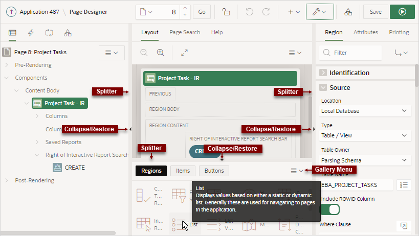
7.2.3 Central Pane of Page Designer
The top of the central pane in Page Designer contains the Layout, Page Search, and Help tabs. The lower part of the central pane contains the Gallery.
7.2.3.1 Layout Tab
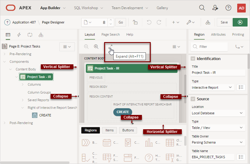
The Layout tab displays in the central pane of Page Designer and is a visual representation of how the components are positioned on the page. The Layout tab features context menus. By selecting a component and right-clicking, you can delete, move, or copy the component to other regions, or new regions on the page. You can also move existing regions, items, and buttons relative to other components by simply clicking on the component and dragging it to the new location. For example, you can place items next to one another by dragging the second item to the end of the first item and dropping it in the dark yellow box that appears when you hover in the desired location. You can quickly add new components to an existing page by dragging the component from the Gallery up to the desired position within the Layout tab.
You can adjust the size of each pane by selecting and dragging the horizontal and vertical splitters. To expand or collapse each pane, click the small triangle labeled Collapse in the center of each splitter. Alternatively, you can click the Expand button to make the Layout tab larger and then Restore to return it to the previous size.
Tip:
Hidden items do not display in the Layout tab, but do display in the Rendering tree.
Key features of the Layout tab include:
-
Context menus. Right-click a component or control to display a context menu.
-
Quick Access to the Property Editor. Select a component or multiple components to display the corresponding attributes in the Property Editor in the right pane.
-
Drag and Drop . Move, copy, and reorder regions, items, and buttons by dragging and dropping. You can also add new regions, items, and button by dragging them from the Gallery and dropping them to the desired position on the page.
-
Tooltips. Position the mouse over a component or control to view a tooltip of basic information, such as the region type, item type, and so on.
Tip:
When dragging components to a new position, such as dragging an item onto the same line as an exiting item, you need to drag the component into the desired position and wait until the grid changes and the new drop position displays. See Adding a Region, Item, or Button by Dragging and Dropping.
Layout Menu
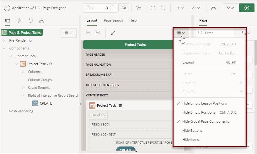
The Layout menu displays on the right side of the pane. Use this menu to customize the type and amount of information that displays and to delete, move, and copy selected components. To have a specific region fill the the Layout tab, select the region and select Display from Here from the Layout menu. The selected region fills the Layout tab. To restore the view, select Display from Page.
Parent topic: Central Pane of Page Designer
7.2.3.2 Page Search Tab
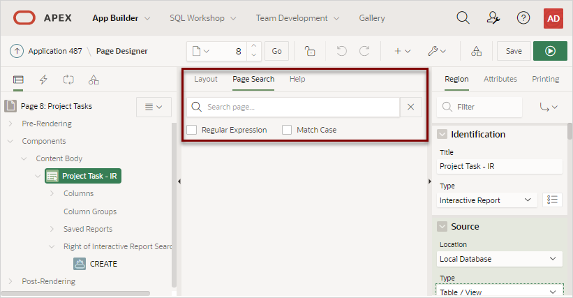
The Page Search tab displays to the right of Layout in the central pane. Use Page Search to search all page metadata including regions, items, buttons, dynamic actions, columns, and so on. To search a page, enter a search terms in the field provided. To match the case, select Match Case. To search for a regular expression, select Regular Expression.
Parent topic: Central Pane of Page Designer
7.2.3.3 Help Tab
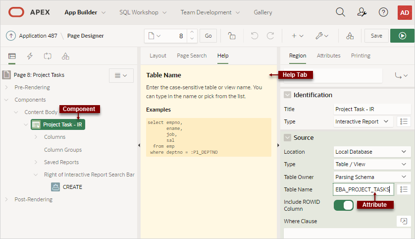
Page Designer includes Help for every Property Editor attribute. To view Help, select the attribute and click the Help tab. Once you activate the Help pane, the content that displays changes every time you select another attribute. In this example, the Source, Type attribute is selected and the Help tab describes what the attribute is for and the available options.
See Also:
Parent topic: Central Pane of Page Designer
7.2.3.4 Gallery
The Gallery displays beneath the Layout tab in the central pane of Page Designer. The Gallery contains three tabs: Regions, Items, and Buttons. When you pass the cursor over a control or component, a tooltip displays that describes it. You can adjust the size of the pane by dragging the horizontal and vertical splitters. To collapse or restore the Gallery pane, click the small triangle in the center of each splitter.
You can add new controls and components to a page by selecting the control or component from the Gallery and dragging and dropping them into the Layout tab. Alternatively, you can select a control or component in the Gallery and right-click to view a context menu.
Gallery Menu
Parent topic: Central Pane of Page Designer
