7.2 View Model Monitor Results
The Model Monitor Results page displays the monitoring results of each model that are being monitored. By clicking on any model that has run successfully, you can view the detailed analysis of each model such as model drift, model metrics, prediction statistics, feature impact, prediction distribution and predictive versus drift importance for each feature. The predictive impact versus drift importance for each monitored feature is computed only if data monitoring is enabled.
1. Model Monitor Results page
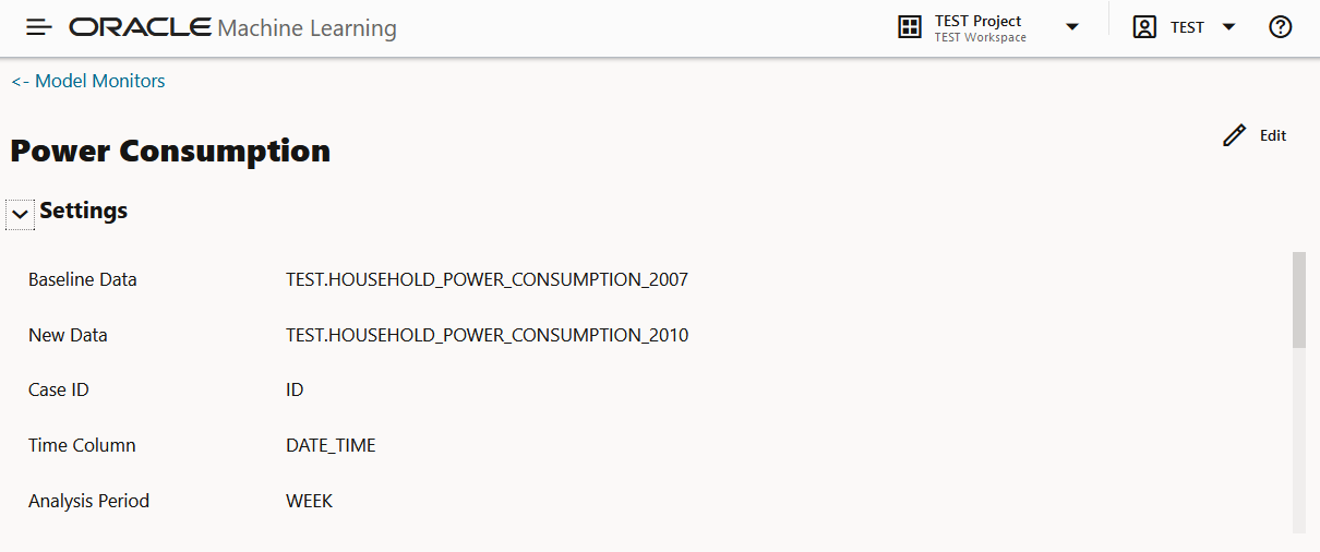
- Settings — The Settings section displays the model monitor settings. Click on the arrow against Settings to expand this section. You have the option to edit the model monitor settings by clicking Edit on the top right corner of the page.
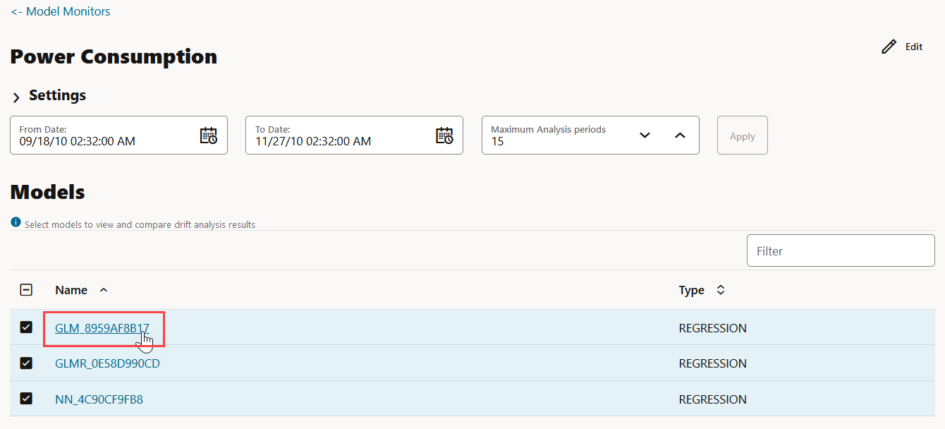
- Models — The Models section lists all the models that are
monitored by the monitor. In this example, the models GLM_929D4B0849,
GLMR_C4F02CA625 and SVML_2D730E0ECA monitored by the Power
Consumption monitor are listed.
Figure 7-10 Models on the Model Monitor Results page
You can choose to view and compare the results of one or more monitored models by deselecting the ones that you want to exclude. You can also view the results of each feature of the model by clicking on the model. These results — Feature Impact chart, Prediction Distribution, and Predictive Impact versus Drift Importance chart are displayed on a separate pane that slides in. The Predictive Impact versus Drift Importance chart is computed only if the Monitor Data option is selected while creating the model monitor.
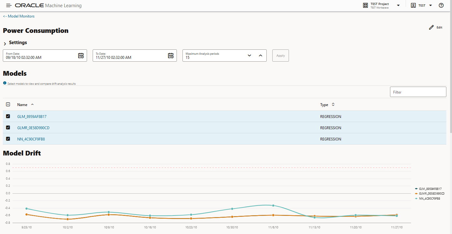
- Model Drift — The Model Drift section is displayed just
below the Models section. Model drift is the percentage change in the
performance metric between the baseline period and the new period. A
negative value indicates that the new period has a better performance metric
which could happen due to noise.
The X axis depicts the analysis period, and the Y axis depicts the drift values. The horizontal dotted line represents the drift threshold settings that each monitor gets by default. The default covers the typical use case. However, you can choose to customize it based on specific use case. The line depicts the drift value for each point in time for the analysis period. Hover your mouse over the line to view the drift values. A drift above the threshold indicates significant change in model predictions. Exceeding the threshold suggests rebuilding and redeploying your model may be necessary. If the drift is below the threshold, it indicates that there are insufficient changes in the data to warrant further investigation or action. That is, possibly rebuilding a machine learning model using this data.
Figure 7-11 Model Drift on the Models Monitor Results page
If you want to view the drift details of one model at a time, click on the model name on the right to select or deselect it, as shown here.

- Metric — This Metric section displays the computed metrics
for the selected models. The computed metric is plotted along the y axis,
and the time period is plotted along the x axis. In this example, the metric
R2 or R-squared is displayed for all the three models. Hover your cursor on
other points on the line to view the details of the computed metric. The
value of R2 for all the models is equal to 1. Here, the value of R2 for all
the three monitored models is 1. This indicates that all the three models
are good fit for the data.
The computed metrics for Regression are:
- R2 — A statistical measure that calculates how
close the data are to the fitted regression line. In general,
the higher the value of R-squared, the better the model fits
your data. The value of R2 is always between 0 to 1, where:
0indicates that the model explains none of the variability of the response data around its mean.1indicates that the model explains all the variability of the response data around its mean.
- Mean Squared Error — This is the mean of the squared difference of predicted and true targets.
- Mean Absolute Error — This is the mean of the absolute difference of predicted and true targets.
- Median Absolute Error — This is the median of the absolute difference between predicted and true targets.
The computed metrics for Binary Classification are:- Accuracy — Calculates the proportion of correctly
classifies cases - both Positive and Negative. For example, if
there are a total of TP (True Positives)+TN (True Negatives)
correctly classified cases out of TP+TN+FP+FN (True
Positives+True Negatives+False Positives+False Negatives) cases,
then the formula is:
Accuracy = (TP+TN)/(TP+TN+FP+FN) - Balanced Accuracy — Evaluates how good a binary classifier is. It is especially useful when the classes are imbalanced, that is, when one of the two classes appears a lot more often than the other. This often happens in many settings such as Anomaly Detection etc.
- ROC AUC (Area under the ROC Curve) — Provides an aggregate measure of discrimination regardless of the decision threshold. AUC - ROC curve is a performance measurement for the classification problems at various threshold settings.
- Recall — Calculates the proportion of actual Positives that is correctly classified.
- Precision — Calculates the proportion of predicted Positives that is True Positive.
- F1 Score — Combines precision and recall into a
single number. F1-score is computed using harmonic mean which is
calculated by the formula:
F1-score = 2
                                            × (precision × recall)/(precision +
                                    recall)
The computed metrics for Multi-class Classification are:
- Accuracy
- Balanced Accuracy
- Macro_F1
- Macro_Precision
- Macro_Recall
- Weighted_F1
- Weighted_Precision
- Weighted_Recall
- R2 — A statistical measure that calculates how
close the data are to the fitted regression line. In general,
the higher the value of R-squared, the better the model fits
your data. The value of R2 is always between 0 to 1, where:
- Prediction Statistics — Scroll further down to view the
Prediction Statistics section. The computed
prediction statistic is plotted along the y axis, and the time period is
plotted along the x axis. In this screenshot, the Population Stability Index
for the Generalized Linear Model — Regression model GLMR_C4F02CA625 for
10/30/10 is displayed. Hover your cursor on other points on the line to view
the computed metric.
Click on the drop-down list to view all the prediction statistics. The statistics of the predictions of the model vary according to the type of model.
For Regression, the computed prediction statistics are:- Population Stability Index — This is a measure of
how much a population has shifted over time or between two
different samples of a population in a single number. The two
distributions are binned into buckets, and PSI compares the
percents of items in each of the buckets. PSI is computed as
PSI = sum((Actual_% - Expected_%) x ln
                                            (Actual_% / Expected_%))
The interpretation of PSI value is:PSI < 0.1implies no significant population change0.1 <= PSI < 0.2implies moderate population changePSI >= 0.2implies significant population change
- Min — This is the lowest value of the computed statistics for the analysis period.
- Mean — This is the average value of the computed statistics for the analysis period.
- Max — This is the highest value of the computed statistics for the analysis period.
- Standard Deviation — This is the value that shows how much variation from the mean exists.
For Binary Classification, the computed prediction statistics are:- Population Stability Index
- Mean
- Min
- Max
- Standard Deviation
- Bin Distribution of prediction probabilities
- Class distribution
For Multi-class Classification, the computed prediction statistics are:- Population Stability Index
- Class Distribution
- Population Stability Index — This is a measure of
how much a population has shifted over time or between two
different samples of a population in a single number. The two
distributions are binned into buckets, and PSI compares the
percents of items in each of the buckets. PSI is computed as
2. Model Monitor Details
- Feature Impact — The Feature Impact chart computes the impact of each feature in the model for the specified time. The chart also the gives you the option to view the feature impact on a linear scale as well as on a logarithmic scale. Hover your mouse over the chart to view the details - Feature Name, Date, and Feature Impact.
- Click Log Scale to view the feature impact computation on a logarithmic scale.
- Click
 to view the feature impact computation in a line graph.
- Click
 to view the feature impact computation in a table.
- Click Limit the most impactful features to drop down list to select a value.
Figure 7-15 Viewing Feature Impact on a liner scale
In this screenshot, the feature GLOBAL_INTENSITY, that is, the global minute-averaged current intensity of the household electric consumption is seen to have the maximum impact on the model GLM_8959AF817 as compared to the other features. Click on Log Scale to view feature impact computation on a logarithmic scale, as shown in the screenshot below. Click X on the top right corner of the pane to exit.
Figure 7-16 Viewing Feature Impact on a Logarithmic Scale
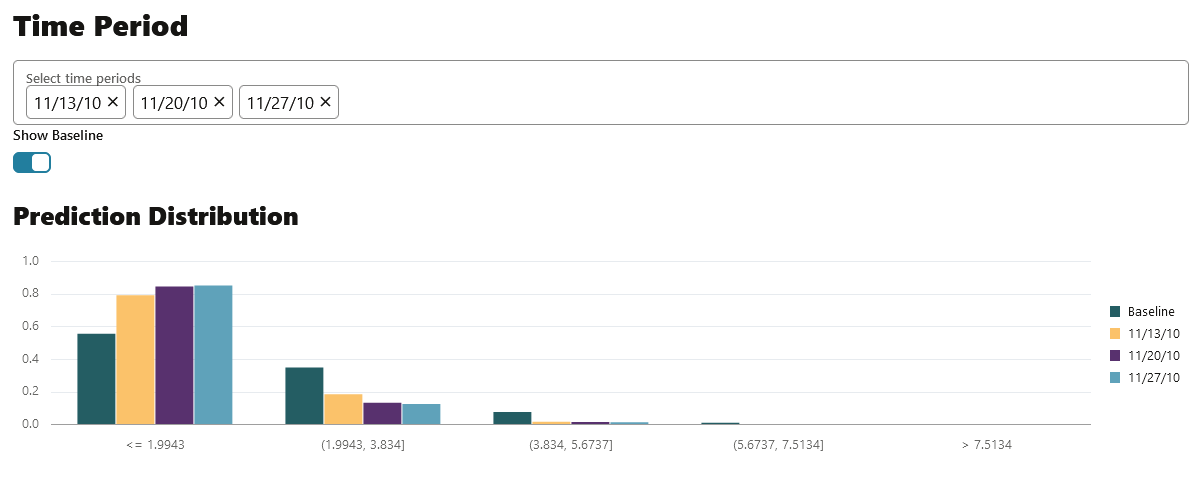
- Prediction Distribution — Scroll down to view the Prediction Distribution. Prediction Distribution is plotted for each analysis period. The Baseline data is displayed, if selected. The bins are plotted along X-axis, and the values are plotted along the Y-axis. Hover your mouse over each histogram to view the computed details. Click X on the top right corner of the pane to exit.
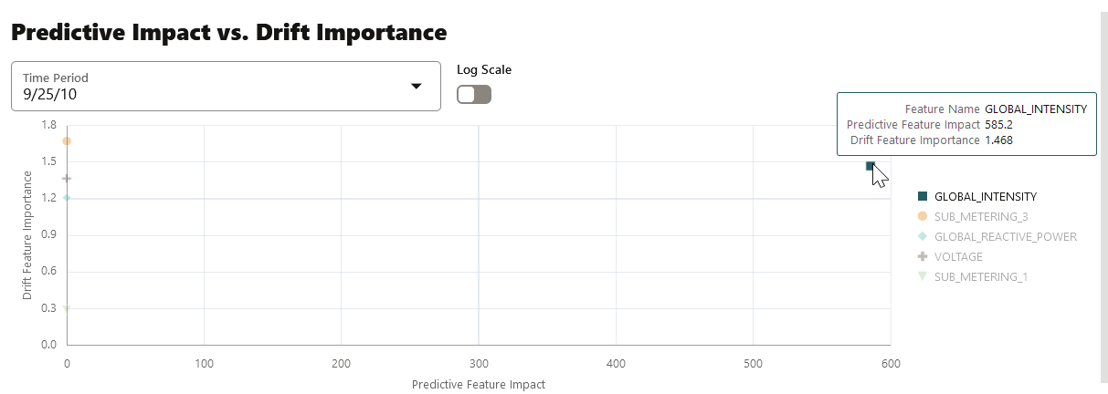
- Predictive Impact vs Drift Importance — Scroll further down the pane to view the Prediction Impact versus Drift Importance chart. This chart helps in understanding how the most impactful features drift over time. Drift Feature Importance is plotted along the Y-axis and Prediction Feature Impact is plotted along the X-axis. Click X on the top right corner of the pane to exit.
Note:
The Prediction Impact vs Drift Importance chart is computed only if you select the Monitor Data option while creating the model monitor.Figure 7-18 Predictive Feature Impact versus Drift Importance
In this screenshot, you can see that the feature GLOBAL_INTENSITY has the maximum impact on the selected predictive model GLM_8959AF817 as compared to the other features - SUB_METERING_3, GLOBAL_REACTIVE_POWER, VOLTAGE, and SUB-METERING_1.
Parent topic: Model Monitoring
