4.7 Vertex Shapes
Vertices are rendered as circles by default. The shape style
property allows using alternative geometries either by passing a shape keyword or by
providing additional configuration for more control. This property is available anywhere
vertex styles can be specified (for example in settings.baseStyles.vertex,
settings.baseStyles['vertex:group'], or within
settings.ruleBasedStyles).
Supported values are circle, ellipse square, rectangle, roundedRectangle, triangle, diamond, pentagon, hexagon, and octagon.
The following describes a few additional configurations:
ellipse,rectangle, androundedRectanglecan setwidthHeightRatioto control aspect ratio.roundedRectanglealso supportscornerRadiusRatio(defaults to0.1).trianglecan rotate usingdirection: 'up' | 'down' | 'left' | 'right'.- Applying
shape: nullremoves any shape override and falls back to the defaultcircle. - When combined with
label.angle: null, enablinglabel.resizeParentlets the chosen shape adapt to the label length.
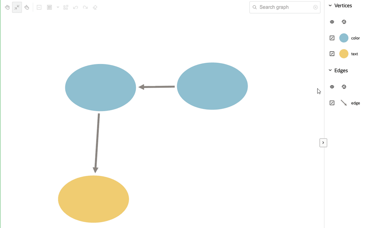
The following shows an example of applying ellipse styling to
vertices:
const settings = {
  baseStyles: {
    vertex: {
      shape: { type: 'ellipse', widthHeightRatio: 1.5 }
    }
  }
};
The preceding code produces the following output:
Figure 4-12 Applying Ellipse Styling to Vertices
Parent topic: Usage Examples
