11.2 Basic Example with
GraphVisualization
Learn to set up and display a graph visualization in your Jupyter notebook using a graph configuration from a JSON file.
Consider the following sample graph configuration in
sample_data.json file:
{
  "vertices": [
    {
      "id": "ACCOUNTS{\"ID\":1}",
      "properties": {
        "ID": 1,
        "NAME": "User1",
        "BALANCE": 10000
      },
      "labels": ["ACCOUNTS"]
    },
    {
      "id": "ACCOUNTS{\"ID\":2}",
      "properties": {
        "ID": 2,
        "NAME": "User2",
        "BALANCE": 20000
      },
      "labels": ["ACCOUNTS"]
    },
    {
      "id": "ACCOUNTS{\"ID\":3}",
      "properties": {
        "ID": 3,
        "NAME": "User3",
        "BALANCE": 30000
      },
      "labels": ["ACCOUNTS"]
    },
    {
      "id": "ACCOUNTS{\"ID\":4}",
      "properties": {
        "ID": 4,
        "NAME": "User4",
        "BALANCE": 40000
      },
      "labels": ["ACCOUNTS"]
    },
    {
      "id": "ACCOUNTS{\"ID\":5}",
      "properties": {
        "ID": 5,
        "NAME": "User5",
        "BALANCE": 50000
      },
      "labels": ["ACCOUNTS"]
    }
  ],
  "edges": [
    {
      "id": "TRANSFERS{\"TXN_ID\":1}",
      "source": "ACCOUNTS{\"ID\":1}",
      "target": "ACCOUNTS{\"ID\":2}",
      "properties": {
        "TXN_ID": 1,
        "AMOUNT": 1500
      },
      "labels": ["TRANSFERS"]
    },
    {
      "id": "TRANSFERS{\"TXN_ID\":2}",
      "source": "ACCOUNTS{\"ID\":2}",
      "target": "ACCOUNTS{\"ID\":4}",
      "properties": {
        "TXN_ID": 2,
        "AMOUNT": 700
      },
      "labels": ["TRANSFERS"]
    },
    {
      "id": "TRANSFERS{\"TXN_ID\":3}",
      "source": "ACCOUNTS{\"ID\":3}",
      "target": "ACCOUNTS{\"ID\":5}",
      "properties": {
        "TXN_ID": 3,
        "AMOUNT": 1200
      },
      "labels": ["TRANSFERS"]
    }
  ],
  "numResults": 10,
  "graphOwner": "GRAPHUSER",
  "graphName": "BANK_GRAPH",
  "isLastResultSet": true
}
You can then create a basic graph visualization in a Jupyter notebook
using GraphVisualization, as shown:
from oraclegraph import GraphVisualization as Graph
import json

with open("sample_data.json", "r") as f:
    data = json.load(f)

# Option 1: Create widget and assign data
graph = Graph()
graph.data = data

# Option 2: Create widget with data in constructor
graph = Graph(data=data)

# Display height in pixels
graph.height = 600

# Display option 1
display(graph)

# Display option 2
graph
As seen in the preceding code, entering graph in a
notebook cell displays the visualization. You can change graph.height to
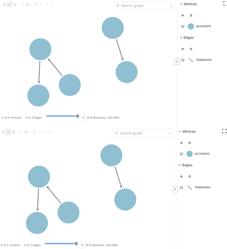
adjust the visual area. The code produces the following two graph visualizations, one for
option1 and one for option2:
You can also use the simple_data.json file, located in the
jupyter-notebooks/examples/data folder on GitHub, for a larger graph
configuration.
