Schema View
The Graph Visualization library allows you to visualize a graph’s schema in the form of a property graph.
Once the schema view is enabled, it will appear along side the graph in the graph visualization panel as shown:
Figure: Visualizing Schema and Graph Views
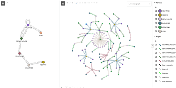
Description of the illustration schema_and_graph_view_viz.png
-
Schema View Modes
You can switch between Schema view, Graph view, or use both in the graph visualization panel using the toggle buttons in the toolbar. -
Schema View Configuration Parameters In order to enable Schema View in your visualization, you must configure a few related properties.
Schema View Modes
You can switch between Schema view, Graph view, or use both in the graph visualization panel using the toggle buttons in the toolbar.
Figure: Schema View Modes
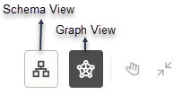
Description of the illustration schema_view_toggle.png
Depending on which toggle button is active the corresponding view will be displayed. The following describes more about the supported modes:
-
Schema: In this mode, the schema view is displayed spanning the entire visualization.
-
Graph (default): In this mode, the graph is displayed spanning the entire visualization.
-
Schema and Graph: In this mode, when both the toggle buttons are active, the schema and graph regions will appear side-by-side with a separator in between, as shown in Figure: Visualizing Schema and Graph Views. The separator can be dragged to resize the regions.
It is important to note that depending on your data and settings configurations, either the Schema or Graph view will be always enabled in the toolbar. If both the toggle buttons are manually turned off, then it automatically defaults to Graph view.
Schema View Configuration Parameters
In order to enable Schema View in your visualization, you must configure a few related properties.
The following properties control the behavior of Schema View:
-
schema(optional): This provides the data that is shown in a Schema View. This property takes data in theGraphSchemaformat that is described in settings. Schema View will not be supported if this property is not configured. -
schemaSettings(optional): This defines various settings (for example, styling) to control the rendering of Schema View. This property follows theSettingsformat that is described in settings.schemaSettings.baseStylesandschemaSettings.ruleBasedStylesallow custom styling of the Schema View. This is similar tosettings.baseStylesandsettings.ruleBasedStylesthat customize styling for the existing graph view.If styling is not specified through
schemaSettings, then the Graph Visualization library will use a default styling to render vertices and edges in Schema View. Also, certain features like pagination, legends, and so on will not apply to Schema View. Therefore, such attributes will not have any effect even if configured inSettings. -
The
Settingsinterface supports the following additional properties to customize Schema and Graph views display in the graph visualization panel. See settings for more information on each of the following properties.-
viewMode(optional): This controls the Schema View and Graph View display. It can also be used to switch between views at runtime. Supported values areexpandedandcollapsed. Schema View mode will be determined byschemaSettings.viewModeand Graph View mode will be determined bysettings.viewMode. -
viewLabel(optional): This specifies a label that is displayed in Schema View or Graph View. If configured, the value will appear as a label on the top center of the corresponding view. It will also be used in the tooltip for the Schema View and Graph View toggle buttons. -
legendState(optional): This specifies whether the legend region in the Graph View is in expanded or collapsed state. Supported values areexpandedandcollapsed. This property will not have any effect when specified inschemaSettingsfor Schema View as there is no legend region for this view.
The following shows an example
schemaSettingsfor Schema View.{"viewMode": "expanded", "viewLabel": "Schema View", "baseStyles": { "vertex": { "caption": "${properties.labelName}", "color": "blue" }}}The following shows an example
settingsfor Graph View.{"viewMode": "collapsed", "viewLabel": "Graph View", "legendState": "collapsed", "baseStyles": { "vertex": { "caption": "${properties.labelName}", "color": "red"}}} -