Configuring Attributes for the APEX Graph Visualization Plug-in
Learn how to customize your graph visualization using the Graph Visualization plug-in attributes in your APEX application.
You can configure the attributes for the plug-in component in the Attributes tab (Property Editor) on the right pane of the Page Designer.
The attributes are grouped as per their scope in the following panels:
Settings
The Settings panel appears as shown:
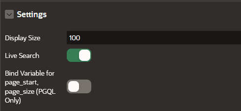
Description of the illustration apex_settings_panel.png
The following table describes the attributes in the Settings panel:
Table: Settings Attributes
| Attribute | Description |
|---|---|
| Display Size | An integer value that determines how many elements are displayed in the graph. Default is 100. |
| Live Search | Switch on this toggle to enable Live Search when visualizing the graph. |
| Bind variable for page_start, page_size (PGQL Only) | This toggle enables binding variables for page_start and page_size parameters and applies only for PGQL property graphs. This toggle does not apply for SQL property graphs. |
Appearance
The Appearance panel appears as shown:
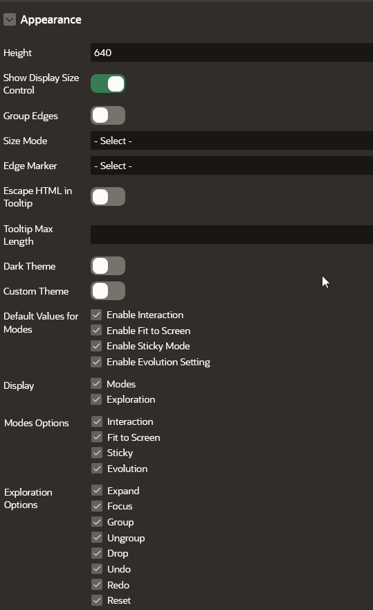
Description of the illustration apex_appearance_panel.png
The following table describes the attributes in the Appearance panel:
Table: Appearance Attributes
| Attribute | Description |
|---|---|
| Height | An integer value (in px) to set the size of the graph visualization panel. Default value is 400 px. |
| Show Display Size Control | This toggle determines if the display size control feature needs to be displayed at the bottom of the graph visualization. It is switched ON by default. If this toggle is switched OFF, then the display size control feature is not displayed in the graph visualization panel. |
| Group Edges | When this option is enabled, multiple edges between the same source and target vertex will be grouped together in the graph. The grouped edges will be shown as a single edge with a number on it, indicating how many edges have been grouped. |
| Size Mode | Two size modes are supported:
|
| Edge Marker | Supported edge markers are:
|
| Escape HTML in Tooltip | Switch on this toggle if you wish to escapes HTML content used on vertex or edge tooltip. |
| Tooltip Max Length | An integer value that determines the maximum length of characters for the tooltip. Default value is 100. |
| Dark Theme | Enable this toggle to switch to a dark theme. |
| Custom Theme | Enable this toggle if you wish to configure a custom theme for the following:
|
| Default Values for Modes | Specifies the default state of mode for the following options:
|
| Display | You can enable or disable the Modes and Exploration options. Supported Modes Options are:
Supported Exploration Options are:
|
Legend
The Legend panel appears as shown:
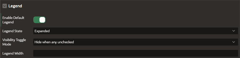
Description of the illustration apex_legend_panel.png
Table: Legend Attributes
| Attribute | Description |
|---|---|
| Enable Default Legend | Determines whether legend entries are automatically generated from graph data. It is enabled by default. If you wish to generate the legend entries based only on Rule-Based Styles, then you can disable this toggle. If the default legend is disabled and RuleBasedStyles is not configured, then the graph does not show any color as shown in the figure at the end of the table. |
| Legend State | Specifies whether the legend region is in expanded or collapsed state when the graph loads in the graph visualization panel. Supported options are:
|
| Visibility Toggle Mode | Specifies how the visibility of graph vertices and edges are determined when the visibility checkbox of a legend is toggled. Supported options are:
|
| Legend Width | An integer value that specifies the width of the legend region. |
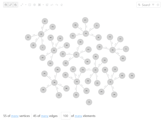
Description of the illustration apex_legend_disabled.png
Layout
The Layout panel allows you to choose one of the following layout options:
-
Circle -
Concentric -
Force(default) -
Grid -
Hierarchical -
Radial -
Geographical
The layout configuration parameters may vary for different layouts.
Force Layout
The Force layout configuration parameters are described in the following table:
Table: Force Layout Attributes
| Attribute | Description |
|---|---|
| Spacing | Spacing determines how close different vertices are rendered next to each other. Default is 1.5. |
| Alpha Decay | Controls the rate at which the simulation’s internal alpha value, which influences node movement, decreases over time, gradually stabilizing the force layout. Default is 0.01. |
| Velocity Decay | Determines how fast a simulation ends. Default is 0.1. |
| Edge Distance | The simulation tries to set each edge to the specified length. This can affect the padding between vertices. Default is 100. |
| Vertex Charge | Influences the underlying forces (for example, to remain within the viewport, to push vertices away from each other, and so on). If Enable Cluster is true, then it influences the forces among clusters. Default is -60. |
| Enable Cluster | Switch on this toggle if you wish to enable cluster based layout. |
| Cluster By | By default, the cluster layout (if enabled) uses the first element in vertex.labels to form the cluster. It can also be set to the property name of a vertex, and the clusters will be formed based on the property value. |
| Hide Unclustered Vertices | Determines whether to display vertices that do not belong to any cluster. Default is false. |
Circle, Concentric, and Radial Layouts
The following layouts require only the Spacing configuration:
-
Circle: Spacing sets the radius of the circle. Default is 2. -
Concentric: Spacing sets the minimum spacing in between vertices. It is used for radius adjustment. Default is 2. -
Radial: Spacing sets separation gap between neighboring vertices if they share the same parent vertex. If set to 0, then spacing will not be applied. Default is 2.
Grid Layout
The Grid layout supports the following configuration options:
-
Spacing: Spacing sets the space between elements in the grid. Default is 2.
-
Rows: Determines the number of rows in the grid.
-
Columns: Determines the number of columns in the grid.
The default number of rows and columns are dynamically calculated depending on the height and the width of the graph visualization panel.
Hierarchical Layout
The Hierarchical layout configuration parameters are described in the following table:
Table: Hierarchical Layout Attributes
| Attribute | Description |
|---|---|
| Rank Direction | Alignment of the ranked vertices. Supported options are - `Up to Left`, `Up to Right`, `Down to Left`, `Down to Right`, `Top to Bottom`, `Bottom to Top`, `Left to Right`, `Right to Left`. |
| Ranker | Specifies the type of algorithm used to rank the vertices. Supported algorithms are: Network Simplex, Tight Tree, and Longest Path. |
| Vertex Separation | Sets the horizontal separation between the vertices. |
| Edge Separation | Sets the horizontal separation between the edges. |
| Rank Separation | Sets the separation between two ranks(levels) in the graph. |
Geographical Layout
The Geographical layout configuration parameters are described in the following table:
Table: Geographical Layout Attributes
| Attribute | Description |
|---|---|
| Map Type | Select map type in map visualization or graph visualization settings, or provide your own sources and layers. |
| Longitude | Specify the vertex property to use for determining the longitude of a vertex. |
| Latitude | Specify the vertex property to use for determining the latitude of a vertex. |
| App ID | Specify the appId to fetch maps from http://maps.oracle.com/elocation. If omitted, a generic appId will be used. |
| Show Information | Enabling this toggle, displays an info box in the visualization that shows the latitude and longitude of the mouse position and the zoom level of the map. |
| Navigation | Displays the navigation controls towards the top right region of the map. |
| Markers | Displays location markers on the map |
See Also: Layouts page in JavaScript API Reference for Property Graph Visualization
Captions
The Captions panel appears as shown:
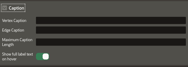
Description of the illustration apex_caption.png
The following table describes the attributes in the Caption panel:
Table: Caption Attributes
| Attribute | Description |
|---|---|
| Vertex Caption | Specify the property to be displayed as the vertex label. If a vertex has a property named `caption` or `title`, then the value of that property is automatically used as the caption text to be displayed for that vertex in your graph visualization. |
| Edge Caption | Specify the property to be displayed as the edge label. |
| Maximum Caption Length | Specify the maximum length of the caption. |
| Show full label text on hover | Enable this toggle if you wish to display the vertex and edge caption when hovering over a specific vertex or edge. |
Tip: You can use the AS keyword in the PROPERTY clause of the CREATE PROPERTY GRAPH DDL statement to rename a vertex property as caption or title. This ensures that the property value is used as the default caption for that vertex in the graph visualization.
Evolution
The Evolution panel appears as shown:
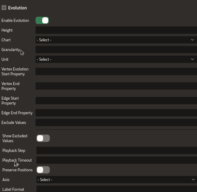
Description of the illustration apex_network_evolution.png
The following table describes the attributes in the Evolution panel:
Table: Evolution Attributes
| Attribute | Description |
|---|---|
| Enable Evolution | Switch on this toggle to enable network evolution in the graph visualization. |
| Height | Specify the height of the chart. |
| Chart | Select the chart type - Bar or Line. |
| Granularity | Specify the aggregation granularity for the input unit. |
| Unit | Select the unit of time for the increment. |
| Vertex Evolution Start Property | Select the name of the property to use for the vertex filtering. The time frame for the graph will be after the Vertex Evolution Start Property. |
| Vertex End Property | Select the name of the property to use for the vertex filtering. The time frame for the graph will be before the Vertex End Property. |
| Edge Start Property | Select the name of the property to use for the edge filtering. The time frame for the graph will be after the Edge Start Property. |
| Edge End Property | Select the name of the property to use for the edge filtering. The time frame for the graph will be before the Edge End Property. |
| Exclude Values | Specify one or more values to be excluded. |
| Show Excluded Values | Enable this toggle if you wish to display the excluded values. |
| Playback Step | Specify a value to determine how often does the playback advance in ms. |
| Playback Timeout | Specify a value to determine how many steps are taken per time out during playback. |
| Preserve Positions | If switched on, network evolution will keep the original vertex positions of the graph during playback. |
| Axis | Select one of the supported values - vertices, edges, or both. |
| Label Format | Specify a string that represents the format in which the date must be displayed. Note that the format must include either YYYY, MM, or DD. Otherwise, the format will be ignored. |
Schema
The Schema panel appears as shown:
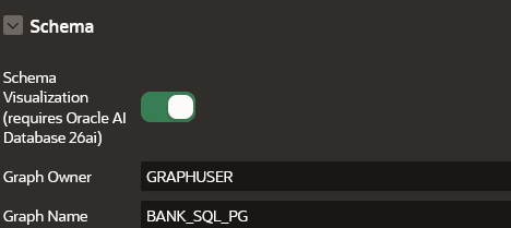
Description of the illustration apex_schema_panel.png
The following table describes the attributes in the Schema panel:
Table: Schema Attributes
| Attribute | Description |
|---|---|
| Schema Visualization | Switch on this toggle to enable graph schema visualization. |
| Graph Owner | Specify the owner of the SQL property graph used in the SQL graph query. This is a mandatory parameter. If the graph is not qualified with the schema name in the SQL graph query, then the graph owner is the current schema that is associated with the APEX application workspace. |
| Graph Name | This is a mandatory parameter. Specify the name of the SQL property graph used in the SQL graph query. |
Expand
The Expand panel appears as shown:
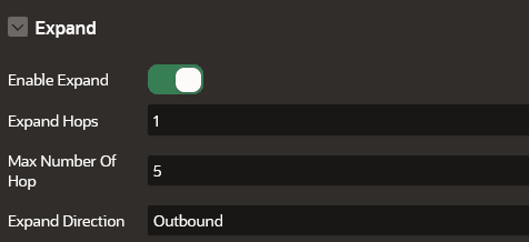
Description of the illustration apex_expand_settings.png
The following table describes the attributes in the Expand panel:
Table: Expand Attributes
| Attribute | Description |
|---|---|
| Enable Expand | Switch on this toggle to enable expanding a graph vertex in the graph visualization. |
| Expand Hops | Specify the number of hops to expand. This configuration is to retrieve n-hops neighbors of specified vertices. The expand hop value should be equal to or greater than 1. |
| Max Number of Hop | Specify the maximum number of possible hops while performing expand and focus actions. Default is 5. |
| Expand Direction | Specify the direction of the edges to be traversed when expanding to neighboring vertices. Supported values are:
|
See Graph Interaction Options in Property Graph Visualization Developer’s Guide and Reference for more information.
Advanced Options
The Advanced panel appears as shown:
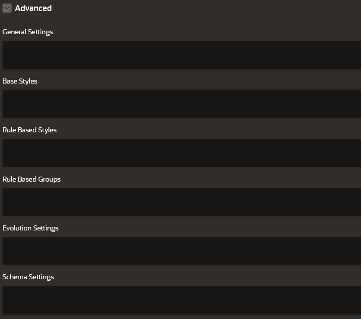
Description of the illustration apex_advanced_options.png
The Advanced panel allows you to configure custom and default styling for your graph visualization using the following options:
General Settings
You can specify the general graph visualization settings (see settings) in JSON format.
For instance, the following JSON example specifies the theme, legend width, and layout configurations:
{
"theme": "dark",
"layout": "hierarchical",
"legendWidth": "20"
}
The corresponding graph visualization is as shown:
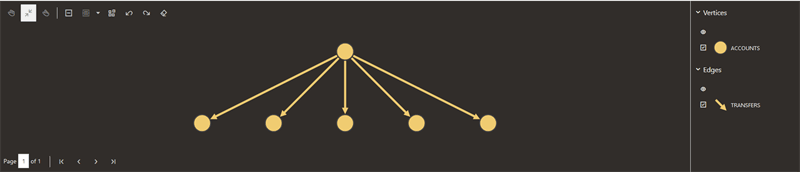
Description of the illustration apex_general_settings.png
Base Styles
Base style expressions are used to overwrite the default styling for the vertices and edges in the graph.
For instance, the following JSON example overwrites the default vertex styling:
{
   "vertex":{
      "size":12,
      "label":"${properties.EMPLOYEE_ID}",
      "icon":"fa-user"
    }
}
The corresponding graph visualization is as shown:
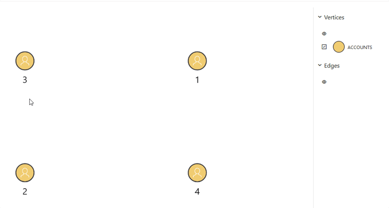
Description of the illustration apex_base_style.png
For more examples, see Base Style Usage in Property Graph Visualization Developer’s Guide and Reference.
Rule-Based Styles
Rule-based style expressions are used to specify the target element into which the given style must be applied. The applied custom style is reflected in the legend panel as well. See Rule Expressions in Property Graph Visualization Developer’s Guide and Reference for more information.
For instance, the following JSON example creates a custom color style for employee IDs ranging from 100 to 110:
[
  {
    "_id": 1,
    "component": "vertex",
    "stylingEnabled": true,
    "target": "vertex",
    "visibilityEnabled": true,
    "conditions": {
      "operator": "and",
      "conditions": [
        {
          "property": "EMPLOYEE_ID",
          "operator": ">=",
          "value": "100"
        },
        {
          "property": "EMPLOYEE_ID",
          "operator": "<=",
          "value": "110"
        }
      ]
    },
    "legendTitle": "Rule-Based Style",
    "style": {
      "color": "red"
    }
  }
]
The corresponding graph visualization is as shown:
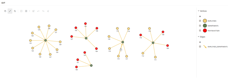
Description of the illustration apex_rule_based_style.png
For more examples, see Rules Based Styles Usage in Property Graph Visualization Developer’s Guide and Reference.
Rule-Based Groups
You can create groups based on defined conditions.
For instance, consider the following JSON example:
[
  {
    "_id": 582378657398,
    "name": "Manual Group by DEPARTMENT_ID",
    "type": "group",
    "applyOnLoad": true,
    "component": "vertex",
    "enabled": true,
    "groupBy": "DEPARTMENT_ID",
    "conditions": {
      "operator": "and",
      "conditions": [
        {
          "component": "vertex",
          "property": "DEPARTMENT_ID",
          "operator": ">=",
          "value": "50"
        },
        {
          "component": "vertex",
          "property": "DEPARTMENT_ID",
          "operator": "<=",
          "value": "150"
        }
      ]
    }
  },
  {
    "_id": 45245237398,
    "name": "Manual Group by JOB_TITLE",
    "type": "group",
    "applyOnLoad": true,
    "component": "vertex",
    "enabled": true,
    "groupBy": "JOB_TITLE",
    "conditions": {
      "operator": "and",
      "conditions": [
        {
          "component": "vertex",
          "property": "JOB_TITLE",
          "operator": "~",
          "value": "^(Programmer|Sales Representative|Administration Assistant|Marketing Representative)$"
        }
      ]
    }
  }
]
The corresponding graph visualization is as shown:
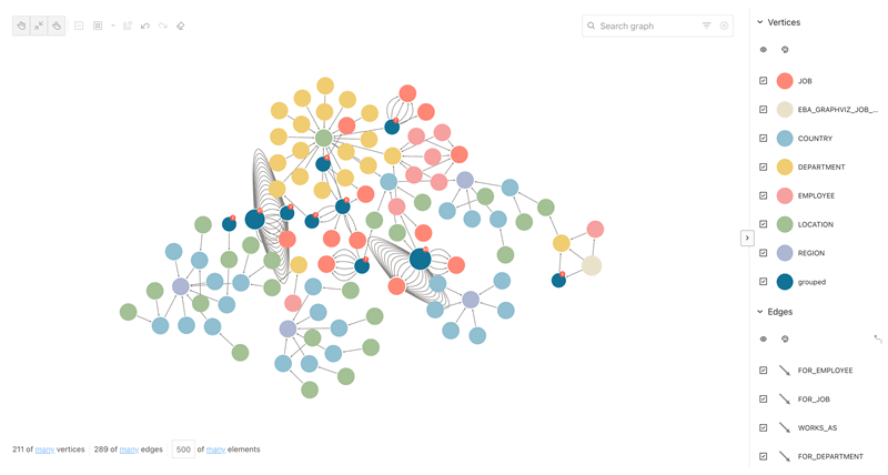
Description of the illustration apex_smart_group.png
Evolution Settings
You can provide the configuration for network evolution in JSON format.
For example:
{
    "vertex": {
      "start": "properties.HIRE_DATE"
    },
    "unit": "year",
    "chart": "line"
}
The corresponding graph visualization is as shown:
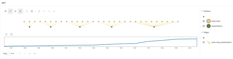
Description of the illustration apex_evoloution_settings.png
Schema Settings
You can provide the configuration for schema visualization.
For example:
{
  "viewMode": "expanded",
  "layout": "hierarchical",
  "searchEnabled" : false
}
Callbacks Options
The Callbacks panel appear as shown:
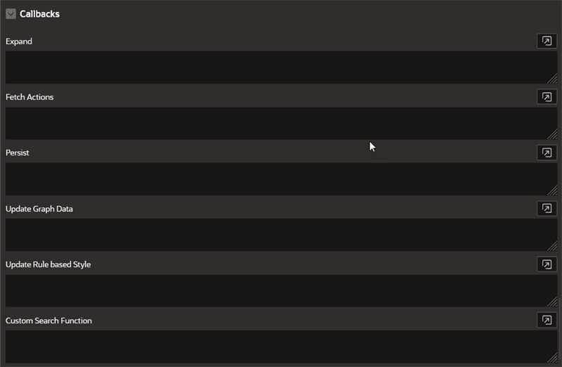
Description of the illustration apex_callbacks.png
The Callbacks panel comprises the following options:
Table: Callbacks Attributes
| Attribute | Description |
|---|---|
| Expand | To expand a selected vertex in the graph visualization, see Expand Callback for more information. |
| FetchActions | To retrieve the graph actions from a data source, refer to fetchActions for more information. |
| Persist | To persist the graph actions to a data source, refer to persist for more information. |
| UpdateGraphdata | Callback to handle events when the graph data is updated. |
| Update Rule based Style | Callback to perform custom handling when editing styles, toggling visibility checkbox , or reordering the legend items in the graph visualization legend panel. Refer to updateRuleBasedStyle for more information. |
| Custom Search Function | Callback to retrieve a list of vertices and edges that matches a search. Refer to search for more information. |
- Expand Callback
You can expand a selected vertex in the graph and fetch the adjacent vertices using the Expand callback in the Property Editor of the Page Designer.
Expand Callback
You can expand a selected vertex in the graph and fetch the adjacent vertices using the Expand callback in the Property Editor of the Page Designer.
-
Switch to the Processing tab on the left pane of the Page Designer and navigate to the After Submit node.
-
Right-click and select Create Process from the context menu.
-
Enter the process Name.
-
Specify Type as Execute Code.
-
Select the source Location as Local Database.
-
Select the source Language as PL/SQL and enter the following code in the PL/SQL input box.
DECLARE
    data clob;
    ids sys.dbms_sql.varchar2a :=  APEX_APPLICATION.G_F01;
    graph VARCHAR2(100) := 'BANK_GRAPH';
    hops NUMBER := TO_NUMBER(APEX_APPLICATION.G_x01);
    n NUMBER := hops - 1;
    id_strings VARCHAR2(32767) := ' (';
    query VARCHAR2(32767);
    incur    sys_refcursor;
    l_cur    number;

BEGIN
    for i in ids.FIRST..ids.LAST LOOP
        IF i = ids.LAST THEN
            id_strings := id_strings || apex_exec.enquote_literal(ids(i)) || ') ';
        ELSE
            id_strings := id_strings || apex_exec.enquote_literal(ids(i)) || ', ';
        END IF;
    END LOOP;

    if hops > 1 then
        query  := 'SELECT id_x, id_e, id_z
        FROM GRAPH_TABLE (' || graph || ' MATCH (x) ->{,' || n || '} (y) -[e]-> (z)
        WHERE JSON_value(vertex_id(x), ''$.ELEM_TABLE'') || json_query(vertex_id(x),
          ''$.KEY_VALUE'' returning varchar2) IN ' || id_strings ||'
        COLUMNS (vertex_id(x) as id_x, edge_id(e) as id_e, vertex_id(z) as id_z))';
    else
        query  := 'SELECT id_x, id_e, id_z
        FROM GRAPH_TABLE (' || graph || ' MATCH (x) -[e]-> (z)
        WHERE JSON_value(vertex_id(x), ''$.ELEM_TABLE'') || json_query(vertex_id(x),
          ''$.KEY_VALUE'' returning varchar2) IN ' || id_strings ||'
        COLUMNS (vertex_id(x) as id_x, edge_id(e) as id_e, vertex_id(z) as id_z))';

    end if;

    open incur for query;
    l_cur := dbms_sql.to_cursor_number(incur);
    data := ora_sqlgraph_to_json(l_cur);


    dbms_sql.close_cursor(l_cur);
    apex_util.prn(data, false);
END;
In the preceding code, <graph_name> denotes the name of the graph. Note that the process takes the vertex
idto be expanded as input and returns the resulting output as JSON. -
Select the execution Point as Ajax Callback.
-
Switch to the Rendering tab on the left pane of the Page Designer and select the graph visualization component.
-
Switch to the Attributes tab on the right pane and enter the following code in the Expand input box in the Callbacks panel.
const data = await apex.server.process('<process_name>', {
    f01: ids,
    x01: hops
}, { dataType: 'text' });
try {
    return JSON.parse(data);
} catch (error) {
    return [];
}
In the preceding code, <process_name> refers to the name of process that was provided at step-3.
-
Click Save.
-
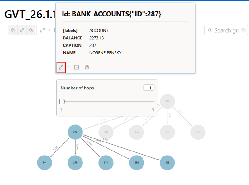
Run the application page and you can now click expand (as shown highlighted in the following figure) on any specific vertex in the graph.
The following figure shows the 1-hop neighbors after expanding from vertex
CAPTION: 287. A hop count slider is displayed, allowing you to select a value between one and five to determine how many n-hop neighbors are fetched.