8 Theme
This chapter contains OGL Theme knowledge articles.
Can I remove the "Powered by" footer?
Yes.
Paying customers can completely white-label the Guided Learning layer.
In order to do that you need to download the Design Kit.
In the design kit you can use the following CSS rule to hide the 'Powered by' footer.
div.sttip .guide-footer {
    display: none;
}
How to Change the Help Icon
The help icon is part of the Guided Learning theme.
Paying customers can download and configure their theme by downloading the design kit.
To change the background color of the icon:
div.ir-marker {
    background-color: #12bc8d;
}
To change the ? to another letter:
Add the following CSS rule to the design kit (if it doesn't already exist).
div.ir-marker:after {
    content: 'i';
}
To change it to your own custom image:
div.ir-marker:after {
 content: none;
}

div.ir-marker {
background:
 url(data:[your image goes here])
 no-repeat
 left center;
}
You can use the following service to get the Data URI of your image - https://dopiaza.org/tools/datauri/index.php
Is it possible to make the overlay a little lighter?
Yes, download the design kit and edit as desired.
To Export (download) your OGL Theme Design Kit:
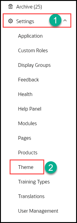
- From the OGL Console, select Settings from the left navigation panel.
- Select Theme in the left panel.
- The Theme Editor modal opens:
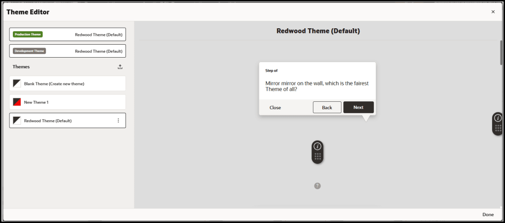
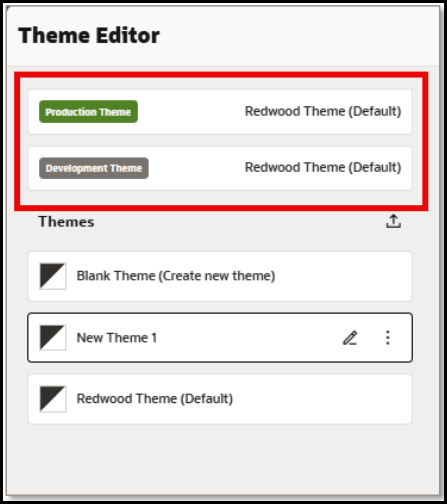
The currently set PROD and DEV themes are always listed at the top of the editor:
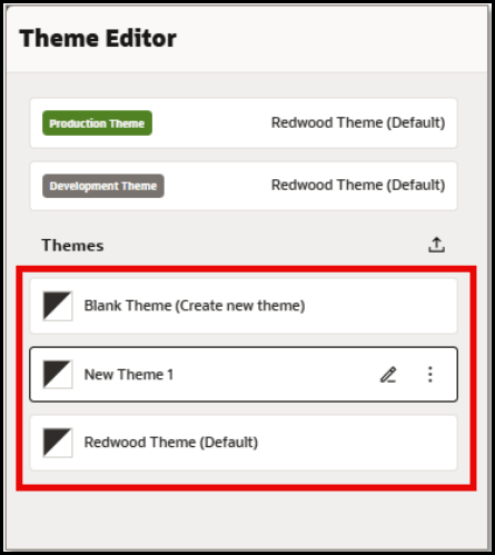
- In the Themes section, choose the theme from the list of available themes to
edit/export.
- In the Themes section, choose the theme from the list of available themes to
edit/export.

- Select Export to download the selected theme as an HTML file to your default Downloads folder.
- Navigate to the folder where you downloaded the theme HTML file.
- Open the theme HTML file in a text editor, such as Notepad.
- In the HTML source code, insert the following in the Custom CSS section
in theme file to adjust the opacity of the
overlay:
.stExposeDiv { opacity: 0.3 !important;}
We offer multiple themes to our users. Is there any way to change the OGL theme based on user or, even better, to update individual styles on the fly?
Oracle Guided Learning themes are 100% CSS, so if you dynamically add CSS rules on the fly in such a way that they will 'win' over the default rules in your theme, you can easily change the look and feel at run time.
Enabling Multiple Styles in the same Guide
When there is a requirement to have different formatting for tips or help icons within the same guide (or even the same step), you will need to update the theme. An example of this would be having Smart Tip icons for policy documentation be one color, the associated tip a different style, and Smart Tip icons for how to use the tool in the default style.
To enable multiple styles:
-
Download the Design Kit and open the html doc in your preferred text editor
- Best Practice: Search for "ir-marker" then organize your code in an orderly fashion
- It will help to have your custom code entered in proximity to the default code
- The following code will result in the help icon containing an "i" when the POLICY class is active:
div.<your_class_name >.ir-marker:after {
content:'i';
}
so, for a class called "POLICY"...
/*This is the text for the POLICY Smart Tip*/ div.POLICY.ir-marker:after { content:'i'; } - The following code will result in the help icon having a green background when the POLICY class is active:
div.<your_class_name >.ir-marker{
background-color: deeppink;
}
so, for a class called "POLICY"...
div.POLICY.ir-marker { background-color: green; } - The following code will result in the Next and Done buttons being green when the POLICY class is active:
div.sttip div.tooltip.<your_class_name> div.stFooter [data-iridize-role="nextBt"] {
background-color: darkorchid;
}
so, for a class called "POLICY"...
div.sttip div.tooltip.POLICY div.stFooter [data-iridize-role="nextBt"] { background-color: green; } - The following code will result in the back button being grey when the POLICY class is active:
div.sttip div.tooltip.<your_class_name> div.stFooter [data-iridize-role="prevBt"] {
background-color:grey
}
so, for a class called "POLICY"...
div.sttip div.tooltip.POLICY div.stFooter [data-iridize-role="prevBt"] { background-color:grey } - Save the edited HTML file. The above code will result in changes to the tip footer appearance outside the Next and Back buttons when the POLICY class is active.
- Open Settings for the appId and select Themes
- Scroll to bottom of Setup Theme configuration page and select Upload Theme.
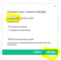
- Select Choose File button to select your edited HTML file then configure dialogue window as shown below then select Upload
- In a new guide or existing guide, create a simple tip pointing to an element on the screen and enable the help icon without "show tip on hover-over" enabled
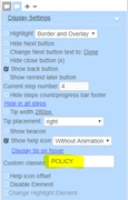
- In the same step, create another tip just as above (point to a different element on the screen), but enter "POLICY" in the class field as shown below
- Save the guide and launch the application
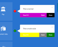
- The step created above should look something like this
Custom Classes – Adding a New Label to a Tile
Adding a New Banner to a tile using OGL
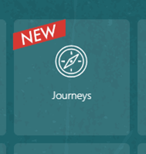
Add the below code to your design kit, Available to export in Settings/ Theme. You will need to open the Theme with a source code editor to add the code anywhere within the /*IRIDIZE_CUSTOM_THEME_START*/ and /*IRIDIZE_CUSTOM_THEME_END*/ section.
Note:
Alternatively, raise a Support ticket in the OGL console and the Team will do it for you.
div.NewStyle.ir-marker {
background: url(https://guidedlearning.oracle.com/player/latest/api/app/hTYVFIuISsO081oFLtO5xg/upload_content_image/9nehkca/image/content_image);
background-repeat: no-repeat;
background-position: center;
border: none;
border-radius: 0%;
background-size: contain;
padding: 24px;
display: inline-block;
}
div.NewStyle.ir-marker:after {
content: none;
display: none;
}
Create a Smart Tip and select the tile you would like to show the banner on as Target and apply the below settings:
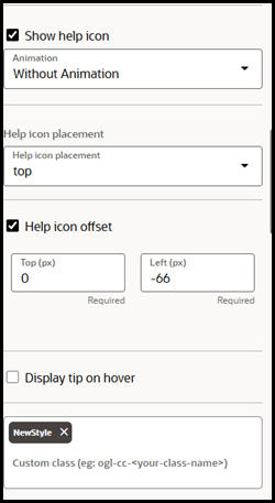
Once the above settings have been added, click on Invisible Tip
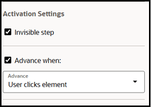
You are good to go!
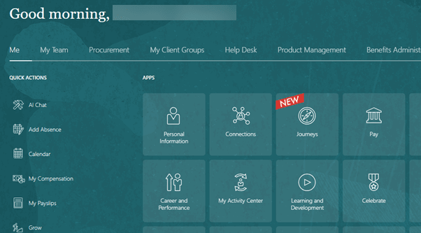
Managing Image URLs in OGL Design Kits
Why avoid Base64 Image URLs
You may have recently encountered a problem with accessing the OGL Console by any of the users. This may have resulted after you have made some recent changes to your OGL Design Kit in the OGL > Settings > Theme section. This issue is caused by custom images that were embedded as Base64 strings in themes, which is not a recommended practice, as it may cause:
- Session storage overflows (exceeding 5MB browser limits).
- Performance degradation (slow loading, poor caching).
- Maintenance challenges (hard to read/update long strings).
Best Practice: Do not use Base64 image strings. Instead, use hosted URLs for images/icons.
Step‑by‑Step Instructions
Step 1: Upload Images to OCI Bucket (Default provided by OGL) In this example, suppose you wish to upload the following image to your OGL Design Kit:
- From the OGL console, create or edit a guide and add the image
(i.e. Copy/Paste) directly into a tooltip. Once pasted, double-click the image
to open the Image Properties dialog.

Notice that the image URL has been automatically converted to a Base64 URL text string like this:data:image/png;base64,iVBORw0KGgoAAAANSUhEUgAAADIAAAAxCAIAAAAXyW1IAAAChElEQVR4AeyWTUiUURSGw4QW4wQGEdIiaGCiIKEyKDdGC9tEEa2iqFUgLRO3ybTMdBlT7frBVQjRpoLIjQYVRUGLgREEyURI6A+MFj3y2iV/OPeecSNy5Xo43/3ec+5733vm3K9pvLtjHY6mTevyL9PyHEtWK6vlUcCDzbWV1fIo4MHm2spqeRTwYDdEbTW3FLe2Hyr19u+/9bDj0YsjT1/b48C9x+X+ge3dJz1KLWAdakFo743qvoEqyxRKZSguJDD/t+xo29Z5TNsg3MQueZlKq+3MOfYNmyXRyQ8Eaj+JEUm02OjOC5clz58f3799ePvxyvk3Z4+/OnHYGABqlb7ZZ08CFWRDvPBoOHFasNnVcxVLFjhNDF7/1Nfzs17DZ8YYAL6OvawPVthDgO3uvRZ8w4nTau3s4giUYvL2ECvJT7fsgZ0Iz/aoB/mGTaB1tEvxZP//RDSZaDl3wgUuth+UY9g4rUJpj+JJLacxOzc+qkAqVY5h47T4kSv+98y0nMbs/MxnBXKOcgwbp0XlKn5zS1FOY7a5sBgeEhp5VqG1DP1roqaZ1n9FpkevDSU1n6B6nNbs88XGUyiVE7vOSsYEMjQfikyPq9o4rbmx0bA/uk5KwS5biRACNckJfhkZlm/YOC0S1W9WlIJq5Q6hu7KSZgwLGBhgbi18Iel8JJRv2DgtgmkNk9UhHA36IeTsbwfe8okBDHDgNPXgbmLnS6IFm+mRYe6QcJrMuAYKcT9O3b+TGJVKi3S06XcXTyEb4rEMM9EBDDAh7y+ddt1aDloigWxccHwdGN8O4RUwwITAT+GJ1k0rMe8aYZmWR8CsVlbLo4AHm2srq+VRwIPNtbUB1PoLAAD///W5JH0AAAAGSURBVAMAyfBQJI5bALcAAAAASUVORK5CYII=? - Save & Exit the guide. Once saved, the image will be
automatically uploaded and hosted on the OGL server, and the Base64 URL
will be converted to a hosted URL like this:
https://guidedlearning.oracle.com/api/edge/app/EWxJBmADQGuGbk5T3yqnxQ/upload_content_image/601bry4/image/content_image
Step 2: Generate Hosted URLs
- Once uploaded, each image will have a unique hosted URL like the one shown in #2 above.
- Re-open the guide where you inserted the image and double-click the image to
open the Image Properties dialog.

- Copy the entire new hosted URL from the URL field.
Note:
You may want to paste the URL into a text file, which you will need in the next step.
- Open your Theme Editor in OGL console.
- Locate the theme that you wish to update and export it, if needed.
- Open the Theme HTML file in a text editor, such as Notepad.
- Locate the Base64 URL strings (e.g., data:image/png;base64,...).
- Replace them with the hosted URL.
- Repeat this process for all other images, replacing all Base64 URLs with the new hosted URLs throughout the theme to update all images.
- Save the Theme HTML file.
- In OGL, open the Theme Editor and upload the updated
theme.
Example:
- ❌ Base64: data:image/png;base64,iVBORw0KGgoAAAANSUhEUg...
- ✅ Hosted URL: https://guidedlearning.oracle.com/api/edge/app/HSyW_l+GQEegD_2GtaL8bA/upload_content_image/05tthio/image/content_image
- Save changes to your theme and preview the theme in the OGL editor.
- Set the theme as DEV Theme

- Confirm images load correctly.
- Once all images have been verified, publish the updated theme
from Development → Production.

- Ensure all custom images are restored without Base64 issues.
Temporary Workaround
- Use the Default Theme (no Base64 URLs), if immediate stability is required.
- Limitation: Custom images will be missing.
- To restore visuals, follow the above steps to replace Base64 URLs with hosted URLs.
Best Practices
- Never embed images as Base64 URLs.
- Always use hosted URLs for images/icons
- Document and share these practices internally and with customers.
Reference
For detailed framework instructions, see the official OGL User Guide.