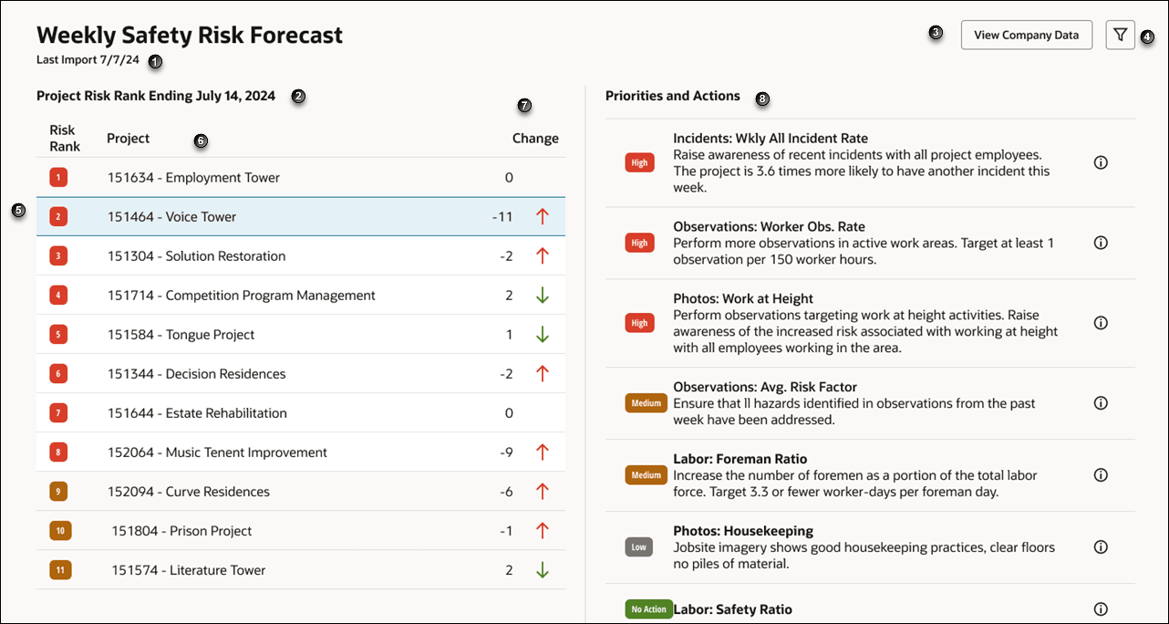
Weekly Safety Risk Summary
Use the Weekly Safety Risk Summary dashboard to view a high-level list of all projects ranked by the likelihood of an incident to occur in the week ahead.
You can use this dashboard to:
- View the overall risk ranking for the projects in your portfolio. The risk rank is based on the likelihood of an incident occurring in the coming week.
- Understand the risk factors driving the incident risk on each project.
- Potentially reduce project risk by implementing the recommended action steps.

The following screen elements are displayed on the Weekly Safety Risk Summary dashboard:
| Screen Elements | Description |
|---|---|
| 1 | Displays the date the data was last imported. The dashboard predictions are based on the data for the week prior to this date. |
| 2 | Project Risk Rank Ending - Displays the week ending date. The project ranking is calculated for the week ending on the date specified. |
| 3 |
View Company Data button. Select to view the data used to generate the dashboard. The following metrics are displayed in the dialog box:
|
| 4 | Filter button. Select to filter the projects list. |
| 5 |
Rank column. Display a numerical risk rank for each project. The risks are color coded as follows:
|
| 6 | Project column. Displays the ID and the name of the project. |
| 7 |
Change column. Displays the change in project risk rank from last week's predictions. The numeric value shows the change in ranking, and the arrow indicates whether the project has moved up or down the list. An up arrow in red color indicates that the project's risk rank has increased, while a down arrow in green indicates that a project has decreased its project risks. A value of 0 indicates that there is no change in risk rank from last week. |
| 8 | Priorities and Actions pane. Displays the project priorities and the recommended actions. The priorities are labeled as High, Medium, Low, and No action. The metric is listed along with the recommended actions. You can hover over the Tool Tip icon to view a definition of the metric. |
| Weekly Risk Summary, Weekly Project Risk, Risk Report Card, and Model Performance tabs. | Tabs to navigate to the Weekly Risk Summary, Weekly Project Risk, Risk Report Card, and Model Performance pages. |
How to use the dashboard
- View projects that are at high risk for safety incidents by monitoring the Rank and Change column for each project.
- Use the Change column number and arrows to see how much the risk rank of a project has changed from the prior week.
- Select an individual project from the Project column to view the priorities and actions that must be taken on the selected project. The priorities and actions are displayed on the right pane.
- Hover over the Tool Tip icon to view a description of the metrics.
- Click the View Data button to view the metrics detail that was used to predict risks. This data is an aggregation of the metrics across all projects.