Day By Day and Hourly Breakdown
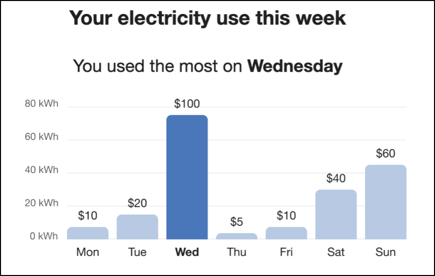
The purpose of the Day by Day and Hourly Breakdown is to provide business customers with a granular view at their energy use by showing them how much energy they spent on each day of the previous week, and also indicating the time of day with the highest energy usage.
Examples
The images below show examples of the Day-by-Day and Hourly Breakdown modules for electricity customers.
Day-by-Day Breakdown
The image below is an example of the Day-by-Day Breakdown module for electricity customers.

Hourly Breakdown
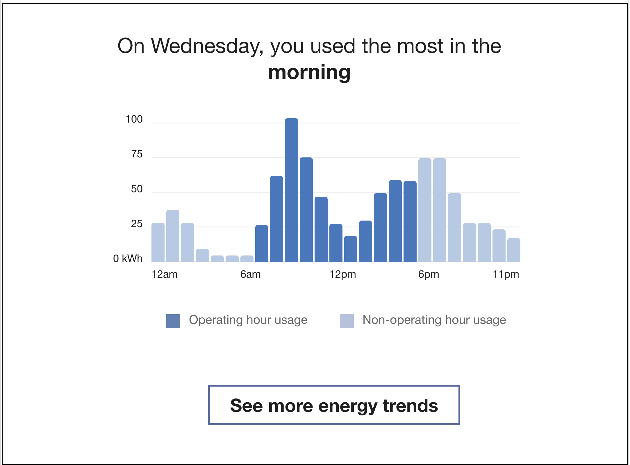
The Hourly Breakdown feature displays the hourly use for a customer's highest use day from the previous week. It allows customers to notice trends in their usage according to the time of day, which helps them identify ways they can save energy. Dual fuel versions of the communication include graphs for both electric and gas use.
The image below is an example of an Hourly Breakdown that includes Operating Hours information for electricity customers.

See More Trends Button: Clicking this link takes business customers to the Data Browser in the Oracle Utilities Opower web portal. If the customer is not signed in to the web portal, they are prompted to either sign in to their account or register if they have not previously done so.
Configuration Options
This section discusses the configuration options for the Day By Day and Houlry Breakdown module.
Day by Day Breakdown Options
For each element listed in the table, indicate the desired configuration in the Input Value column. If you do not provide an input for optional configurations, the default will be used.
| Configuration Option | Input Value |
|---|---|
|
Title and Subtitle The title indicates the purpose of the graph. The subtitle indicates the day when energy usage or cost was the highest. Default: Varies by fuel type. See User Experience Variations below for details. |
Optional Choose one of the following:
|
|
Bar Colors Bar colors in the graph can match the utility’s color palette. Both the peak bar color and the non-peak bar color can be changed. Default: The colors in the example represent the default colors. |
Required Choose one of the following:
|
|
Display Cost Information (not depicted) If a customer's rates are modeled, the cost per day can be displayed below each bar in the graph. Default: Display cost information if it is available. |
Optional Choose one of the following:
|
| Operating Hours If the business customer specifies their operating and non-operating hours through their Business Profile, the bar chart indicates each with two distinct color shades. Default: Display operating hours information if available. |
Optional Use the default (indicates operating and non-operating hour ranges in the graph). |
Hourly Breakdown Options
For each element listed in the table, indicate the desired configuration in the Input Value column. If you do not provide an input for optional configurations, the default will be used.
| Configuration Option | Input Value |
|---|---|
|
Title The title indicates the general time period during which the customer used the most energy. Default: Varies by time of day. See User Experience Variations below for details. |
Optional Choose one of the following:
|
|
Line Colors Colors in the graph line graph and in the shading below the line can match the utility’s color palette. Default: The colors in the example represent the default colors. |
Required Choose one of the following:
|
|
Call-to-Action URL The call-to-action URL (“See more electricity trends”) directs the user to another web feature where this more detailed information about their energy use over time. Default: The link points to the Digital Self Service - Energy Management Data Browser. |
Optional Choose one of the following:
|
| Operating Hours If the business customer specifies their operating and non-operating hours through their Business Profile, the bar chart indicates each with two distinct color shades. Default: Display operating hours information if it is available. |
Optional Use the default (indicates operating and non-operating hour ranges in the graph). |
User Experience Variations
The user experience varies for customers depending upon their service types, available data, costs, and locale. Note that the following list indicates the primary user experience variations, not all possible variations.
Title
- “Your electricity use this week”
- “Your gas use this week”
Subtitle
- “You used the most on <day>"
Gas-Only
For gas-only customers, the electricity unit “kWh” is replaced by “therms” or "CCFs" (whichever unit of measure is appropriate for the utility), and the word "electricity" is replaced by "gas".
Dual Fuel
Dual fuel customers see two separate Day-by-Day Breakdown modules, one for electricity use and one for gas. The heading above each graph specifies the fuel type.
Rates Modeled
If rates are modeled and the utility has opted to display cost information in this module, then cost information is displayed beneath each bar in the graph to indicate the cost of energy for that day.
Operating Hours
If the business customer has filled out the Operating Hours section in their Business Profile, then the bar charts in the Day-by-Day and Hourly breakdowns will show two different shades of blue to differentiate between the energy that was used during operating hours, from what was used during non-operating windows.