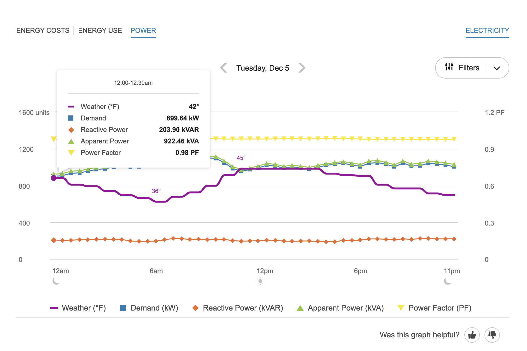
Power View
The Power view of the Data Browser shows business customers several types of data and power measurements over a 24-hour time period: demand, reactive power, apparent power, and power factor. This information allows businesses to see their power efficiency as well as the point in time when they draw the most energy from the grid, and to ensure all systems are running without waste or high cost.
On this page:
Requirements
Utility Requirements
Same as listed in Data Browser.
Customer Requirements
|
Category |
Description |
|---|---|
|
Billing Frequency |
Same as listed in Data Browser. |
|
Data Delivery Frequency |
Same as listed in Data Browser. |
|
Data Requirements |
Interval and Demand Data: Electric interval data in kilo-watt hour (kWh) units is required and is used to calculate demand data. For information on providing this data, see the Oracle Utilities Opower Interval Data Transfer specification. Premise Data: Premise data for the business is required. See the Oracle Utilities Opower Premise Data Transfer specification for more information. Apparent Power: Electric interval data in kilovolt-amp (kVA) units is required to display apparent power. Alternatively, kVA data can be calculated if both kWh and kVArh (kilovolt-ampere reactive hour) units are provided. Power Factor: Power factor is the ratio between the system’s real power (kW) and apparent power (kVA). The power factor value can therefore be calculated and displayed as long as kW and kVA data are available. If necessary, kW and kVA data can be calculated if two of the following types of data are provided: kWh, kVArh, and kWAh (kilo-volt ampere hour). Work with your Delivery Team to determine which data to send based on what is available in your system. Reactive Power Data: To display reactive power data, an additional input of interval data must be provided in kvarh. An applicable |
|
Data History |
Same as listed in Data Browser. |
|
Data Coverage |
Same as listed in Data Browser. |
|
Supported Fuels |
Electricity and dual fuel. Demand data for gas cannot be shown. |
Limitations
- Calculated Demand Data: The Power view does not use or support demand rates data. Rather, demand data is calculated based on interval data provided in kWh and is available to all business customers for a utility. Demand data is displayed as kWs in hourly intervals.
- Peak Demand Icon: Any icon highlighting peak demand in the Power view may not be consistent if a business has other rates that determine peak demand costs for their bill. For example, the Power view may highlight a particular hourly interval as the business customer's highest demand interval, but this may not align with the peak usage indicated on a customer's bill if the business is billed for 30-minute usage intervals.
User Experience
The Power view displays a business customer's demand for a given day, with tooltips providing the exact values for each data point.
Fuel Menu
Only electricity data can be shown in the Power view. If the business also receives gas from their utility, then a gas menu may be displayed but it will be grayed out in the Power view so it cannot be selected.
Time Menu
In the Power view, only subdaily data is shown. The Year view and Bill view are not applicable or available. Customers can use the forward or backward buttons to view data for one 24-hour period at a time.
Line Graph
The line graph uses a horizontal axis (X-axis) to show time intervals and a vertical axis (Y-axis) to show several different types of power data in each interval: Apparent Power, Demand, Power Factor, Reactive Power, and Weather. This helps business customers better understand the energy being used at any given moment for different electrical units of measure.
Customers can use a Filters menu to enable or disable the display of each data type. If customers select or deselect an item from the list, their selections will be preserved the next time they access the menu or sign in.
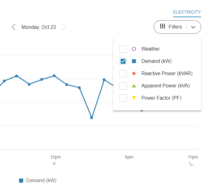
On desktop displays, each data type has a different color-coded shape or icon so it is more easily distinguishable and accessible. On mobile displays, the icons are hidden and color-coded toggles are shown instead.
Notes:
- The line graph only displays data points if the corresponding data is available.
- The Y-axis label shows a generic "Units" label, since the different data types use different units of measure. If Power Factor is selected from the Filters menu, an additional Y-axis displays dynamically on the right side of the line graph to show PF units.
- One or more of the data types may not be displayed in the line graph depending on each utility’s configuration and the relevance of the data to a utility’s customer base.
- If the line graph only contains one or two of the four primary units of measure available for the Power view, then the Filters menu will not be displayed.
Apparent Power
Apparent power is the amount of power used to run machinery and equipment during a specific period of time. It is expressed in kilovolt ampere (kVA) units, where one kVA is equal to 1,000 watts of power. With this information, business customers can that ensure apparent power is within acceptable limits of their building’s total usage or demand, and verify that there is no strain on their usage.
Demand
Demand refers to the rate at which a business consumes electricity, not the actual amount that is consumed. Demand is expressed in kilowatts (kW) rather than kilowatt-hours (kWh). This information allows businesses to see the point in time when they draw the most energy from the grid, identify irregularities, and consider how to lower their usage during those times in the future.
Power Factor
Power factor is a measure of how efficiently power is used in electrical equipment. It is usually expressed as a percentage, based on the ratio between the system’s real power (kW) and apparent power (kVA). The lower the percentage, the less efficient the power usage, which results in less efficient circuits and higher operating costs. Utilities often charge businesses extra money when their power factor is low.
By seeing their power factor trends over time, business customers can identify when there are any inefficiencies and consider how to correct those inefficiencies in the future and reduce overall costs. For example, if the power factor line decreases frequently or noticeably below acceptable limits, there may be a need to schedule maintenance or invest in new equipment.
Reactive Power
Reactive power refers to wasted or lost power. Typically it is used for purposes like the storage and retrieval of energy rather than the consumption of energy, and so it is typically very low compared to the line representing energy demand. If the reactive power line increases, this means that power is being wasted. When this happens, the power factor line will likely show a decrease at the same time, since energy is not being used efficiently.
Weather
Weather data shows the temperature for a given interval in the Power view. Business customers can use this data to infer how weather impacts their power measurements. See Weather Data for more information about how weather data is obtained.
Highest Demand Interval
An icon is displayed over the highest demand interval to indicate when the demand for energy was at its peak. This icon is also shown in the bill and day views of the Energy Use view, where business customers can quickly determine which day in a bill period or which interval in a day contained the highest demand. The customer can then view that day in the Power view to see the exact hour when demand was highest.
Notes about the Peak Demand Icon:
- Demand refers to the rate at which a business consumes electricity, not the actual amount consumed. This means that the interval with the peak demand icon may not always be the same as the interval with the highest amount of energy use. See Demand Versus Usage below for more background details and an illustration.
- The icon is not shown for days in the bill period that did not include the highest demand interval. However, an icon is always shown in the Bill view of the Energy Use view, since that view always displays each day of the bill period.
- There are cases when multiple peak demand icons display within a day. See Multiple Peak Demand Icons below for details.
Tooltips
Tooltips are displayed when customers interact with a data point on the graph. In the Power view, the tooltip provides the specific units of measure for each type of power, such as kilowatts (kW) for demand data, kilovolt-amperes-reactive (kVAR) units for reactive power data, and so on.
See Energy Tooltips for details on what the tooltips may include in other views of the Data Browser.
Disclaimer
Disclaimer messages can be added to the Power view that are specific to the view. For example, a disclaimer message can explain demand and reactive power charges. The disclaimer messages can also include links to resources where business customers can find more information.
Demand Versus Energy Use
Whereas demand is expressed in kilowatts (kW), energy use is expressed in kilowatt-hours (kWh). Demand can be thought of as the rate at which energy is drawn from the grid, rather than how much energy was consumed.
To use a metaphor, imagine that energy is water flowing through a pipe. The pipe itself, however, can only let so much water through at a time. The pipe is like "demand": its size determines how fast the water flows through to meet the need for water.
To give a more concrete example, consider two business customers, Mary and Bob. Mary's utility tracks her business's energy use every hour. This means she has one interval of data per hour. Now imagine that from 4-5 p.m. on March 1st, Mary's business consumed 100 kilowatts of electricity. This means that for the entire hour of 4-5 p.m., Mary's demand was 100 kilowatts, and her business consumed 100 kilowatt-hours.
Meanwhile, Bob's utility tracks his business's energy use every half an hour. This means he has two intervals of data per hour. Now imagine that from 4-4:30 p.m. on March 1st, Bob's business consumed 200 kilowatts of electricity. But then from 4:30-5, he did not consume any more electricity. This means that for the entire hour of 4-5 p.m., Bob's demand was 200 kilowatts, and yet he only consumed 100 kilowatt-hours, since he did not consume any electricity in the second half of the hour.
The important thing to note is that the rate or demand of Bob's electricity consumption was twice as high as the demand of Mary's consumption—even though they both consumed the same amount of energy over a single hour in the end.
User Experience Variations
Multiple Peak Demand Icons
If the demand values for two or more intervals are the same, and these values technically represent the highest demand of the bill period, then multiple peak demand icons are displayed within the same day in the Demand view.
This may be the case, for example, at commercial or industrial locations where a specific set of high-power machinery or equipment needs to be turned on at regular points in time, resulting in a demand spike that consistently reaches the same amount multiple times in a day, or on multiple days in a bill period.
This behavior can also occur in the Energy Use view. See Energy Use View - Multiple Peak Demand Icons for details.