Energy Use View
The Energy Use view of the Data Browser displays how much energy a business customer consumed over specific periods of time. Customers can view energy usage for each bill over a 13-month period. If the required data is available, the customer can also view daily and subdaily data.
On this page:
Requirements
Same as listed in Data Browser.
Limitations
Same as listed in Data Browser.
User Experience
The Energy Use view displays how much energy a business customer is using over time. This section describes the user experiences for businesses that have billing data and daily AMI data.
Fuel Menu
Electricity is displayed by default. If the customer is dual fuel, they will see options that allow them to switch between electricity and gas use.
A Combined view can be displayed, which combines electricity and gas costs into a single number using a price-weighted index. When the Combined view is enabled, the data point tooltips also display combined totals.
Time Menu
Depending on what data is available, the Energy Use view presents different kinds of trends and insights at varying levels of granularity over time.
- Year view: Energy use by each bill period in a year. Monthly, bi-monthly, and quarterly bills are supported.
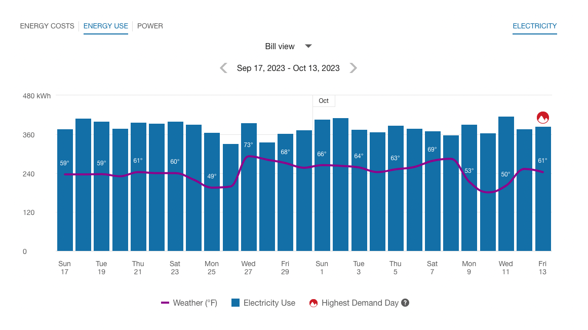
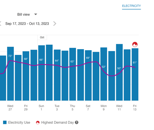
- Bill view: Energy use by each day in a bill period, as well as the day with the highest demand. AMI data is required for this view.
- Day view: Energy use by each hour of a day, as well as the interval with the highest demand. AMI data is required for this view.
There are also forward and backward buttons that customers can select to display contiguous blocks of time. In the year view, for example, clicking the forward or backward button displays contiguous 13-month blocks of time for businesses on monthly billing.
Bar Graph
The bar graph uses a vertical axis (Y-axis) to show the cost, and a horizontal axis (X-axis) shows the time period. The bars use the "You" color, which is blue by default and commonly changed to the utility's brand color. Lighter bars represent estimated bills or usage reads. See General Display Rules for details on how the graph behaves and how the data visualization can change depending on which view is selected.
Highest Demand Day or Interval
In the bill and day views, an icon is displayed over the day or interval when demand was at its peak. Demand refers to the rate at which a business consumes electricity, not the actual amount that is consumed. This means that the day or interval with the peak demand icon may not always be the same as the day or interval with the highest amount of energy use. See Demand Versus Usage for more information about the difference between these units of measure.
Example: Highest Demand Day Icon in the Bill View
The peak demand icon can also be shown in the Power view of the Data Browser to indicate the highest demand interval within a specific day. Additionally, there are cases when multiple peak demand icons can be displayed.
Weather Data
A line graph representing the average temperature during each time period is overlaid on the bar graph. This allows business customers to see how their usage relates to local weather patterns. The weather data is based on data from the airport weather station closest to the location of the business. See Weather Data for details on how weather data is retrieved.
Tooltips
Tooltips are displayed when business customers interact with a data point on the graph. See Energy Tooltips for details on what the tooltips may include.
Disclaimer
Disclaimer messages can be added to the Energy Use view that are specific to the view. For example, a disclaimer message can explain estimated usage. The disclaimer messages can also include links to resources where customers can find more information.
User Experience Variations
Multiple Peak Demand Icons
If the demand values for two or more days or subdaily intervals are the same, and these values technically represent the highest demand, then multiple peak demand icons are displayed in the Energy Use view.
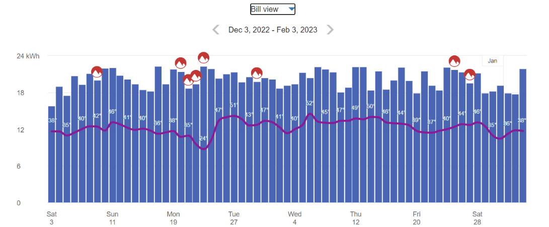
This may be the case, for example, at commercial or industrial locations where a specific set of high-power machinery or equipment needs to be turned on at regular points in time, resulting in a demand spike that consistently reaches the same amount multiple times in the same bill period.
Multiple peak demand icons are displayed in the Energy Use bill or day view under the following conditions:
-
Bill View: Multiple days in a bill period contain an interval with the same demand value, and this value represents the peak demand for the bill period.
-
Day View: Multiple intervals in a day have the same demand value, and this value represents the peak demand for the bill period.
This behavior can also occur in the Power view. See Power View- Multiple Peak Demand Icons for details.
Solar Data and Net Energy Metering
If a customer has solar power and generates more energy than they consume, the Energy Use view will show the customer's energy use as being sent to the grid. Short green bars are shown for negative values, and a tooltip denotes the negative use value. This default experience can be configured to display in different ways. Utilities must coordinate with their Delivery Team to determine which display to use.
Solar Data and Bidirectional Energy
The Energy Use view of solar data can be enhanced for businesses with multi-register meters as opposed to single-register meters. Single-register meters only provide one data stream that provides total net energy use data (kWh). Multi-register meters can provide more details within an interval, such as the amount that goes from the grid to the house or from the house to the grid due to solar power.
When this view is configured, the Energy Use view can display both energy consumption and production data in the same time interval on the horizontal axis of the graph. Usage data is shown as a positive value and solar data is shown as a negative value, indicating a bidirectional flow of energy. The usage and production data is also reflected in the Green Button - Download My Data feature.
Requirements:
- The business must have multi-register meters.
- Account, Billing, and Premise data feeds must be established with the utility.
- Some additional configuration is required to enable the view. Contact your Delivery Team for more information.