How Businesses Use Energy
The How Businesses Use Energy feature allows business customers to see an estimated annual breakdown of energy use categories (such as heating, cooling, lighting, refrigeration, and so on) based on primary business type or activity (such as education, healthcare, retail, or restaurant). With this information business customers can better understand where they use the most energy and how to save energy in those categories.
On this page:
Requirements
Utility Requirements
Same as listed in the product-wide requirements.
Customer Requirements
|
Category |
Description |
|---|---|
|
Billing Frequency |
Monthly, bi-monthly, and quarterly. |
|
Data Delivery Frequency |
Not applicable. |
|
Data Requirements |
Not applicable. Building type data and annual average energy use data based on climate zone are already configured in the cloud service and do not need to be sent by utilities. |
|
Data History |
Not applicable. |
|
Data Coverage |
Not applicable. |
|
Supported Fuels |
Electricity, gas, and dual fuel. |
Limitations
- Authentication: Customers must be logged in to their utility account or standalone web portal account before they can use this feature.
- Supported Business Types: The widget is designed for businesses classified as a small and medium business (SMB). It does not support a breakdown of energy use categories for business types that are commonly associated with large commercial, agricultural, or industrial.
User Experience
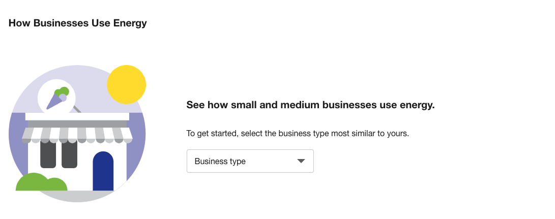
When customers view the widget for the first time, they are prompted to select a business type before they can view a breakdown of usage categories.
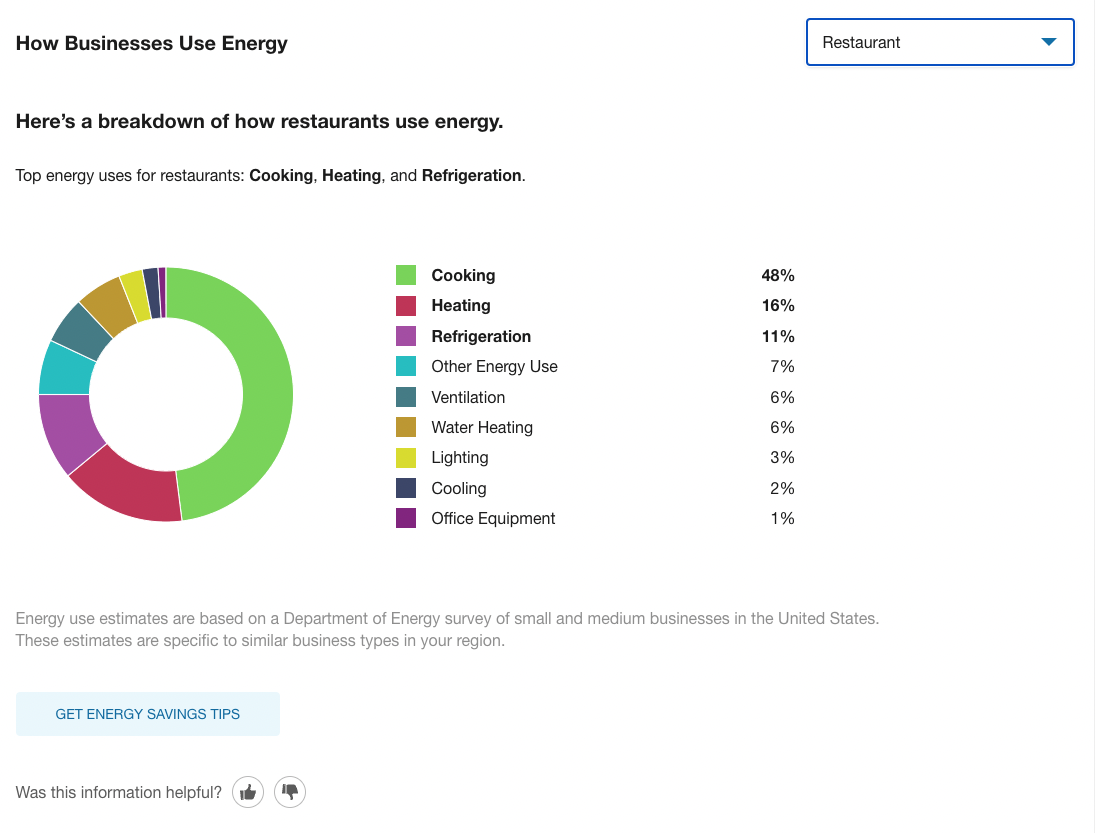
When a selection is made, a color-coded pie chart displays, with an estimated breakdown of how much energy is consumed in different categories every year by similar buildings in the area. "Energy" is defined here as a combination of electricity and gas usage. Customers can click on a usage category and see what percentage of the total annual usage it represents.
Title: The default title of the widget emphasizes how the feature displays energy consumption broken down into specific end-use categories.
Business Type Selector: This menu allows business customers to select a business type that best represents their primary activity.
Note: Business customers currently cannot specify or correct their business type if it does not appear in the menu. In such cases, they must choose another category that most closely matches their primary activity.
Disaggregation: After a customer selects a business type, an insight statement is shown and the pie chart is broken down into color-coded energy usage categories. The categories are expressed in percentages, and are arranged by the most to the least amount of usage. Each percentage value represents the estimated annual consumption of energy in that category by similar buildings in the same climate region. The climate regions used are based on definitions from the U.S. Energy Information Administration.
|
Usage Category |
Description |
|---|---|
|
Cooking |
The energy impact of cooking devices (ovens, stoves, and so on) in a building. |
|
Cooling |
The energy impact of how a building is cooled. |
|
Heating |
The energy impact of how a building is heated. |
|
Lighting |
The energy impact of lighting. This category accounts for devices like energy efficient bulbs as well as indoor and outdoor lights. |
|
Office Equipment |
The energy impact of office equipment, such as computers, printers, and other common office devices. |
|
Other Energy Use |
The energy impact of all other devices in a building that do not fall into a clear category. |
|
Refrigeration |
The energy impact of refrigeration. |
|
Ventilation |
The energy impact of ventilation systems. |
|
Water Heating |
The energy impact of hot water heating. |
Disclaimer: A disclaimer appears below the graphic saying that the percentages shown are annual averages.
Call-to-Action: A button appears below the disclaimer inviting customers to learn about more ways to save energy.
Feedback Prompt: Beneath the explanation is a set of buttons allowing customers to provide feedback about the usefulness of the feature. See Customer Feedback for details.