Comparing Data in the Hierarchy
You can use the account hierarchy to compare billing, service, and sales information across the accounts in the hierarchy. Compare tabs are available on each card that has child accounts or multiple billing accounts associated with it.
When you click on a Compare tab, the system displays charts that provide a visual comparison of either billing, service, or sales data for the associated accounts. When you hover over a bar in the charts, the system displays additional information about the bar, and provides links you can click to view additional details.
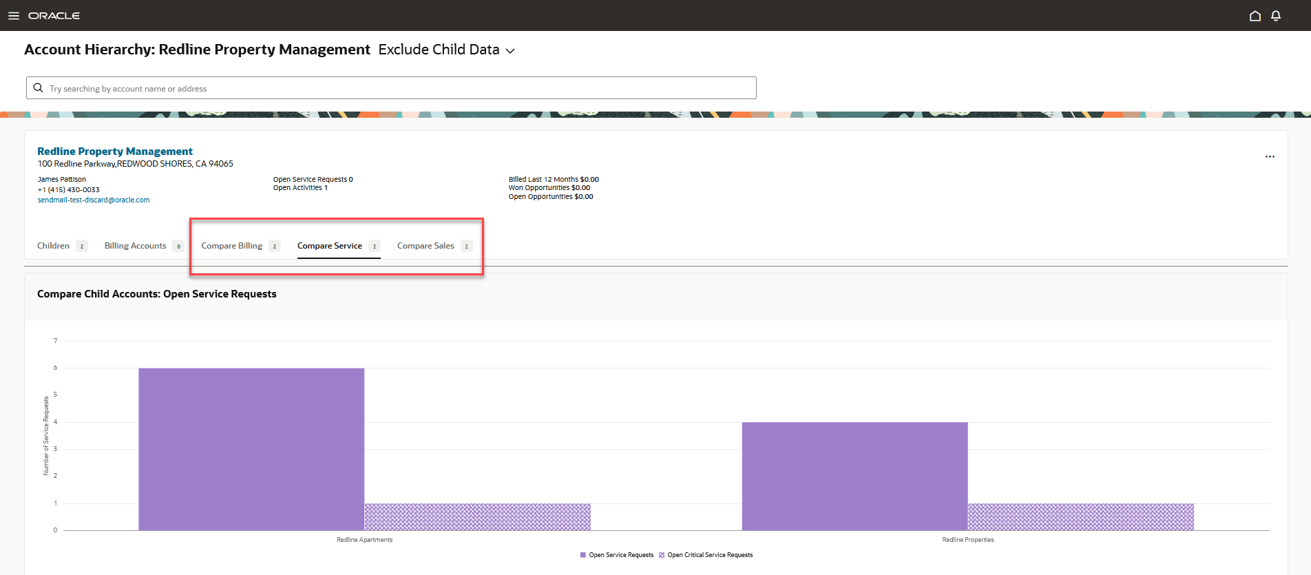
This image shows an example of the Compare Service chart, and identifies where the comparison tabs are on the focus card:
Figure 5-5 Account Hierarchy - Compare Service

The Compare Billing chart displays bars that represent the amount billed during the last 12 months. The bars are split into different sections, based on the service type that was billed. When you click on a bar, the system brings you to the account associated with the bar, and when you hover over a section of the bar, the tool tip displays:
- The date range associated with the billed amount
- The service type and amount billed
- The name of the account associated with that bar
- The number of billing accounts included in the amount
The Compare Service chart displays bars that represent the number of service requests and the number of critical service requests that are associated with each account. When you click on a bar, the system brings you to the account associated with the bar, and when you hover over a bar, the tool tip displays:
- The number of open service requests
- The name of the account associated with that bar
- The number of billing accounts
The Compare Sales chart displays data that represent the number of sales leads and opportunities, as well as the amounts associated with them. When you click on a bar or data point, the system brings you to the account associated with the bar, and when you hover over a bar, the tool tip displays:
- The open revenue associated with that bar, which is measured on the left side of the chart
- The name of the account associated with that bar
- The number of billing accounts
The chart also includes data points that display the number of open leads and opportunities, which are measured along the right side of the chart. When you hover over a data point, the system displays:
- The number of open leads or opportunities
- The name of the account associated with that bar
- The number of billing accounts
Compare Data in the Hierarchy
To compare data in the hierarchy:
- Access Account 360 for your account.
- In the Smart Action bar, type and then select Show Account Hierarchy.
- The system opens the Account Hierarchy page and displays the account structure in cards, using the selected account as the focus card.
- Select the appropriate option at the top of the screen to include or exclude child data from your cards.
- Click on different cards to change the focus card and view additional relationships in the hierarchy.
- Click the one of these tabs to view a comparison for all cards below the focus
card:
- Compare Billing
- Compare Service
- Compare Sales
- Hover over the chart components, such as bars or data points, to view additional information for each component.
- Click on a bar, bar section, or data point to access details at the specific account level.
Parent topic: Using the Account Hierarchy