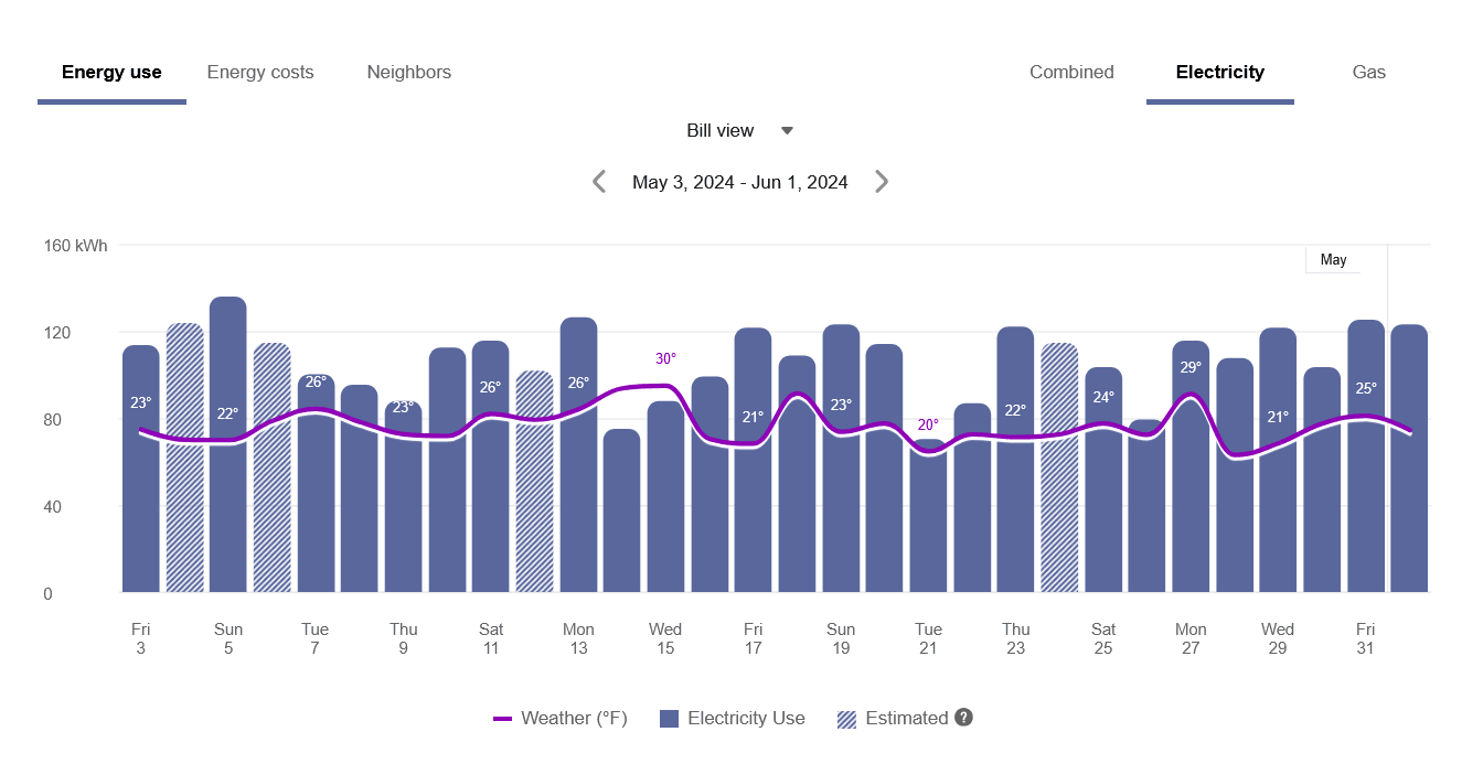
Data Browser
The Data Browser is an interactive tool that allows customers to visualize and explore their energy use trends and costs, and make comparisons to useful benchmarks, such as weather and similar homes. One or more views for different kinds of energy or resource use are available in the feature. If applicable, customers can also use menus to switch between multiple accounts or service points.

Embedding Guidelines
Widget Name: widget-data-browser
- This widget is well-suited for embedding in sections that use the full width of the page. Consider the use of tabs, accordions, or other elements that can show or hide content when embedding this widget on a webpage along with other widgets and content.
- Data Browser is intended for customers interested in further exploring their energy use or billing status. Other products and widgets (such as High Bill Alerts AMI, Weekly Energy Updates, Energy Use Overview, Bill or Usage Forecast, and Neighbor Comparison) can send customers directly to the Data Browser to perform this additional analysis. Since many customers are redirected to this widget, prominent utility site location is not as important a factor to drive user interaction with this widget.
- Green Button is commonly included along with the Data Browser, so consider embedding these two widgets on the same page.
For more information about Data Browser, including details about its data requirements and the overall user experience, see the resources below.
- Data Browser for residential customers
- Data Browser for business customers