Time of Use Daily Peak
For customers with electric time of us rate plans, load-shaping insights can be included in the Home Energy Report using the Time of Use Daily Peak module. This module is designed to educate utility customers about their time of use rate plan and to encourage them to shift energy use to off-peak hours.
This module displays a customer's peak and off-peak usage during weekdays and weekends. Typically, a utility's peak time rates are different on weekdays and weekends.
This module should replace the Daily Peak module in the Home Energy Report v2 for customers who are on a time of use rate plan.
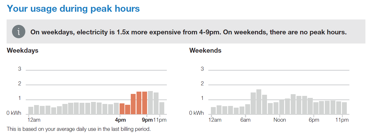
Header: The header statement calls the reader's attention to the fact that this module will show them how they used energy during peak hours. The default header reads "Your usage during peak hours".
Information Icon: A small graphic appears before the insight statement to identify the statement as important information.
Insight Statement: The insight statement describes the reader's time of use plan, including details about when peak times are and how much more expensive electricity is during those times. For example, the insight statement might read "On weekdays, electricity is 1.5x more expensive from 4-9pm. On weekends, there are no peak hours."
Hourly Usage Bar Chart: The module displays two charts showing the customer's average hourly electricity costs during the previous week. The Weekdays chart is displayed first, followed by the Weekends chart. The charts highlight peak hours to draw attention to how the customer's average electricity costs during peak hours compare to their average electricity costs during off-peak hours.
The chart can also display partial-peak periods and multiple peak periods, as needed.
Footer: A statement below the chart identifies the time period used to determine the hourly average usage. For example, the footer statement might read, "This is based on your average daily use in the last billing period."
Graph and Insight Statement Variations: Different components of the Time of Use Daily Peak module, such as the highlights in the bar chart and the insight statement, can take on different states depending on the utility's rate plan. For example, if the time of use rate plan has partial-peak or multiple peak periods, the chart shows these different periods and adjusts the insight statement accordingly. Similarly, the insight statement can change depending on whether the rates are the same during weekdays and weekends.
Fuel: Electric-only and dual fuel
AMI Data Required: Yes
Data History: Minimum of 200 non-zero hourly data points from the appropriate 30-day period
Billing Frequency: Monthly or bi-monthly
Configuration Options:
- Peak Period Names: Peak period names identify each period during the day that has a specific rate. You can specify the names of the peak, off-peak, and partial-peak periods. By default the names are Peak and Off-peak.
- Peak Time Price Ratio in Insight Statement: The insight statement identifies how much more expensive electricity is during peak hours. For example, electricity might be 1.5x more expensive during peak hours. By default, the value is automatically calculated based on the rate plan details we get from the client. However, this value can be manually entered here.
- Peak Time Colors: The bars in the graph can use the utility's color palette, and should be configured to use the same peak colors as the modules in the Time of Use Coach emails, if both features are implemented. Partial-peak colors can also be configured.