JBot Application Configuration
This section includes the following topics:
JBot Configuration Overview
JBot is a system developed by the Oracle Utilities Network Management System group for representing GUI forms as XML documents. Product versions of files are stored in ${NMS_BASE}/dist/baseconfig. Project versions are stored under ${NMS_CONFIG}/jconfig.
This document contains a description of the configuration needed for all Oracle Utilities Network Management System Java Tools. This includes configuration to:
• Organize all Java Swing Components visually.
• Attach language-independent text and tooltips to the Components.
• Attach specific logic to user actions on the Components.
• Display specific pieces of data held in memory on the Components.
• Set Components' enabled/editable status dependent upon tool-specific States.
Glossary of Terms
Term | Definition |
|---|---|
Command | Specific piece of functionality that is executed when a user acts on the GUI. |
Component | A member of or enhancement to the standard Java Swing package, including TextFields, TextAreas, Buttons, Tables, Trees, Panels, etc. |
Data Store | Collection of data that may be accessed by any Command and displayed by any Component. |
Java | Platform-independent object-oriented computer language. |
Properties | Standard Java configuration text file. *.properties files define all text and tooltips for each Component. |
Swing | Java library of standard visual Components. |
Tag | XML key that describes the Component to be added. Tags look like this: <tag_name>. |
Tool | A grouping of Oracle Utilities Network Management System functionality that may be used as an application or an applet. |
Tool State | Tool-specific milestones, set as internal flags, that may be used to configure Components' enabled and editable statuses. Examples of Tool States: POPULATED, ASSIGNED, and CLEARED. |
JBot Component Gallery
This section contains a sample image of each Component, a description of the Component and the Component's name, which is used in the Component's XML tag.
Component Name/XML Tag | Description |
|---|---|
Button | Single clicking on a button will perform a defined Action. |
CheckBox | Allows an item to be marked as selected. |
CheckBoxMenuItem | A menu item that has a checkbox next to it when it is selected. It is configured just like a MenuItem. |
CollapsiblePanel | Collapsible in the horizontal or vertical direction. The purpose is to save screen real estate. The image and the title are configurable. |
ComboBox | A list of elements that defaults to showing one element. To select from all of the elements, click on the arrow. The purpose of this Component is to save screen real estate and to only allow the user a finite set of options. |
ControlZoneSelector | Popup display of a Control Zone tree, displaying a specified (default 3) # of levels of the control zone hierarchy to allow user selection of a control zone. |
CrewIconsPanel | Specialized panel for Crew Actions window. |
DateTimeSelector | Pop up (actually more of a dropdown) calendar that allows the user to specify the date/time. It will follow the specified date/time format set in nms_datefmt. |
Label | Text description that is associated with another Component, frequently a TextField. |
LabelIndicator | Label whose icon changes with the change in the tool status. |
List | Lists can be single or multi-select. The list box will be scrollable when the number of elements exceed the size of the list. |
MainPanel, SubPanel | Several Components are placed on a panel to control a section of the GUI. If panels are configured to have visible titles, the system automatically adds a border to delineate the area. Configure panel titles in the properties file as the "text" value, or point the "data_source" attribute to a dynamic Data Store value in the xml file. |
Menu | Element of a MenuBar that can have MenuItems, RadioButtonMenuItem, CheckBoxMenuItem, or SubMenu, and Separators (horizontal delimiters). |
MenuBar | Bar at the top of a panel that contains one or more Menu elements. |
MenuItem | Standard text or icon option in a Menu. |
PasswordField | A field that works just as a TextField except that it displays asterisks instead of the characters typed. |
PopupMenu | Right-click menu with a number of menu items which when selected performs a defined action. |
RadioButtonMenuItem | A choice on a menu that is part of a group where only one can be selected at a time. It is configured just like a MenuItem. |
RadioGroup | Similar to a CheckBox, but only one item can be selected at a time. |
ScrollPane | It provides a scrollable view of a set of SubPanel Components (which in turn can contain other components). When screen real estate is limited, it is used to display a set of Components that is large or whose size can change dynamically. |
Slider | A Component that lets the user enter a numeric value bounded by a minimum and maximum value. |
StatusBar | Displays messages to the user. It contains a Oracle Utilities Network Management System icon, and can also have a progress bar and text and label indicators. |
SplitPane | Split the two panels by a divider that can be dragged in either direction to increase or decrease the size of each panel. |
Table | Data is displayed in a tabular format. They can support single or multi-row selection, and cells can display icons and DateTimeSelectors in addition to dates and strings. |
TabbedPane | A component that lets the user switch between a group of components by clicking on a tab with a given title and/or icon. Contains one or more Tabs. |
TextArea | Allows the user to enter text on multiple lines. When the number of lines exceeds the viewing area, then the Component is scrollable. |
TextField | Allows the user to enter text. |
TextIndicator | Changes the displayed text when the tool status changes. |
ToggleButton | A two-state button that stays in the pressed position the first time it is clicked. The button returns to the unpressed position the second time it is clicked. |
ToolBar | Component below a MenuBar on a panel. It can be automatically generated from the MenuBar by setting <ToolBar use_menu="true"/> . Also contains ToolBarItems and Separators. Use <hide_icon="true"> when you wish the icon to be hidden when the menu item is. |
ToolBarItem | Element of a ToolBar, generally with a specified icon. |
ToolContainer | Allows a tool to be contained by another tool. |
Tree | Data can be presented in a hierarchical order. If a parent has children, then the parent can be opened to display the children or closed to hide them. |
TreeTable | A combination of the tree Component and the table Component. This allows a tree to be displayed with multiple columns. Attributes available: name="unique component name" class="fully qualified class name that overrides com.splwg.oms.jbot.component.JBotPaneTreeTable" See Tree Table XML for sample configuration. |
ViewerPanel | Specialized panel used by the Viewer tool. |
Understanding the JBot XML Schema and XML Files
Schemas describes the information required to create a valid XML file, what each element has as its child elements, their attributes, and any restrictions on them. The JBot schema has the following conventions:
• Elements: every word begins with a capital letter (for example, MainPanel, SubPanelType, an so on.).
• Attributes: every word begins with a lowercase letter; attributes with compound names are separated by underscores (for example, name, layout_type, collapse_direction, an so on.).
JBot Schema
JBot Tool XML files are based on the jbot.xsd schema, which has the following structure:
<JbotToolApp>
<GlobalProperties/>
<ToolBehavior/>
<MainPanel>
<MenuBar/>
<ToolBar/>
<PopupMenu/>
<StatusBar/>
</MainPanel>
<BaseProperties>
<Commands/>
<Imports/>
<DataStores/>
<Dialogs/>
<Adapters/>
</BaseProperties>
</JBotToolApp>
JBot Element Definitions
GlobalProperties
The GlobalProperties section defines properties that are used for tool specific configuration values. Global properties are often included by reference to a <toolname>_GLOBAL_PROPERTIES.inc file.
Example: Workspace.xml:
<JBotToolApp ...>
<JBotTool ...>
<Include name="WORKSPACE_GLOBAL_PROPERTIES.inc"/>
.
.
.
</JBotToolApp>
The WORKSPACE_GLOBAL_PROPERTIES.inc then defines global properties for the Workspace:
<!-- ...
Modification of this file also requires change and testing of View Only, Crew Operations and Trouble Maintenance user(s).
File(s) can be found in:
~/src/config/product/jconfig/viewonly/Workspace.xml,
~/src/config/product/jconfig/crew_ops/Workspace.xml and
~/src/config/product/jconfig/trbl_mnt/Workspace.xml
-->
<!-- Used in Workspace.xml -->
<GlobalProperties>
<StringProperty name="product_name" value="CREW"/>
<StringProperty name="startLoginTools" value="WorkAgendaTool, CrewIcons, EventDetails, ControlTool, TroubleInfoTool, CrewInfo, FaultLocationAnalysisTool, FLMTool, ViewerPanelTool, DDSAlarms"/>
<StringProperty name="displayLoginTools" value="WorkAgendaTool, AuthorityTool, CrewIcons"/>
<IntegerProperty name="work_space.max_viewers" value="2"/>
</GlobalProperties>
ToolBehavior
Typically defines what commands to run upon opening or closing the dialog.
MainPanel
Defines the GUI layout of the tool. Includes the following elements:
• MenuBar
• ToolBar
• PopupMenu
• StatusBar
BaseProperties
Contains the configuration that matches JBot names with Java classes.
Commands
This section defines a command. If a command is used either by the tool or by a dialog called from the tool, it must be listed here.
It is preferable to refer to Commands using the (class) name attribute rather than define the name in a child CommandClass element. For example, the following:
<Commands name="CMD_FOO"/>
...
<CommandClass name="CMD_FOO"
class="com.splwg.oms.client.workagenda.FooCommand"/>
is equivalent to:
<Command name="com.splwg.oms.client.workagenda.FooCommand"/>
However, if there is an Import section, the system will attempt to find the command(s) in each package. Thus, the following:
<Command name="com.splwg.oms.client.workagenda.FooCommand"/>
becomes:
<Command name="FooCommand">
...
<Imports>
<Import name="com.splwg.oms.client.workagenda"/>
</Imports>
Imports
This section defines paths for commands so that a command can be used without specifying the full path.
Datastores
All datastores that are used by the tool or any dialogs called by this tool must be listed here. However, a tool is allowed to use a datastore defined by a different tool, as long as the other tool is loaded first. There are also some instances where a datastore can be defined in the code. This is mainly the case in the crew tools.
Dialogs
Dialogs in the list will be loaded on tool startup; dialogs that are not in the list will be loaded the first time they are called.
Adapters
This section is no longer necessary. If an existing JBot configuration file has this section, it can be removed without a problem. If such a tag does exist, it is ignored.
Include Elements
Runtime Include Elements
use standard XML based xi:include tags. The included files are delivered to the client and they are combined by the application at runtime. This allows for specific XML code that is repeated to be defined once, but used in multiple places.
To define an include file, xmlns, xmlns:xsi, and xsi:schemaLocation must be defined.
For example given this XML fragment:
<Perform name="HLM" category="onMessage" type="APPLY_SAFETY_FILTERS">
should be changed to:
<Perform name="HLM" category="onMessage" type="APPLY_SAFETY_FILTERS"
xmlns="http://www.ces.com"
xmlns:xsi="http://www.w3.org/2001/XMLSchema-instance"
xsi:schemaLocation="http://www.ces.com http://localhost/xml/jbot.xsd">
XML code that will be used by multiple tools
...
</Perform>
The include files should be saved with an .xml extension.
To reference this file in another XML file, use the following syntax:
<xi:include xmlns:xi="http://www.w3.org/2001/XInclude"
href="/SafetyStartup.xml" parse="xml"/>
...
This allows the second XML document to use the XML code defined in the include file. The above example defines filters that will be used by multiple tools within Web Switching. Therefore, when filters need to be changed, they can be changed once and it will be applied to all tools that are using the include file.
Build Time Include Elements
the main limitation on xi:include tags is that they can only be used to insert a single element. While that approach works fine in the body of a JBot configuration, it doesn't work well for inserting tool properties, actions, or datastores.
In these cases, it is easier to use the build time based <Include> element. In this case the build process that creates the nms_config.jar file will perform the inclusions.
These include files should be saved without any extra attributes, and saved with an .inc extension.
<Perform name="HLM" category="onMessage" type="APPLY_SAFETY_FILTERS">
...
To reference the file, use the following syntax:
<Include name="SafetyStartup.inc"/> s
JBot Commands
JBot commands are operations performed as a result of an event. Some examples of events are button presses, table editing and row selecting. Commands are defined in a "Perform" tag. The actual options for the Perform tags vary with the component type.
Here is an example of configuring a command to be run when a menu is selected:
<MenuItem name="MNU_EMERGENCY_CONTENT_SELECTION"
icon="Preferences16.gif">
icon="Preferences16.gif">
<PressPerform>
<Command value="DisplayDialogCommand">
<Config name="dialog" value="DLG_EMERGENCY_CONTENT_SELECTION"/>
</Command>
</PressPerform>
</MenuItem>
This will display the dialog DLG_EMERGENCY_CONTENT_SELECTION.
JBot Command Reference
There are many JBot commands available. The HTML-based command reference is available at:
$NMS_BASE/documentation/command_doc/index.html
All commands accept the following <Config> parameters:
• runInTool: the JBotTool that this command should run in. This defaults to the current tool.
• abortable: whether this command should be aborted when a previous command aborts. This defaults to true, but can be configured as false in the rare case that there is a Command that should be executed, say, even when a dialog is canceled that sets the abort flag.
JBot Actions
JBot actions allow you to define a list of commands that can be reused multiple times in a configuration. Defining a command directly on a component works well if there is only one place where the command is needed. However, if there are multiple places where the same commands are called, such as a menu item and a button, this provides a way to only define the action once.
Actions should be defined in the ToolBehavior or DialogBehavior tags.
<Action name="ACT_PRINT">
<Command value="DisplayDialogCommand">
<Config name="dialog" value="DLG_PLANNED_REPORT_CONTENT_SELECTION"/>
</Command>
<Command value="GenerateReportCommand" when="GENERATE_REPORT">
<Config name="report_location" value="/Webswitching/PlannedSwitching/PlannedSwitching.xdo"/>
<Config name="parameter_datastore" value="DS_PLANNED_REPORT_CONTENT"/>
<Config name="base_file_name" value="SwitchPlan"/>
<Config name="file_description" value="report"/>
<Config name="show_progress_dialog" value="true"/>
<Config name="dest_file_reference" value="REPORT_FILE_REF"/>
<Config name="dest_datastore" value="DS_PLANNED_REPORT_CONTENT"/>
</Command>
</Action>
Then to use this action, the ExecuteActionCommand command should be called:
<MenuItem name="MNU_PLANNED_PRINT" icon="Print16.gif" accelerator="control P">
<PressPerform>
<Command value="ExecuteActionCommand">
<Config name="action" value="ACT_PRINT"/>
</Command>
</PressPerform>
</MenuItem>
The action is run just like another jbot command. Other commands or actions can also be defined before or after the action command, just like any other jbot command.
Actions can also call other actions, by using the ExecuteActionCommand from within another action.
It is also possible for actions to take parameters. For example:
<Action name="ACT_GGENERATE">
<Command value="GenerateReportCommand" when="GENERATE_REPORT">
<Config name="report_location" value="/Webswitching/PlannedSwitching/$REPORT_NAME$.xdo"/>
<Config name="parameter_datastore" value="DS_PLANNED_REPORT_CONTENT"/>
<Config name="base_file_name" value="SwitchPlan"/>
<Config name="file_description" value="report"/>
<Config name="show_progress_dialog" value="true"/>
<Config name="dest_file_reference" value="REPORT_FILE_REF"/>
<Config name="dest_datastore" value="DS_PLANNED_REPORT_CONTENT"/>
</Command>
</Action>
.
.
.
<MenuItem name="MNU_PLANNED_PRINT" icon="Print16.gif" accelerator="control P">
<PressPerform>
<Command value="ExecuteActionCommand">
<Config name="action" value="ACT_PRINT"/>
<Config name="$REPORT_NAME$" value="PlannedSwitching"/>
</Command>
</PressPerform>
</MenuItem>
This will replace the token $REPORT_NAME$ with the value PlannedSwitching. Any text in the configuration can be replaced this way. You cannot, however, replace the Command names themselves.
If you wish to use an Action defined in a different XML file there are two options. The first option is if you wish to run the action in the other tool. In that case, you can use the "runInTool" option, like other commands. However, if you wish to run the action in the current tool, even though it is defined in another tool, use the tool config option.
When Attributes
Various elements can have a when clause that indicates that the configuration should only be used if the when clause returns true. For example:
<Command value="SetDataStoreValuesCommand"
when="VIEWER_STUDY_MODE and (DS_FLM_GLOBAL.PF_IS_ON=='true')">
<Config name="sources" value="'JAVA_VIEWER', 'PF'"/>
<Config name="targets"
value="DS_FLM_GLOBAL.STARTED_FROM, DS_FLM_GLOBAL.STUDY_FOR"/>
</Command>
This will only be run if the status flag VIEWER_STUDY_MODE is true, and if the datastore value DS_FLM_GLOBAL.PF_IS_ON equals the text literal "true".
The following example will only show the component if the datastore value is not Y.
<Visible initial="true" when="$DS_ABNORMAL_CONDS.PRI_TEXT != 'Y'"/>
Note that the $ in front of the system is used to indicate the value is a string, if it has not been populated yet. Otherwise this would not return a true because a comparison with a null always returns false.
Validation Toolkit
The validation toolkit provides a way of validating user data, as well as another way of coloring tables or other components. While most JBot commands work off of the underlying data, the validation toolkit works off of GUI widgets.
The Validation Testing Tool shows various examples what can be configured using the validation toolkit. The example is in:
jconfig/ops/test/xml/Validation.xml.
To run this tool, add the following code to WorkspaceMenuBarTool.xml to create a menu item that will start the Validation Testing Tool:
<MenuItem name="MNUITM_VALIDATION" hide_icon="true">
<PressPerform>
<Command value="DisplayToolCommand">
<Config name="tool" value="Validation"/>
<Config name="class" value="com.splwg.oms.jbot.JBotTool"/>
</Command>
</PressPerform>
</MenuItem>
In WorkspaceMenuBarTool_en_US.properties add:
MNUITM_VALIDATION.text = Demo Tool...
When you click on the new menu choice, it will display the tool:
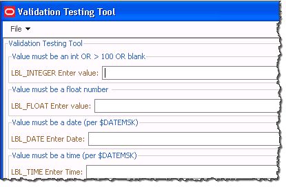
Feel free to try various values in the form to understand how the validation toolkit can be used. The form is defined by Validation.xml. To use this form, find the section on the from that is like the validation you wish to perform, then look at Validation.xml to see the code needed.
Locale-Specific Properties File
Property Naming Convention
The [toolname]_[language]_[locale].properties file contains all language related properties for the components. They are identified with the syntax:
KEY.property = value string
Property | Component Type | Description |
Text | All Actions | String displayed on the Button that invokes the Action. Syntax: ACT_KEY.text = string Example: ACT_SET_START_DATE.text = set starting date |
text Radio | Button group members, table headers, combo box entries | String displayed on the piece of a larger component. Syntax: RBG_KEY.ENTRY_KEY.text = string Example: RBG_OUTAGE_TABLE.H_IDX.text = Device index |
tooltip | All Components and Actions | Tool tip string. Syntax: KEY.tooltip = string Example: ACT_SET_START_DATE.tooltip = Set the starting date to the current date |
When there is no locale, the tool tries these file names.
1. [toolname].properties
2. [toolname]_en_US.properties
If there is a locale defined, the tools will try these file names.
1. [toolname]_[language]_[locale].properties
2. [toolname]_[language].properties
3. [toolname].properties
Reserved Words
Here are some reserved words that you may use in property files. It is recommended that when used, it should be placed at the top of the file.
reserved word | What it does |
include | List of additional property files to read in. This list must be separated by spaces. If you want the current file to override the included property file, use propertyname_SELF. |
includeList | Returns the list of property files that were read in. This value is set by the PropertyReader class and cannot be overridden. |
includeListCount | Number of property files read in. This value is set by the PropertyReaderclass and cannot be overridden. |
Sample use of include is in MessageCode_en_US.properties file.
# List the other files to include as part of reading in
# this property file. Just the base name is needed.
# Must be space delimited only!
include = CoreResources
The include directive should be treated like a "replace or add" operation. Any property found in the current file that is also in the included file will be replaced by what is specified in the included file. In order to override settings in an included file, you need to add an additional property file with those overridden values or you can specify [base property name]_SELF to use the properties in the current property file. Specifying this "_SELF" option as the last included file will ensure that the settings in this file will always take precedence over any included property value.
Example
This example demonstrates usage of include where we override some properties from the included property file.
SwmanTool_en_US.properites has many property settings including the following entry:
TAB_STEPS.text=Steps
SwmanEmergencyTool_en_US.properties may have very few settings and may only have the following:
include = SwmanTool SwmanEmergencyTool_SELF
# Override label for Steps tab
TAB_STEPS.text=Emergency Steps
In this case, all of the properties in SwmanTool_en_US.properties will be included in the SwmanEmergencyTool_en_US.properties property file along with the one overridden property setting for TAB_STEPS.text. Since ordering matters when including properties, the properties in the current file (SwmanEmergencyTool_SELF) will override the properties from the previously included files.
If no properties need to be overridden, then the inclusion of include file [base property file name]_SELF or in the example above "SwmanEmergencyTool_SELF" is not required.
GUI Configuration
Laying Out Components
Layout values are based on Java's GridBagLayout component.
Modify Fill
The fill value is a string. When set to BOTH, the component will fill its entire x,y coordinates. When set to NONE, the component will fit only the area that it needs to. For example, if a button is set to NONE, then the button will only fill around the text. To be even more specific, if two text letters are on a button, then it will be smaller than if there are six text letters on the button.
Fill can also be specified to be HORIZONTAL or VERTICAL for specific fill in one direction. Note that for labels, fill should generally be set to NONE. If it is not NONE, then attempts to right-justify the label by setting the anchor to "EAST" will fail.
Modify Insets
Insets are given as four different values: top, bottom, left, and right. Each of these values will buffer a component from all other components. For example, if all of the values are 2, then the component will be two pixels on all four sides from the closest components.
Modify Weight
The weight is given as x and y values. The x stands for horizontal and y stands for vertical. The weight indicates how much to stretch the component relative to the other components on the frame.
Choosing the Font
Labels can have their font defined by the optional <Font> tag under the <LabelBehavior> tag.
<LabelBehavior>
<Font name="Tahoma-BOLD-24"/>
</LabelBehavior>
Oracle Utilities Network Management System code uses the Java Font.decode() method (see the Java Font class documentation for further information).
To ensure that this method returns the desired Font, format the name parameter in one of these ways:
• fontname-style-pointsize
• fontname-pointsize
• fontname-style
• fontname
• fontname style pointsize
• fontname pointsize
• fontname style
• fontname
in which style is one of the four case-insensitive strings: "PLAIN", "BOLD", "BOLDITALIC", or "ITALIC", and pointsize is a positive decimal integer representation of the point size. For example, if you want a font that is Arial, bold, with a point size of 18, you would call this method with: "Arial-BOLD-18".
If a style name field is not one of the valid style strings, it is interpreted as part of the font name, and the default style is used.
Only one of ' ' or '-' may be used to separate fields in the input. The identified separator is the one closest to the end of the string that separates a valid pointsize or a valid style name from the rest of the string. Null (empty) pointsize and style fields are treated as valid fields with the default value for that field.
Some font names may include the separator characters ' ' or '-'. If str is not formed with three components (e.g., style or pointsize fields are not present in str) and fontname contains the separator character, then these characters may be interpreted as separators. In this case, the font name may not be properly recognised.
The default size is 12 and the default style is PLAIN. If the name does not specify a valid size, the returned Font has a size of 12. If the name does not specify a valid style, the returned Font has a style of PLAIN. If you do not specify a valid font name in the name argument, this method will return a font with the family name "Dialog".
Bold and Italic Labels
Labels can be defined as plain, bold, italic, or bold italic. This is done by the optional <Font> tag under the <LabelBehavior> tag.
This is an example of an italic label:
<Label name="LBL_ITALIC_TEXT">
<LabelPlacement start="0,relative"/>
<LabelBehavior>
<Font style="ITALIC"/>
</LabelBehavior>
</Label>
This is an example of a bold label:
<Label name="LBL_BOLD_TEXT">
<LabelPlacement start="0,relative"/>
<LabelBehavior>
<Font style="BOLD"/>
</LabelBehavior>
</Label>
This is an example of a label that is neither bold or italic:
<Label name="LBL_NORMAL_TEXT">
<LabelPlacement start="0,relative"/>
</Label>
This is an example of a label that is both bold and italic:
<Label name="LBL_BOLD_ITALIC_TEXT">
<LabelPlacement start="0,relative"/>
<LabelBehavior>
<Font style="BOLD ITALIC"/>
</LabelBehavior>
</Label>
Advanced Configuration Options
This section describes components that provide more intricate configuration options.
JTable
1. Column Editor - A column in a table can be specified to have a different component for editing its cells. The valid components that can be specified are a ComboBox, a CheckBox, a TextField, or a TableCellTextArea. When a column has a different editor, such as a ComboBox, then all the rows in the table have a ComboBox for that column. A specific editor, rather than the default one, is generally specified when we want that column to be editable. When an editor is specified for a column, we should make sure that we provide all the necessary configuration options for that editor.
2. Column and Row Popup Menus - This option specifies the name of the right click pop up menus, which would show up when a user right clicks on a column header or one of the rows of the table. The name should be a valid name as per the name of the pop up menus that are already created while parsing the XML file.
3. Status Keys - The background and the foreground color of the rows in the table is configurable as per the contents of that row. The list of all the possible statuses for which we want the background and foreground colors to change are provided by status keys. The status keys are specific to the table and they should be valid values in a column of the data store from which the table obtains its data. This column is configured as the status_column in the <TableBehavior> element. Note that these row colors will be used to color the first visible column of the row if the user enables "Cell Coloring" instead of "Row Coloring" and no Cell Colors are configured for this table. All RGB colors are supported.
4. Column Visibility - the Column element allows a Visible sub-element with attributes for "initial" and "when," which behave like the Visible elements available for other Components.
5. Column Justification - In tables, text is typically left justified and numbers are typically right justified. It is possible to override the justification on a per-column basis by using the justification attribute: <Column key="EVENT_IDX" justification="left"/>
The options are:
• left: the column is left justified.
• right: the column is right justified.
• center: the column is center justified.
• general: numbers are right justified and other data is left justified. (Default)
6. Text Wrapping - To wrap text in a column, set the WrapText element to true:
<Column key="swmanStep.operationOutcome">
<Editable initial="true"/>
<WrapText initial="true"/>
<Editor>
<TableCellTextArea/>
</Editor>
</Column>
To make a wrapped column editable, use the TableCellTextArea editor:
<Column key="swmanStep.operationOutcome">
<Editable initial="true"/>
<WrapText initial="true"/>
<Editor>
<TableCellTextArea/>
</Editor>
</Column>
7. Preferred Column Widths - To set columns within an auto-resized table to use a preferred column width, a minimum and max column width will need to be specified. Thus, the column can be resized within the limits of the minimum and maximum setting. When the table is initially displayed, it uses the preferred size, which is the existing "width" property setting.
Example:
XML - Table Behavior Definition
<TableBehavior auto_resize_columns="true" data_source="DS_EXAMPLE">
<Column key="Idx" />
<Column key="Cls" />
<Column key="Description" />
</TableBehavior>
Property - Table Column Settings
TBL_EXAMPLE.Idx.text=Number
TBL_EXAMPLE.Idx.minimum_width=10
TBL_EXAMPLE.Idx.width=90
TBL_EXAMPLE.Idx.maximum_width=150
TBL_EXAMPLT.Cls.text=Type
TBL_EXAMPLT.Cls.minimum_width=10
TBL_EXAMPLT.Cls.width=90
TBL_EXAMPLT.Cls.maximum_width=150
TBL_EXAMPLT.Description.text=Description
In this case, the table will be initially drawn with the first two columns having a width of "90" and the Description column spanning to utilize the rest of the space given to the JTable component. The first two columns can be resized, but only down to a width of 10 and up to 150. If the entire table is squished, the Description column will be cut down until all the columns have reached their preferred width. At which point all the columns will be squished at the same rate. Since the Description column does not have a preferred width, the width of the label ("Description") is used.
8. Defining Column Headers - A column header can be defined as either text or an icon. See the following example:
TBL_WA_ALARMS.STATUS.text = Status
TBL_WA_ALARMS.STATUS.icon = status.png
TBL_WA_ALARMS.STATUS.tooltip = Event Status
The image file specified for an icon should exist in the tool’s images configuration directory, along with all other image files.
Define a text value for all column headers, including those defined as icons. The text value will be used in various dialogs where the column name is displayed.
The tooltip is used to define a message that will pop up when the mouse is hovered over a column header. If an icon is defined, and a tooltip is not, the system will automatically use the text value as the tooltip.
9. Defining Cell Attributes - If you do not wish to color your entire row, you can color individual cells using the <CellColor> element. The check_column is the column whose value will be compared, and the "key" will be the column whose color is changed. These cell colors are used both when Row Coloring is enabled and when Cell Coloring is enabled. All RGB colors are supported.
<CellColor check_column="FLISR_STATUS" key="EVENT_IDX">
<Status key="-1" bg_color="yellow" fg_color="black"/>
<Status key="1" bg_color="green" fg_color="black"/>
<Status key="2" bg_color="pink" fg_color="black"/>
<Status key="REDLINED" fg_color="black" bg_color="red"
font="strikethrough"/>
font="strikethrough"/>
</CellColor>
The font attribute can be a particular font name or an attribute, such as strikethrough, bold, italics, subscript, or superscript.
10. Defining Cell Separators - If you wish to have table cell separators, add the following to the corresponding TableBehavior elements:
show_horizontal_lines="true"
show_vertical_lines="true"
11. Changing Cell Separator Color - The default table cell separator color is a light gray. To change the color, add a line to $NMS_CONFIG/jconfig/global/properties/theme.properties:
table.normal.gridcolor=<rgb hex value>
For example, to change the table cell separator to black (hex #000000):
table.normal.gridcolor=#000000
12. Adding Tiebreaker Sort Field.- If a sort contains duplicate values, then there is no guarantee that the sort will always display in the same order. Setting a tiebreaker column will use the indicated column as the last column of any sort to ensure that the order remains consistent.
13. Defining Lock Columns - Add the last column to be locked as a lock_column attribute to the TableBehavior tag. For example:
lock_column="FEEDER_ALIAS"
Note that locked columns cannot have a Visible "when" attribute configured for them.
14. Changing the Cell Coloring When Selected - Normally, the entire row is shown as the selected color when it is selected on. Adding the TableBehavior attribute show_cell_color_on_select="true" will show the cell color even when the row is selected.
For other properties that can be modified, see the product version of theme.properties.
Drag and Drop Support
Tables, Tree Tables, Crew Icons, and Crews in the Viewer can be configured to respond to drag and drop. Using the same mechanism, copy and paste can also be supported.
To support Dragging from a component, a DragSource should be configured in the behavior tag. See this example from Workagenda.xml:
<DragSource enable_cut="false" enable_copy="true" enable_drag="true" flavor="EVENT"/>
<DragSource enable_cut="false" enable_copy="true" enable_drag="true" flavor="String:"/>
This enables dragging and copying. There are two defined "flavors." The EVENT means that it can be the source of a component has a DropPerform configured to EVENT. The "String:" defines a comma separated format that can be copied to the clipboard and saved to other applications, such as Microsoft Excel.
By default, all columns will be copied to the clipboard. If only a subset is required, they may be defined by listing them in the flavor:
<DragSource enable_cut="false" enable_drag="true" flavor="String:crewInfo.effectiveZoneName,crewInfo.crewId,crewInfo.crewType,crewInfo.contact,crewInfo.crewSize,crewDispatch.feeder_alias,crewDispatch.working_at_alias,estRestoreDateTime,crewInfo.numberOfAssignments,hoursWorked,#MOBILE_TYPE,#SHIFT_STATUS,
#JOB_STATUS"/>
#JOB_STATUS"/>
Drag support can be enabled or disabled by adding a "when" attribute. For example:
<DragSource enable_cut="false" enable_copy="true" when="!VIEW_ONLY" enable_drag="true" flavor="EVENT"/>
DropPerform
DropPerform should be defined as part of the elements behavior element.
<DropPerform enable_drop="true" enable_paste="true" flavor="CREW_KEY">
<Command value="com.splwg.oms.client.crew.AssignCrewCommand"/>
</DropPerform>
This example supports both dropping and pasting to component. It will accept any components with a DragSource flavor of CREW_KEY.
Dialog Configuration Options
JBot dialogs are defined in xml files that start with DLG_. They have a similar configuration to JBot tools. One difference is that the dialogs use the datastores and jbot statuses of the tool they are attached to.
Here is an example of the start of a dialog configuration:
<JBotToolDialog width="280" height="120" modal="false"
always_on_top="true">
always_on_top="true">
• width: The width of the dialog.
• height: The height of the dialog.
Note: If the height and width are not defined, it will use the natural size of the components that are initially visible.
• modal: If the dialog requires the dialog be dismissed before using another part of the system, then this should be set to true. If the dialog only needs to be dismissed before using that particular tool, then this should be set to true; otherwise, it should be set to false.
• always_on_top: If a dialog should remain on top even if another window is selected, set this to true. Note that modal dialogs are implicitly always on top and do not need this attribute specified.
Performing Actions When Tools and Dialogs Open or Close
If a command or a list of commands needs to be run in response to a window action, such as a tool opening or closing, it can be defined using the <ToolBehavior> and <DialogBehavior> tags. These tags use a <Perform> subtag that takes a name and a category. The "name" attribute should be "Window" and the category name will be either windowOpened or windowClosing. windowOpened will allow the users to run code when the window opens for the first time. windowClosing will run when the users has requested that the tool close, but before the system actually closes the window (to allow the system to validate data, etc.). Other window events can also be caught. Please see the Java documentation for the WindowListener Interface for further information; the methods in that class can be used as the "category" attribute in this tag.
Here is an example on running a command when a tool opens:
<ToolBehavior>
<Perform name="Window" category="windowOpened">
<Command value="DoSomethingCommand"/>
</Perform>
</ToolBehavior>
Here is an example of a command running when a tool closes:
<ToolBehavior>
<Perform name="Window" category="windowClosing">
<Command value="QuitCommand"/>
</Perform>
</ToolBehavior>
Setting component height and widths normally, the size of the tool, along with the weight and fill attributes determine the size of the components. However, sometimes it is necessary to have a component be a certain size. To do this, specify a component_width and component_height attributes in the behavior tag. For example:
<Table name="TBL_WA_SUMMARY">
<TablePlacement start="0,0" width="8" height="1" weight="1,0"
fill="HORIZONTAL" insets="2,2,2,2" anchor="NORTHWEST"/>
fill="HORIZONTAL" insets="2,2,2,2" anchor="NORTHWEST"/>
<TableBehavior data_source="DS_WA_SUMMARY" resize_columns="true"
auto_resize_columns="false" component_height="59">
auto_resize_columns="false" component_height="59">
Calculated Fields
JBot has a rather complicated way of defining text substitution and formatting of fields. Normally, a component refers to a column as it exists in a datastore. (For example, DS_TABLE.code refers to the column code in the datastore DS_TABLE.) This section has examples of most of the different combinations that can be done with calculated fields. For each example, the field name and a sample output is given. The output uses the following datastore as its source:
Status | Priority | Code | Date |
A | 1 | N | 1/2/08 12:33 |
B | 4 | O | 1/4/07 3:33 |
C | 10 | 1/4/07 3:33 | |
D | 20 | Q | 1/4/07 3:33 |
Calculated fields are indicated by preceding the field with a #. The format is:
#field1, field2, …%[format definition]
The format definition is based on the java.text.MessageFormat class. (Please refer to the official Java documentation for more information on the MessageFormat class.)
Examples of Calculated Fields
Concatenating two fields together with a comma separating them:
#Status,Code%{0},{1}
A,N
B,O
C,
D,Q
Concatenating two or more fields together with a space separating them:
#Status,Code%{0} {1}
A N
B O
C
D Q
Replacing a field’s value with another value:
#Status%{0}||A|Status 1|B|Status B
Status 1
Status B
C
D
Note: If a value isn't defined, then the original value is used unless the default value is provided. In the example above, if the value of the Status field is 'A' then it is replaced with 'Status 1' and if the value is 'B' then it is replaced with 'Status B'. Otherwise, it is unchanged. The default value is configured by adding a single value to the end of the list ( #Status%{0}||A|Status 1|B|Status B|Default ).
Replacing a field’s value with a value from a property file:
Add the following lines to the JBotFormat_en_US.properties files:
STATUS.A = Status 1
STATUS.B = Status B
Then follow this example:
#Status%{0}|||STATUS
Status 1
Status B
C
D
Note: Default value can be configured by adding entry, which does not have the original value, to the property file. In the example above such an entry would be: STATUS = Default Status.
Replacing an integer code with a string:
#Priority%{0,choice,1#Priority A|5#Priority B|10# Priority C}
1, 4, 10, 20
Priority A, Priority B, Priority C, Priority C
Note that if the value is greater than the last choice, it will use the last choice. Likewise if a value is less than the first value, it will use the first value. Otherwise, it will use the largest lookup value that is not greater than the original value.
Performing a conditional:
#Status,Code,Priority %{0=B?1:2}
1
O
10
20
Performing a conditional if a value is null:
# Code,Status%{0=null?1:0}
N
O
C
Q
Displaying Date and Time Fields
Date, time, and date/time fields use the formatting defined in the Global_en_US.properties file. The following table includes the product configuration as an example.
Format | Value | Keyword | Example Setting |
|---|---|---|---|
Date%{0} | 01/02/08 12:33 | Centricity.DateTimeFormat | MM/dd/yy HH:mm |
Date%{0,date} | 01/02/08 | Centricity.DateFormat | MM/dd/yy |
Date%{0,date,long} | 01/02/08 12:33 | Centricity.LongDateFormat | EEE, MMM dd HH:mm |
Date%{0,time} | 12:33 | Centricity.TimeFormat | HH:mm |
Date%{0,time,long} | 12:33:30 | Centricity.LongTimeFormat | HH:mm:ss |
Date/Time Custom Sub-Formats
In addition, five custom date formats are available to configure in the Global_en_US.properties file.
• Centricity.SubFormat1= MM/dd/yy HH:mm:ss.SSS
• Centricity.SubFormat2=
• Centricity.SubFormat3=
• Centricity.SubFormat4=
• Centricity.SubFormat5=
This allows for the definition of additional date/time formats. For example, displaying time with milliseconds precision:
Format: Date%{0,date,subformat1}
Value: 01/02/08 12:33:44.123
Returning a value if a substring matches
To define coloring rules, it is sometimes helpful to return a value if a value matches anywhere in a column. This can be done with the MatchSubstringFormat. The following example will return "Out" if "Out" appears anywhere in the string, or an empty string if it does not contain it.
<Column name="#TROUBLE_OUT" definition="#demo.MatchSubstringFormat(Out,TROUBLE_CODE)%{0}"/>
Using regular expressions to parse values
It is possible to use regular expressions to parse data. For example, to create a column that displays the area code of a phone number (where the phone # is in the format ###-###-####), the following can be used:
<Column name="#AREA_CODE" definition="# MatcherFormat(...).*,PHONE_NUMBER)%{1}"/>
To remove the dashes from a phone number:
<Column name="#PHONE" definition="# MatcherFormat((.*)-(.*)-(.*),PHONE_NUMBER)%{1}{2}{3}"/>
If you have a task that could be done with either MatchSubstringFormat or MatcherFormat, it is best to use MatcherFormat as it is more efficient.
How many percent characters (%) do I need?
A percent character (%) defines the start of a format.
A single % means that the original value should be used for both equality testing (such as cell filtering) and sorting. In other words if two source values are mapped to the same display value, then the underlying value will be used for things like cell filtering. If there is a unique mapping, however, performance is the best with this option.
A double (%%) means that the formatted value should be used for equality testing, but for sorting purposes the underlying value should be used. This would be appropriate for priority text strings. For example, if you had a priority field that got mapped to "Emergency", "Priority", "Routine", and "Planned," it would allow the sorting based underlying code instead of alphabetically.
A triple (%%%) means that the formatted value should be used both for equality testing and for sorting.
Status Flags
When dealing with tools that have a parent-child relationship, status flag values are checked in the parent tool unless the status flag is preceded with a percent character (%). This format is used when checking the value of a status flag in a Visible-when or Enabled-when clause within an XML configuration file. For example, a parent-child relationship exists between switching sheets and it's associated safety documents. The safety documents are considered to be child tools of the switching sheet. To check a status flag in the child tool that is used in both the child and parent, then use the % in front of the status flag name.
For example:
<Enabled initial="false" when="%TBL_TAG_DEVICES_SELECTED"/>
Filters
You can use the ApplyFilterCommand to predefine filters on any JTable or DataStore.
For example, the following filters the TBL_COMMENTS to only show rows where the "messages" field = "Y":
<Command value="ApplyFilterCommand">
<Config name="table" value="TBL_COMMENTS"/>
<Config name="column" value="messages"/>
<Config name="operator" value="match"/>
<Config name="value" value="Y"/>
</Command>
The following creates a filter named "ANALOG_QUALITY_ALARMS" using the DS_NMS_ALARMS where the ddsEventType=3, isAlarm=true, and source!=4. This filter named "ANALOG_QUALITY_ALARMS" can then be referenced in other commands, such as ConfigureAudiblesCommand:
<Command value="ApplyFilterCommand">
<Config name="filter_name" value="ANALOG_QUALITY_ALARMS"/>
<Config name="datastore" value="DS_NMS_ALARMS"/>
<Config name="filter_01" value="ddsEventType|=|3"/>
<Config name="filter_02" value="isAlarm|=|true"/>
<Config name="filter_03" value="source|not|4"/>
</Command>
You can also use the <Filter> and <FilterItem> elements to define a filter that you use in a Filter menu.
For example, this creates a filter where the row value "eventTypeAndAlarm" is equal to "1:true", "1:false", etc. and the "source" field is not "FLISR", "FLM", or "OPT":
<Filter name="FILTER_DEVICE_OPERATIONS">
<FilterItem column="eventTypeAndAlarm"
operator="multi-match" value="1:true 1:false 101:true
101:false 401:true 401:false"/>
<FilterItem column="source" operator="multi-not"
value="FLISR FLM OPT"/>
</Filter>
See the command documentation for ApplyFilterCommand and ConfigureAudiblesCommand for more details and available options.
Adding Docking Container to Another Tool
To add a docking container to an existing tool, use the following:
<DockingContainer name="TEST_DOCK">
<DockingContainerPlacement start="0,0" weight="1,1" fill="BOTH"/>
<DockingContainerBehavior/>
</DockingContainer>
To specify a docking location of a tool, use the "dock" attribute of the <JBotTool> element:
<JBotTool locale="en_US" width="800" height="400" dock="TEST_DOCK:NORTH">
You can use: NORTH, SOUTH, EAST, WEST, or CENTER
In order to dock a tool in this way, the tool should already be visible.
JBot DataStore Reference
To aid the implementer in determining the available columns for a datastore, it is possible to create a report that contains all the current values of a datastore for a running system. Because each system can have different configured columns, it is necessary to create this documentation from a running system.
Creating the JBot DataStore Report
1. Start the Java application you wish to document. Ensure that the tools you are interested in are populated.
2. Bring up a shell window as the nms user on the nms server.
3. Type:
Action any.publisher* ejb client <client id> jbot_report c:/OracleNMS/datastore_report.txt
This will create the datastore report on the specified client machine. If you wish to change the location that the report will be stored, change the above command.
Reading the Datastore Report
The report contains all the datastores that are currently valid for the application, along with all of the valid columns.
See the following excerpt from the report, which describes the DS_WA_ALARMS datastore from Work Agenda.
Datastore: :DS_WA_ALARMS
CUSTOMER_NAME=
COND_PHASES=B
COND_STATUS_NAME=RDO
EST_REST_TIME=07/27/09 14:02
DEVICE_ALIAS=xfm_oh_JO-9976
CTRL_ZONE_NAME_5=JO CO 9362
CTRL_ZONE_NAME_6=
CRIT_K=1
...
Note that some of the columns listed are objects that would never be printed. For example, see the excerpt below:
crew.zone_hdl=com.ces.corba.CES.Handle@1646de5
crew.zone_hdl.class_number=4802
crew.zone_hdl.app=0
crew.zone_hdl.instance_number=1001094
The crew.zone_hdl is an object that would not be displayed. That object contains the class_number, instance_number, and app, which can be displayed.