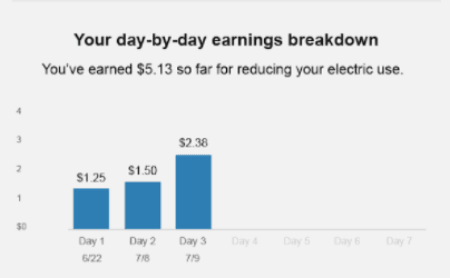
Email History Bar Chart
The History Bar Chart module allows customers to compare their earnings or energy savings for the six most recent peak days. A pair of bars is shown for each peak day. One represents the customer's savings or earnings for a specific peak event, while the other stands for the average earnings or savings for a peak event. Six peak days are always displayed; if fewer than six peak days have occurred, future events are shown in gray with no dates below the bars. The title of the graph, and the y-axis units and scale vary based on the amount that they earn in USD.

If the customer is missing data for an event, the event is not shown in this module.
This module may appear in post-event emails for customers on all tracks. See Peak Time Rebates Tracks for more information.
For each track, the module can compare you against average-savings homes, or only display the customer's day-by-day savings. If they have earned money during any event, they will see a cumulative total of the amount they have saved. If the customer has not earned any money during the current season, then they are encouraged to visit the utility's website to see tips that will help them save during future events.