Email Two Bar Chart
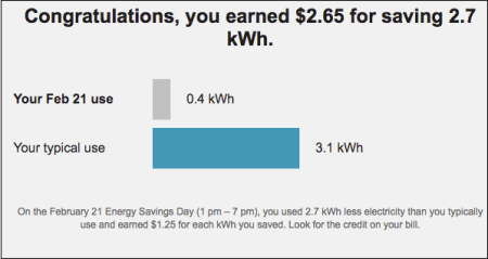
The Two Bar Chart module shows the customer how much they saved during the peak event. The customer's energy savings and the amount they earned are clearly displayed, making this information one of the first things that the customer notices in this module. The graph compares the customer's baseline usage to their usage during the peak event, reinforcing the fact that reducing energy usage below their baseline during a peak event results in earning money towards their bill. Other content provides the customer with information about when the event was, and how their energy usage during this time compared to their baseline usage.
The following is an example of the Personal Comparison module for Peak Time Rebates:

This module is available for customers on the Peak Rewards and Simple Money tracks. See Peak Time Rebates Tracks for more information.