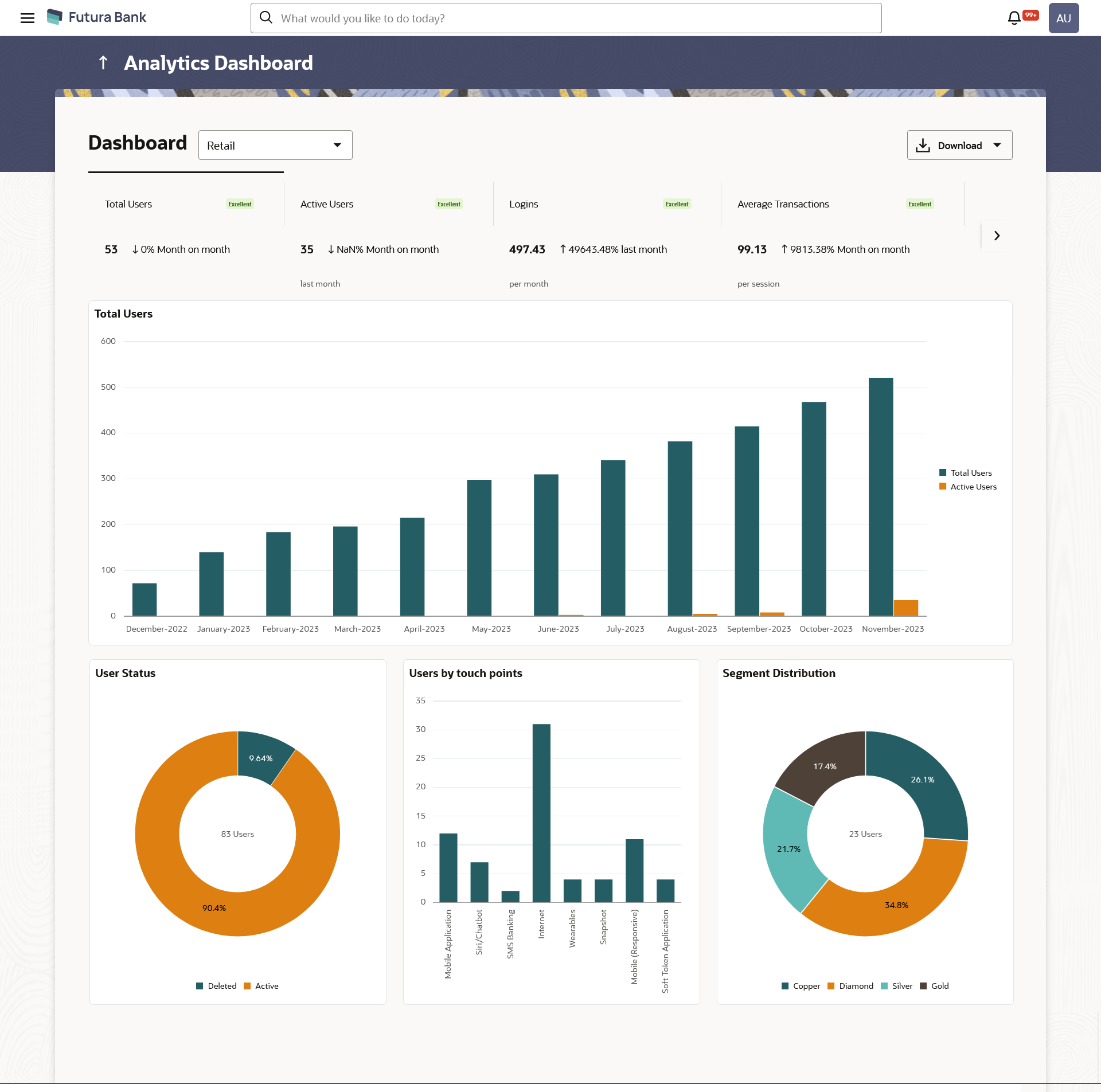
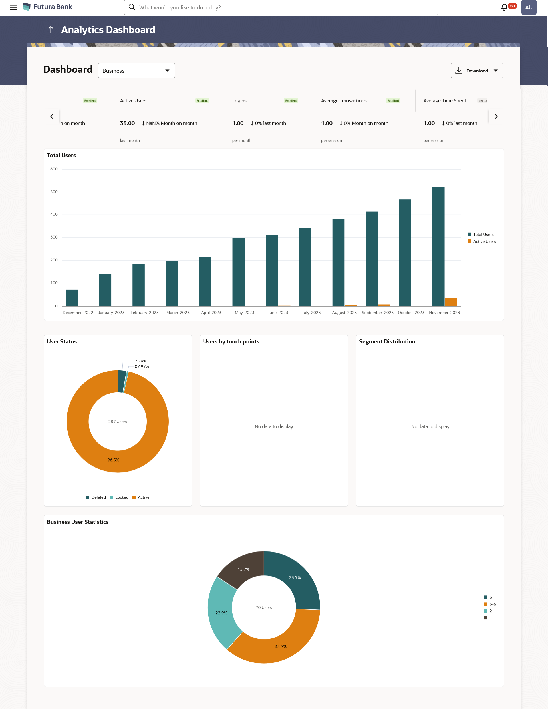
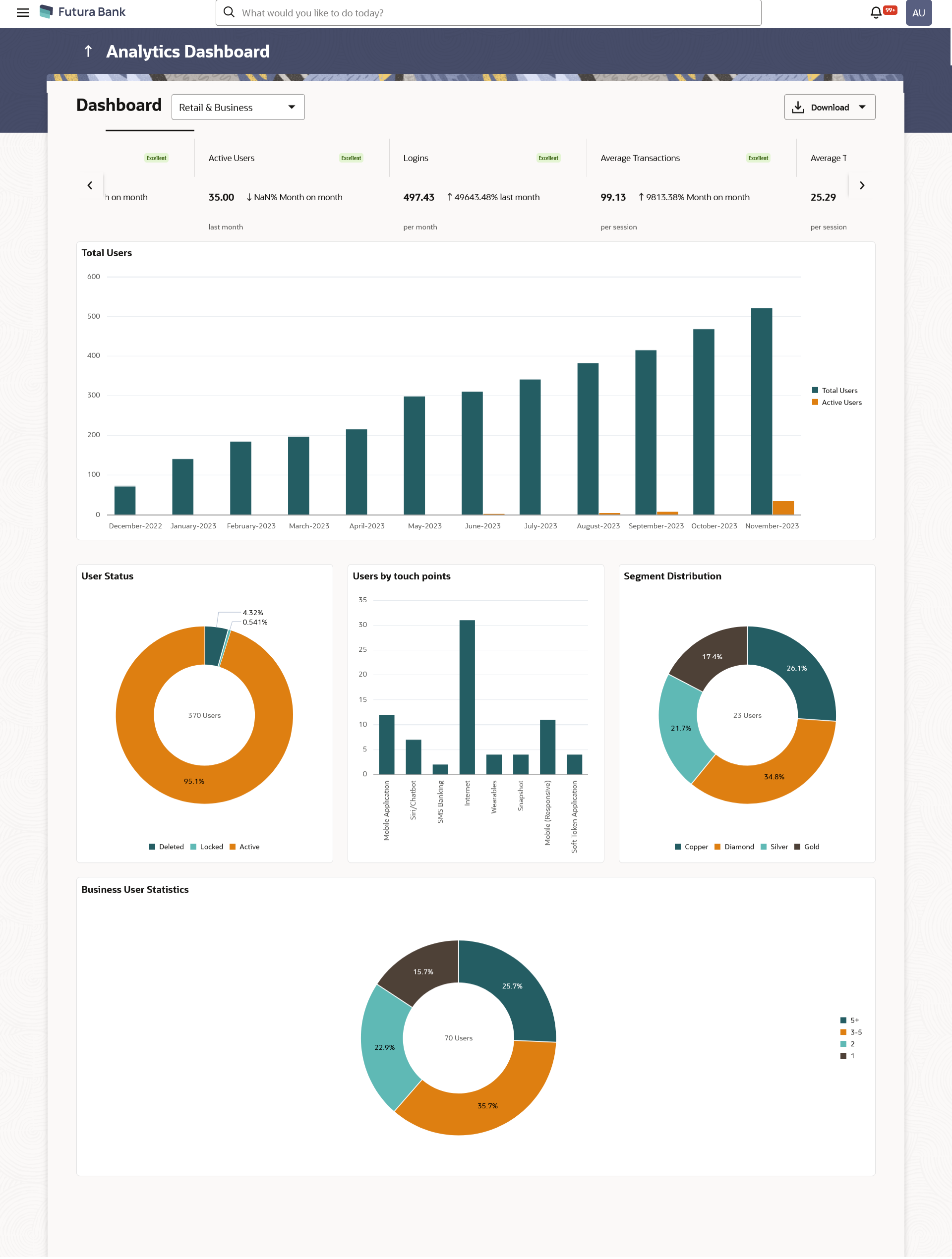
| User Type |
Type of user.
The user can be:
- Retail
- Business
- Retail & Business
|
| Following are the widgets
gets displayed on dashboard |
|
KPIs
Following are the different performance indicators
shown
|
| Total Users |
This card displays change in total users on
month-by-month basis ( in %), and the status based on that.
|
| Active Users |
This card displays the change in active users in the last
month on a month-by-month basis (in%) and the status based
on that. |
| Logins |
This card displays the change in total number of logins (
in %) per month in comparison to the last month, and the
status based on that. |
| Average Transactions |
This card displays the average transactions performed per
session on month-by-month basis ( in %), and the status
based on that. |
| Average Time Spent |
This card displays the average time spent to complete a
task for transactions by user in comparison to the last
month ( in %), and the status based on that. |
| Status |
The status displayed on performance indicators.
The
options are:
- Excellent - > +10%
- Good – between +5% and +10%
- Neutral – between -5% and +5%
- Warning - between -10% and -5%
- Critical - >-10%
|
| Widgets |
| Total Users |
This graph provides a quick snapshot of the total users
and active users in the last 12 months.
The user can view the more information in each month by
hovering over each slice of the graph.
|
| User Status |
This widget displays the allocation of different users (
in %) in donut graph form.
It provides view of the deleted
users and active users with respect to total number of
users. The user can view detailed information by
hovering over a donut graph in each slice.
|
| Users by touch points |
This graph provides a quick snapshot of the total users
with respect to some selected touch point.
The user can
view the more information in each touch point by
hovering over each slice of the graph.
|
| Segment Distribution |
This widget displays the allocation of different users as
per the segment ( in %) in donut graph form.
The user can
view detailed information by hovering over a donut graph
in each slice.
|
| Business User Statistics |
This widget displays the number of users per business (
in %) in donut graph form. |
| User Logins by Devices |
This chart enables the users to track the distribution of
user logins across different devices and mostly used touch
points for selected quarter.
The user can view the more
information in each device by hovering over each slice
of the graph.
|
| User Activity |
This widget helps identify the users logins frequency for
the selected quarter.
The user can view detailed
information by hovering over a donut graph in each
slice.
|
| Device Preferences |
The bank can identify the users who are using the
multiple devices for accessing the platform their banking
needs.
The user can view detailed information by
hovering over a donut graph in each slice.
|
| Age wise Primary Touch Points Usage |
The users can explore the age-wise device usage trends
using this widget.
The user can view detailed information
by hovering over a donut graph in each
slice.
|
| Top 20 Transactions |
This widget enables the user to gain insights into the
most widely used transactions, providing a snapshot of user
behaviour while accessing the banking services through
channel banking platform.
The user can view the more
information in transaction listed by hovering over each
slice of the graph.
|


