4.3 Data Quality Summary
The Data Quality Summary tab provides a concise and comprehensive snapshot of the overall data quality status within the system. It is designed to present key metrics and insights, enabling users to monitor and assess the effectiveness of data quality processes. Key features of this tab include:
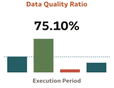
- Data Quality Ratio (Bar Chart): The Data Quality Ratio measures the proportion of unique failed records to the total unique scanned records within a specific entity. This metric is visualized as a bar chart, categorized by execution periods, with the most recent value prominently displayed. It provides stakeholders with insights into the effectiveness of data quality checks over time.
- Activity - Results Data Browsing:
- Objective: to provide a clear and measurable indicator of data quality within a specific entity by highlighting the proportion of failed records as a percentage of the total scanned records.
- Persona: Business Analyst
Table 4-8 Activity - Results Data Browsing
Step Description Observations Follow the navigation path: Home → Catalog → Shared Folders → Data Quality Visualization à Data Quality à Data Quality Summary The Quality Ratio is displayed like below based on the default filter set. Figure 4-1 Activity - Results Data Browsing
- Scanned records (Line Chart): This metric represents the count of unique records scanned within a specific entity. A line chart is utilized to visualize this data, categorized by the execution period, with the most recent value prominently displayed for quick reference.
- Activity - Results Data Browsing
- Objective: to track and visualize the volume of records scanned within a specific entity over time
- Persona: Business Analyst
| Step Description | Observations |
|---|---|
| Follow the navigation path: Home → Catalog → Shared Folders → Data Quality Visualization à Data Quality à Data Quality Summary | Number of processed records are shown like below based on
the default filter criteria.
Figure 4-2 Activity - Results Data Browsing 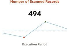 |
- Error records (Line Chart): This metric represents the count of
unique failed records within a specific entity. A line chart is utilized to display
this data, categorized across execution periods
- Activity - Results Data Browsing
- Objective: to track and visualize the volume of error records within a specific entity over time
- Persona: Business Analyst
| Step Description | Observations |
|---|---|
| Follow the navigation path: Home → Catalog → Shared Folders → Data Quality Visualization à Data Quality à Data Quality Summary | Number of Errors identified are shown based on the
default filter criteria.
Figure 4-3 Error records (Line Chart) 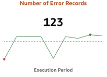 |
- Checks Executed Vs Failed (Bar Chart): This indicates the percentage of Data Quality (DQ) checks that failed relative to the total number of checks executed. The data is visualized using a bar chart, categorized by execution periods, with the most recent value prominently displayed.
- Activity - Results Data Browsing
- Objective: to provide a clear and actionable view of the effectiveness of executed Data Quality checks over time.
- Persona: Business Analyst
| Step Description | Observations |
|---|---|
| Follow the navigation path: Home → Catalog → Shared Folders → Data Quality Visualization à Data Quality à Data Quality Summary | Based on the filter criteria set, the chart is shown as
below
Figure 4-4 Checks Executed Vs Failed (Bar Chart) 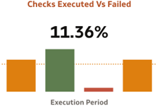 |
- Attributes Executed Vs Failed (Bar Chart): represents the proportion of number of unique attributes that have failed during data quality (DQ) checks, compared to the total number of attributes that underwent DQ checks. Bar chart enabled for this Tile categorized across execution period with last Value on display.
- Activity - Results Data Browsing
- Objective: To track and analyze the proportion of attributes failing Data Quality checks relative to the total attributes tested, enabling stakeholders to identify and address data quality issues effectively.
- Persona: Business Analyst
| Step Description | Observations |
|---|---|
| Follow the navigation path: Home → Catalog → Shared Folders → Data Quality Visualization à Data Quality à Data Quality Summary | Based on the filter criteria set, the chart is shown as
below:
Figure 4-5 Attributes Executed Vs Failed (Bar Chart) 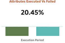 |
- Failed Records Analysis: Offers a detailed view of the failed records, categorized by various dimensions such as check type, check class, and other groupings, helping users identify recurring issues and problem areas.
- Number of Failed Records by Group: This view gives the number of
failed records grouped by DQ Group for Date, run description and Run Execution
Identifier as Trellis Columns
- Objective: To provide a comprehensive analysis of failed records across dimensions like check type, check class, and groupings, enabling users to pinpoint recurring issues and address root causes effectively.
- Persona: Business Analyst
| Step Description | Observations |
|---|---|
| Follow the navigation path: Home → Catalog → Shared Folders → Data Quality Visualization à Data Quality à Data Quality Summary | Different charts for each dimension are shown as
below:
Figure 4-6 Failed Records Analysis  |