8.3 Top 10 Allocation Run Times – Current period Analysis
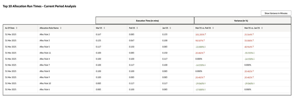
This widget is a table type widget derived from the earlier widget. The widget looks like the following:
Figure 8-4 Top 10 Allocation Run Times – Current period Analysis

This table is similar to the table in the Top 10 Allocation Run Times widget but now listed with only the top ten most time consuming rules from the latest As-of-date run. We exhibit a periodic analysis for these rules based on how they performed in the current period versus how they performed in the last two execution runs.
The execution timings of the current As-of-date run (in our example, March 2025) of these allocation rules are compared with the execution timings of these same rules in the earlier two As-of-date run periods (in our example, February 2025 and January 2025). We display these comparison figures under the column Variance and the actual execution timings under the column Execution Time (in mins).
The variance is expressed either in minutes or in percentages. The default is expressing Variance in percentages. The formula for Variance (in %) is illustrated through the following example:
- Variance (in %) for Mar’25 vs. Feb’25 =
[[Execution Time (Mar’25) - Execution Time (Feb’25)]/ Execution Time (Feb’25)] x 100%
- Variance (in %) for Mar’25 vs. Jan’25 =
[[Execution Time (Mar’25) - Execution Time (Jan’25)]/ Execution Time (Jan’25)] x 100%
The formula for Variance (in mins) is illustrated through the following example:
- Variance (in mins) for Mar’25 vs. Feb’25 =
[Execution Time (Mar’25) - Execution Time (Feb’25)]
- Variance (in mins) for Mar’25 vs. Jan’25 =
[Execution Time (Mar’25) - Execution Time (Jan’25)]
The Variance expression can be toggled between expressing in minutes or in percentages through the Show Variance button at the top right corner of the widget.
The Up arrow and the Down arrow adjacent to the Variance values denotes whether the variance is on the Upside (positive value) or on the Downside (negative value) respectively.
The Upside (positive) values are colored as Red and the Downside (negative) values are colored as Green. Let us understand the reason for this coloring through the example of Mar’25 vs. Feb’25 column. This is because a positive value of (Mar’25 vs. Feb’25) denotes that in Mar’25 the rule has taken more execution time than in Feb’25 which is a cause of concern for the current period (Mar’25). Thus this positive value is marked in red. Similarly, a negative value of (Mar’25 vs. Feb’25) denotes that in Mar’25 the rule has taken lesser execution time than in Feb’25 which is a green flag suggesting that the performance of the rule might have improved in the current period (Mar’25). Thus this negative value is marked in green.
It is understood that a lesser rule execution time can be due to several other factors like lesser amount of source data available thereby lesser amount of output data generated, or due to change in rule definition or due to database optimizations or change in database configurations, etc. The widget just gives a symbolic idea with the variance and detailed analysis is not in scope of this widget.
Note:
A more detailed analysis on the longest running allocation rules per As-of-date can be done from the Analytics menu under Processing Analytics.