About detail bar graphs
With a detail bar graph, you determine the row variables and column variables of the report that appear on the y-axis, and the subject counts that appear on the x-axis. There is a subject count for each primary variable that you select as a display option. You can break down the case counts for the primary variable by specifying a secondary variable. If you specify a secondary variable, a graph key indicates the meaning of each bar.
You can also create multiple graphs, one for each value of a row or column variable that you specify as a subset variable.
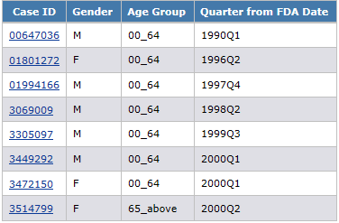
For example, a report shows gender, age group, and quarter from FDA date for each case ID:

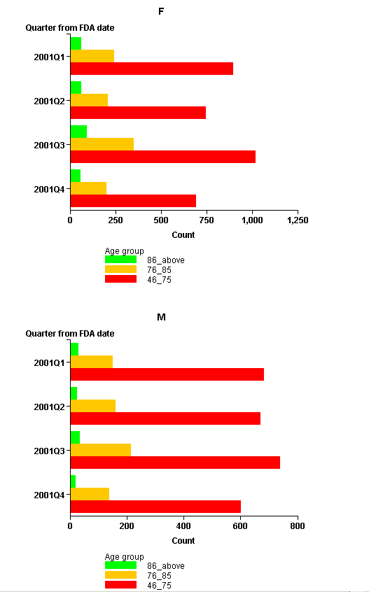
Depending on the display options that you specify, the graph might look like this, where Gender is the subset variable, Quarter from FDA date is the primary variable, and Age Group is the secondary variable:

Parent topic: Detail bar graphs