|
|
|
|


Defining controls
An item must include one control definition. A control definition can consist of:
- A single data entry control such as a text box
- A group consisting of multiple controls of the same type; for example, a set of radio buttons
- A group consisting of multiple controls of different types; for example, a set of radio buttons that includes a pulldown control, a text box control, and a simple radio control
The InForm Architect application supports the following types of data entry controls:
Control |
Example |
Description |
|---|---|---|
Group |
|
A set of controls. Use a group control to combine multiple controls of different types or to create a compound control that consists of more than one text box control. |
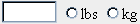
Radio group |
|
A set of controls from which a user must select only one value. |
Checkbox group |
|
A set of controls in which a user can select as many values as are applicable. |
Pulldown control |
|
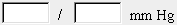
A list of values from which a user can select only one. Pulldown controls can include a control in which the user selects units. |
Text box control |
|
A box in which a user enters a value explicitly. Text box controls can include a control in which the user selects units. This unit control can be presented as a radio control, a pulldown list, or a simple element. |
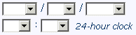
Date/Time control |
|
A set of controls in which a user selects date or time values. A Date/Time control can include pulldown controls for day, month, year, hour, minute, and second. You can also define the time portion of a Date/Time control as a set of text controls. |
Calculated control |
|
A control whose value is determined by a calculation based on the value entered in one or more other controls. An item containing a calculated control is unnumbered and read-only. A calculated control can include a unit component. |
Simple control |
|
A wrapper that contains an element definition and is used to include the element definition in a group, radio group, or check box group control. A simple control can include a unit component. |


