Filter
The filter component allows the user to restrict the set of data returned by a page. This component is most likely used in combination with the simple or advanced search component where it extends the search criteria, however it can also be used without a search component. Filter entries are concatenated to the search query, thereby reducing the number of search results found.
| A filter entry is used to extend the search query, it does not change the criteria or search values used in quick search or advanced search. If the user already provided an entry in the simple or advanced search, that is retained and extended with the filter input. |
Behavior
In the UI click Filter to display the Filter dialog.
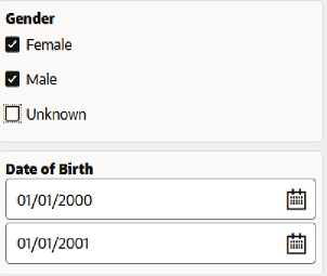
Each criterion shows in a separate section. For each criterion, the display is based on the property type (of the lowest level property), and adheres to the single value or referenced property design.
Any change in a filter criterion value automatically starts a new search.
This component allows one or more filters to be configured. A filter criterion consist of one property.
"filters": {
   "properties": [
       {
          "name": "",
          "sequence": 1,
          "queryOperator": ""
       },
       ...
   ]
},
For any field which does not have any input no filter is applied. For enum’s displayed with checkboxes this means that if there are no entries for any of the optional values, it considers 'all values'.
queryOperator
A Non-mandatory attribute to support query api operations. For details refer to the section "Query DSL Grammar" in the Query API chapter of the Developer Guide.
For some queryOperator it is possible to add multiple values:
| Operator | UI Specification |
|---|---|
bet |
Two fields are shown to capture the range |
in |
Possible to add multiple values, follows the multi-value property specification. Each value is shown in a new row. An empty row is shown by default. Subsequently, if a value is populated on the last row, an empty row is automatically added to the list and a delete button is placed next to the row that has just been populated. The delete button is never placed on the last (empty) list entry. |
nin |
Possible to add multiple values, follows the multi-value property specification. Each value is shown in a new row. An empty row is shown by default. Subsequently, if a value is populated on the last row, an empty row is automatically added to the list and a delete button is placed next to the row that has just been populated. The delete button is never placed on the last (empty) list entry. |
When the queryOperator are not specified, then the following applies:
-
The search is case-insensitive.
-
If the enum has display type set to checkbox, the search operator used is 'in'
-
The search operator is 'like' for text attributes that allow wildcards like % and _, the search operator is 'equals' for other types of attributes.
Multiple filter criteria are combined using an 'AND' statement. OR-search is implement between the various values of a property when the same search property is added multiple times. For example: A can search for claims with 'code like CL004%' AND '(Status=Enter OR Status=Change)' is possible.
| Property | Operator | Remarks |
|---|---|---|
String |
All |
|
Integer |
All |
|
Date |
All |
Using 'like' operator may not result in correct results. |
Date Time |
All |
Using 'like' operator may not result in correct results. |
Referenced Field |
All |
|
Boolean |
eq, neq |
|
Oracle Health Insurance Money |
neq, eq, gte, lt, bet |
|
Enums as checkbox |
in, nin |
|
Enum as radio button |
eq, neq |
|
Enums as drop down |
eq, neq |