5 Compliance Dashboard
Workbook synopsis
The Compliance Dashboard report allows Oracle Site Activate administrators and stakeholders to understand if users are taking full advantage of the system by monitoring whether users are actively entering in completion dates and accurately entering in planning dates.
Dashboards and sheets
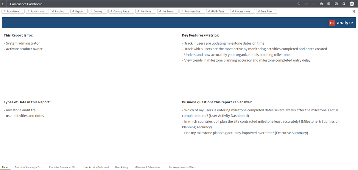
About
- Study startup roles that would use the report
- Key report features and metrics
- Types of data the report contains
- Examples of how to use the report to answer a business question
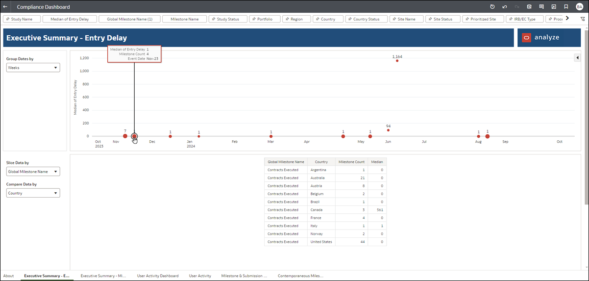
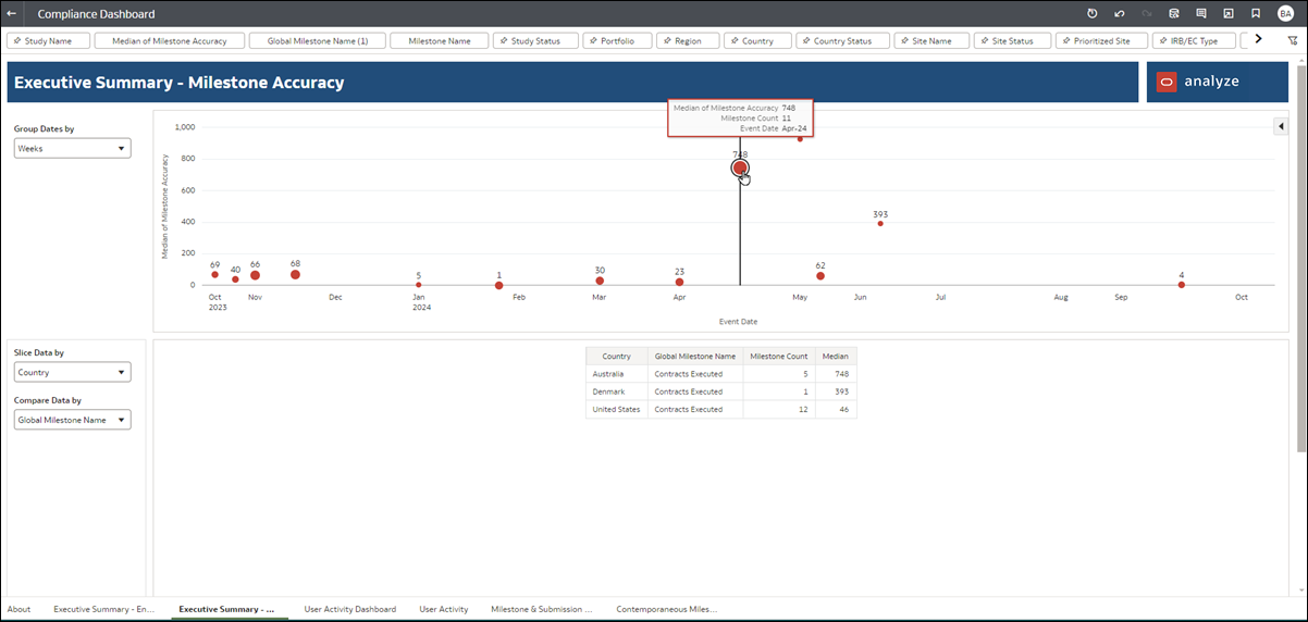
Executive Summary - Entry Delay dashboard and Executive Summary - Milestone Accuracy dashboard
These dashboard worksheets show a high-level summary of milestone date entry and milestone planning accuracy compliance. The top of the dashboards shows total median milestone entry delay or total the total median milestone planning accuracy in an easily understood dot chart visualization. The size of the dots reflect the milestone count. Hover over any dot to view additional delay or accuracy details. Use the Group Dates by filter to adjust data grouping by Years, Quarters, Months, or Weeks.
In the lower section of the worksheets, to the left side, use the Slice Data By and Compare Data by filters to adjust data included in the tabular view.
- "slice data by" all Oracle Site Activate, portfolio, region, country, study, global milestone, user
- "compare data by" all Oracle Site Activate, portfolio, region, country, study, global milestone, user
User Activity Dashboard
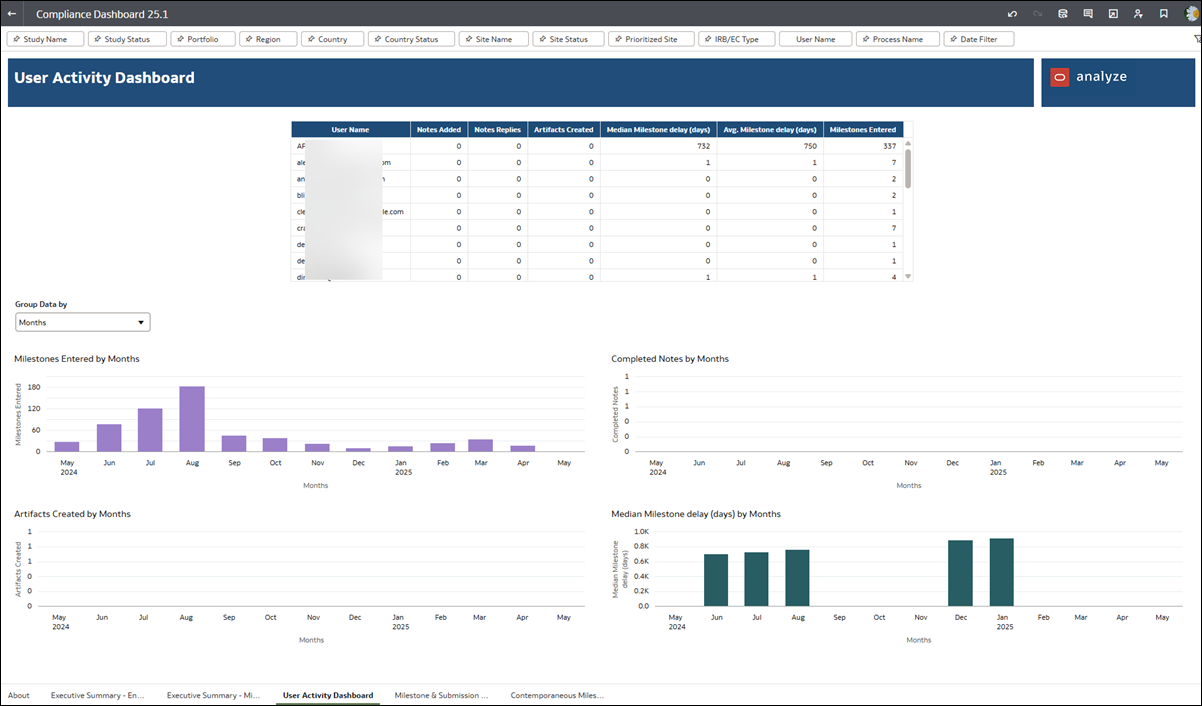
This dashboard allows for tracking actions of Oracle Site Activate users over time. The upper section of the worksheet displays a sortable table with a single row per user. Each user has the following metrics per row:
- total notes created in Oracle Site Activate
- total artifacts created in Oracle Site Activate
- median delay in days from milestone completed date to milestone entered date
- average delay in days from milestone completed date to milestone entered date
- total milestones entered in Oracle Site Activate
The lower section of the User Activity Dashboard includes five separate graphs, which you can group by Weeks, Months, Quarters, or Years using the "Group data by" control just above the graphs. The graphs show:
- Milestones Entered
- Completed Notes
- Artifacts Created
- Median Milestone Delay (days)
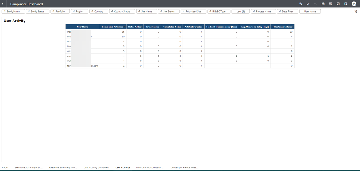
User Activity Detail
Milestone & Submission Planning Accuracy
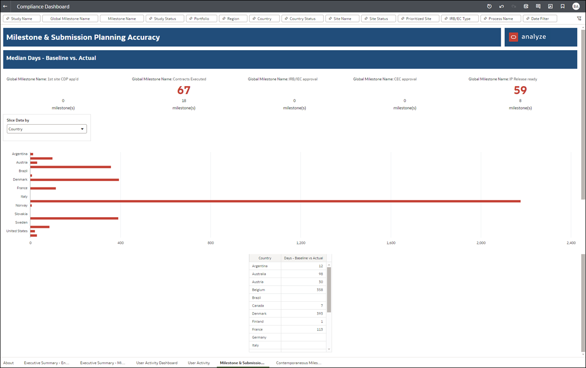
This worksheet allows you to compare the baseline milestone date to the actual milestone date to understand how accurate your organization is in planning global milestones and identify areas for improvement. The upper portion of the worksheet includes five top-level KPIs that show median of baseline to actual.
The lower section of the worksheet includes bar graph and tabular data visualizations. You can control the dimension that drives the graph and the table using the "Slice Data by" filter in the worksheet. The graph and table metrics are the median of baseline to actual for the selected dimension (e.g., Region, Country, Study Name, etc.).
Contemporaneous Milestone & Submission Entry dashboard
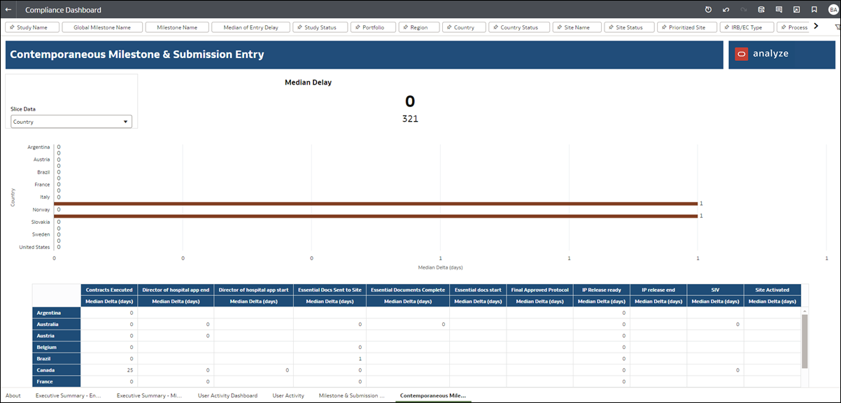
This worksheet focuses on comparison of the actual milestone date to the date the milestone was entered. The comparisons show contemporaneous (within the same time period) data entry. This worksheet is intended to help you understand if Oracle Site Activate users are entering data into the system in a timely manner.
At the top of the worksheet, you'll see the Key Performance Indicator for Median Delay, which is controlled by the report level filter. Below, the worksheet includes a bar graph and table that are controlled by the "Slice Data" selector (Region, Country, and Study Name). Graph and table metrics are the median of actual to date entered for the selected dimension.
Use any of the filters displayed at the top of the worksheet to subset the worksheet data to your preferred view.
