Management reports
We migrated Management reports (e.g., Account Metrics, Adoption Dashboard, etc.) to Oracle Analytics Cloud and made report-level updates.
Account Metrics
The Account Metrics report migration changed the location for the “Show Studies Broken Down By” filter on the Studies Dashboard worksheet. Instead of adding this filter to those that run along the top of the worksheet, we placed the filter right on top of the bar graph it controls.
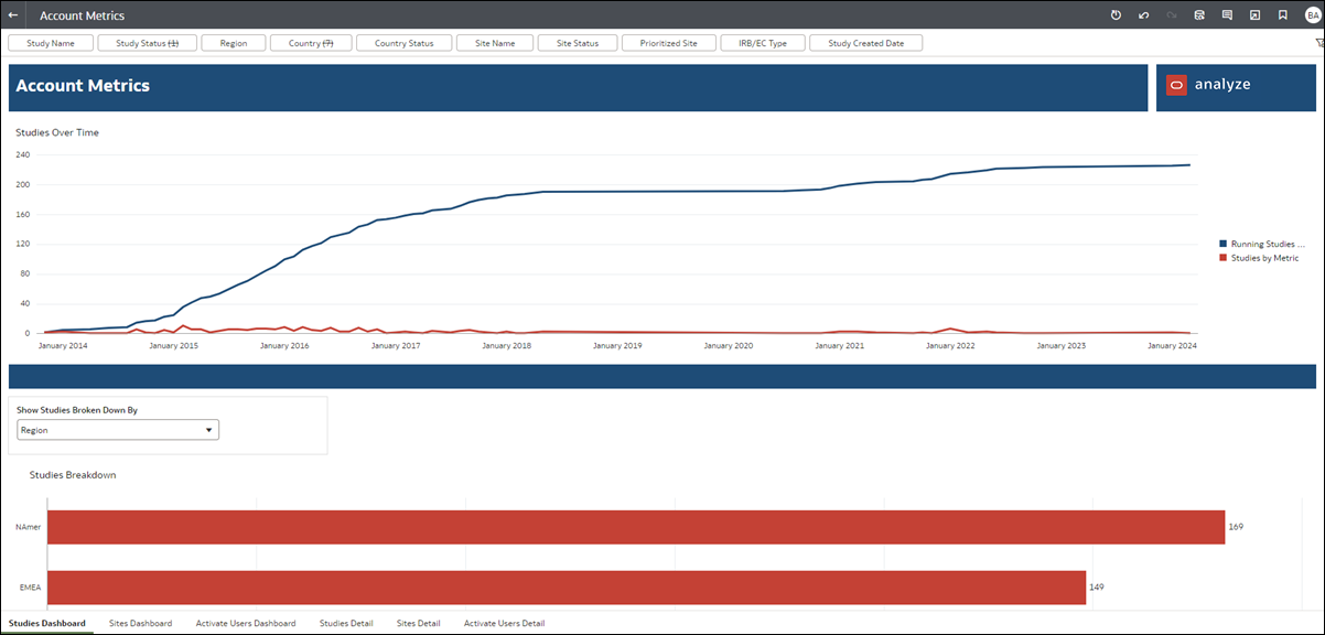
The Account Metrics report also has the following minor functionality updates:
- The hyperlinks between study/site dashboard and study/site details now require you to right-click after clicking on the visuals. The report will not redirect automatically, and you must select which page you want to drill down into.
- When you hover you cursor over a visualization, you'll see the data points you selected, as represented by the line/legend.
- The "Site used at" filter is not available in 24.2.1; however, you can still access the "Site created at" filter.
Adoption Dashboard
After migration to Oracle Analytics Cloud, the Adoption Dashboard report has significant visualization improvements. For instance, where appropriate across the report, we updated the formatting for KPIs to make them easier to see with bold text titles and numbers in red text. We also made the following worksheet-specific updates:
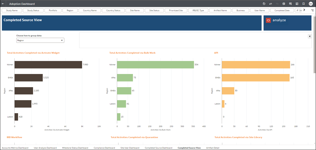
Account Metrics Dashboard: We relocated the "Choose unit of measure" filter and relabeled it to “Choose how to group data.” This filter is now available within the dashboard above the bar graph data. Also, selecting a metric for Total Studies, Total Sites, and Total Users is now unnecessary, as each metric row displays by default.
Milestone Status Dashboard, Compliance Dashboard, and Site User Dashboard: These worksheets also include the “Choose how to group data” filter above the bar graphs. Also, the metric selection filters are no longer available. Instead, we created separate bar graphs for each previously available metric. You’ll see the new graphs in the lower section of the worksheets below the KPIs.
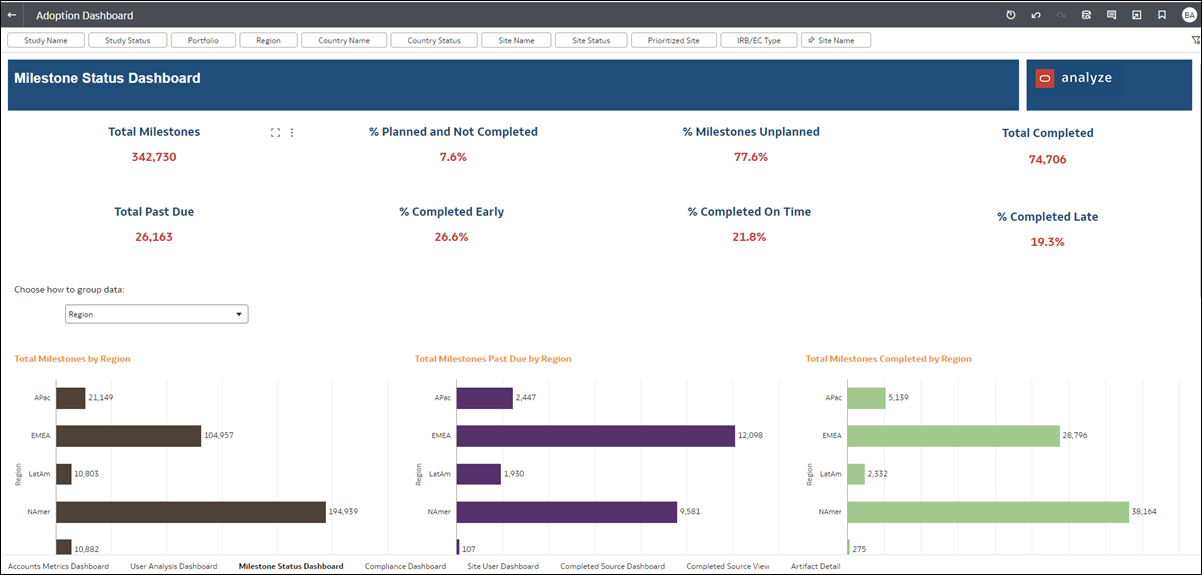
Completed Source Dashboard: This dashboard previously showed charts in a tabular view; this format is no longer available. With the 24.2 migration, we split the worksheet into the Dashboard sheet that shows the KPIs and related source graphs and a new Completed Source View worksheet where you can group data by Region, Portfolio, Study Name, Business Role, and more.
Artifact Detail: The report now presents data on the Artifact Detail worksheet in a tabular view.
Compliance Dashboard
All standard report About pages now use a consistent font and background; all text on the About pages is unchanged. The Compliance Dashboard report's About page reflects this enhancement.
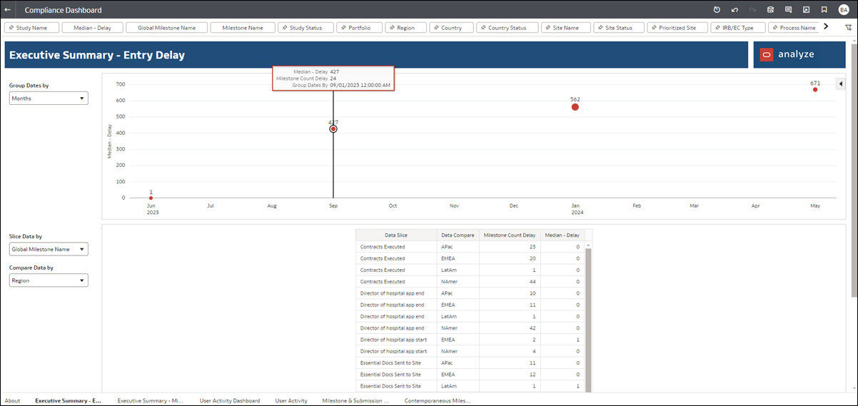
The report's migration to Oracle Analytics Cloud resulted in changes to the Executive Summary Dashboard worksheet. We split the summary into two separate sheets: Executive Summary - Entry Delay and Executive Summary – Milestone Accuracy worksheets, reflected in the worksheet title. Additionally, we replaced the upper section’s line charts with more easily understood dot charts. The size of the dot reflects the milestone count. Hover over any dot to view additional delay or accuracy details.
You’ll also find Group Dates by, Slice Data by, and Compare Data by filters on the left side of the Executive summary worksheets.
Additionally, we updated the Median filter’s Max value to default at 500. You can change this value, but the updated default value filters out outliers.
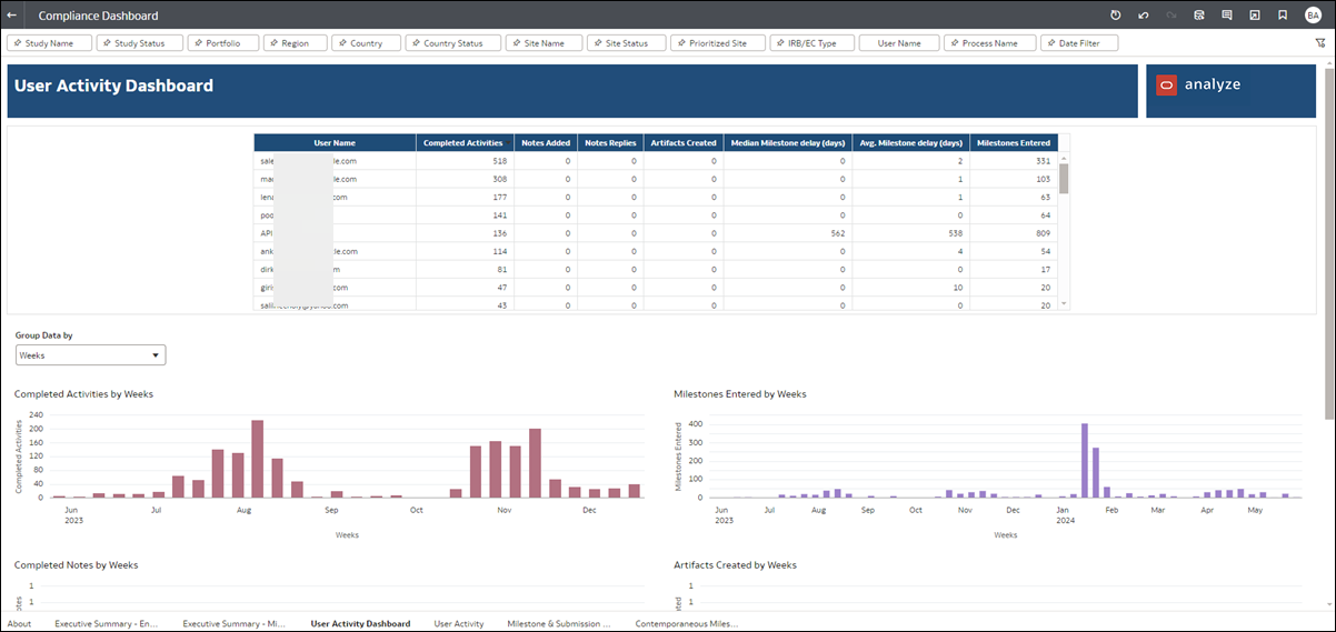
We also enhanced the User Activity Dashboard to replace the previous Activities Total trend graph at the bottom of the worksheet with five separate graphs, which you can group by Weeks, Months, Quarters, or Years. The graphs are:
- Completed Activities
- Milestones Entered
- Completed Notes
- Artifacts Created
- Median Milestone Delay (days)
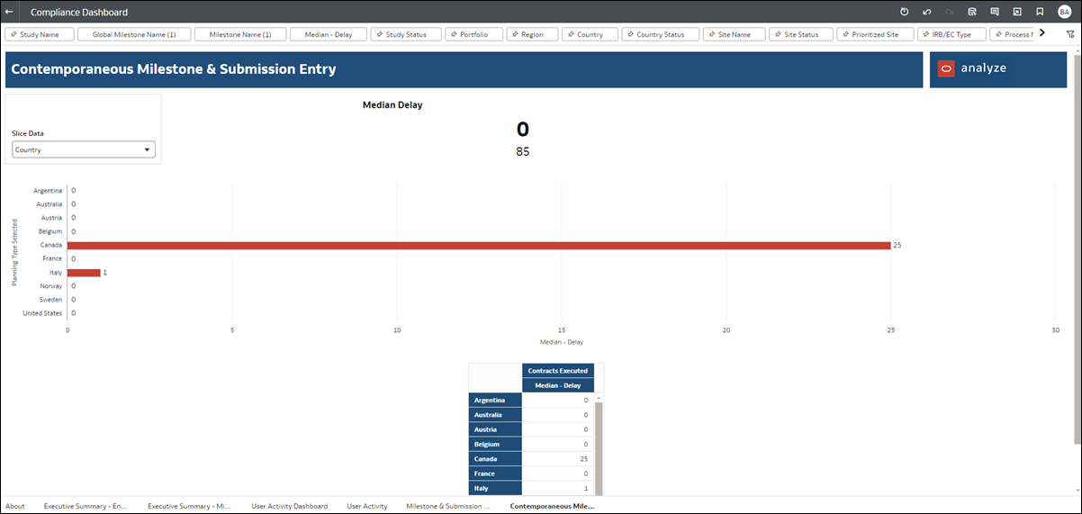
Finally, on the Contemporaneous Milestone & Submission Entry worksheet, we modified how the sheet displays KPIs. The worksheet shows one KPI based on the report level filter. You’ll find the filters for Global Milestone Name and Milestone Name at the report level at the top of the worksheet.
Cycle Times Dashboard
All standard report About pages now use a consistent font and background; all text on the About pages is unchanged. The Cycle Times Dashboard report's About page reflects this enhancement.
The report's migration Includes the following changes for all applicable worksheets:
- Start and End cycles are now driven by filters at the top of worksheets, as applicable (e.g., Cycle Start Level, Cycle Start Point, Cycle End Level, Cycle End Point)
- Min/Max cycle replaced by Cycle Time range filter
- Sort Table By drop-downs are removed. You can now sort tables using column header arrows.
- Units for time differences are limited to days (as compared to the previous day/week/month options)
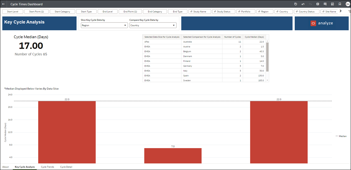
The previous Key Cycles and Cycle Analysis worksheets are now combined to remove functional redundancy. You’ll see the following updates in the newly combined “Key Cycle Analysis” worksheet:
- Using the filters at the top of the worksheet, you can select one cycle to see the KPI, bar chart, and table for that cycle.
- “Number of Cycles” and “Cycle Median” are now one data tile you control with one filter, and the previous box plot to the right of the KPIs is now a bar graph shown beneath the data tile.
- “Portfolio” is no longer available as a selection for the “Compare Your Data By” prompt, will be added later.
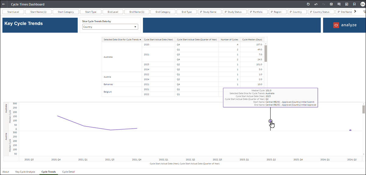
For the Cycle Trends worksheet, you’ll see the following minor differences in the migrated report:
- Unit of Measure is not available. As noted above, this is now limited to days only.
- For the table at the top of the worksheet, we added distinct columns for Cycle End Actual Date (Year), Cycle End Actual Date (Quarter of Year). Also, the Cycle Median (Days) column replaces the previous Median Cycle column.
- For the line chart in the middle of the worksheet, tool tips provide the previously available information structured in bullet points. We also added two new data points, Cycle End Actual Date (Year) and Cycle End Actual Date (Quarter of Year).
Planning Impact Analysis
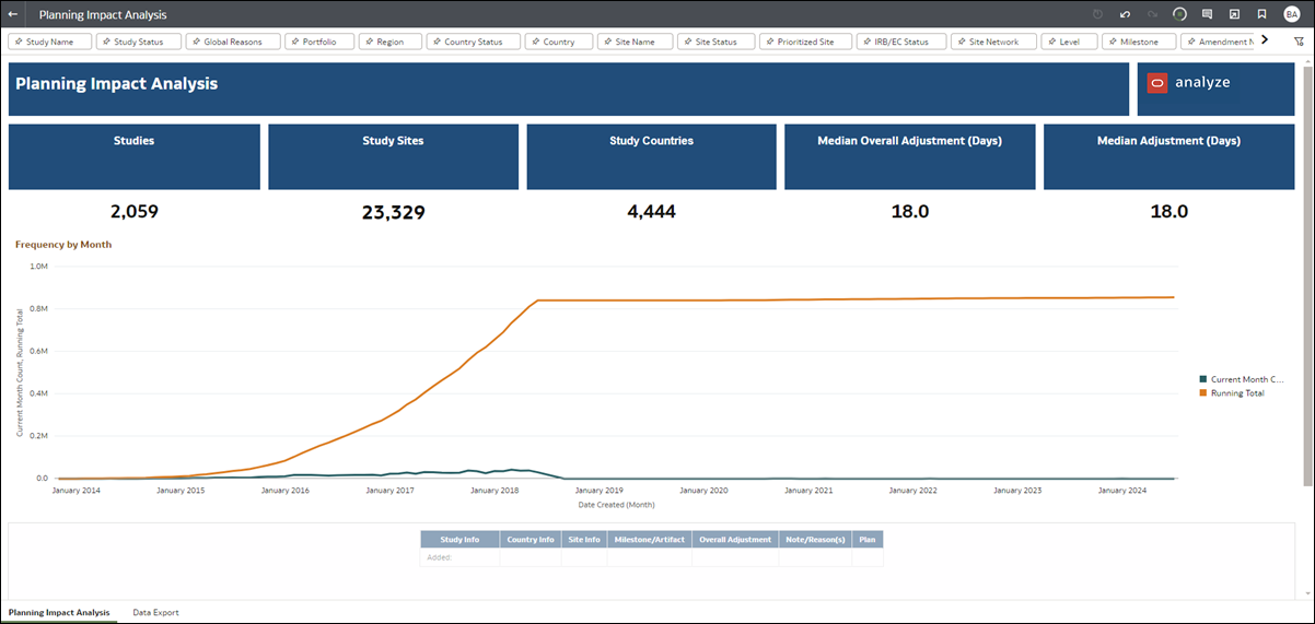
The Planning Impact Analysis report had the following changes resulting from the migration to Oracle Analytics Cloud:
- To improve visualization, we relocated the “Frequency” line graph on the Planning Impact Analysis worksheet to display across the worksheet’s full width, just below the KPIs.
- We removed the text search field at the top of the Planning Impact Analysis worksheet. Text search functionality is no longer available.
- For all worksheets in the report, the list of countries available under the Country filter will show the countries with relevant data (which might be null or not null).
Resource Allocation
All standard report About pages now use a consistent font and background; all text on the About pages is unchanged. The Resource Allocation report's About page reflects this enhancement.
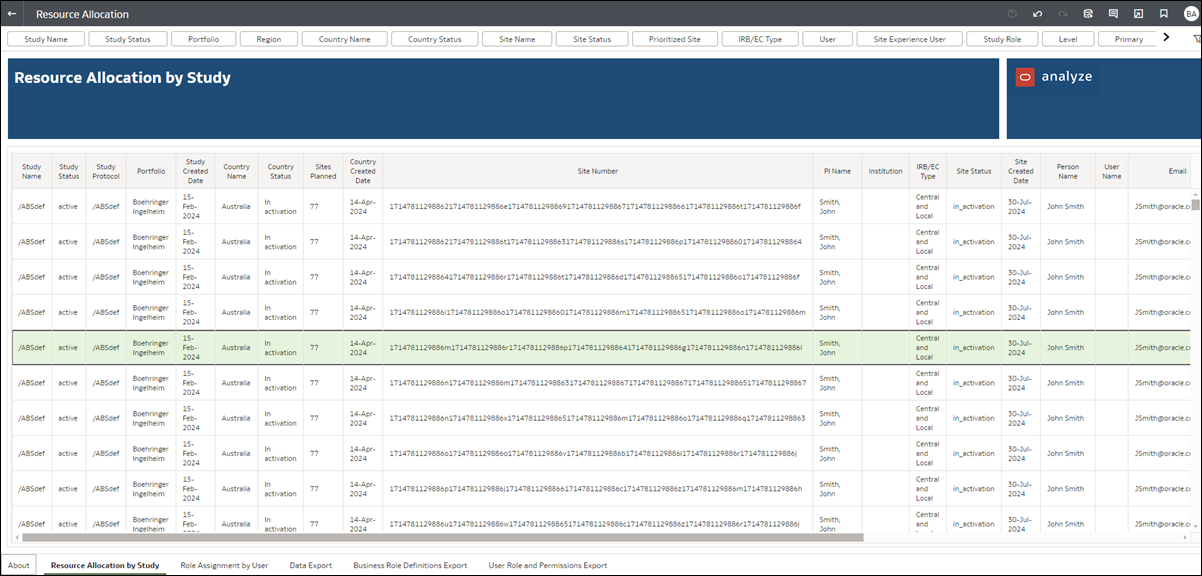
The report also had the following changes resulting from migration:
- On the Resource Allocation by Study, Role Assignment by User, and Data Export worksheets, the "Info" columns (e.g., Study Info, Country Info, Site Info, etc.) now show each data point as separate values. For example, the previous Study Info column is now broken out into separate columns for Study Name, Study Status, Protocol Name, Portfolio, and Study Created Date.
- Due to functional redundancy, the Business role definitions and User role and permissions worksheets were not migrated. These worksheets have been removed from the report with release 24.2.
Parent topic: What's new for Oracle Site Activate users