Contextual Information
The following charts are available.
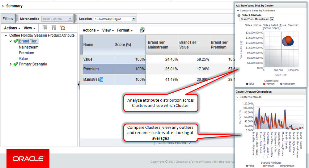
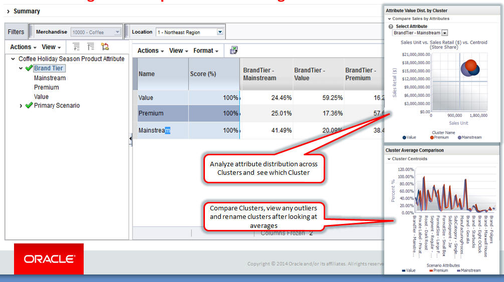
Attribute Value Dist By Cluster
The chart shows a comparison of sales with the average value distribution by clusters. The y axis is sales retail and the x axis is sales units. The z bubble size shows the average value for the selected attribute for the cluster.
Figure 4-34 Attribute Value Dist. by Cluster

Description of "Figure 4-34 Attribute Value Dist. by Cluster"
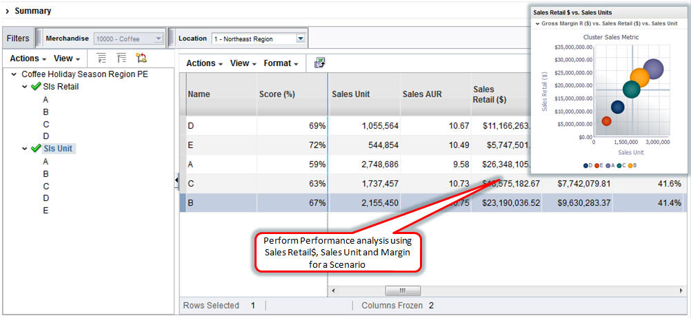
Sales Retail vs. Sales Units
The chart shows a comparison of sales retail and sales unit. The y axis is sales retail and the x axis is sales unit. The z bubble size shows the gross margin retail for a cluster.
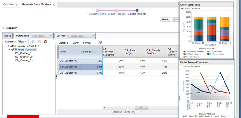
Cluster Average Comparison
The chart overlays the centroid of the cluster and provides a comparison of cluster averages so that you can rename the clusters based on the information in the graph.
Cluster Comparison
The chart shows the stacked contribution of each attribute by percentage for each cluster. You can use this chart to determine which cluster contributes the most for an attribute by viewing the clusters side by side.


