2 AP Cloud Service Dashboard
The Dashboard provides a consolidated, real-time view of key performance indicators (KPIs) to help planners quickly assess business performance and identify areas requiring attention. It serves as the entry point into the application, enabling users to monitor trends, evaluate plan performance, and navigate directly to relevant workspaces for further analysis and action. Different planners may prioritize different KPIs depending on their role or product area. The dashboard supports this by allowing users to select metrics and apply filters, ensuring the view is aligned to their specific planning objectives.
Key Capabilities:
- KPI Monitoring and Trend Analysis. The dashboard presents key metrics such as sales, margin, receipts, and sell-through, allowing users to evaluate overall business health and monitor trends over time. Users can adjust KPI selections, filters, and time horizons to focus on the most relevant insights.
- Exception Identification and Navigation. The dashboard highlights exceptions and performance gaps through visual indicators, enabling users to quickly identify issues such as underperformance or variance to plan. From the dashboard, users can directly launch associated workspaces to investigate and resolve issues, supporting an exception-driven planning approach.
- Filter-Driven Display. The dashboard uses filters and parameter selections to control what data is displayed. Users can adjust KPIs, time horizons, and ranking criteria to dynamically change the view and focus on specific business questions.
Dashboard Components
The dashboard is organized into three primary components:
- Tiles. Tiles are organized by role-based dashboard profiles and display high-level KPI values with visual performance indicators. They provide a quick summary of key metrics and highlight variances or issues requiring attention.
- Charts. Charts provide a time-based view of the KPI associated with the selected tile. When a tile is selected, the chart updates to display detailed trends for that specific metric, enabling users to analyze performance over time.
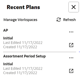
- Recent Plans. The Recent Plans section provides quick access to recently used planning segments, allowing users to resume work without rebuilding selections.
Dashboard Profiles Determine Tiles
Dashboard profiles group key performance indicators (KPIs) based on specific planning functions and business objectives, allowing users to focus on the metrics most relevant to their role.
APCS includes the following dashboard profiles:
-
Administration Dashboard
A standard profile across RPAS Cloud Edition applications that provides administrative insights and system-level monitoring.
-
Assortment Fit Dashboard
Focuses on assortment performance metrics, including sales units (AF Wp Sales U) and sales retail (AF Wp Sales R), providing a summary view of assortment decisions.
-
Item Flow Dashboard
Focuses on execution metrics, including sales and receipt quantities (IF Wp Sales U, IF Wp Sales R, IF Wp Receipts U, IF Wp Receipts R), supporting analysis of weekly flow plans.
Each profile enables users to monitor performance from a specific planning perspective, aligning insights with their current task in the assortment planning process.
Tiles
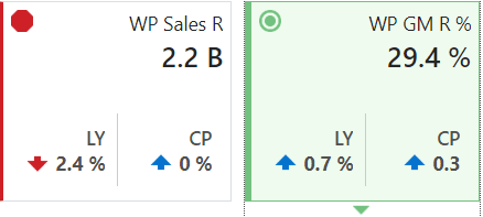
Tiles are displayed across the top of the dashboard and present high-level KPI values with visual indicators of performance. They provide a quick summary of key metrics and highlight variances or issues requiring attention.
The drop-down lists above the tiles control the dashboard profile and the data segment displayed in the tiles and chart area. Selecting a tile updates the chart to show detailed trends for that KPI. The arrow beneath the selected tile indicates which metric is currently displayed in the chart.
Tiles are available in two types:
- Variance tiles display the difference between one metric and one or more related comparison metrics.
- Informational tiles display the current value of a metric without comparison.
Tile colors and icons indicate performance status. For example, a variance tile may display an alert icon when the working plan is below last year, while an informational tile displays a neutral color because it shows data without comparison.
Adding a New Tile
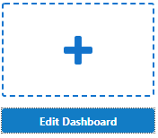
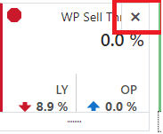
To add a tile, click Add on the right side of the tile carousel. If necessary, scroll to access the control. In the dialog box, select the desired metric tile and click OK. The tile is added to the carousel.
Charts
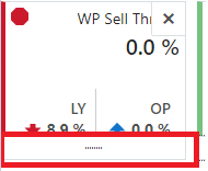
Charts display detailed, time-based trends for the KPI selected in the tile area. When a tile is selected, the chart automatically updates to show the corresponding metric over the defined time horizon.
The horizontal axis represents time (calendar), and the vertical axis represents the selected measure. Charts allow planners to analyze trends, compare performance, and identify patterns across different timeframes.
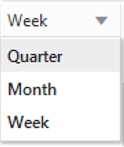
The drop-down selections above the tiles control both the data segment and time horizon used in the chart.

Recent Plans
The Recent Plans section provides quick access to previously created planning segments, allowing users to resume work without rebuilding selections through the wizard. This improves efficiency by reducing the need to repeatedly define the same product, location, and time selections.