A Appendix: Design Standards
This appendix outlines some of the JET and Redwood design standards that are implemented in Brand Compliance as the new UI. The following topics are covered:
See also the Workspace section for details of the Workspace page and navigation, and the List Views section for details of the style and features of list views.
The new UI design standards are based on the Oracle JET technology and Redwood theme. Oracle JET (JavaScript Extension Toolkit) is a development framework for the development of mobile and web applications. The Redwood theme is the new Oracle standard for application look and feel. It is being implemented company-wide to unify the user interface of all Oracle product offerings.
Forms
Forms present the contents of a record’s fields, grouped together in subsections, within a page, or across multiple pages. The same layout is used whether in read or edit mode.
The common components and design standards of forms include the following.
Title Bar
Per the Workspace page and list view pages, forms have a Title bar sub-heading. It shows the name of the record and an Actions menu.
The Actions menu contains context-sensitive options available to perform on the record based on its state and the user’s permissions, such as to put the form in edit mode, and to progress the record through its workflow stages. Some options also appear as icons, next to the Actions menu.
Figure A-1 Title Bar

Tabbed Pages
Forms may present the contents as a tabbed page, either in a tabbed or wizard style. The wizard style is used where there is a logical order to the data entry, in which case the tabs are numbered, and the form buttons include Next and Previous navigation options.
Figure A-2 Wizard Form Tabs

Form Buttons
A set of context-sensitive buttons appear at the bottom of the page for the basic form actions, such as Save, Save and Close, and Cancel. Wizard forms also include Previous and Next options. Inactive buttons are greyed out.
Figure A-3 Form Buttons
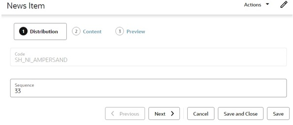
When creating a record, until it has been saved, just the Save and Close button is available (not Save); after the initial save, the user must reopen the record to perform further edits.
When a page is in edit mode and the Cancel button is clicked (or the page’s Workspace tab is closed), a confirmation prompt is presented, waning that any unsaved changes will be lost.
Fields
Read Mode
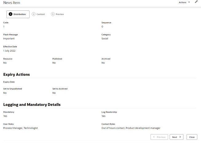
In read or print mode, fields are typically presented in one or two columns, with the values beneath the field labels.
Figure A-4 Form Read Mode
Edit Mode
In edit mode, the field labels appear within the field input area.
Figure A-5 Form in Edit Mode
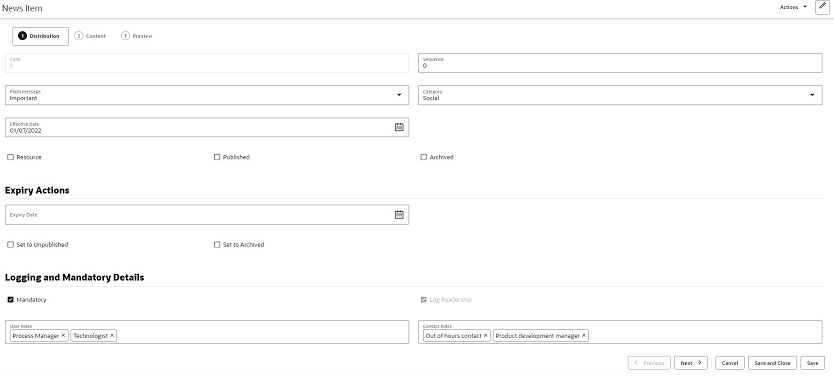
Read only fields are greyed out.
Pick lists are populated by clicking the input area to open the list of available values, or using the type-ahead text filter. If multiple selections are permitted, the selected values are shown in the input area; they are deselected by clicking the X control.
Date fields present a date picker; the selected date is shown in the format according to the user’s locale. Dates may also be keyed in.
Numeric integer fields may have controls to increment and decrement the number.
Rich text fields include options to apply bold, italics, and underline formatting, to insert a hyperlink, and to undo or redo edits.
Mandatory fields are indicated by the text Required beneath the field. Guidance text may appear beneath the field to indicate the expected content.
Validation
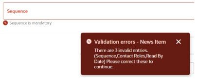
Validation is applied when the record is saved. Errors, such as missing mandatory fields, are indicated within the form.
Figure A-6 Validation Error
Field Alignment
The different types of fields are aligned as follows.
|
Field Type |
Alignment |
|
Number/integer/count |
Far |
|
Multi checkbox |
Near |
|
Boolean/switch/yes-no |
Center |
|
Text/rich text/phone/email/hyperlink/image and so on |
Near |
|
Dates and times |
Near |
|
Other (blob/complex) |
Center |
Images and Files
Depending on the usage, images may be shown as full size, reduced scale, or a thumbnail.
If an image or file cannot be found, a placeholder icon indicating the file type extension is shown instead.
Record Locking
Records that the user has open for editing are exclusively locked for five minute intervals. If the user terminates their session by closing the page, the lock is automatically removed once the five minutes has elapsed. This frees up records where editing has been abandoned due to the session terminating before the record is saved or exited (any changes made during that edit session would have been discarded).
In some cases, the user may have the chance of saving the record before the locks are released and data is lost, in which case a warning message is presented, prompting the user to save their work.
Dialog Boxes
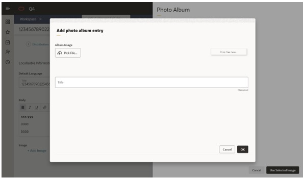
Dialog boxes are presented using a similar style to form pages.
Figure A-7 Dialog Box
Message Boxes
Message boxes are used to present confirmation prompts and warning or error messages.
Figure A-8 Confirmation Message Box
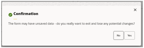
Figure A-9 Warning Message Box
Figure A-10 Error Message Box

Overlays
Some actions present a form as a slide-out overlay, allowing it to be viewed or completed without having to navigate away from the original page.
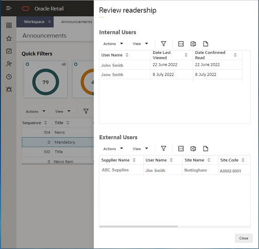
Overlays are presented using a similar style to form pages, with a Close button (plus any other that are appropriate to the action). Simple overlays may use the X as an alternative method of closing.
Figure A-11 Overlay Form
