7 Forms
This chapter provides an overview of the Form framework used in the new User Interface.
The following topics are covered:
Forms present the contents of a record or dialog box for the purpose of viewing or maintaining a record, or for data entry as part of a process. The contents are organized in a logical sequence, with related data being grouped together. The design is based on the Oracle JET technology and Redwood theme, as used by other Oracle Retail applications.
Note:
The initial release packages include the Company, Retailer User, and Library Document forms. Subsequent packages will introduce additional forms. During the transition, the system will open either the new JET UI or the Classic UI form accordingly.
This section describes features of the new JET UI form design. Additional features and design standards will be introduced as other forms are developed.
The main components of a form are:
- Sections, to group common data, opened from the Section Bar which shows a title and an icon.
- Section Tabs, to identify the pages within a section.
- Expanders and Blocks, for grouping related sets of fields within the page, like field sets in Classic UI.
- Fields, which correspond to the data types used in the Classic UI, enhanced with new display types.
- The Actions that are available to apply to the record, some with quick access icons.
- An Attachments area for viewing and maintaining a record’s file attachments and URL links.
- A Change History section containing the record’s change history log information, similar to Classic UI.
Form Contents
The form structure is based on grouping a record’s fields within sections and pages in a way that the user can access the data in a logical manner appropriate to the typical usage of the type of record. Consistency across forms means a familiar and predictable user experience.
When a record is presented for maintenance or workflow progression, the available actions follow a standard pattern, with the options being dynamic to the state of the record (and form), and the user’s access rights.
Sections
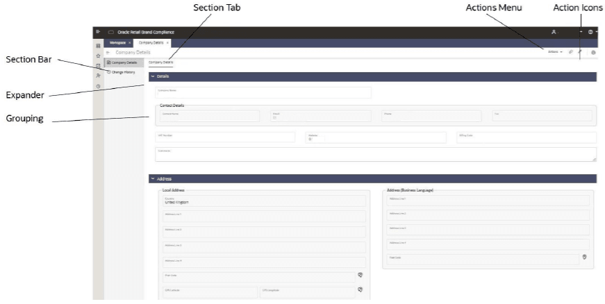
The contents of a form are presented in one or more sections, which are listed in the left-hand Section Bar. Each section has an icon, which is consistent across forms where they have a similar purpose. The section bar can be collapsed to just show the icons.Section Tabs
Within a section, the contents may be split over multiple pages, each with an identifying section tab.Expanders/Blocks
Like field sets in the Classic UI, sets of related fields may be grouped together, either within a static block (with or without a title), or within an expander, which can be collapsed to just show its title.Fields
The individual fields correspond to the data types used in the Classic UI, with some enhanced with new Display Types. A new design style is used. Related fields may be placed within in a Grouping (with or without a title).
The Display Types include the typical field types such as Text, Number, and Selector, extended to cover specific usages, for example Email address, Comments, and GPS coordinates. This allows the presentation, behavior, and validation specific to a type of field to be applied consistently across all forms.
Form Actions
The record’s available actions are grouped within the Actions menu; some are also available as icons for quick access (such as Edit and View Attachments). Forms also have maintenance-related action buttons at the bottom of the page (such as Save, Close, and Save & Close).
Attachments
The facility for holding general attachments against a record has a View Attachments action to open a slide-out pane form where the attachments and URL links can be viewed and maintained, in a similar way to the Classic UI.
Some forms may have an embedded list for specific types of attachments. This will typically show the first three in the list, with the View Attachments link used to open the full list.
The slide-out panel containing a record’s file attachments can also be opened from list views.
Note:
Until a form has been converted to the JET UI design, the View Attachments option will continue to open its records in the Classic UI, from where the user can locate its attachments within the Attachments page or section.Change History
A common Change History section is used across all forms to present the change history logging information, in a similar way to the Classic UI.
The log of individual changes is presented as a list view, along with the standard features for searching, sorting, and exporting the log.
For the types of records that are subject to workflow, the section will include a table of the Status Change History logging details.
Examples
This section includes examples of some of the forms, and their new design features.
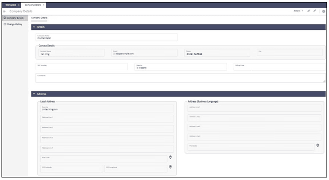
Company Form
Retailer User Form
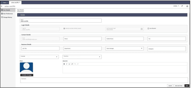
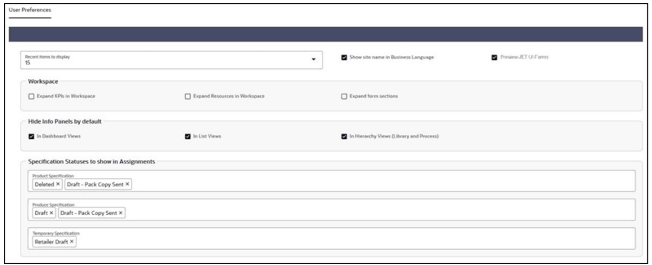
The User Preferences page becomes a section of the form, where the user can edit their own preferences. Users can also view the preferences of other users, and if a User Administrator, may edit them.
Note:
The set of Workspace preferences are not yet functional. They will be utilized in a future release.Library Document Form
In a similar way to the JET UI Announcements, the Retailer administrator uses a wizard to maintain and publish documents.
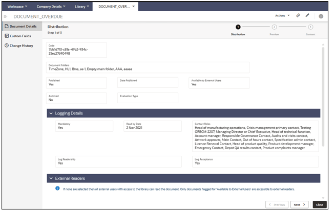
Users view the document using a read pane, which contains:
- Details of the document, including any additional details such as keyword tags and custom fields.
- A list of the document’s file attachments.
- Buttons to confirm they have read or accepted the document, where required.

- Retailer users also have access to view the readership & acceptance logs.
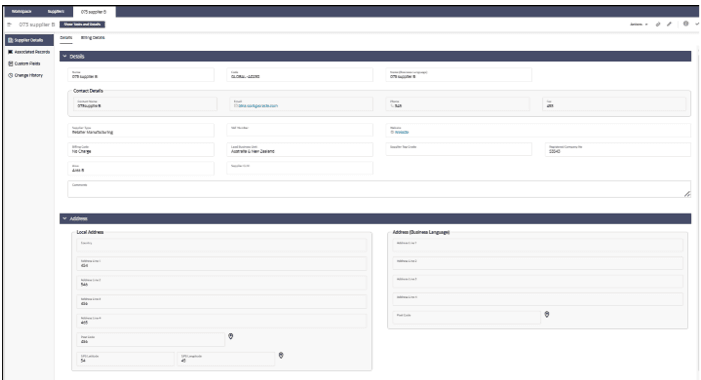
Supplier Form
The Details page contains the main supplier and contact details:
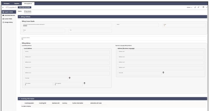
The Billing Details page contains the billing and invoicing details:
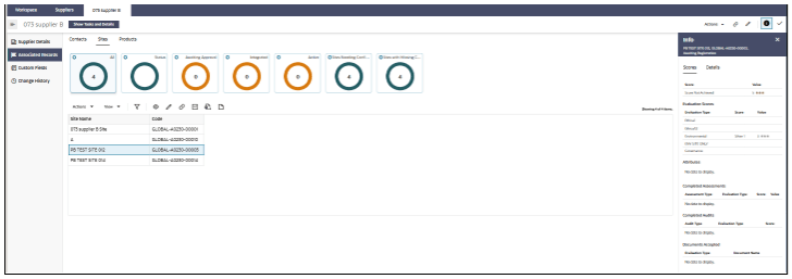
The Associated Records page contains lists of the associated Contacts, Sites, and Product Records:
