5 Merchandising Style Guide
This section outlines the styles used in developing the Merchandising solution user interfaces. It is included here so that you can use the information for any custom reports or bolt-on applications to give them a similar look and feel, providing a more seamless experience for your users.
Fonts
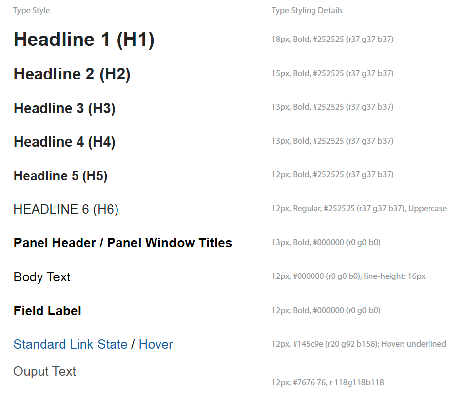
The primary typeface that is used for the UI is Arial, with Helvetica used for some of the headings.

Colors
These are the colors used in the UIs. Which colors apply for which components is described below.

Global Screen Structure

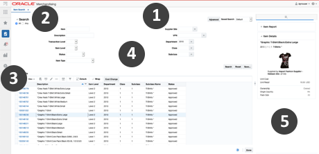
All the screens in Merchandising have a similar layout, with these main key areas:
-
Global Navigation Bar
-
Application Tabs
-
Navigational Area
-
Local Area
-
Contextual Area
Global Navigation Bar
The global navigation bar shows the name of the solution and also contains the user menu and a global help icon. The makeup of this bar is as follows:
| Components | Font | Background Color | Size |
|---|---|---|---|
|
Top Border |
Red |
Height: 2 pixels |
|
|
Main Section |
Application title: Headline 1 |
Light Gray |
Height: 42 pixels |
|
Bottom Border |
Medium Gray |
Height: 1 pixel |

