6 Application Customization
The Merchandising suite provides different options for customizing the user interface to meet your business practices, and in some cases to surface custom content. This includes adding links to custom workflows or reports in the Tasks menu, adding custom reports to dashboards or contextual panes, and customizing the labels used in the solutions. These options are accessed from the Settings icon in the sidebar menu in each of the Merchandising solutions.
User Interface
User interface customization is an option that can be used to customize the look and feel of the tasks, reports menu, and sidebar menus and which applications are shown in the Application Navigator.
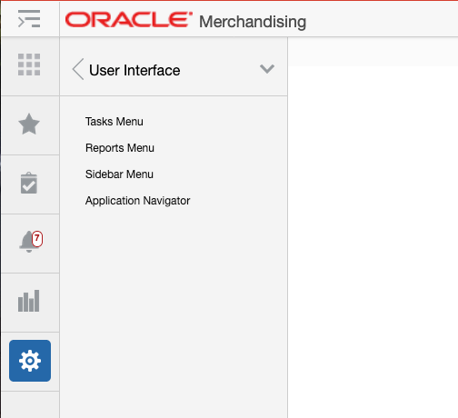
Tasks Menu
The Tasks Menu link opens the Tasks Menu page, which allows an administrator can add, modify or remove the tasks available. For example, you may want to add a link for your users to a custom bolt-on application. You can also add a new folder and re-organize how the base task links are organized.
Figure 6-1 Base Merchandising Tasks Menu
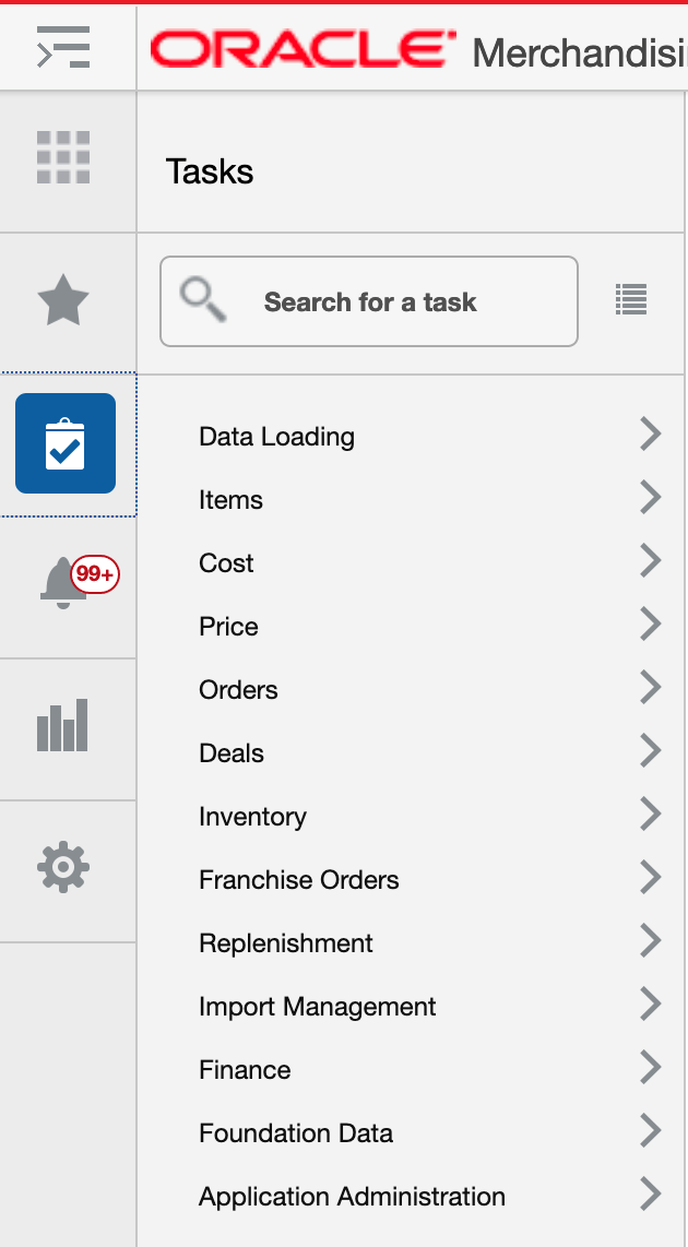
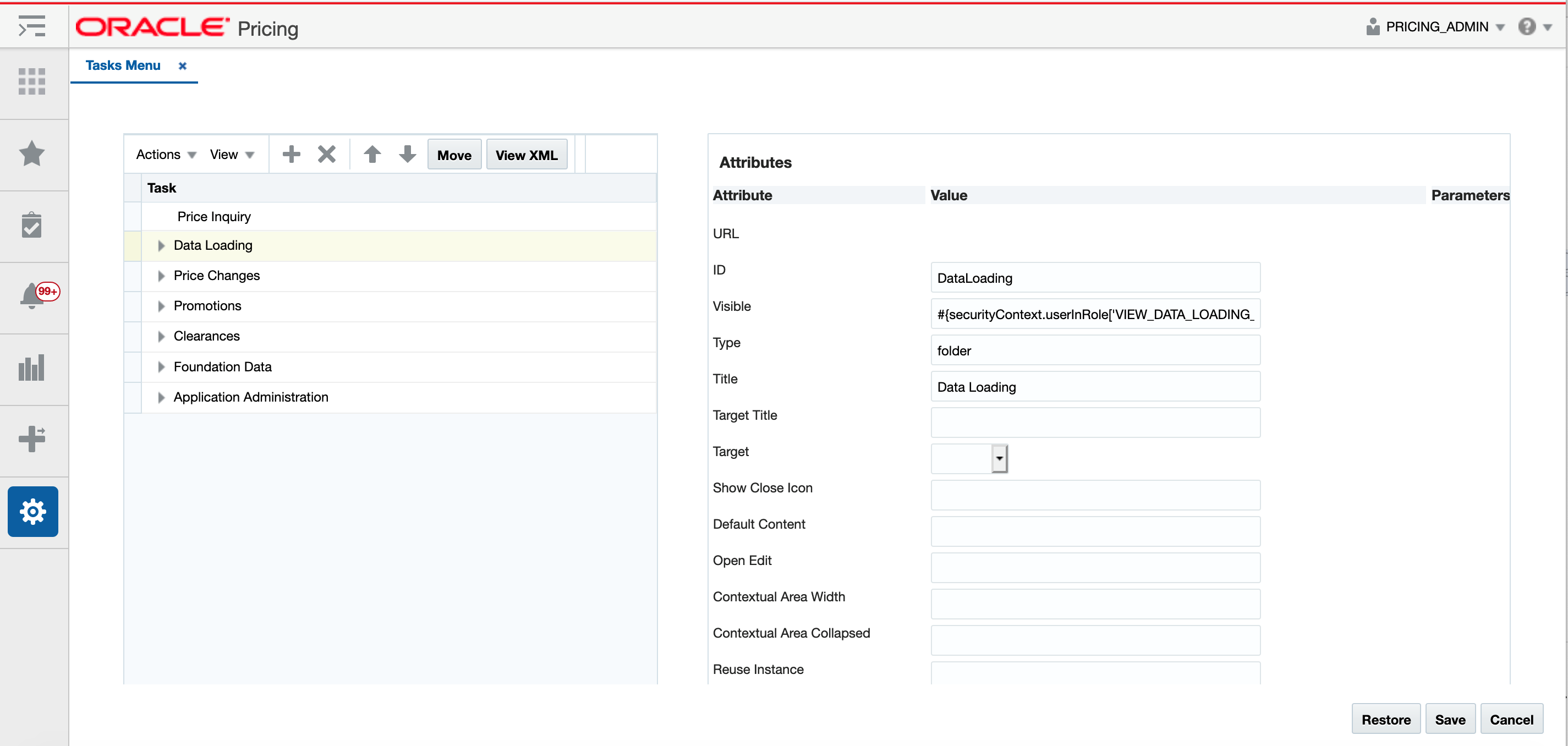
Clicking on the Task Menu option under Settings displays a page like is shown below. On this page are buttons to save, restore or cancel the changes.
When you click Save, your changes will be immediately reflected in the Tasks menu. The Cancel button closes the tab without saving the changes. The Restore button replaces the customized menu with the with the base product configuration.
Figure 6-2 Table View
You can also click on the View XML button to view the XML version of the menu in an XML editor. The XML view contains a View Tables button which takes the user back to the tables view. The XML view also has a View Revisions button that allows you to view prior revisions of the task list. This should be used to re-apply any customizations you make after a patch is applied, as customizations are not retained during patching.
Figure 6-3 XML View
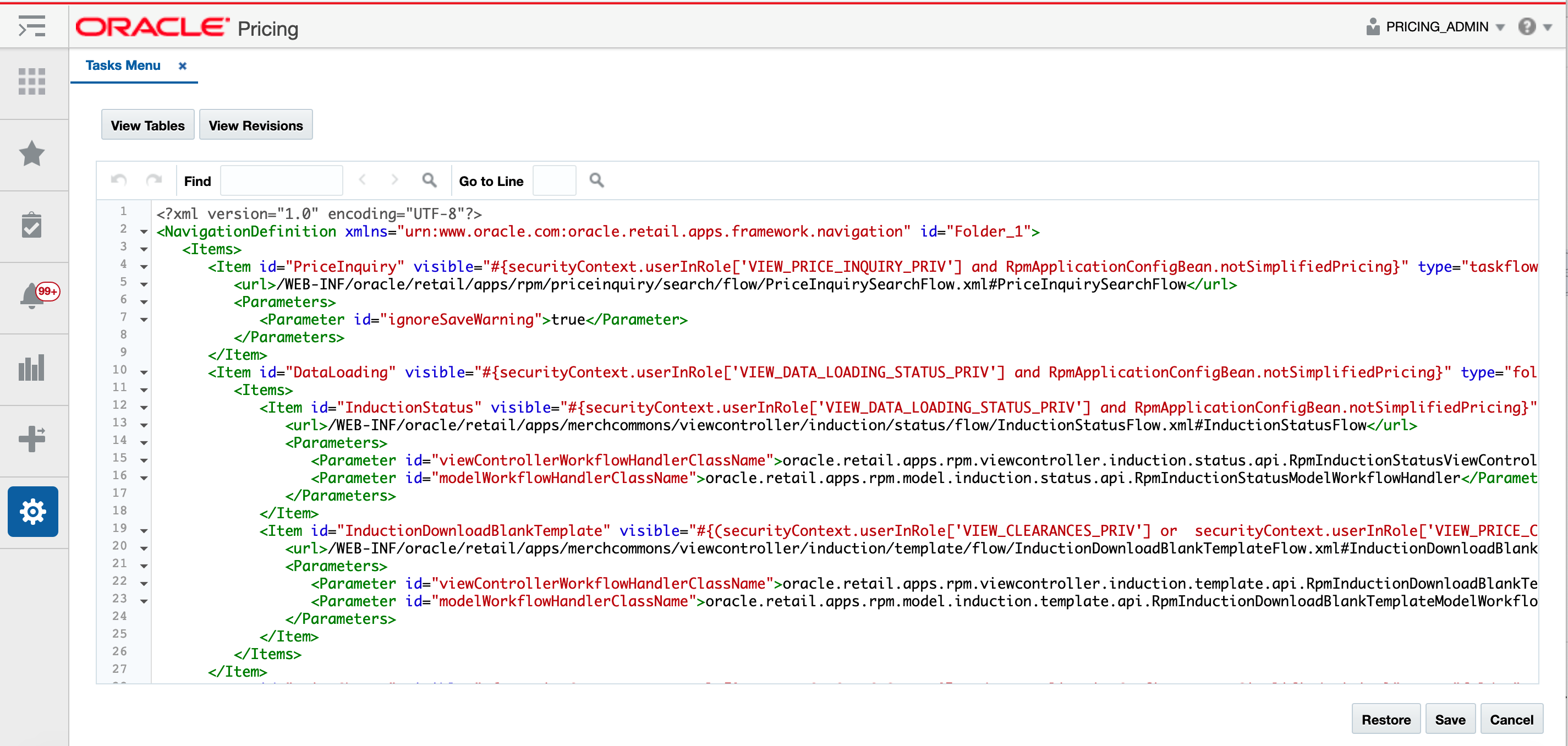
The task menu model xml file uses the xml schema definition called NavigationModel.xsd for xml validation. The Navigation Model schema definition file is used to validate any changes done by the administrator on the task menu xml file. The task menu model file consists of a hierarchy of item elements. Each element represents a menu item in the task menu. The item element can either be a folder or a URL, with a list of attributes and parameters that identify the task menu item.
Below is the example of a task menu model item:
<?xml version="1.0" encoding="UTF-8" standalone="yes"?>
<NavigationDefinition … >
   <Items>
      <Item id="myFolder" title="My Folder" type="folder">
         <Items>
            <Item id="myContent" type="link" title="My Content" target="_blank" refreshOnDisclosure="false" dynamicTabFocus="true" closeOverride="false" reloadTab="false" popupContentHeight="250" popupContentWidth="250" popupStretchChildren="none" popupResize="on" popupId="0" renderIconTitle="textOnly" modulePathActiveValidation="all">
               <url>http://<xyz>.com</url>
            </Item>
         </Items>
      </Item>
   </Items>
</NavigationDefinition>
Add New Task Menu Items
In cloud service implementations, there are two types of task menu items that can be added - a folder or a link.
Add a New Task Link
To add a new task link, starting from the Tasks Menu page, select the folder in the Task table where you want your link displayed. For example, if you want to add a new link under Items in Merchandising, highlight the Items row in the Task table. Then, click the Create iconic button (![]() ) or select Create from the Actions menu. Or, if you don't want it displayed in an existing folder, then select the Create On Top option from the Actions menu. Both options will result in a popup being displayed like shown below.
) or select Create from the Actions menu. Or, if you don't want it displayed in an existing folder, then select the Create On Top option from the Actions menu. Both options will result in a popup being displayed like shown below.

In the popup, give your link a unique ID, select the type link, and enter a business facing title. Then click OK. You should now see the new link item in the Task table. To rearrange the order that the link is displayed in the folder click on the up and down arrows (![]() ) in the Task table toolbar or click on the Move button, which will allow you to select another folder to which to move your link.
) in the Task table toolbar or click on the Move button, which will allow you to select another folder to which to move your link.
Next, you will need to configure your link using the Attributes panel. Alternatively, you can click on the View XML option and configure your link. The following attributes apply for task links:
| Attribute | Description |
|---|---|
|
URL |
The full URL for your link. If you are adding the link using the View XML option, the entire URL must be marked as character data (e.g. enclosed in CDATA). |
|
ID (id) |
Unique identifier for menu items. When adding your custom link, make sure that it does not duplicate any of the base IDs. |
|
Visible (visible) |
Indicates if the item should be rendered (visible) or not. Valid values are true (default) or false. It can also be an Expression Language (EL) expression that evaluates to true or false, such as if you want to use the application security settings to determine the visibility of your link. For example, if you want your link only visible to users with the Maintain Items privilege, then you can use the ADF securityContext API isUserInRole method and set this to #{securityContext.userInRole['MAINTAIN_ITEMS_PRIV']}. |
|
Type (type) |
Indicates the type of the item. Valid values are:
An additional type (taskflow and dynamicContent) is not supported in SaaS implementations for the Task List. |
|
Title (title) |
Used to provide the user-facing title of the task item in the primary language. Required. |
|
Target (target) |
For custom links, one of the following target types can be selected:
|
|
Access Key (accessKey) |
Optional. Used to specify the keyboard keystroke or a group of keystrokes that are used to access the navigation item using the keyboard. |
|
Short Description (shortDesc) |
Optional. Used to provide the description of the navigation item which will be displayed when the user hovers over a menu item. |
The other attributes in the Tasks Menu page do not apply for custom task menu links.
Add a New Folder
To add a new sub-folder, starting from the Tasks Menu page, select the folder in the Task table where you want your sub-folder displayed. For example, if you want to add a new subfolder under Inventory in Merchandising, highlight the Inventory row in the Task table. Then click the Create iconic button (![]() ) or select Create from the Actions menu. Or, if you don't want to add your folder in an existing folder, select the option Create On Top from the Actions menu. Both options will result in a popup being displayed like shown below.
) or select Create from the Actions menu. Or, if you don't want to add your folder in an existing folder, select the option Create On Top from the Actions menu. Both options will result in a popup being displayed like shown below.
In the popup, give your folder a unique ID and enter a user-facing title. Also, select the type folder. Then click OK. You should now see the new folder in the Task table. You can optionally also configure the attributes in the Attribute panel, or using the View XML option. The parameters for folders are similar to those described above for adding task links.
To rearrange the order that the subfolder is displayed in the selected folder, click on the up and down arrows (![]() ) in the Task table toolbar or click on the Move button, which will allow you to select another folder to which to move your folder.
) in the Task table toolbar or click on the Move button, which will allow you to select another folder to which to move your folder.
To move links into this new folder, follow the steps in Modify an Existing Task. To add new tasks to this folder, follow the steps in Add a New Task Link.
Modify an Existing Task
If you need to modify a custom link or folder you added previously, you can also do that in the Tasks Menu page. Also, there are some changes you can make to base links in this view, with limitations.
Rearrange Folders or Links
If you want to rearrange the order of folders or links (base or custom), highlight the link or folder to be moved in the Task table of the Tasks Menu page. Then, click on the up or down arrows (![]() ) in the Task table toolbar to move the link or folder up or down within the same parent folder.
) in the Task table toolbar to move the link or folder up or down within the same parent folder.
Move Folder or Link to New Folder
If you want to move a link or folder (base or custom) to a different parent folder, then highlight the link or folder to be moved in the Task table of the Tasks Menu page. Then, click the Move button in the Task table toolbar. This will open a popup where you can select the new parent folder for your folder or link.
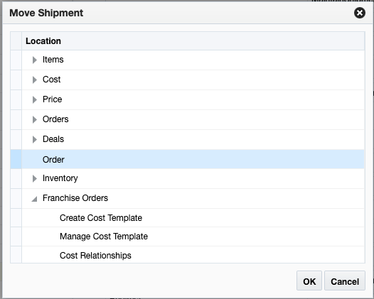
If you want to move your item to the top level so that it isn't inside of a parent folder, then select Move On Top from the Actions menu.
Modify Link Attributes
If you want to modify the attributes for your custom link or folder, you can do that by highlighting the appropriate link or folder in the Task table of the Tasks Menu page and editing the attributes similar to what was described in the Add New Task Menu Items section.
You can also do some limited editing of the attributes for base task list links or folders. The attributes that can be modified for a base task link or folder are described in the table below.
| Attribute | Description |
|---|---|
|
Visible (visible) |
Indicates if the item should be rendered (visible) or not. Valid values are true (default) or false. It can also be an Expression Language (EL) expression that evaluates to true or false, such as if you want to use the application security settings to determine the visibility of your link. For example, if you want your link only visible to users with the Maintain Items privilege, then you can use the ADF Customizing this for base links should be done only in exceptional situations. Best practice is to control visibility for base links and folders based on the privileges assigned to your user's roles, or using system options settings. For more details on the privileges that control the base links and folders, see the Security Guide - Volume 2 for the applicable Merchandising solution. |
|
Title (title) |
Used to provide the user-facing title of the task item in the primary language. Required. |
|
Default Content (defaultContent) |
Indicates whether the corresponding link is displayed by default in the content area when the application is launched. This could be used to display one of the base workflows by default to a user when they log into a Merchandising solution. Valid values are true (default) or false. It can also be an Expression Language (EL) expression that evaluates to true or false, such as if you want to use the application security settings, similar to the Visible attribute. This attribute is not applicable for base folders or custom links/folders. |
|
Access Key (accessKey) |
Optional. Used to specify the keyboard keystroke or a group of keystrokes that are used to access the navigation item using the keyboard. |
|
Short Description (shortDesc) |
Optional. Used to provide the description of the navigation item which will be displayed when the user hovers over a menu item. |
The other attributes in the Tasks Menu page do not apply for modifying base task menu links.
Remove a Task
If you want to remove a custom task link or folder that you previously added, then highlight the link or folder in the Task table of the Tasks Menu page and click on the delete iconic button (![]() ) or select Delete from the Actions menu.
) or select Delete from the Actions menu.
Note:
It is highly recommended that you don't delete any of the base task links.
Re-apply Task Customizations After Patching
If you have made any customizations to the Tasks menu, then after a patch update, the changes will be lost. To re-apply your changes after patch updates, follow these steps:
-
From the Settings menu, select User Interface > Tasks Menu.
-
Click the View XML button, and then from the XML view, select View Revisions.
-
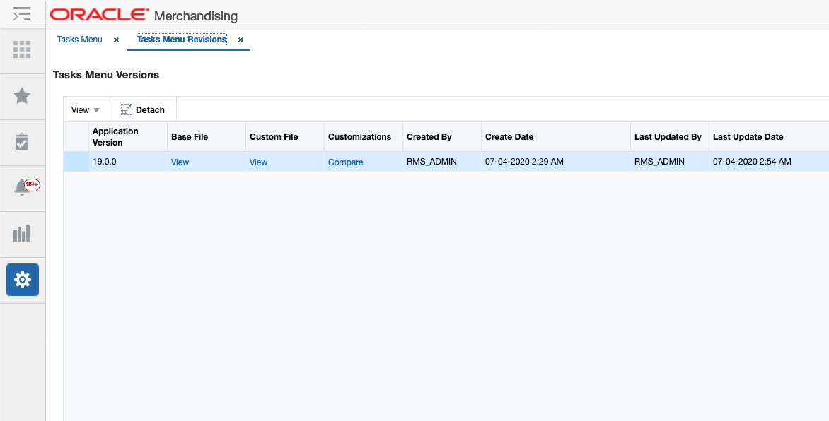
This will open the Tasks Menu Versions page.
-
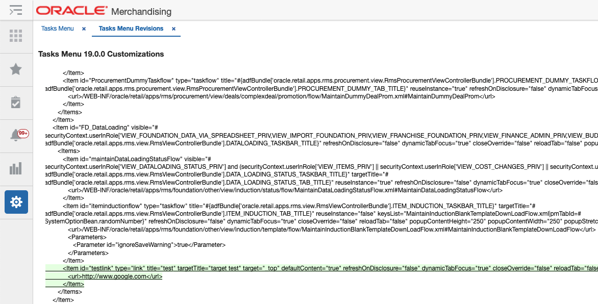
From here, you can view the base version, your customized version, or a comparison of the two. The comparison view highlights your additions and subtractions from the base model, as you can see in the example below.
-
Note the customizations made - you may want to copy to a text editor, highlighting the changes as appropriate - and then click Back to return to the Task Menu Versions page.
-
Click Cancel to return to the Task Menu XML View page. Using the highlighted differences from the revision page, reapply your customizations. Then, click Save.
-
Click on the Tasks menu icon (
 ) to validate that your changes have been re-applied.
Reports Menu
The Reports Menu link opens the Reports Menu page that allows you to add, modify or remove the reports available in the Reports menu. For example, if you have built some custom reports using BI Publisher, you might add the links using this function.
Figure 6-4 Base Merchandising Reports Menu
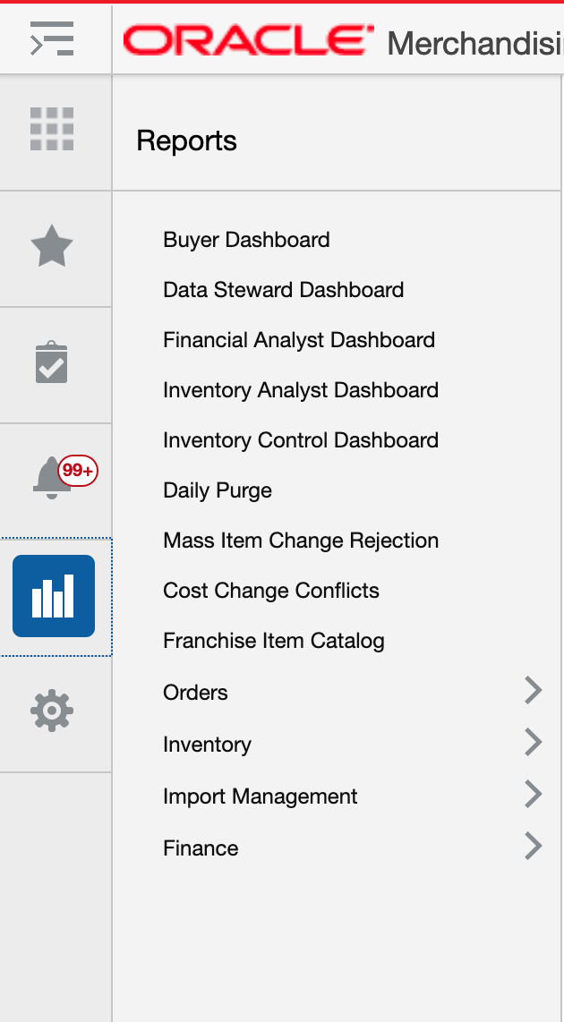
Clicking on the Reports Menu option under Settings displays a page like is shown below. On this page are buttons to save, restore or cancel the changes.
When you click Save, your changes will be immediately reflected in the Reports menu. The Cancel button closes the tab without saving the changes. The Restore button replaces the customized menu with the with the base product configuration.
Figure 6-5 Table View
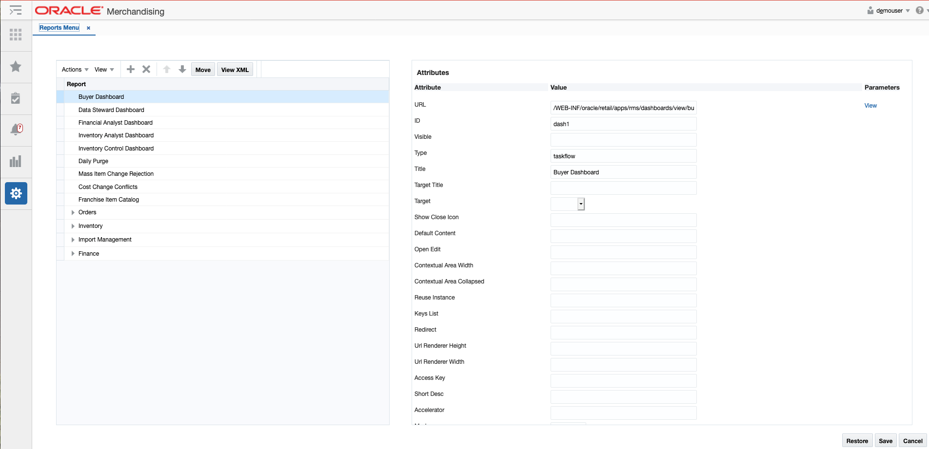
You can also click on the View XML button to view the XML version of the menu in an XML editor. The XML view contains a View Tables button which takes the user back to the tables view. The XML view also has a View Revisions button that allows you to view prior revisions of the reports list. This should be used to re-apply any customizations you make after a patch is applied, as customizations are not retained during patching.
Figure 6-6 XML View
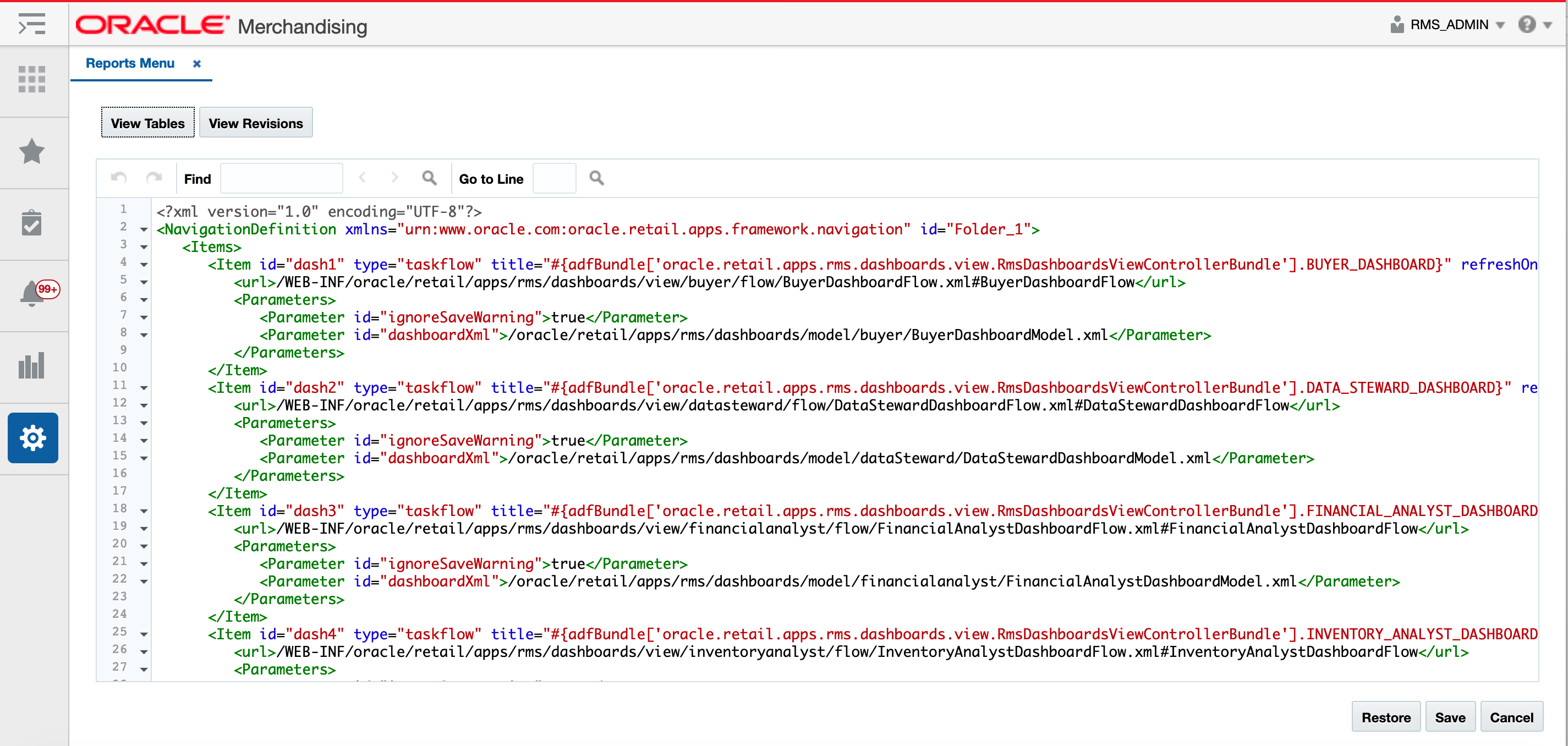
The Reports menu customization is similar to that used for the Tasks menu. The Reports menu model file consists of a hierarchy of item elements. Each element represents a menu item in the Reports menu. The item element can either be a folder or a URL, with a list of attributes and parameters that identify the task menu item.
Add New Report Menu Items
In cloud service implementations, there are two types of report menu items that can be added - a folder or a link.
Add a New Report Link
To add a new report link, starting from the Reports Menu page, select the folder in the Report table where you want your link displayed. For example, if you want to add a new link under the Finance folder in Merchandising, highlight the Finance row in the Report table. Then, click the Create iconic button (![]() ) or select Create from the Actions menu. Or, if you don't want it displayed in an existing folder, then select the Create On Top option from the Actions menu. Both options will result in a popup being displayed like shown below.
) or select Create from the Actions menu. Or, if you don't want it displayed in an existing folder, then select the Create On Top option from the Actions menu. Both options will result in a popup being displayed like shown below.
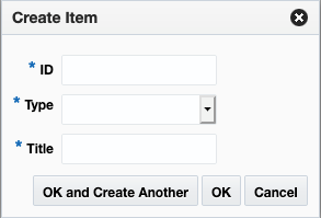
In the popup, give your link a unique ID, select the type link, and enter a business facing title. Then click OK. You should now see the new link item in the Report table. To rearrange the order that the link is displayed in a folder click on the up and down arrows (![]() ) in the Report table toolbar or click on the Move button, which will allow you to select another folder to which to move your link.
) in the Report table toolbar or click on the Move button, which will allow you to select another folder to which to move your link.
Next, you will need to configure your link using the Attributes panel. Alternatively, you can click on the View XML option and configure your link. The following attributes apply for report links:
| Attribute | Description |
|---|---|
|
URL |
The full URL for your link. If you are adding the link using the View XML option, the entire URL must be marked as character data (e.g. enclosed in CDATA). |
|
ID (id) |
Unique identifier for menu items. When adding your custom link, make sure that it does not duplicate any of the base IDs. |
|
Visible (visible) |
Indicates if the item should be rendered (visible) or not. Valid values are true (default) or false. It can also be an Expression Language (EL) expression that evaluates to true or false, such as if you want to use the application security settings to determine the visibility of your link. For example, if you want your link only visible to users with the Maintain Items privilege, then you can use the ADF |
|
Type (type) |
Indicates the type of the item. Valid values are:
An additional type (taskflow and dynamicContent) is not supported in SaaS implementations for the Report List. |
|
Title (title) |
Used to provide the user-facing title of the report link in the primary language. Required. |
|
Target (target) |
For custom links, one of the following target types can be selected:
|
|
Access Key (accessKey) |
Optional. Used to specify the keyboard keystroke or a group of keystrokes that are used to access the navigation item using the keyboard. |
|
Short Description (shortDesc) |
Optional. Used to provide the description of the navigation item which will be displayed when the user hovers over a menu item. |
The other attributes in the Report Menu page do not apply for custom menu links.
Add a New Folder
To add a new sub-folder, starting from the Report Menu page, select the folder in the Report table where you want your sub-folder displayed. For example, if you want to add a new subfolder under the Orders folder in Merchandising, highlight the Orders row in the Report table. Then click the Create iconic button (![]() ) or select Create from the Actions menu. This will result in a popup being displayed like shown below.
) or select Create from the Actions menu. This will result in a popup being displayed like shown below.

In the popup, give your folder a unique ID and enter a user-facing title. Also, select the type folder. Then click OK. You should now see the new folder in the Report table. You can optionally also configure the attributes in the Attribute panel, or using the View XML option. The parameters for folders are similar to those described in "Add a New Report Link".
To rearrange the order that the subfolder is displayed in the selected folder, click on the up and down arrows (![]() ) in the Report table toolbar or click on the Move button, which will allow you to select another folder to which to move your folder.
) in the Report table toolbar or click on the Move button, which will allow you to select another folder to which to move your folder.
To move links into this new folder, follow the steps in "Modify an Existing Report". To add new reports to this folder, follow the steps in "Add a New Report Link".
Modify an Existing Report
If you need to modify a custom link or folder you added previously, you can also do that in the Report Menu page. Also, there are some changes you can make to base links in this view, with limitations.
Rearrange Folders or Links
If you want to rearrange the order of folders or links (base or custom), highlight the link or folder to be moved in the Report table of the Reports Menu page. Then, click on the up or down arrows (![]() ) in the Report table toolbar to move the link or folder up or down within the same parent folder.
) in the Report table toolbar to move the link or folder up or down within the same parent folder.
Move Folder or Link to New Folder
If you want to move a link or folder (base or custom) to a different parent folder, then highlight the link or folder to be moved in the Report table of the Reports Menu page. Then, click the Move button in the Report table toolbar. This will open a popup where you can select the new parent folder for your folder or link.

Modify Link Attributes
If you want to modify the attributes for your custom link or folder, you can do that by highlighting the appropriate link or folder in the Report table of the Reports Menu page and editing the attributes similar to what was described in the "Add New Report Menu Items" section.
You can also do some limited editing of the attributes for base report links or folders. The attributes that can be modified for a base report link or folder are described in the table below.
| Attribute | Description |
|---|---|
|
Visible (visible) |
Indicates if the item should be rendered (visible) or not. Valid values are true (default) or false. It can also be an Expression Language (EL) expression that evaluates to true or false, such as if you want to use the application security settings to determine the visibility of your link. For example, if you want your link only visible to users with the Maintain Items privilege, then you can use the ADF Customizing this for base links should be done only in exceptional situations. Best practice is to control visibility for base links and folders based on the privileges assigned to your user's roles, or using system options settings. For more details on the privileges that control the base links and folders, see the Security Guide - Volume 2 for the applicable Merchandising solution. |
|
Title (title) |
Used to provide the user-facing title of the report item in the primary language. Required. |
|
Default Content (defaultContent) |
Indicates whether the corresponding link is displayed by default in the content area when the application is launched. This could be used to display one of the base reports or dashboards by default to a user when they log into a Merchandising solution. Valid values are true (default) or false. It can also be an Expression Language (EL) expression that evaluates to true or false, such as if you want to use the application security settings, similar to the Visible attribute. This attribute is not applicable for base folders or custom links/folders. |
|
Access Key (accessKey) |
Optional. Used to specify the keyboard keystroke or a group of keystrokes that are used to access the navigation item using the keyboard. |
|
Short Description (shortDesc) |
Optional. Used to provide the description of the navigation item which will be displayed when the user hovers over a menu item. |
The other attributes in the Report Menu page do not apply for modifying base task menu links.
Remove a Report
If you want to remove a custom report link or folder that you previously added, then highlight the link or folder in the Report table of the Reports Menu page and click on the delete iconic button (![]() ) or select Delete from the Actions menu.
) or select Delete from the Actions menu.
Note:
It is highly recommended that you don't delete any of the base report links.
Re-apply Report Customizations After Patching
If you have made any customizations to the Reports menu, then after a patch update, the changes will be lost. To re-apply your changes after patch updates, follow these steps:
-
From the Settings menu, select User Interface > Reports Menu.
-
Click the View XML button, and then from the XML view, select View Revisions.
-
This will open the Reports Menu Versions page.
-
From here, similar to the Tasks menu, you can view the base version, your customized version, or a comparison of the two. The comparison view highlights your additions and subtractions from the base model.
-
Note the customizations made - you may want to copy to a text editor, highlighting the changes as appropriate - and then click Back to return to the Report Menu Versions page.
-
Click Cancel to return to the Report Menu XML View page. Using the highlighted differences from the revision page, reapply your customizations. Then, click Save.
-
Click on the Reports menu icon (
 ) to validate that your changes have been re-applied.
Sidebar Menu
The Sidebar Menu link opens a page that allows you to modify or remove the icons available in the sidebar menu for Merchandising solutions. For example, you could hide the Quick Create option in Allocation or Pricing if you are not using that functionality.
Figure 6-7 Sidebar Menu
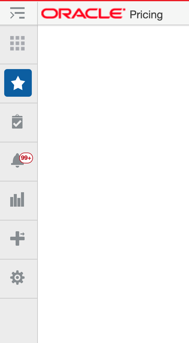
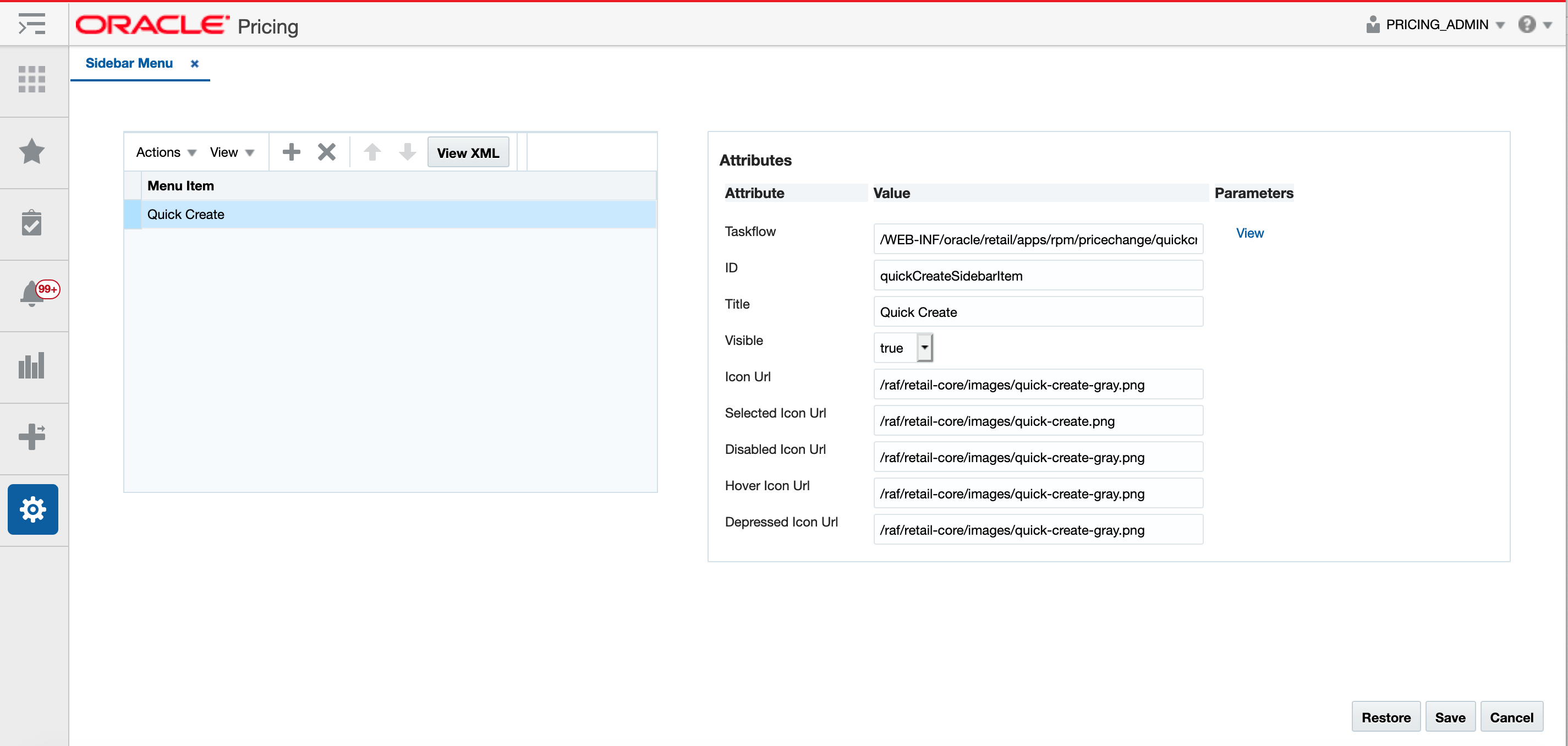
Clicking on the Sidebar Menu option under Settings displays a page like is shown below. On this page are buttons to save, restore or cancel the changes.
When you click Save, your changes will be immediately reflected in the Sidebar menu. The Cancel button closes the tab without saving the changes. The Restore button replaces the customized menu with the with the base product configuration.
Figure 6-8 Table View
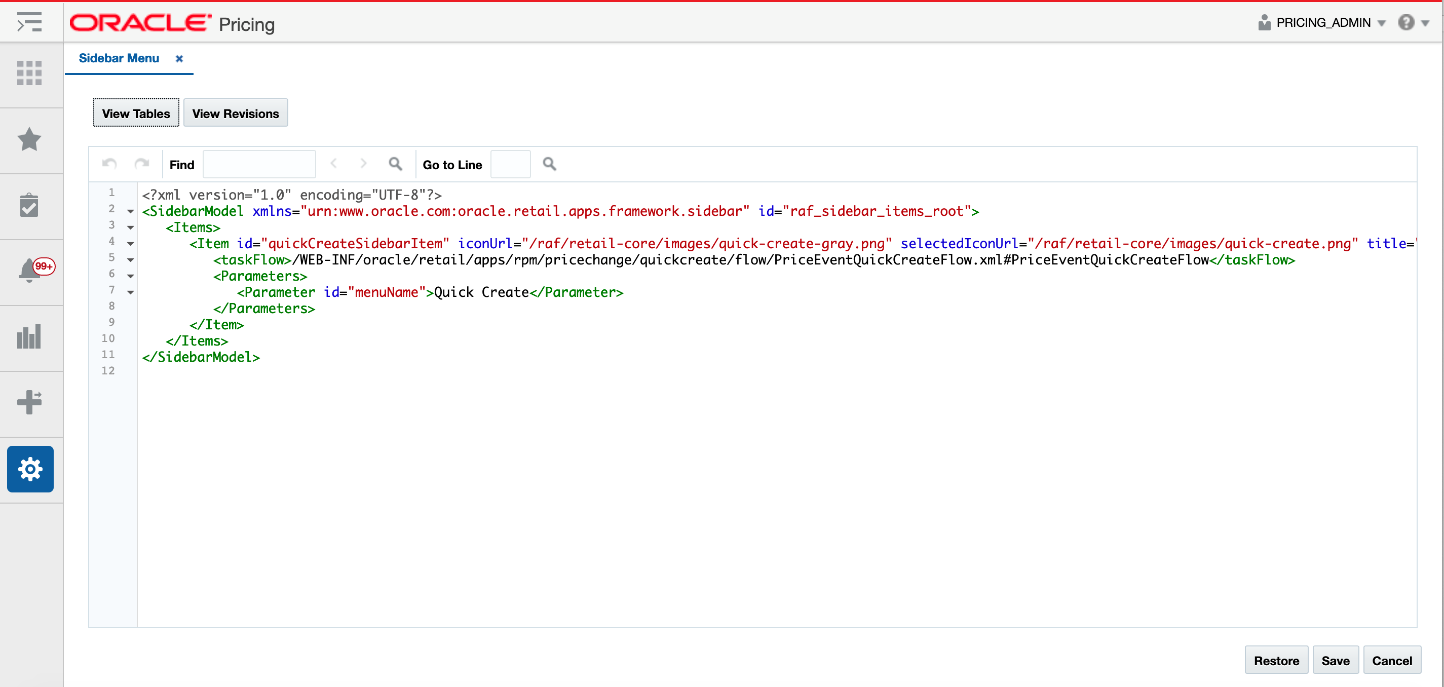
You can also click on the View XML button to view the XML version of the menu in an XML editor. The XML view contains a View Tables button which takes the user back to the tables view. The XML view also has a View Revisions button that allows you to view prior revisions of the Sidebar. This should be used to re-apply any customizations you make after a patch is applied, as customizations are not retained during patching.
Figure 6-9 XML View
Modify a Sidebar Icon
The base icons for Settings, Reports, Notifications, Tasks, and Favorites are not able to be modified. However, for Pricing, Invoice Matching, and Allocation, which have a Quick Create or Quick Match option, you are able to configure in the Sidebar Menu page. To modify the base settings, from the Settings menu, select User Interface > Sidebar Menu. Highlight the base icon to modify in the table on the left side of the page. Then, in the attributes on the right side of the page, you can do the following:
-
Update the title displayed when a user hovers over the icon
-
Update the visible attribute to determine whether or not it should be displayed (valid values are true or false)
Re-apply Sidebar Customizations After Patching
If you have made any customizations to the Sidebar, then after a patch update, the changes will be lost. To re-apply your changes after patch updates, follow these steps:
-
From the Settings menu, select User Interface > Sidebar Menu.
-
Click the View XML button, and then from the XML view, select View Revisions.
-
This will open the Sidebar Menu Versions page.
-
From here, similar to the Tasks menu, you can view the base version, your customized version, or a comparison of the two. The comparison view highlights your additions and subtractions from the base model.
-
Note the customizations made - you may want to copy to a text editor, highlighting the changes as appropriate - and then click Back to return to the Sidebar Menu Versions page.
-
Click Cancel to return to the Sidebar Menu XML View page. Using the highlighted differences from the revision page, reapply your customizations. Then, click Save. The changes should be immediately applied to the sidebar menu.
Application Navigator
The Application Navigator allows users to launch different applications from the Merchandising solution they are currently using so that they can shuffle between multiple applications based on their privileges and avoid having to open a new tab and enter a new URL to launch an application. Users can instead click on the solution from a list, which will launch that application in a new tab or window based on the browser settings.
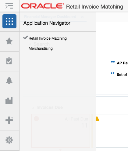
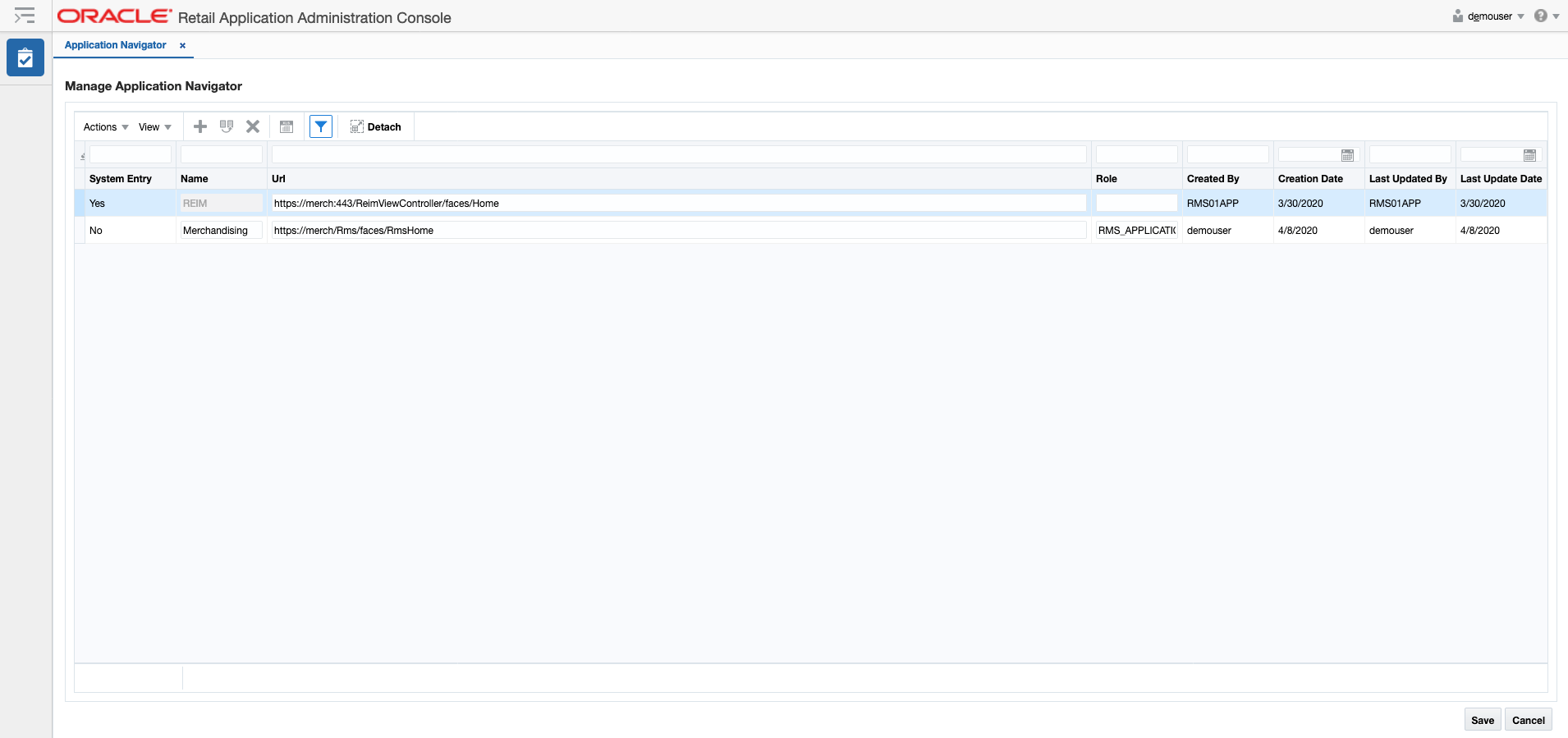
If a user has access to multiple applications (based on their defined role) you can configure their list to show all available solutions in the Application Navigator page. Otherwise only the current solution will be displayed. Clicking on the Application Navigator option in the Settings > User Interface menu will open the Application Navigator screen in the Oracle Retail Application Administrator Console (ORAAC).
Add an Application
The Add action is enabled at all times and allows an administrator to add a new URL.
-
From the Actions menu, select Add. A new, empty entry is added to the table.
-
Enter a name, the application URL, and the role to which the URL applies. The remaining columns are populated automatically. URLs for the Merchandising solutions, or other solutions used by your user community can be included here.
-
Click Save to save your changes.
Users impacted by the new URL link you've added may need to log out and back in, in order to see the changes.
Modify an Application
While all the columns on a row can be modified, only the Role and URL columns of a System record can be modified by the administrators. After making updates, click Save to save your changes.
Duplicate an Application
The Duplicate action adds a copy of each selected row below its originating row. The object name or unique identifier of the duplicate row is "Copy of <Object Name>" and appears in edit mode to prevent accidentally creating duplicate labels. This function may be helpful if you want to add the same link for multiple roles. After making updates, click Save to save your changes.
Dashboards and Reports
The Dashboard and Reports menu under Settings provides options to customize the reports displayed in Dashboards and the contextual pane in the Merchandising solutions. This can be used to add your own reports in the dashboard or in the contextual pane. Or to re-order or remove base reports from a particular dashboard or screen, or even to move base reports to different dashboards or contextual panes.
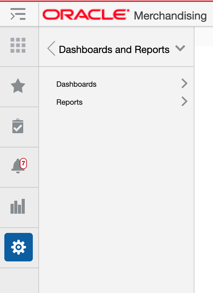
Dashboards
Dashboards are used by Merchandising solutions to surface exceptions and key metrics to users. Each dashboard is targeted for specific user roles, like the Buyer dashboard shown below. Most dashboards have two main sections - the filters and the reports.
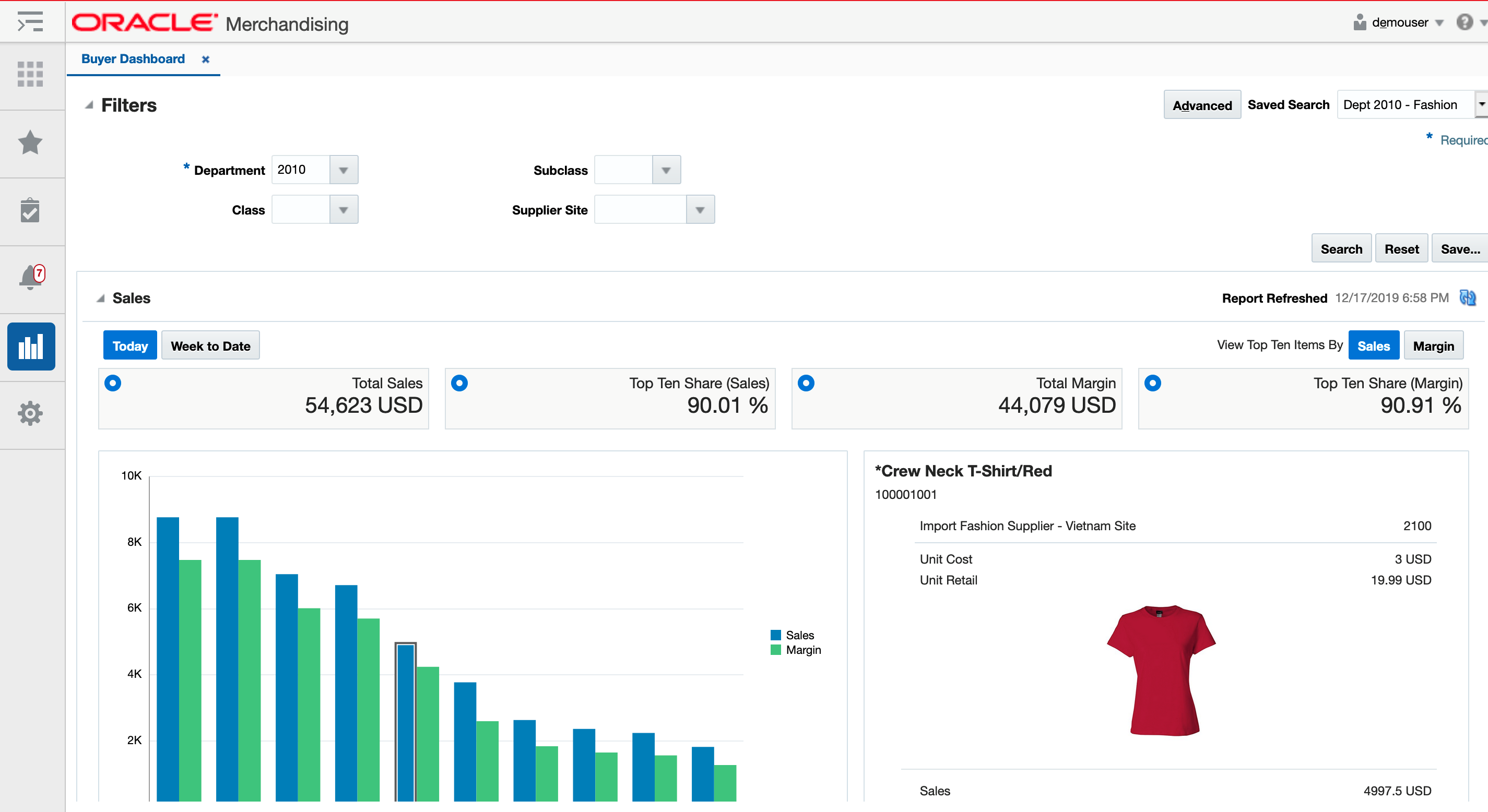
The base solutions come with pre-defined reports, which can be used. But, you can also add your own reports and re-order or remove ones that don't apply to your business. The filters cannot be modified. Adding or modifying the reports for a dashboard is done through the Settings > Dashboards and Reports > Dashboards link.
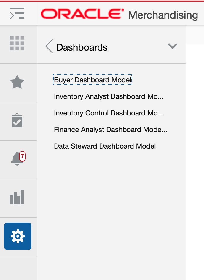
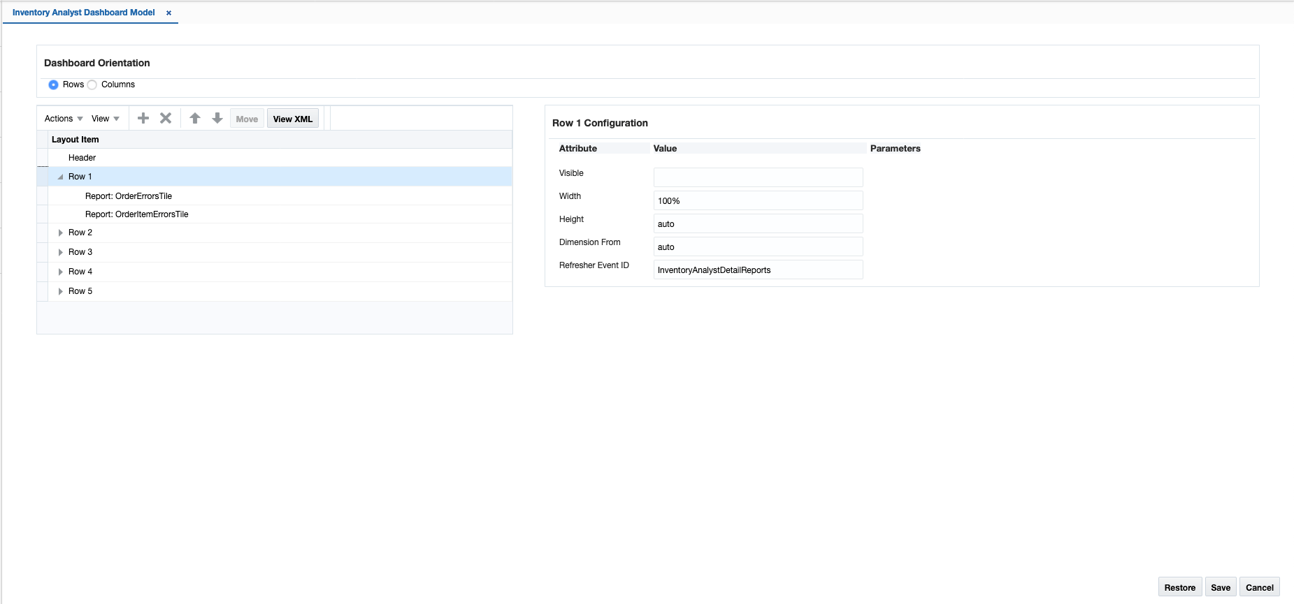
Clicking on the Dashboards option will show you a list of the available dashboards in the Merchandising solution you are logged into. To modify a dashboard, click the appropriate link. This will open the Dashboard Model page for the selected dashboard, as shown below.
In this page, you can add new reports to the dashboard, modify the appearance of existing reports, reorder the reports in the dashboard, or remove the reports from display.
When you click Save, your changes will not be immediately reflected in the dashboard if it is open. To see the changes reflected, close the dashboard and reopen it. The Cancel button closes the tab without saving the changes. The Restore button replaces the customized dashboard with the base product configuration.
Figure 6-10 Table View
You can also click on the View XML button to view the XML version of the dashboard in an XML editor. The XML view contains a View Tables button which takes the user back to the tables view. The XML view also has a View Revisions button that allows you to view prior revisions of the dashboard. This should be used to re-apply any customizations you make after a patch is applied, as customizations are not retained during patching.
Figure 6-11 XML View
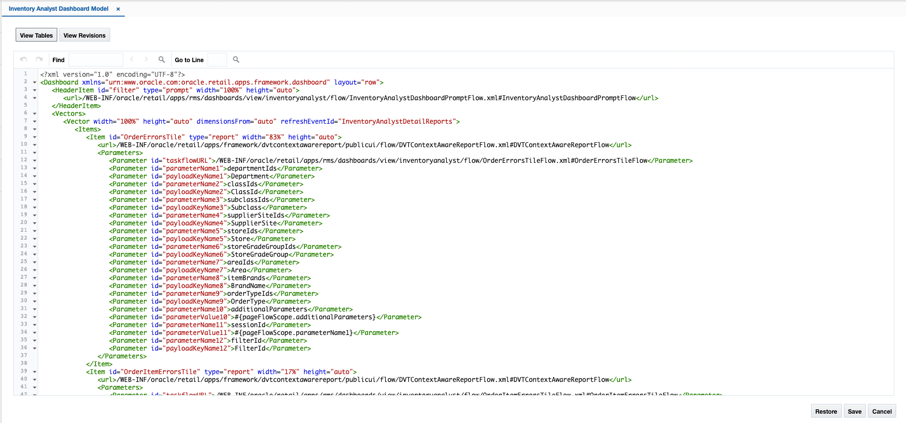
Add a Report
If you have created a custom report that you want displayed in a base dashboard, then in the Settings Menu, click on the Dashboards and Reports folder and then the Dashboard folder; then select the dashboard you wish to edit. Click the create iconic button (![]() ) in the Layout Item table toolbar, or select Create from the Actions menu. This will display a popup similar to the below:
) in the Layout Item table toolbar, or select Create from the Actions menu. This will display a popup similar to the below:
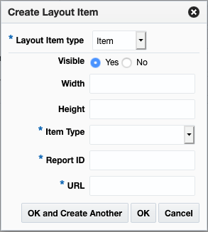
For the new report item, enter all the required fields in the popup as follows:
| Attribute | Description |
|---|---|
|
Layout Item Type |
For custom reports, the only valid value is item. |
|
Visible |
Indicate whether or not you want your report to be visible in the dashboard. Valid values are Yes (true) and No (false). The default when adding a new report will be Yes. It can also be an Expression Language (EL) expression that evaluates to true or false, such as if you want to use the application security settings to determine the visibility of your report. For example, if you want your link only visible to users with the Maintain Items privilege, then you can use the ADF |
|
Width |
Indicates the percentage of the overall width of the dashboard you want your report to be displayed in the dashboard. Usually you will want this to be 100%. |
|
Height |
Indicates how tall your report should be in the dashboard in pixels. You can also specify auto if you want the overall size of your report to determine how it is displayed. However, if you have a larger report, this may not be ideal. |
|
Item Type |
For custom reports, the only valid value is report. |
|
Report ID |
Unique identifier for your custom report. When adding your custom report, make sure that it does not duplicate any of the base IDs. |
|
URL |
In order for your report to be refreshed using the dashboard parameters, you will want to use the following for the URL in the popup. /WEB-INF/oracle/retail/apps/framework/contextawarereport/ publicui/flow/ViewContextAwareReportFlow.xml #ViewContextAwareReportFlow The actual report will be defined as an attribute parameter (see table below). |
Then click OK. You should now see your report listed in the Layout Item table. For your custom report, you will also need to configure some additional attributes and parameters. This is done by clicking the View link next to the URL link in the configuration panel, which results in the View Parameters popup being displayed. Initially this will be blank for a newly added custom report.
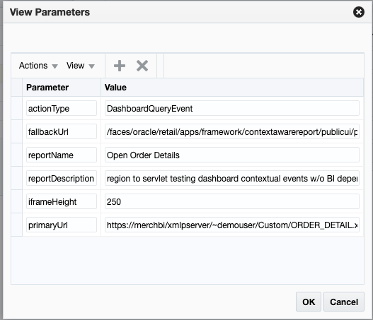
Click the Create iconic button or select Create from the Actions menu to add parameters. Below are the recommended minimum parameters that you add for your report:
| Attribute | Description |
|---|---|
|
actionType |
This should be set to DashboardQueryEvent. |
|
fallbackUrl |
Set this to the same value as you used for URL above. |
|
primaryUrl |
The full URL for your report. If it is a BI publisher report, your URL might look like this: Note that the report URL also includes references to the dashboard filters, in this case department. For a full list of the available parameters for each dashboard, see "Dashboard Parameters" in the appendix. |
|
reportDescription |
This should be a description of the report to be used by a screen reader. Required to ensure your report appears in the dashboard. |
Click OK to save your changes in the View Parameters popup. Then, click Save in the dashboard model page to save your dashboard settings.
To test the configuration, open the dashboard where you added your report to validate that it is displayed as expected.
Modify a Report
If you want to modify a custom report you added previously, you can also do that in the dashboard model page (Settings > Dashboards and Reports > Dashboards) for the applicable dashboard. Also, there are some changes you can make to base reports in this view, with limitations.
Rearrange Reports
If you want to rearrange the order of the reports in a dashboard (base or custom), highlight the report to be moved in the Layout Item table of the appropriate dashboard model page. Then, click on the up or down arrows (![]() ) in the Layout Item table toolbar to move the report up or down. If you want to move the report to a different column or row, then highlight the report to be moved in the Layout Item table of the dashboard model page. Then, click the Move button in the Layout Item table toolbar. This will open a popup where you can select the new column or row for your folder or link.
) in the Layout Item table toolbar to move the report up or down. If you want to move the report to a different column or row, then highlight the report to be moved in the Layout Item table of the dashboard model page. Then, click the Move button in the Layout Item table toolbar. This will open a popup where you can select the new column or row for your folder or link.
Add a Base Report to Another Dashboard
If you want to add one of the base reports to a different base dashboard, you can do this, provided the parameters required by the report are available in the dashboard filter where you want to add it. The easiest way to do this is to copy the XML for the base report and paste it into the new dashboard's configuration and then update naming or remove any non-required parameters from the configuration that aren't supported in the new dashboard. For example, if you wanted to also display the Incomplete Items report (on the Data Steward dashboard in the base configuration) in the Buyer Dashboard, then you'd do the following:
-
Click on Settings > Dashboards and Reports > Dashboards and open the configuration for the Data Steward dashboard.
-
Click on the View XML button to switch to the XML view.
-
Highlight the full configuration for the report with the ID IncompleteItems, including all the parameters and copy the text.
-
Click on Settings > Dashboards and Reports > Dashboards and open the configuration for the Buyer dashboard.
-
Click on the View XML button to switch to the XML view.
-
Paste what you copied from the Data Steward model in this view. Where you copy it will determine where it will be displayed in the dashboard - for example, if you want it displayed first, paste it above the configuration for DailySales. This can also be changed later following the instructions above in the Rearrange Reports section.
-
Remove any parameters that are not available in the new dashboard. For this report, that includes parameters 9-16 related to UDA values, location, create dates, item type, item level, transaction level, UDA, and season.
-
Click Save to save your changes.
Open the Buyer dashboard to validate that the Incomplete Items report is displayed as expected.
Modify Report Attributes
For custom icons, you can update any of the attributes that are described above under Add a Report. For base reports, it is recommended that you only modify the Visible property to hide a report if you do not want it displayed or only want it displayed for users with certain privileges.
Remove a Custom Report
If you want to remove a custom report that you previously added, then, in the appropriate dashboard model page, highlight the report in the Layout Item table and click on the delete iconic button (![]() ) or select Delete from the Actions menu.
) or select Delete from the Actions menu.
Note:
It is highly recommended that you don't delete any of the base reports.
Re-apply Dashboard Customizations After Patching
If you have made any customizations to a dashboard, then after a patch update, the changes will be lost. To re-apply your changes after patch updates, follow these steps:
-
From the Settings menu, select Dashboards and Reports and then select the dashboard menu model you wish to update.
-
In the dashboard model page, click the View XML button, and then from the XML view, select View Revisions.
-
This will open the Dashboard Model Versions page.
-
From here, similar to the Tasks menu, you can view the base version, your customized version, or a comparison of the two. The comparison view highlights your additions and subtractions from the base model.
-
Note the customizations made - you may want to copy to a text editor, highlighting the changes as appropriate - and then click Back to return to the Dashboard Model Versions page.
-
Click Cancel to return to the Dashboard Model XML View page. Using the highlighted differences from the revision page, reapply your customizations. Then, click Save.
-
Open the dashboard that you just updated to validate that your changes have been re-applied.
Contextual Reports
Contextual reports are available in many key workflows throughout the Merchandising suite of solutions to provide additional information to the user of a particular workflow to help in decision making. The reports are considered contextual, as they can use parameters that are published by the workflow in which it is displayed.
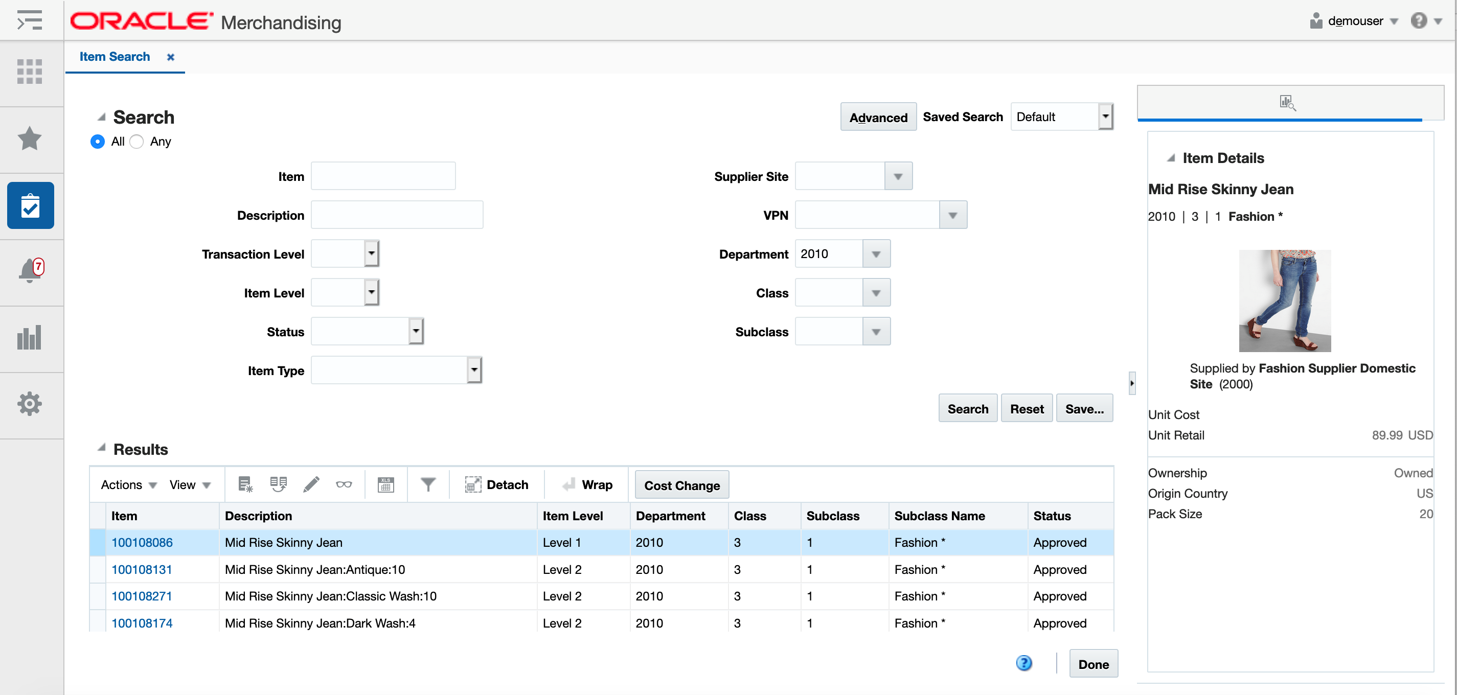
This can also be an area of extensibility, as you are able to configure your own reports as well. This is done through the Settings > Dashboards and Reports > Reports link.
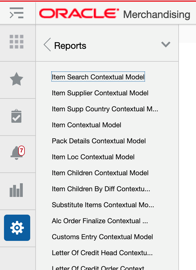
Clicking on this option will show you a list of the available pages for the Merchandising solution you are logged into that have a contextual pane enabled for contextual reports. To add, modify, or remove reports shown in a page's contextual pane, click the link for the page you wish to modify. This will open the Contextual Model page for a specific workflow.
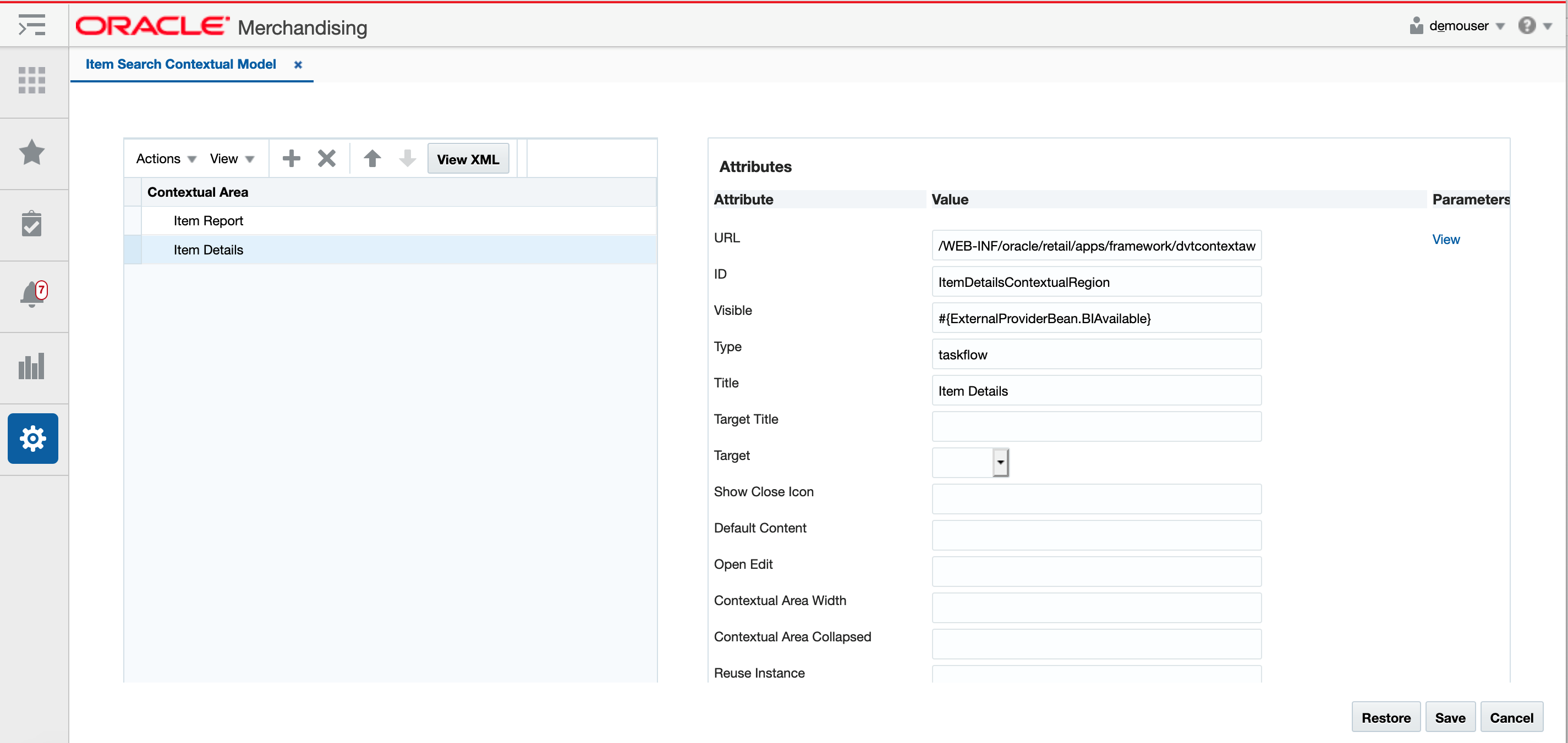
In this page, you can add new reports to the dashboard, modify the appearance of existing reports, reorder the reports in the contextual pane, or remove the reports from display.
When you click Save, your changes will not be immediately reflected in the contextual pane if it is open. To see the changes reflected, close the page with the contextual page you are modifying and re-open it. The Cancel button closes the tab without saving the changes. The Restore button replaces the customized pane with the base product configuration.
Figure 6-12 Table View
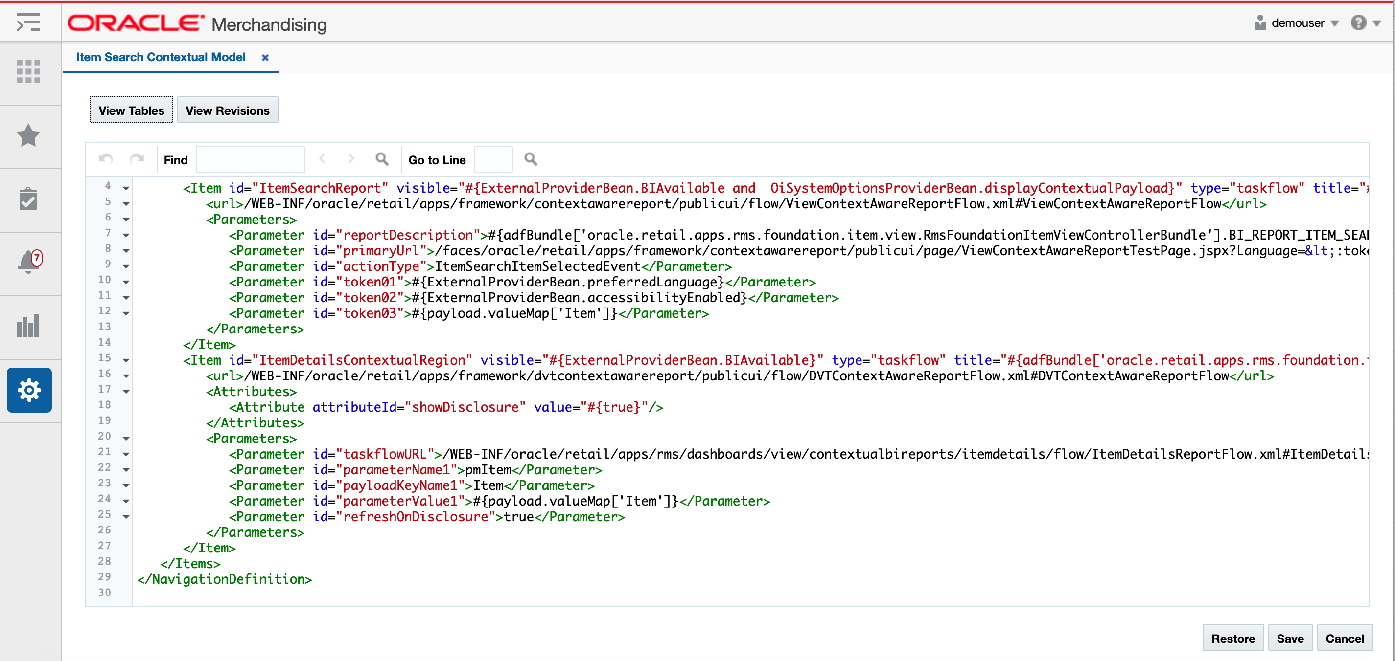
You can also click on the View XML button to view the XML version of the contextual pane in an XML editor. The XML view contains a View Tables button which takes the user back to the tables view. The XML view also has a View Revisions button that allows you to view prior revisions of the contextual pane. This should be used to re-apply any customizations you make after a patch is applied, as customizations are not retained during patching.
Figure 6-13 XML View
Add a Report
To add a new report, starting from the contextual model page, click the Create iconic button (![]() ) or select Create from the Actions menu. This will result in a popup being displayed like shown below.
) or select Create from the Actions menu. This will result in a popup being displayed like shown below.

In the popup, give your report a unique ID, select the type, and enter a business facing title. Then click OK. You should now see the new link item in the Contextual Area table. To rearrange the order that the report is displayed in the contextual pane, click on the up and down arrows (![]() ) in the Report table toolbar.
) in the Report table toolbar.
Next, you will need to configure your link using the Attributes panel. Alternatively, you can click on the View XML option and configure your report. The following attributes apply for contextual reports:
| Attribute | Description |
|---|---|
|
URL |
In order for your report to be refreshed using the contextual parameters, you will want to use the following for the URL. /WEB-INF/oracle/retail/apps/framework/contextawarereport/ publicui/flow/ViewContextAwareReportFlow.xml #ViewContextAwareReportFlow The actual report will be defined as an attribute parameter (see table below). |
|
ID (id) |
Unique identifier for the report. When adding your custom report, make sure that it does not duplicate any of the base IDs. |
|
Visible (visible) |
Indicates if the item should be rendered (visible) or not. Valid values are true or false. It can also be an Expression Language (EL) expression that evaluates to true or false, such as if you want to use the application security settings to determine the visibility of your report. For example, if you want your link only visible to users with the Maintain Items privilege, then you can use the ADF |
|
Type (type) |
Indicates the type of the item. For contextual reports, this must be taskflow. |
|
Title (title) |
Used to provide the user-facing title of the task item in the primary language. Required. |
All other attributes are not used or should be left as the default value for custom reports. However, for your custom report, you will also need to configure some additional attributes and parameters. This is done by clicking the View link next to the URL link in the configuration panel, which results in the View Parameters popup being displayed. Initially this will be blank for a newly added custom report. Below is an example when the required attributes are added.
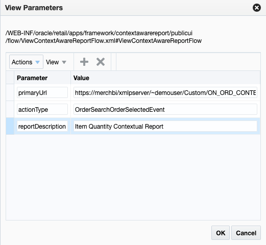
Click the Create iconic button (![]() ) or select Create from the Actions menu to add parameters. Below are the recommended minimum parameters that you add for your report:
) or select Create from the Actions menu to add parameters. Below are the recommended minimum parameters that you add for your report:
| Attribute | Description |
|---|---|
|
primaryUrl |
The full URL for your report. If it is a BI publisher report, your URL might look like this: https://<hostname>/<tenantname>/xmlpserver/~demouser/Custom/ON_ORD_CONTEXT.xdo?_xmode=4&_xf=html&_xpt=1&OrderNo=<Order> Note that the report URL also includes references to the contextual payload values, in this case order number. For a full list of the available parameters for each contextual panel, see "Contextual Parameters" in the appendix. |
|
actionType |
This should be set to an action type appropriate for the workflow where you are adding the report. See "Contextual Parameters" in the appendix for valid action types for each Merchandising solution and workflow. |
|
reportDescription |
This should be a description of the report to be used by a screen reader. Required to ensure your report appears in the contextual panel. |
Click OK to save your changes in the View Parameters popup. Then, click Save in the contextual model page to save your settings.
To test the configuration, open the page where you added your report to validate that it is displayed as expected.
Modify a Report
If you want to modify a custom report you added previously, you can also do that in the contextual model page for the applicable workflow. Also, there are some changes you can make to base reports in this view, with limitations.
Rearrange Reports
If you want to rearrange the order of the reports in a contextual pane (base or custom), highlight the report to be moved in the Contextual Area table of the appropriate model page. Then, click on the up or down arrows (![]() ) in the Contextual Area table toolbar to move the report up or down.
) in the Contextual Area table toolbar to move the report up or down.
Add a Base Report to Another Contextual Pane
If you want to add one of the base reports to a different contextual pane, you can do this, provided the parameters required by the report are available in the workflow where you want to add it. The easiest way to do this is to copy the XML for the base report and paste it into the new contextual model configuration and then update the parameters, as needed. For example, if you wanted to display the Item Details contextual report that is in the Item Search contextual pane in the base configuration, and add it to the Franchise Order contextual pane, then you'd do the following:
-
Click on Settings > Dashboards and Reports > Reports and open the configuration for the Item Search Contextual Model.
-
Click on the View XML button to switch to the XML view.
-
Highlight the full configuration for the report with the ID ItemDetailsContextualRegion, including all the parameters and copy the text.
-
Click on Settings > Dashboards and Reports > Report and open the configuration for the Franchise Order Header Contextual Model.
-
Click on the View XML button to switch to the XML view.
-
Paste what you copied from the Item Search model into this view. Where you copy it will determine where it will be displayed in the contextual pane - for example, if you want it displayed first, paste it above the configuration for FranchiseOrderHeadReport. This can also be changed later following the instructions above in the Rearrange Reports section.
-
Remove any parameters that are not available in the new workflow. In this example, none of the parameters need to be updated.
-
Click Save to save your changes.
Open the Franchise Order page to validate that the Items Details report is displayed as expected.
Modify Report Attributes
For custom reports, you can update any of the attributes that are described above under Add a Report. For base reports, it is recommended that you only modify the Visible property to hide a report if you do not want it displayed or only want it displayed for users with certain privileges.
Remove a Custom Report
If you want to remove a custom report that you previously added, then, in the appropriate contextual model page, highlight the report in the Contextual Area table and click on the delete iconic button (![]() ) or select Delete from the Actions menu.
) or select Delete from the Actions menu.
Note:
It is highly recommended that you don't delete any of the base reports.
Re-apply Contextual Report Customizations After Patching
If you have made any customizations to a contextual pane, then after a patch update, the changes will be lost. To re-apply your changes after patch updates, follow these steps:
-
From the Settings menu, select Dashboards and Reports and then select the contextual menu model you wish to update.
-
In the contextual model page, click the View XML button, and then from the XML view, select View Revisions.
-
This will open the Contextual Model Versions page.
-
From here, similar to the Tasks menu, you can view the base version, your customized version, or a comparison of the two. The comparison view highlights your additions and subtractions from the base model.
-
Note the customizations made - you may want to copy to a text editor, highlighting the changes as appropriate - and then click Back to return to the Contextual Model Versions page.
-
Click Cancel to return to the Contextual Model XML View page. Using the highlighted differences from the revision page, reapply your customizations. Then, click Save.
-
Open the page for the contextual pane you just updated to validate that your changes have been re-applied.
Label Customization
Resource Bundles
The Resource Bundles option in the customization menu has screens that allow you to customize certain labels, error messages, and list of values used by Merchandising solutions. The Resource Text Strings option provides a screen to do this customization for your primary language or other supported languages. It can also be used for adding translations for languages that are not supported in the Merchandising solutions.
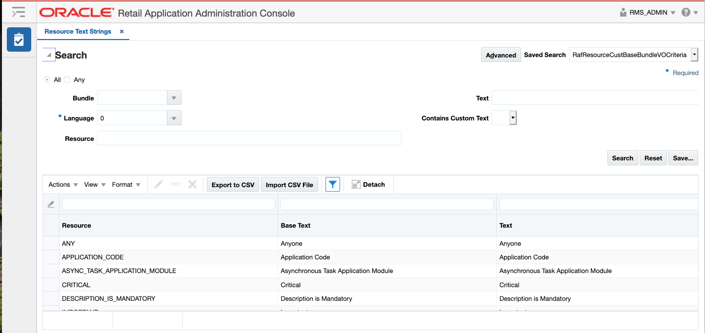
To update the description, select the language in which you want to make your updates and optionally a partial text string
to search for the instances you want to update. Then, click the Edit option in the Actions menu or the iconic button (![]() ).
).
This will open a popup where you can enter your custom text. If there are a lot of strings that require updates, you can also select to export the data to a CSV and then re-import once your changes have been applied.
The other option under Resource Bundles, entitled Imports Management, allows you to view the status of the imported files and any errors that occurred during the re-import process. This screen also allows you to import files and re-process that previously encountered errors, if you believe the issue has been corrected.
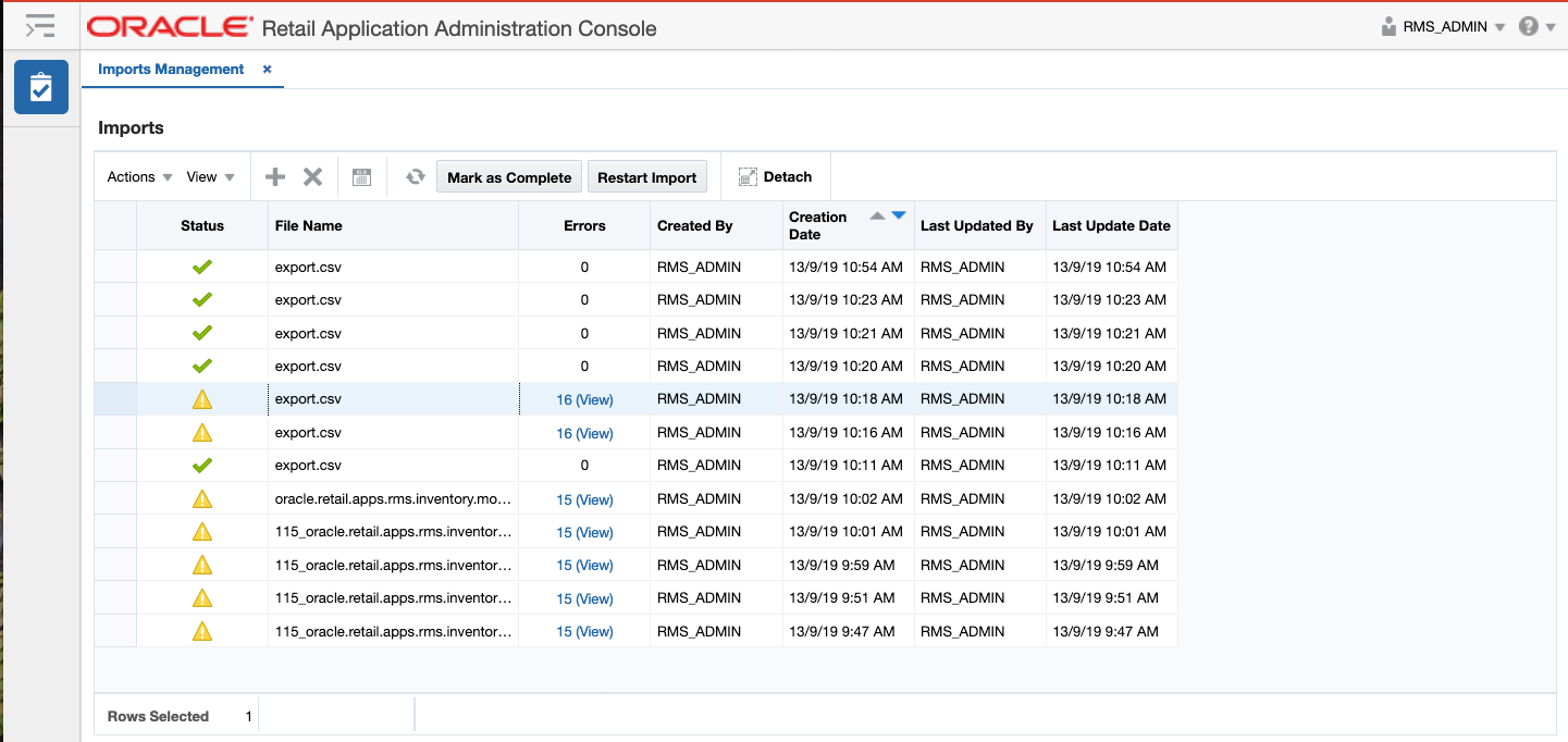
See also the "UI Platform Services" section for using ReST services for integrating label updates. If you make any changes to labels either using the screens shown here or using the service, you will need to log an SR to get support in activating the changes in your environment as it requires a server restart.
Note:
Merchandising also holds a number of labels and error messages in database tables. For information on updating these, see the Codes and Descriptions and Error Messages sections of the Oracle Retail Merchandising Implementation Guide. Updates for these two components do not require a server restart.
Dynamic Hierarchy
The Dynamic Hierarchy in Merchandising allows you to change the names of the merchandise and organizational hierarchy levels, as well as the terms used for manufacturers, distributors, wholesalers, franchisees, and countries of manufacture. This includes singular and plural values in both the default English version of the terms, as well as translated terms for all supported languages.
For example, if you want to call the fourth level of the merchandise hierarchy ‘Category’ instead of ‘Department’, you can change the corresponding tokens from ‘Department’/’Departments’ to ‘Category’ and the plural ‘Categories’. These values will be used to replace all instances of ‘Department’ and ‘Departments’ throughout Merchandising.
To change any of the provided token values, you will need to upload a .csv file containing the following
fields from the Dynamic Hierarchy Token Mapping table (DYNAMIC_HIER_TOKEN_MAP_TL):
-
LANGUAGE
-
TOKEN
-
RMS_NAME
-
CLIENT_NAME
For example:
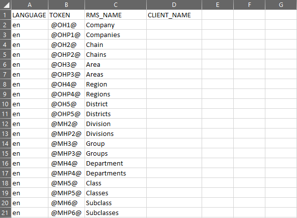
The file should be defined as follows:
-
The file should be named
dynamic_hierarchy_mapping_tl.csv -
In the
.csvfile, you only need to provide records for the tokens that need to be updated. Other token values will not be touched and should not be present in the.csvfile. -
The
client_namefield should hold the desired name to which you would like to change the label. -
Token changes for different languages can be included in this same file.
-
Do not use quotes surrounding the language, token, or name values. For example:

-
Include a newline character in the last line. This can be verified by opening the
.csvfile in a text editor such as Notepad++ rather than opening in Microsoft Excel or Open Office. The below screenshot depicts an example of how the.csvshould be defined: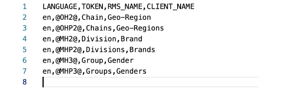
Once the file is ready, it should be uploaded through File Transfer Services using the AdminProcess storage prefix. For more details, refer to the “File Transfer Services (FTS)” section of the “ReSTful
Web Services” chapter in the Merchandising Inbound and Outbound Integration Guide found in the Help Center on the Merchandising
Foundation Cloud Service Operate & Integrate page.
The background job that executes these changes will run once every 30 minutes. Once the job has completed, the number on the notification icon in the task bar will increase and a notification will be presented in the notifications pane. You can view details of the notification in the Notifications screen as shown below:
