12 Deployment Tool
Note:
This chapter contains descriptions of features that are not supported in the current version of RPASCE. However, in order to assist in the process of migration of a pre-CE solution to the CE platform, the configuration components associated with these deprecated features remain present within the RPASCE Configuration Tools and therefore continue to be described within this document. For additional information, see Appendix – Calculation Engine User Guide in this document.
In order to create and maintain an RPASCE application, administrators make use of a number of RPASCE server utilities. Some of those utilities require specially formatted input or command files. Examples of the files include the globaldomainconfig.xml used in application partition creation and maintenance and the distwbconfig.xml used to set up and maintain distributed workbook storage.
While these files can be manually created and modified using a text editor, care must be taken not only to ensure the correctness of the information contained within the resources but also to maintain the proper XML formatting of the file. In order to assist in file creation and maintenance, the RPASCE Configuration Tools has a new tool called the Deployment Tool.
Using the Deployment Tool, it is possible to generate and modify the contents of RPASCE server utilities within a graphical user interface that represents the content of the resource with user interface controls. Content can be modified through conventional tabular interfaces and through user actions, as opposed to through manual editing of an XML file resource. The Deployment Tool will then create the appropriately formatted XML schema within the file so that it may be used by RPASCE server utilities.
Because deployment resources are not a part of a configuration, the Deployment Tool is not a part of creating or loading a configuration; instead, users launch and dismiss it separately through the Configuration Tools workbench.
General Process Flow for Generating Deployment Resources
The Deployment Tool supports the creation, inspection and modification of the following RPASCE deployment resources:
-
Workbook storage files (distwbconfig.xml)
-
Application partitioning files (globaldomainconfig.xml)
-
Online administration task description files (admintasks.xml)
For each of these resources, distributed workbook storage, global application configuration and administrative tasks, the following functionality is available:
Creation of New Resource
Perform the following steps to create a new resource.
-
Upon launching the Deployment Tool from the Utilities menu of the Configuration Tool, the user will select to create a new resource of the desired type.
-
Using the UI controls present in the view designed for the desired resource, the user will enter the information contained within the resource.
-
The user saves the created resource as a file on the user's local system.
-
Once saved, the resource must be transferred to the system containing the RPASCE application or upon which the RPASCE application will be created as a manual process. The information can then be applied to the application using the method appropriate for the resource (for example,
rpasInstallfor initialglobaldomainconfig.xmlinformation).
Modification of an Existing Resource
Perform the following steps to edit an existing resource.
-
The original resource file must be transferred from the system containing the RPASCE application to the user's local system.
-
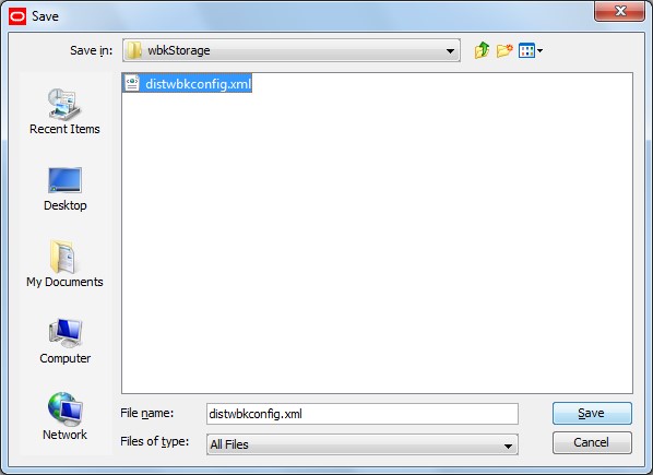
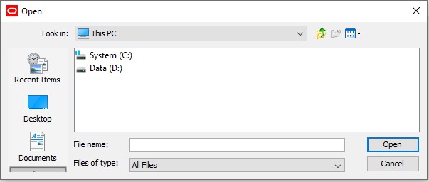
Upon launching the Deployment Tool from the Utilities menu of the Configuration Tool, the user will select to open an existing resource of the desired type. When prompted by the tool, the user will select the file on their local system.
Figure 12-2 Open Window for Opening an Existing Resource
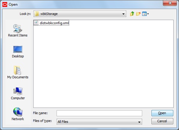
Description of "Figure 12-2 Open Window for Opening an Existing Resource" -
Using the UI controls present in the view designed for the desired resource, the user can inspect the content of the resource and modify it as desired.
-
The user saves the modified resource to their local system.
User Interface
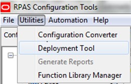
The Configuration Tools is extended with an option to open the Deployment Tool. This option is accessed as a menu item in the Utilities menu of the Configuration Tools workbench. Once opened, the Deployment Tool is represented within the Configuration Manager tree to allow users to navigate between it and any other open tools. Selecting the Deployment Tool menu item when the tool is already open will cause the tool to close; if any resource is currently being edited within the tool, the user will be prompted to save this resource before closing.
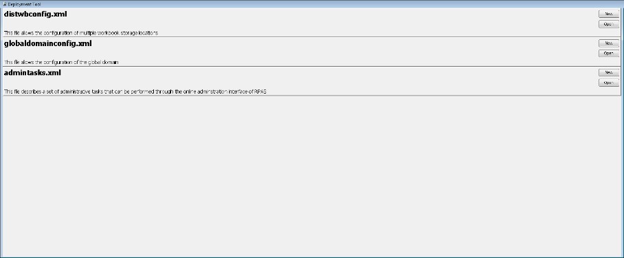
When first opened, the Deployment Tool presents the user with the set of deployment resources it supports. For each resource, the user can select between creating a new resource and opening an existing resource file.
When a new resource is created or an existing resource is opened, the Deployment Tool changes to present a resource-specific set of UI controls that can be used to specify the information for that specific resource. The user can then modify the resource and upon saving the specified information will be translated into the appropriate format. The functionality of each of these resources is described in detail in the following pages.
Navigate: In the Configuration Tools workbench pane, select Utilities and then Deployment Tool.
Result: The Deployment Tool window opens in the workspace.
Deployment Tool - Distributed Workbook Storage
The initial resource to be implemented within the Deployment Tool
is Distributed Workbook Storage or distwbconfig.xml. This resource is used to specify the locations of some storage
locations across which workbooks created for a application can be
balanced.
The initial set of workbook storage locations can be supplied at PDS creation time in the form of an XML resource. The Deployment Tool will allow users to specify the information required by this resource and will use that information to create the XML resource file on the user's local system so that it can be migrated to the RPASCE application host system and used.
Creation of a New Resource
To configure a new workbook storage location resource, click New located in the upper right-hand corner of the distwbconfig.xml resource.
Figure 12-5 Distributed Workbook Storage Resource

Description of "Figure 12-5 Distributed Workbook Storage Resource"
The Workbook Storage Locations window opens in the workspace.
The Workbook Storage Locations Window
Figure 12-6 Workbook Storage Locations Window

Description of "Figure 12-6 Workbook Storage Locations Window"
Upon creating a new storage location or upon selecting an existing partition, users will set values for the following attributes:
-
Storage location root – The location on drive that will serve as the root of the workbook storage
-
Storage location threshold – A threshold (in disk usage percentage) beyond which the storage location will not be used for the creation of new workbooks.
Figure 12-7 Workbook Storage Locations Thresholds Window
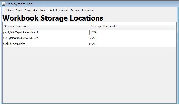
Description of "Figure 12-7 Workbook Storage Locations Thresholds Window"
Contents of distwbconfig.xml Resource
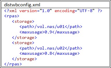
As part of the deployment information managed by Configuration Tools, design requires an extra configuration file “distwbconfig.xml" to be created. This file should contain the complete information of the distributed workbook storage, including its root directory and various parameters it may have. Meanwhile, the format of the file conforms to other similar configurations we already have.
Top node of <rpas> is needed to conform to other RPASCE configuration files. Within <rpas> tag, the <storage> tag is used to specify the settings of each workbook storage location. There can be multiple entries for <storage> within the <rpas> tag.
Within each <storage> tag, currently we require two tags:
<path> tag specifies the root directory of the distributed storage. This root directory must exist otherwise RPASCE considers the configuration as invalid and throws exception when it parses this file. However, it is not necessary for the directory to be empty at the application creation time since such storage device can be shared by multiple RPASCE applications.
Usually, the directory specifies the path that is outside the root of the global application, where the extra storage is mounted. Note that if the RPASCE administrator also wants to save workbooks under the application as before, a workbook storage location must be added where the parent directory of the application is specified in the <path>.
<maxusage> tag specifies the max usage level for the storage. If the workbook size stored in this storage location grows over this threshold, RPASCE does not allow new workbooks to be in order to prevent possible disk full failure. The level is represented as a percentage of the total volume of the storage. When specifying the safe level, we should keep in mind that workbook size usually doubles when opened due to the checkpoint directories. As a result, the administrator should allow extra room in the max usage level so that it is buffered against workbook open action. The actual percentage also depends on the typical workbook size of the application and the total storage capacity. If the typical workbook size is small while the storage device is larger, the max usage level can be higher in percentage, and vice versa.
Directory Structure of the Distributed Workbook Storage
In the configuration file, the RPASCE administrator specifies the root directory of the distributed storage, which must be an existing directory. RPASCE will manage the directory structure beneath the root directory such that it reflects the same directory structure as in a regular RPASCE application, including a directory for master application, all local application directories under the master application, users and user-id directory under each application. Eventually the workbooks will be stored within the user-id of the workbook owner.
These are the reasons to maintain similar directory structures:
The distributed storage may be shared by multiple RPASCE applications. So, the master application is needed as a direct subdirectory within the distributed storage root.
RPASCE workbook names are unique within a single application, but not unique across applications. Both ldom1 and ldom2 may have workbook t00001, though they are completely different workbooks. The local application path is put right beneath the master application directory.
In the original RPASCE application, the local application storage may be partitioned using globaldomainconfig.xml so that each local application may use a different storage. Here, since we are in the distributed storage already, no need to further complicate the local application directory. All local application subdirectories within a master application are located on the same directory level.
In other RPASCE functionality, such as workbook copy, RPASCE assumes the workbook's parent directory is the user-id and users of the application. So, the users/user-id directory must also exist in the distributed storage directory structure.
Figure 12-9 shows the directories of a Merchandise Financial Planning application with two distributed storage locations assigned to it, and a user ,john, who has already built two workbooks in a local application:
Figure 12-9 Example of Distributed Storage Directories
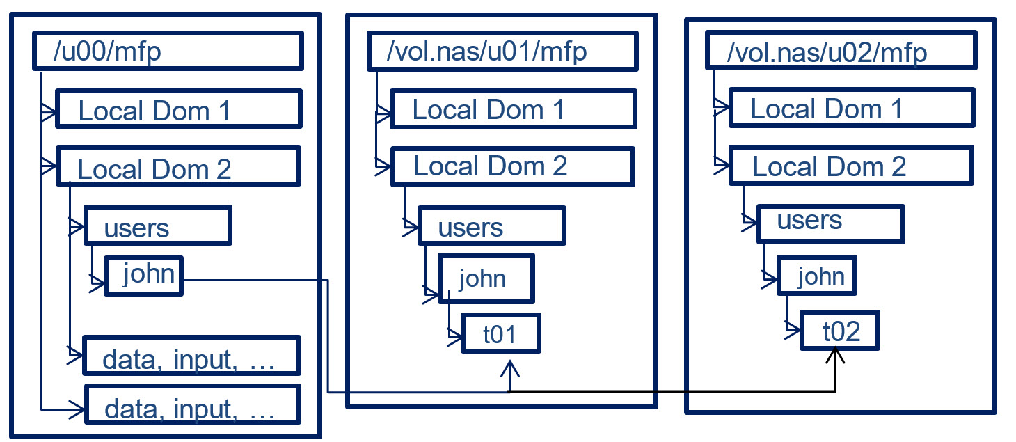
Description of "Figure 12-9 Example of Distributed Storage Directories"
If no distributed workbook storage is specified for the application, workbooks are saved exactly as before.
If the RPASCE administrator put the root directory of the application as an entry for distributed workbook storage, together with other distributed storage locations, the existing application directory will be used to store workbooks as well. The only caveat here is that RPASCE might create ldom0 right beneath the master application’s directory to store the workbook but the real local application ldom0 with its data, input, and so on, may be stored in another location as specified by globaldomainconfig.xml.
Since RPASCE only requires the root directory to exist at the time of configuration, RPASCE automatically creates any subdirectories on demand when a new workbook is to be stored in the distributed storage. As a result, actions such as adding new user, adding new local application, removing user, or removing a local application have no impact on the directory structure of the distributed storage. When a user is removed from the application, all workbooks belonging to this user are removed from the application, and from the distributed storage, but the user's directory will stay in the distributed storage, though it must be empty. When a new user is added to a application, the user's directory is created in the application, but not in the distributed storage. Only when this new user builds a new workbook, is the user's directory created in the distributed storage.
Note that the storage location should not reside inside a application or any other places which may be moved or deleted frequently or outside of the control of RPASCE. In that event, the application loses access to the workbooks in that storage.
Deployment Tool – Global Domain Configuration
This release of the Deployment Tool will include support for the creation and maintenance of the domain partitioning resource called globaldomainconfig.xml. This resource is used to specify the path to the master domain, the partition dimension in the master domain, the path to the sub-domains and the list of positions, from each sub-domains, on the partition dimension.
Figure 12-10 Global Domain Configuration Resource

Description of "Figure 12-10 Global Domain Configuration Resource"
To configure a new workbook storage location, click New located
in the upper right-hand corner of the globaldomainconfig.xml resource. You are taken to the Global Domain Configuration window.
To access an existing resource, click Open located in the
upper right-hand corner of the globaldomainconfig.xml resource. You are presented with the files saved on their local
system.
To add a sub-domain, click Add Subdomain.
Figure 12-11 Global Domain Configuration Window

Description of "Figure 12-11 Global Domain Configuration Window"
To remove a sub-domain, the user clicks the Remove Subdomain menu option.
To access an existing resource the user clicks the Open button located in the upper right-hand corner of the globaldomainconfig.xml resource. The user is presented with the files saved on their local system.
The initial set of globaldomainconfig can be supplied at domain creation time in the form of an XML resource. The Deployment Tool will allow users of the Configuration Tool to specify the information required by this resource and will use that information to create the XML resource file.
When opening an instance of this file, the user will be presented with the path to the master domain, the partition dimension in the master domain, the path to the sub-domains and the list of positions, from each sub-domain, on the partition dimension. When creating a new resource, all this information will be empty. Upon creating a new global domain configuration or upon selecting an existing global domain configuration, users will be able to set values to the following attributes:
-
Path - The path to the master domain
-
Partition Dimension – how each of the local domain must be partitioned based on position groupings.
-
Subpath – the path to the sub-domain
-
Subpositions – the list of positions, in each sub-domain, on the partition dimension.
Figure 12-12 Global Domain Configuration Sub-Domains
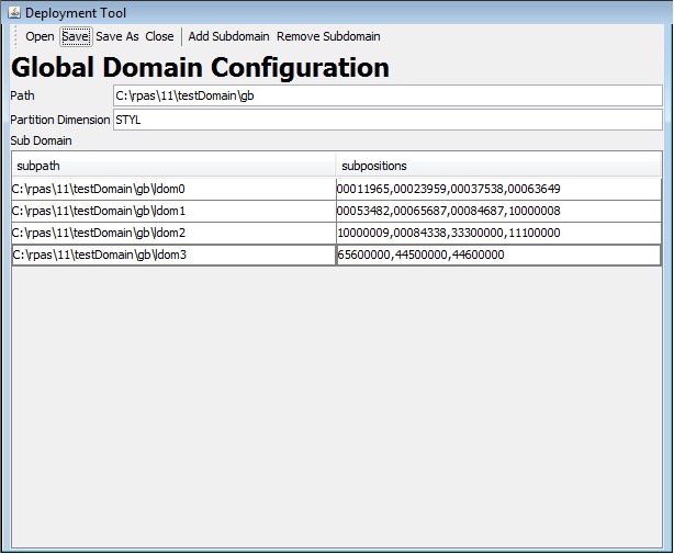
Description of "Figure 12-12 Global Domain Configuration Sub-Domains"
Deployment Tool – Online Administrative Tasks
RPASCE adds the ability for selected users of the RPASCE Client to manage the execution of server-side operations from within the client. This functionality takes the form of some standard templates that can be used to launch and monitor traditionally offline operations.
For example, administrators of RPASCE applications often have a regular data load process in which new positions enter a hierarchy, have their roll-up information modified or are retired from a hierarchy. This process is today managed by a system administrator making a call to the loadhier utility on the host system of the RPASCE application.
Using the Online Administrative interface, this task is accomplished by connecting to the RPASCE PDS through the RPASCE Client and selecting to build the Online Administration wizard (the Online Administrative workbook is implemented as a wizard-only workbook). From within the workbook wizard, the administrator (or any properly authorized user) can select the hierarchy load process from a set of tasks supported by the Online Administration functionality. The user would then specify any information the task was configured to require at the time the wizard (for example, the hierarchy or hierarchies to load) and then submit the task to the RPASCE server which would execute the necessary call to RPASCE server utilities.
These administrative task templates require a document that describes the administrative tasks that can be performed within the application. Currently, a minimum of three resources is needed to describe administrative tasks:
-
One resource to define common RPASCE administrative tasks
-
One or more resources to define application-specific administrative tasks
-
One resource to define customer-specific tasks
The ability of the system to support multiple application-specific resources allows support of PDS that contain multiple applications.
The Deployment Tool supports the creation and maintenance of administrative task resources. The Tool supports the creation of new resources and the loading, inspection, and modification of existing resources through a graphical user interface (GUI) and allows these resources to be saved to local storage so that they can be packaged and deployed to RPASCE servers.
Figure 12-13 Administrative Tasks Resource

Description of "Figure 12-13 Administrative Tasks Resource"
To configure a new administrative task resource the user clicks the New button located in the upper right-hand corner of the admintasks.xml resource. The user is taken to the Administrative Task View window.
To access an existing resource the user clicks the Open button located in the upper right-hand corner of the admintasks.xml resource. The user is presented with the files saved on their local system.
Administrative Task View
A new view has been added to the Deployment Tool to support the configuration of administrative task resources. This view is used to create a standard set of tasks packaged as a part of RPASCE, by creators of applications to create application specific tasks and by customers and/or implementers to create task resources for implementation specific tasks.
The new view supports creating new resources or opening and modifying existing resources. When a resource is created or opened, users of the Deployment Tool will be presented with a set of controls to create, modify, or remove the functional elements of the administrative task resource.
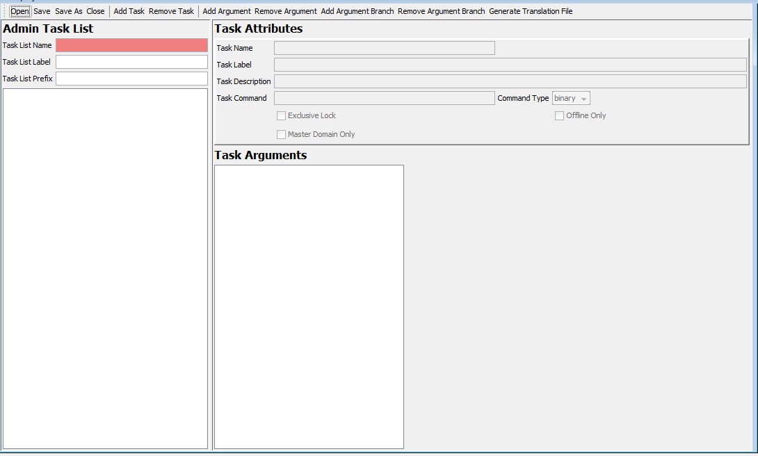
Within the view, users create and modify administrative tasks. New tasks are created through a menu bar action; existing tasks may be inspected or modified by selecting them from the administrative task list on the left side of the view. When viewing an existing task, additional menu bar actions allow the creation of arguments, argument lists and argument branches. A final set of menu bar actions will allow the removal of existing tasks, arguments, argument lists or argument branches.
Once a task is selected, the upper area of the view allows inspection and modification of task properties. Underneath the task properties is a navigation tree to allow selection of arguments, argument lists and argument branches. The center component under the task properties will be a set of controls to specify the properties of the selected argument, argument list or argument branch.
Administration Task Resource Contents
Although RPASCE will support multiple resources defining administrative tasks, each of these resources must have a common format. The resources will be stored in an XML format with a rigidly defined internal structure.
Within the administrative task resource, the following container elements are supported:
-
admin-task-list
-
admin-task
-
argument-list
-
argument-branches
-
argument-branch
-
argument
Hierarchy of Elements in the Administrative Task Resource
In addition, there are some elements used to describe properties of the container elements. Each of these elements is described later.
Admin Task List Element
Every administrative task resource will have as its root element the <rpas> element that is common to all rpas XML resources. This root element will contain a single child element, the admin-task-list element. The admin-task-list is primarily a container for the admin-task elements contained within the resource but will does support the following properties:
-
label – a user label used to describe the tasks contained within this resource
Create a New Task
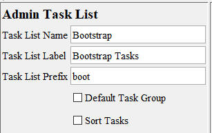
Upon creating a new task, you can set values for the following values:
-
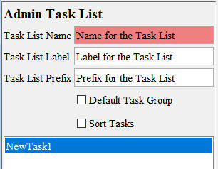
Task List Name. Text field for entering the name of the Task List.
-
Task List Label. Text field for entering the label of the Task List.
-
Task List Prefix. Text field for entering the prefix for the Task List.
-
Default Task Group. If the check box is selected, then a default task group in the Select Task page in RPASUI can be selected.
-
Sort Tasks. If the check box is selected, then the tasks within the task list will be sorted by task labels.
After the values have been entered, the user clicks Add Task to add the new task to the Task List.
Adding a new or selecting an existing task loads the properties of that task into the Task Attributes panel and populates the Task Arguments tree with the arguments (if any) defined for that task.
Remove a Task
This removes the currently selected administrative task from the list of tasks contained within this adminTasks resource.
Figure 12-16 Admin Task List with Task Selected for Removal
Description of "Figure 12-16 Admin Task List with Task Selected for Removal"
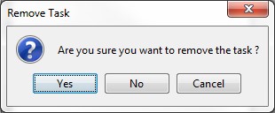
Click Remove Task and the confirmation window opens.
Click Yes to remove the task and the task is then removed from the Admin.
Task Attributes Element
Each admin-task element represents a single administration task that can be launched through the online administration interface. These elements represent an RPASCE executable or executable script. The contents of the admin-task element define the task and its properties. Each admin-task element supports the following properties:
-
Task Name – a user name identifying the administrative task
-
Task Label – a user label identifying the administrative task
-
Task Description – a longer description of the activity performed by this task
-
Task Command – the command performed by this task
-
Command Type –whether the command is an executable binary or script
-
Exclusive Lock – checked if the command requires an exclusive lock on the application; unchecked otherwise
-
Offline Only - checked if the command requires all currently active DBServer processes to be halted prior to execution of the task; unchecked otherwise
.
The administrative task view of the Deployment Tool allows users to configure values for each of the previous attributes. It will also allow users to create the argument-list element that describes the arguments to the command represented by the admin-task element.
Task Argument List Element
The argument-list element is used to describe the group of argument elements that make up the set of parameters passed to a command within an administrative task. The argument-list has no properties; it serves as a container for argument elements.
Argument Element
The argument element contains the definition of a single argument passed as a parameter to a command within an administrative task. Each argument element contains a set of properties that describe the usage and appropriate values for the argument. These properties are:
-
Argument Name – a user name identifying the argument.
-
Argument Label – a user label identifying the argument.
-
Argument Option Tag – the argument flag (an example is –d).
-
Required – checked if the argument is required, unchecked if the argument is optional.
-
Editable – unchecked if the argument can be modified within the Administrative Task Workbook, checked if the argument is fixed.
-
Value Type – User can select one value type from the drop-down list that contains the following terms: simple text, single select sort list, multi select sort list, switch-only, single select unsort list, multi select unsort list, text, date, datetime. For arguments that have a switch-only value of 0, this property holds a value for the additional parameter. If the value of the editable property is 1, then this value is a default that may be modified within the Administrative Task Workbook. If the value of the editable property is 0, then this value is fixed.
-
Default Value – Specify the default value.
To add an argument the user clicks on Add Argument. The Argument Attributes Window is opened in the workspace.
The argument is added according to the following rules:
-
If the argument tree has no selection or if the current selection is an argument not contained within an argument branch, the argument will be added to the argument list of the task.
-
If the current selection is an argument contained within an argument branch or is an argument branch, the argument will be added to the argument list of the argument branch.
Argument Branch Element
In order to support the use of RPASCE utilities that have multiple valid sets of arguments, the argument list element also allows the definition of an argument-branches element. Each argument-branches element represents a choice between sets of arguments. Argument-branches elements then in turn contain an argument element and, optionally, an argument-list element representing the arguments required by the utility when that usage of the utility is required.
As an example, consider the loadhier utility. This utility can be used to perform multiple operations:
-
loading a single hierarchy data file, executed by the –load operation
-
loading multiple hierarchy data files, executed by the –loadAll operation
-
purging hierarchy data, executed by the –purgeAll operation
In order to support the previous commands, the task definition for the loadhier utility would require an argument-branches element with three child argument-branch elements, one describing the usage for each of the three commands. When using the Administrative Task Workbook, the user would be required first to select the desired command and would then supply the information for the arguments associated with that argument list's arguments.
The argument-branch element is used to organize the arguments associated with one of the set of choices represented by an argument-branch element. Each argument-branch contains an argument element. This argument element represents the desired choice for the argument-branch. In cases where a choice in an argument-branch requires more than a single argument, an argument-branch may also optionally include an argument-list element containing the additional arguments for the branch.
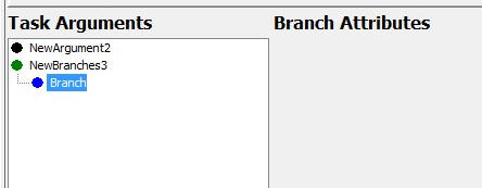
To add an argument branch, the user clicks on Add Argument Branch. This adds a new argument to the currently selected administrative task and the Branch Attributes window opens in the workspace.
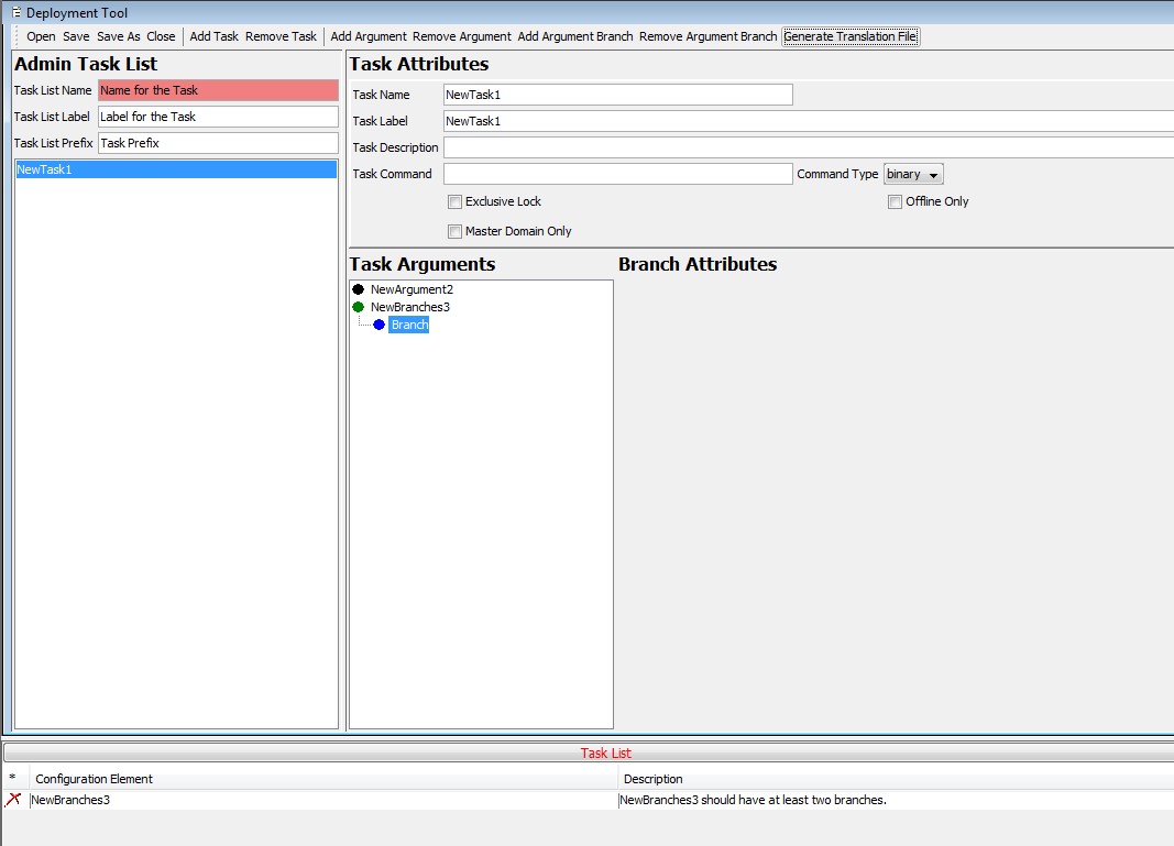
When creating argument-branches, it is required to have at least two argument-branch options. Otherwise, a configuration element error will be generated in the Configuration Tools Task List.
Figure 12-21 Task List Error Due to Only Creating One Branch
Description of "Figure 12-21 Task List Error Due to Only Creating One Branch"
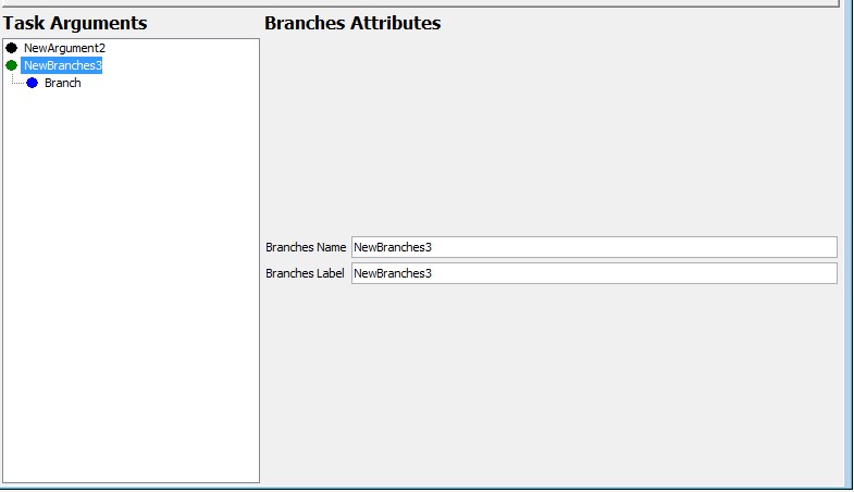
To see the Branch Attributes, highlight the desired argument branch. Selecting an argument or argument branches will populate the Argument Attribute panel with the properties of the argument or argument branch.
Figure 12-22 Argument Attribute Panel (Populated)
Description of "Figure 12-22 Argument Attribute Panel (Populated)"
Remove Argument Branch
Select Remove Argument Branch to remove the currently selected argument branch from the argument list of the administrative task. If the branch to be removed is the only branch contained within its branches, the user is prompted to allow the now-empty branches to be removed as well.
Generate Translation File
Select Generate Translation File to create a pair of resource files within the directory containing the admintask.xml currently loaded into the UI. These files can be used to support translation of the content present within the admin task list.
Figure 12-23 Generate Translation File Button
Description of "Figure 12-23 Generate Translation File Button"
You are prompted to save the admin task prior to generating the translation file. This ensures that the translation file is saved in the same directory as the admin task list xml.
Deployment Tool – Dashboard Settings Resource
The RPASCE platform contains a home page that users view and interact with when logging into the system. This page is called the Dashbord, and it provides summary information in the form of health-check metrics about a user's plans as well as summary information about exceptions present in that user's area of responsibility.
The Dashboard provides at-a-glance information in order to offer guidance to the user about areas of their information that require attention. This allows users to better organize the time and effort they spend in the application.
Within the system, a Dashboard is a hybrid of a traditional workbook containing the information backing the display and a new view representation consisting of information provided in a set of tiles, each of which can be selected to provide supporting information. The supporting information is presented in charts that display lower-level information about the summary information presented within the tile.
Because the dashboard is a hybrid of traditional RPASCE workbooks and a new visual representation, the process of configuring an RPASCE Dashboard consists of two components. First, a workbook must be configured in the application that defines the data available within the dashboard and how it is created and maintained within that workbook. Second, a resource file that defines the presentation layer configuration that determines how that information is made available in the form of tiles. Their detail charts must be created and deployed to the client tier in a manner like existing taskflow resources.
This file resource, often called the “Dashboard Settings" file, is a JSON encoded text document that contains information about the dashboard profiles and their tiles that is used by the client to organize and present the data contained within the dashboard workbook. JSON is an information encoding format similar to the XML encoding used in other parts of the platform that does not suffer from some of the limitations and security concerns in XML and is seeing wide adoption in the world of Cloud applications.
However, JSON is also a format that is new and not as widely known as XML. Like XML, it is meant primarily for machine consumption; that is, it can be difficult for humans to read and write JSON structures.
For this reason, the Deployment Tool contains an interface for the creation of the content of the Dashboard Settings resource. Using this tool, the person performing the configuration can interact with a graphical user interface that is like other Configuration Tools-based interfaces and the Tool will generate the appropriate JSON file content. Like with other Configuration Tools interfaces, this allows the people performing configuration to focus on what information they want present in the configuration (as defined in terms of measures, RPASCE views, and so on) and let the tool manage the generation of the appropriate file resources.
DashboardSettings.json View
The DashboardSettings.json View can be used to create, delete, and modify the contents of a Dashboard Settings file resource using a set of actions represented through buttons, menu items, and text forms. This information is organized around a set of entities that describe the view layer of the Dashboard, such as dashboard profiles and metric and exception tiles.
By representing this information in a user interface, the tool allows users to work with an organized form of the information that can be easily navigated and modified. Then, through the Save action, the information present within the interface can be written out into the appropriately formatted JSON file by the tool, allowing uers to concentrate on the content and allowing the tool to manage the encoding process.
The DashboardSettings.json View can be accessed from the main Deployment Tool screen through the DashboardSettings.json item. Users can either select New to initially create a Dashboard Setting configuration or select Open to load an existing resource.
Figure 12-24 DashboardSettings.json Option in Deployment Tool

Description of "Figure 12-24 DashboardSettings.json Option in Deployment Tool"
To access an existing resource, click Open which is located in the upper right-hand corner of the DashboardSettings.json entry. The user is presented with the files saved on their local system.
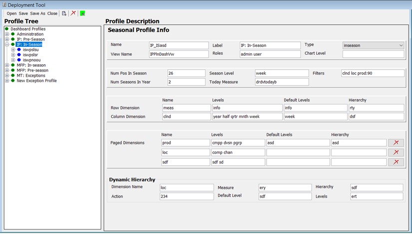
Once a dashboard settings resource is opened, its contents will be loaded into the DashboardSettings.json View.
Figure 12-25 DashboardSettings.json View with Loaded Resource
Description of "Figure 12-25 DashboardSettings.json View with Loaded Resource"
Within the DashboardSettings.json view, users are presented with a navigation pane on the left, containing a tree structure of the entities making up a dashboard settings configuration such as dashboard profiles and the tiles they contain. When an entity is selected within the navigation pane, its information is loaded into the content pane on the right. This allows users to view and modify that entity's information. Profiles and tiles can be created and deleted through actions present on the top toolbar.
DashboardSettings.json Resource Contents
The following elements make up the contents of the DashboardSettings.json resource and are described in these sections:
Note:
For additional
information on the elements of the DashboardSettings.json resource, their properties, and how they work together with the
dashboard workbook, consult the Configuring Dashboards in RPASCE chapter.
Metric Profile Element
A Metric Profile represents a collection of tiles containing metric information accessible by a user within the Dashboard. Each user typically has access to one or more profiles, depending on that user's role, and each profile aligns with an aspect of their role's responsibility. For example, users of planning applications may have access to both Pre-Season and In-Season Dashboard profiles that contain information about upcoming or current seasons, respectively. Users can select which of the profiles they wish to view through a selector control in the RPASCE Client.
Metric Profiles contain information in the form of tiles that provide summary information about their area of the business. This information often takes the form of Key Product Indicators or other health-check metrics such as actual performance versus performance in prior periods or versus the planned performance.
Metric Profiles contain not only the set of tiles that are associated with that profile but also a set of common information that defines how the Dashboard is presented when that profile is selected.
Figure 12-26 Metric Profile Information in the DashboardSettings.json View
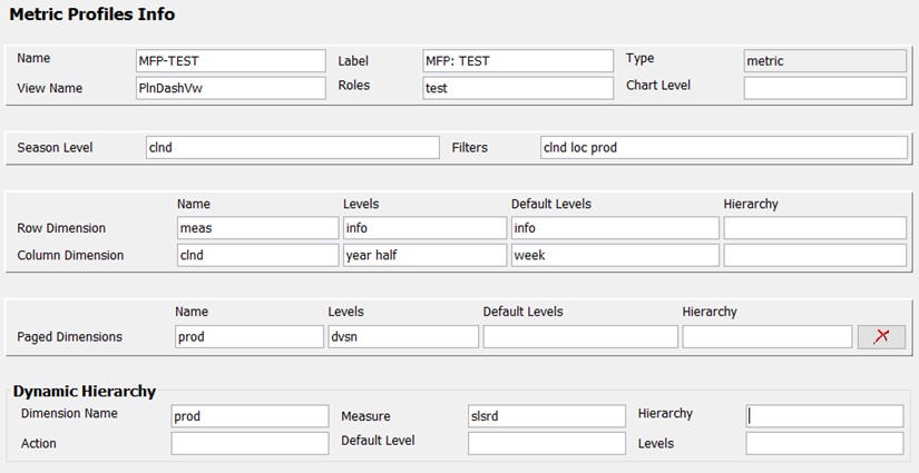
Description of "Figure 12-26 Metric Profile Information in the DashboardSettings.json View"
The set of properties defined for a Metric Profile is:
-
Name–an internal identifier for the profile.
-
Label–the user facing label for the profile.
-
Type–the type of profile will be metric. This field is read-only.
-
ViewName–the name of the view configured in the dashboard workbook that supports this profile.
-
ChartLevel–the default level to use in filters for detail charts in this profile.
-
Filters–the whitespace-separated list of dimensions that must be presented as filters in the dashboard when this profile is being displayed. In order to accommodate positions with differing position label lengths, each dimension may optionally provide a width value in the format <dimension>:<length>.
-
Dynamic Hierarchy- used to create hierarchical roll-ups based upon the attribute values of positions.
Additionally, the view contains information describing how to lay out dimensions across the row, column, and page axes of the detail chart. Each profile contains one Row Dimension, one Column Dimension, and as many additional paged dimensions as are needed, based upon the intersection of the view configured in the View Name.
The properties defined for a dimension entry are:
-
Name–the name of the dimension being assigned.
-
Levels–the set of levels in the assigned dimension that must be made available in the chart filter controls.
-
Default Level–the initial level in the dimension that must be selected within the chart filter controls.
To add a new metric profile to the dashboard settings configuration, click Add Metric Profile action (located under Add) from the toolbar. A new profile entry is added to the navigation pane and selected in the content pane so that its information can be entered.
To remove an existing metric profile from the dashboard settings configuration, select the profile and click Remove from the toolbar. A confirmation window opens.
Click Yes to remove the current metric profile from the configuration.
Seasonal Profile Element
The properties defined for a Seasonal Profile are:
-
Name–an internal identifier for the profile.
-
Label–the user facing label for the profile.
-
Type–the type of profile. Supported types include preseason, inseason, and exceptions. Seasonal profiles must use either preseason or inseason from the drop-down field.
-
ViewName–the name of the view configured in the dashboard workbook that supports this profile.
-
ChartLevel–the default level to use in filters for detail charts in this profile.
-
Num Pos In Season–the number of positions in the seasonLevel that make a season.
-
Num Seasons In Year–the number of seasons in a calendar year. In cases where the product of the numPosInSeason and NumSeasonInYear values does not align with a calendar year, the dashboard will build with a logged warning.
-
Filters–the whitespace-separated list of dimensions that must be presented as filters in the dashboard when this profile is being displayed. In order to accommodate positions with differing position label lengths, each dimension may optionally provide a width value in the format <dimension>:<length>.
-
Dynamic Hierarchy–used to create hierarchical roll-ups based upon the attribute values of positions.
Figure 12-27 Seasonal Profile Information in the DashboardSettings.json View
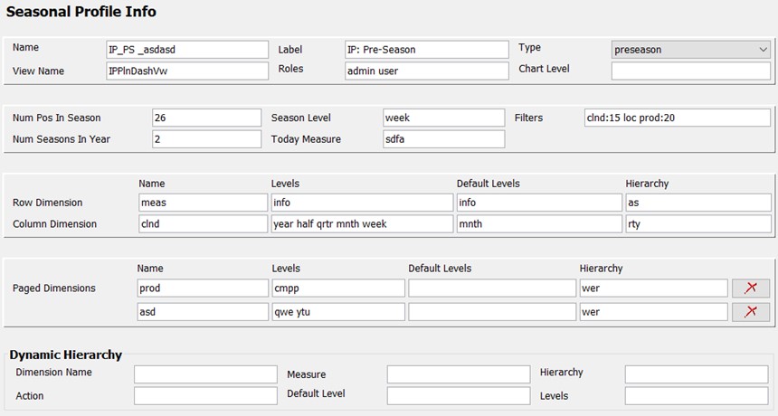
Description of "Figure 12-27 Seasonal Profile Information in the DashboardSettings.json View"
Additionally, the view contains information describing how to lay out dimensions across the row, column, and page axes of the detail chart. Each profile contains one Row Dimension, one Column Dimension, and as many additional paged dimensions as are needed, based upon the intersection of the view configured in the View Name.
The properties defined for a dimension entry are:
-
Name–the name of the dimension being assigned.
-
Levels–the set of levels in the assigned dimension that must be made available in the chart filter controls.
-
Default Level–the initial level in the dimension that must be selected within the chart filter controls.
To add a new metric profile to the dashboard settings configuration, click Add Seasonal Profile (located beneath Add) from the toolbar. A new profile entry is added to the navigation pane and selected in the content pane so that its information can be entered.
To remove an existing metric profile from the dashboard settings configuration, select the profile and click Remove from the toolbar. A confirmation window opens.
Click Yes to remove the current seasonal profile from the configuration.
Exception Profile Element
An Exception Profile represents a collection of tiles containing exception information accessible by a user within the Dashboard. As with Metric Profiles, a configuration can contain multiple Exception Profiles, and different users may have access to one or more of the available profiles, based upon their role.
Unlike Metric Profiles, Exception Profiles containing tiles that report on the count and nature of exceptions as defined by the application are intended, in an exception-driven planning model, to provide guidance to the user about what aspects of the business require their time and attention.
Exception Profiles contain not only the set of tiles that are associated with that profile but also a set of common information that defines how the Dashboard as a whole is presented when that profile is selected.
Figure 12-28 Exception Profile Information in the DashboardSettings.jsonView
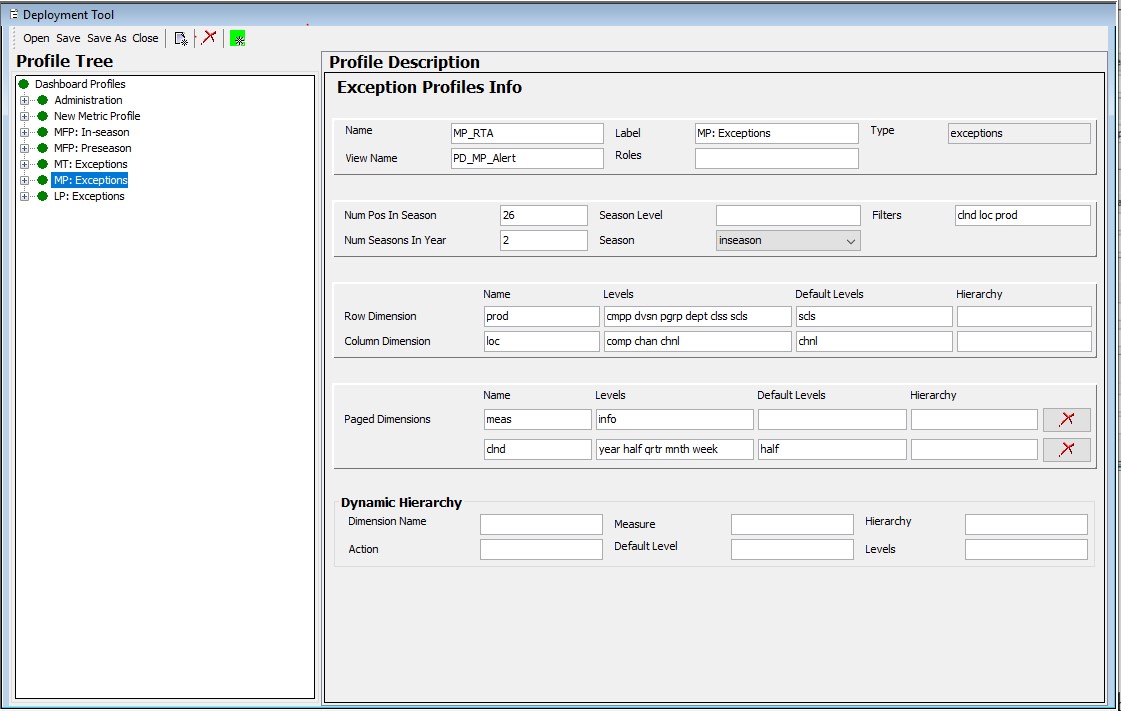
Description of "Figure 12-28 Exception Profile Information in the DashboardSettings.jsonView"
The properties defined for an exception profile are:
-
Name–an internal identifier for the profile.
-
Label the user-facing label for the profile.
-
Type–the type of profile is exceptions. This is a read-only field.
-
ViewName–the name of the view configured in the dashboard workbook that supports this profile.
-
Num Pos In Season–the number of positions in the seasonLevel that make a season.
-
Num Seasons In Year–the number of seasons in a calendar year.
-
seasonLevel - the level in the calendar dimension used to define a season in conjunction with the numPosInSeason and numSeasonInYear attributes (for example, week)
-
season - the seasonality timeframe that this Exception dashboard profile can show. This season property can be set to either inseason, preseason, or both. If none is specified, then this property defaults to inseason.
-
Filters-the whitespace-separated list of dimensions that must be presented as filters in the dashboard when this profile is being displayed. In order to accommodate positions with differing position label lengths, each dimension may optionally provide a width value in the format <dimension>:<length>.
-
Dynamic Hierarchy–used to create hierarchical roll-ups based upon the attribute values of positions.
Additionally, the view contains information describing how to lay out dimensions across the row, column, and page axes of the detail chart. Each profile contains one Row Dimension, one Column Dimension, and as many additional paged dimensions as are needed, based upon the intersection of the view configured in the View Name.
When created, a Dashboard Profile (Metric/Seasonal/Exception) contains no Page Dimension entries. Click Add Page Dimensions (inside the asterisk button from the tool bar) to add entries.
Click Remove (located within the page dimension entry) to remove Page Dimension entries for the Dashboard Profile (Metric/Seasonal/Exception).
Figure 12-29 Page Dimension Entry Showing Remove

Description of "Figure 12-29 Page Dimension Entry Showing Remove"
The properties defined for a dimension entry are:
-
Name–the name of the dimension being assigned.
-
Level– the set of levels in the assigned dimension that must be made available in the chart filter controls.
-
Default Level–the initial level in the dimension that must be selected within the chart filter controls.
-
Hierarchy–the hierarchy (for dimensions with multiple hierarchies) to be used within the filters of the dashboard.
To add a new exception profile to the dashboard settings configuration, click Add Exception Profile (located beneath Add) from the toolbar. A new profile entry is added to the navigation pane and selected in the content pane so that its information can be entered.
To remove an existing exception profile from the dashboard settings configuration, select the profile and click Remove in the toolbar. A confirmation window opens.
Click Yes to remove the current exception profile from the configuration.
Dynamic Hierarchy Element
Dynamic Hierarchy represents the following information:
-
Dimension Name–this name must match with either of the row, column or paged dimensions. This indicates to which dimension the dynamic hierarchy is linked.
-
Measure–the name of the measure that is meant to hold the user's selection of the attribute to be used in the attribute roll-up.
-
Hierarchy–the hierarchy that contains the attribute roll-up. The dashboard only supports the use of a single hierarchy (for dimensions with multiple hierarchies) within the chart filters.
-
Action–the menuId property of the menu item that performs the dynamic hierarchy operation in the workbook. This value is accessible in both the tmpl.cfg file generated for the dashboard workbook as well as in the .xml file that contains the configuration of the dashboard workbook.
-
Default Level–the default level to display in the filters of the dashboard when the dynamic hierarchy is active.
-
Levels–a JSON array of the levels present within the hierarchy created by the dynamic hierarchy operation.
Metric Tile Element
A Metric Tile provides information about a specify KPI or other health-check information. Each tile provides the value of the corresponding metric scoped to the set of positions defined by the filters of the dashboard profile containing the tile. Each tile can support zero, one, or two supporting metrics to provide additional information about the main metric.
The configuration of a Metric Tile consists of supplying information about the metrics displayed in that tile as well as information used to create the detail chart that is displayed when that tile is selected in the Dashboard.
Figure 12-31 Metric Tile Information in the DashboardSettings.json View

Description of "Figure 12-31 Metric Tile Information in the DashboardSettings.json View"
The set of properties defined for a Metric Tile is:
-
Measure–the measure containing the information to be displayed in the metric tile and its supporting chart.
-
Inserted–true if the tile must be initially visible in the profile. Users may show and hide available tiles from within the Client.
-
Tiles ID - a string that serves as a unique identifier for the tile. This property can be used when more than one metric tile contains information for a single measure (for example, the same base value with different comparison metrics in each tile). This property is optional; if a value is not provided, the value for measure will be used. However, when multiple tiles use a single measure, the UI may not be able to provide the correct information for things such as tile description.
-
Description - a short description of the information provided by the tile that can be displayed in the tile info Window.
The Metric Tile element can contain yAxisFormat. For yAxisFormat properties, see "Configuring the Unit of Measurement Display in Dashboards".
To add a new metric tile to the current metric profile, select the metric and click Add Metric Tile action (located beneath Add) in the toolbar. A new tile entry is added to the navigation pane and selected in the content pane so that its information can be entered.
To remove an existing metric tile from the dashboard settings configuration, select the tile and click Remove in the toolbar.
The confirmation window opens.
Click Yes to remove the current metric tile from the configuration.
Comparison Metric Tile Element
The properties defined for a Comparison Metric Tile are:
Figure 12-32 Comparison Metric Tile Information in the Dashboard Settings JSON View

Description of "Figure 12-32 Comparison Metric Tile Information in the Dashboard Settings JSON View"
-
Measure–the name of the measure that is the primary metric displayed in the tile.
-
Content Measures –an optional list of measures to be used within the supporting chart for this tile. If no value is given, then the measures used in the tile will be displayed within the chart.
-
Chart Type–the type of chart to display for this metric tile. Supported values are bar and line.
-
Sub Measures–an optional list of measures to be displayed underneath the main metric within the tile. Space on the tile constrains the maximum number of subMeasures to three.
-
Inserted–true if the tile must be initially visible in the profile. Users may show and hide available tiles from within the Client.
-
Tiles ID - a string that serves as a unique identifier for the tile. This property can be used when more than one metric tile contains information for a single measure (for example, the same base value with different comparison metrics in each tile). This property is optional; if a value is not provided, the value for measure will be used. However, when multiple tiles use a single measure, the UI may not be able to provide the correct information for things such as tile description.
-
Description - a short description of the information provided by the tile that can be displayed in the tile info Window.
-
Sort Measures–an optional list of measures that can be used to sort the information displayed within the chart. The contents of the sortMeasures array are a list of JSON objects with the following properties:
-
Measure–The name of the measure that is used to order the chart.
-
Ascending–True or false, depending on whether the ordering must be ascending (true) or descending (false).
-
-
DualY–a JSON object used to support the use of dual-Y axis scales. By specifying the dualY property, it is possible to display a secondary set of values with independent scaling, either within the same chart as other measures or in a secondary chart displaying underneath the primary chart. The properties supported by DualY are:
-
measure – A list of measures to display in a splitY chart.
-
splitDualY– Either on or off. When on, the dualY measures displays in a separate chart. When off, a single chart with two y-axis scales will be displayed.
-
splitterPosition–When splitDualY is set to on, this value will provide the ratio of space on the y axis to be given to each of the displayed charts. Valid values are 0 to 1.
-
The Comparison Metric Tile element can contain yAxisFormat. For yAxisFormat properties, see "Configuring the Unit of Measurement Display in Dashboards".
To add a new comparison metric tile to the current metric profile, click Add Comparison Metric Tile (located beneath Add) in the toolbar. A new tile entry is added to the navigation pane and selected in the content pane so that its information can be entered.
To remove an existing comparison metric tile from the dashboard settings configuration, select the tile and click Remove in the toolbar.
The confirmation window opens.
Click Yes to remove the comparison metric tile from the configuration.
Metric Tile Variance Element
Metric Tiles can be configured to supplement the metric they display with up to two supporting metrics. The supporting metrics can provide additional information about the metric in question, such as variance from performance to performance in a prior period or to planned performance.
These supporting metrics are often configured as variances, and the Dashboard supports the ability to specify threshholds for those variances. Should the variance fall higher or lower than a certain threshold, the Metric Tile will present represent that information through a color-coding scheme:
-
Blue–tile contains no supporting metrics or no thresholds defined on those supporting metrics.
-
Green–tile contains at least one supporting metric with a defined threshold but the value is in the defined acceptable range.
-
Yellow–tile contains at least one supporting metric with a Severe threshold defined and the value is out of the acceptable range of the Severe threshold but supporting metric does not contain a Critical threshold or value is in the acceptable range for that Critical threshold.
-
Red–tile contains at least one supporting metric with a Critical threshold defined, and the value is out of the acceptable range for that Critical threshold.
Information about supporting metrics for a metric tile as well as threshold information for those tiles that require it is configured through the Metric Tile Variance element and its child elements, the Left Variance and Right Variance elements (for the left and right slots in the tile, respectively. Each of these elements is covered later.
Figure 12-33 Variance information in the DashboardSettings.json View

Description of "Figure 12-33 Variance information in the DashboardSettings.json View"
Variance elements are automatically created for every metric tile added to the configuration. However, they only need to be configured for those metric tiles that make use of supporting metrics. Single-metric tiles need not provide values for the variance element.
The set of properties defined for a variance element is:
-
Medium Threshold Value–the value that sets the severity threshold for evaluation of variances.
-
High Threshold Value–the value that sets the Critical threshold for evaluation of variances.
Additionally, variance elements must contain either of a Left Variance, a Right Variance, or both a Left Variance and Right Variance element. These elements contain information about the supporting metrics and how they should be presented within the Tile and within the detail chart displayed when the tile is selected.
Figure 12-34 Supporting Metric Information in the DashboardSettings.jsonView

Description of "Figure 12-34 Supporting Metric Information in the DashboardSettings.jsonView"
Within the Sub Variance Tiles Info panel is located the Thresholds entity. It has the following three fields:
-
Severity–sets the severity level to high, medium or low based on the severity
-
Comparison–sets the comparison operators (‘>', ‘<', ‘=')
-
Value–sets the severity value
Thresholds entry can be removed by clicking the Remove button () located within each threshold's entry.
The properties defined for a Left Variance or Right Variance element are:
-
Measure–the measure containing the value to display in the tile and use for the evaluation of thresholds.
-
Plan–a short label to identify the supporting value in the tile.
-
Chart Measure–the measure whose data should be displayed within the detail chart for this tile when it is selected.
To add a supporting metric to a tile, select the tile's variance element and click either Add Left Tile or Add Right Tile (located beneath Add) in the toolbar (to create an entry for the left or right slots, respectively). A new left or right variance element is added to the navigation pane and selected in the content pane so that its information can be entered.
To remove an existing left or right variance element from the configuration, select the element and click Remove in the toolbar. A confirmation window opens.
Click Yes to remove the selected left or right variance element from the configuration.
Exception Tile Element
An Exception Tile contains information about a specific defined exception condition defined within the application. Each tile provides information to identify the exception and to provide a count of the number of violations of the exceptions condition, both in total for the set of positions currently selected within the profile filters but also broken down to provide the number of unique positions in one or more dimensions that contain exceptions for example, the number of sub-classes containing at least one exception).
Additionally, many Exception Tiles contain information to allow them to participate in the workflow designed to resolve the exception. These tiles provide the options to perform a launch from the Dashboard into a new or existing workspace for a step defined as the appropriate place to resolve the exception and to initiate Alert Navigation Mode for the appropriate Real Time Alert defined within that step.
Note:
For more information on Alert Navigation Mode in the RPASCE client, see the Real Time Alerts chapter in Oracle Retail Predictive Application Server Cloud Edition User Guide.
Configuring an Exception Tile consists of providing information about the exception to be displayed and optionally information to support the ability to launch from the Dashboard into the appropriate step and Real Time Alert to resolve the exception.
Figure 12-35 Exception Tile Information in the DashboardSettings.jsonView
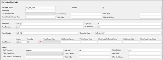
Description of "Figure 12-35 Exception Tile Information in the DashboardSettings.jsonView"
The set of properties defined for an Exception Tile is:
-
Exception Tile ID–an internal name to identify the tile.
-
Inserted–true if the tile must be initially visible in the profile. Users may show and hide available tiles from within the Client.
-
Hit Measure–the measure containing exception hit count information for the tile.
-
Top Count–the number of positions in Top Dimension to display within the detail chart for the tile.
-
Top Dimension–the dimension used to organize hit count information in the detail chart. In the chart, the information is displayed as a series of charts, one for each position in Top Dimension being displayed.
-
By Dimension–the dimension forming the series displayed in the charts created for the positions of Top Dimension.
-
Open Template–the template into which the user can launch to resolve the exception displayed in the tile.
-
Open Alert Name–the Real Time Alert in the configured template that is used to drive the exception resolution in Alert Navigation Mode. The value entered for this property must match the case of the name of the Real Time Alert.
-
Sort Measures–an optional list of measures that can be used to sort the information displayed within the chart. The contents of the sortMeasures array are a list of JSON objects with the following properties:
-
DualY–a JSON object used to support the use of dual-Y axis scales. By specifying the dualY property, it is possible to display a secondary set of values with independent scaling, either within the same chart as other measures or in a secondary chart displays underneath the primary chart. The properties supported by DualY are:
-
measure – A list of measures to display in a splitY chart.
-
splitDualY– Either on or off. When on, the dualY measures display in a separate chart. When off, a single chart with two y-axis scales will be displayed.
-
splitterPosition–When splitDualY is set to on, this value will provide the ratio of space on the y axis to be given to each of the displayed charts. Valid values are 0 to 1.
-
The Exception Tile element can contain yAxisFormat. For yAxisFormat properties, see "Configuring the Unit of Measurement Display in Dashboards".
To add a new exception tile to the configuration, select an exception profile and click Add Exception Tile (located beneath Add) in the toolbar. A new exception tile is added to the navigation pane and selected in the content pane so that its information can be entered.
To remove an existing tile from the configuration, select the tile and click Remove in the toolbar. A confirmation window opens.
Click Yes to remove the tile from the configuration.
Creating Dashboard Profiles: Two Examples
This section provides two examples that describe how to initially create Dashboard Profiles using the Deployment Tool. Refer to previous sections of this chapter for questions about the GUI components within the Deployment Tool.This section focuses on the business logic in configuring the profiles. The unit of measurement formatting, that is, the yAxisFormat, can be applied to the Dashboard Profile Tiles such as Metric Tile, Comparison Metric Tile, or Exception Tile, Sort Measures, or Dual Y-Axis. See Configuring Dashboards in RPASCE for detailed examples of the Y-Axis Format.
Example 1: Creating a Dashboard Seasonal Profile
The process for creating Metric and Seasonal Profiles are very similar. This example describes the creation of a seasonal profile, including the definition of one metric tile within that profile. Starting from an (nearly) empty file, each step of the profile creation process using the Configuration Deployment Tool is described.
Creating a Seasonal Profile
From the Configurator, select New to initially create a Dashboard Setting Configuration or select Open to load an existing resource and then delete the content of that resource in order to create the blank one. Figure 12-36 shows a blank Dashboard Setting Configuration.
Figure 12-36 Blank Dashboard Setting Configuration

Description of "Figure 12-36 Blank Dashboard Setting Configuration"
Next, create a new Seasonal Profile, shown in Figure 12-37.
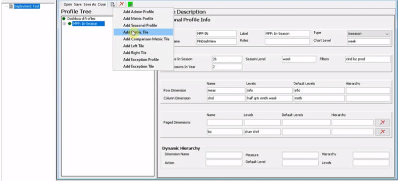
Figure 12-38 shows an In-Season profile created with the name MFP-IN and the label MFP: In-Season to match. The view to be displayed in the Dashboard workbook has a View Name of PlnDashView. This profile is available to all MFP application users and is not restricted to a particular single role, so the Roles field is left blank. In order to restrict the profile view to MFP planners only, the Roles field must be filled with the role of MFP planners’ user group. The level to be displayed in the charts for the time series is the week level, so the value of week is entered into the Chart Level field. Data is most commonly viewed as a time series at week level.
Because the Seasonal Profile is selected, the dashboard will draw a time horizon based on seasonality. Two fields must be configured. Seasonal type can be either the current period (InSeason type) or in the coming period (PreSeason type). In Figure 12-38, the Configurator selected the Inseason type. The season must be defined, as shown in Figure 12-39 The configuration divides a fiscal year into two seasons in which each season has 26 weeks. The filters available at the top of the Dashboard UI are clnd loc prod for a standard three-dimensional Dashboard workbook.
Next, define how to lay out dimensions across the row, column, and page axis of the detail chart in the Dashboard view. Each profile contains one row dimension, one column dimension, and as many additional paged dimensions as needed, based upon the intersection of the view configured in the View Name field. In Figure 12-40, Row Dimension is at meas dimension and info is the default level. If no levels are specified, the lowest level will be used as the default for the display. The Hierarchy field was originally designed to tell the Dashboard which branch the branch hierarchy to use; however, the Dashboard can now determine this automatically, and this field is often left blank.
Since this is a seasonal profile, the Column Dimension field is set to clnd to display calendar on the x-Axis in order to see time series. The Levels field is used to determine at which levels the dashboard displays the data inside the chart. In Figure 12-40, there are four level options available: half, qrtr, mnth, and week. To see aggregated data for the default level, enter mnth.
Next, configure the dimensions Product and Location. They are configured as page dimensions. Since by default there is only one Paged Dimension object in the blank profile, a second Paged Dimension object is added. The Default Levels fields are left blank, which means the lowest level specified in the Levels field will be used as the default.
This seasonal profile does not use dynamic hierarchy, so the Dynamic Hierarchy fields are left blank. If dynamic hierarchy is used, values must be entered into the Dynamic Hierarchy fields. Users must enter the name of dimension affected by the dynamic hierarchy into the Dimension Name field, the measure containing the information for setting up the dynamic hierarchy mapping into the Measure field, the hierarchy that representing the branch inside the dimension that uses the dynamic hierarchy, the menu ID of the menu item into the Action field, the Default Levels, and Levels. See Seasonal Profile Element for details.
Creating a Metric Tile
Next, right click the MFP: In-Season profile and select Add Metric Tile to add a new metric tile, as shown in Figure 12-41.
In the Metric Tile Info interface shown in Figure 12-42, enter the name of measure for the tile. If the dashboard is to be used in a Retail Home implementation, the tile must be uniquely identified and the Tiles ID field requires a unique name, since more than one tile may reference the same measure. However, since this is not the case in the current example, the Tiles ID field is left blank. The Inserted check box is selected, indicating that this tile is visible by default in the Dashboard UI and no editing for setting visible tiles is required.
Next, add additional metrics for the tile. Click the + sign next to the new metric tile to display the Variance Tiles menu item and select it to add the variance tile. Supplement the main metric tile by adding a left tile and a right tile.
The left tile is used to compare the current year sales with the last year sales. The measure name mpwpslsvl shown in Figure 12-44 is the variance of the current year sales in comparison to last year sales; that is the value shown in the tile itself. The measure that holds the historical sales data will be visible inside the chart.
The right tile, shown in Figure 12-45, displays the comparison to the current plan. As before, the measure appearing in the tile is the actual variance itself (mpwpslsrvs), but inside the chart, the metric that holds current sales data mpcpslsr is displayed.
The final step is specifying the thresholds. Thresholds can be specified for either the left tile or the right tile. In Figure 12-46, the right tile has two thresholds, one medium and the other severe or high, for the variance to the current plan. Right click the right tile (mpwpslsrvc tile) shown in Figure 12-46, then click Add Thresholds to add one threshold. Repeat this step to add the second threshold.
The first threshold is a medium threshold. If sales do not perform to the plan, the variance is less than 0, and the Dashboard UI flags it as medium error. The badge inside the tile on Dashboard UI will show that it is not performing up to the current plan.
The second threshold is a high threshold. If the variance is more than five percent less than the plan, then it is flagged as a high error. The red badge in the UI indicates this, as shown in Figure 12-47.
The results of the Dashboard Seasonal Profile configuration are shown in Figure 12-48.
Figure 12-48 Dashboard UI for the MFP In-Season Profile
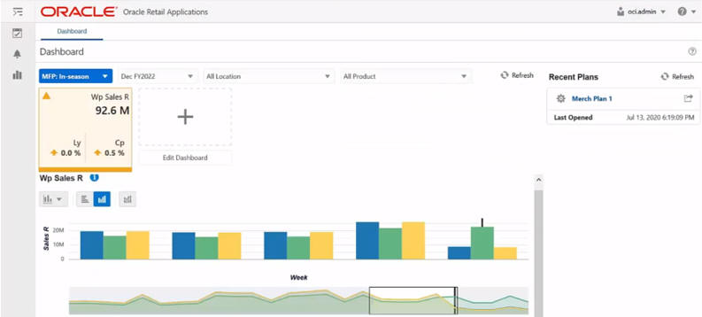
Description of "Figure 12-48 Dashboard UI for the MFP In-Season Profile"
Example 2: Creating a Dashboard Exception Profile
This section describes the steps to create a dashboard exception profile.
Creating an Exception Profile
As in Example 1: Creating a Dashboard Seasonal Profile, starting from an (nearly) empty file, this example describes the steps to create the exception profile. For greater detail regarding the components used, see Example 1.
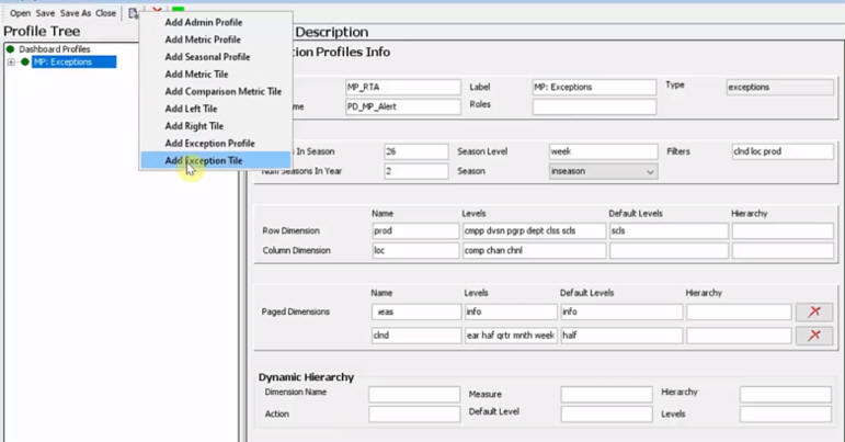
Complete the fields in the Exception Profiles Info interface as described in this section. The Type field is pre-populated with exceptions. A view name, profile name, and profile label are provided. The Roles field is left blank so that the Dashboard profile view is available for all users of the application.
The standard, two half seasons with 26 weeks within each season, is configured. A fiscal year contains two seasons. The filters used to range data in the Dashboard UI contain clnd loc prod. The Exception Profile supports performing exception-based processes in pre-season planning. Users can select the inseason, pre-season, or both as the season type. As in the Seasonal Metric Profile, if inseason is selected, the Dashboard will center itself in the time period containing today. If preseason is selected, it will determine which period today is in and will center on the upcoming time period so that users can resolve exceptions in the preseason planning.
The Product dimension is configured as the Row Dimension and Location as the Column Dimension. That means that the exceptions are first grouped by product, then further grouped by location. The Levels contain levels available in Filters that users can range down. As in the Metric Profile, the hierarchy field is usually left blank since the Dashboard can determine the value.
The paged dimensions have two dimensions, one at meas and the other at clnd. The default level is at dimension half, a higher level, so that users can drill down the data to lower levels defined within the Levels field.
This configured Exception profile does not use the Dynamic Hierarchy feature. If the Dynamic Hierarchy is used, then the corresponding information must be entered.
Creating an Exception Tile
Right click the MP:Exception profile and select Add Exception Tile from the drop-down list, as shown in Figure 12-50.
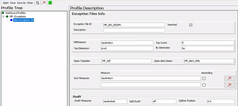
The alert of interest in is the Min Sales count. Enter the corresponding information is entered into the Exception Tiles Info interface. See Exception Profile Element for a detailed explanation of each component.
To begin, an explicit Tile ID is required for every Exception Tile (but not necessarily for a Metric Tile). The Inserted check box is selected by default so that this tile is visible in the Dashboard UI.
The HitMeasure field has the measure name mpalnslscn, indicating the measure containing the exception hit count information for the tile. The Top Dimension entered is the Product dimension, and By Dimension is Location dimension. The Top Dimension and By Dimension override the settings in the profiles if they are different. Note that in the example, these two settings are the same. The TopCount is set to 5 so that when users view the alert hits by product and location dimensions, they will start out with the top five products in the RPASCE UI display.
Next, configure the ability to launch out of the Dashboard into the workbook in order to resolve exceptions displayed in the tile. Enter the workbook template to be launched into the Open Template. Enter the real time alert name into the Open Alert Name.
In addition to simply ranking the display based on those products that have the most alert hits, users can also use Sort Measures to group data based on the metric values. In this example, the check box for Ascending is deselected for the first sort measure, so the data is sorted in descending order.
The DualY section is optional. Once configured, it is used to display a secondary metric inside the chart when the user is looking at the information. The DualY section contains an optional configuration to display alert hits on a different scale via a split DualY. With Split DualY, instead of one chart, users see a distinct, secondary chart that stacks on the other in the RPASCE UI display. In this example, the Split DualY is not used, and the field contains off and Splitter Position 0.0.
Dashboard Exception Profile Instance in the RPASCE UI
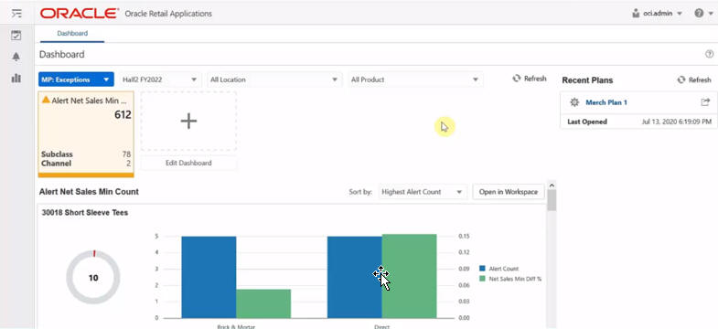
Figure 12-52 shows the Dashboard instance in the RPASCE UI. In the MP: Exceptions profile, users can view the exception Tile, the Location, Product and the optional levels within each hierarchy. Users can launch the workbook from the Open in Workspace option. The Sort By option contains an additional sorting metric specified by the Sort Measure configuration. Alert hits are broken out first by product, then by location dimension. The second metric Net Sales Min Diff % plugged into the DualY configuration is also in the chart. There is one range for the alert hit and a second range for the diff percentage.
Deployment Tool – Retail Home Dashboard Settings
Retail Home Portal contains a home page that users view and interact with when logging into the system. This page is called the Retail Home Dashboard and it provides summary information in the form of health-check metric tiles of the retail application.
The Cloud engineering team deploys and starts up the customer's retail planning applications and the Retail Home application to various provisioned servers. When the user logs into the Retail Home Portal, the metric tiles display on the Dashboard authorized by the user's currently effective enterprise role. For each tile, the Retail Home application invokes a web service (in this example, called Edge web service) on the deployed instance of the planning application that contributed the tile. The Edge web service retrieves the tile's measure data from the dashboard workbook and returns the data to Retail Home, which renders the measure data in the tile.
How Metric Tiles are Populated in the Retail Home Portal Dashboard Page
Conceptually, a Dashboard is a hybrid of a traditional workbook containing the information backing the display and a new view representation consisting of information provided in a set of tiles, each of which can be selected to provide supporting information. The supporting information is presented in various UI formats that display lower-level information about the summary information presented within the tile.
Because the dashboard is a hybrid of traditional RPASCE workbooks and a new visual representation, the process of configuring a Retail Home Dashboard consists of two components. First, a workbook must be configured in the application that defines the data available within the dashboard and how it is created and maintained within that workbook. Second, a resource file that defines the presentation layer configuration that determines how that information is made available in the form of tiles. Their detail charts must be created and deployed to the client tier.
In detail, the retail planning application must perform the following two tasks for Retail Home uptake:
-
Create a Retail Home-specific worksheet in a Dashboard workbook.
The Dashboard Workbook can be an existing regular Dashboard Workbook or a new Dashboard Workbook dedicated to Retail Home. The Retail Home worksheet must be populated with all the Retail Home tile measures, calculation rules, and any special expression libraries that are required to produce measure data. This separate retail-home-specific worksheet in the Dashboard workbook can start life as a copy of the existing application-level dashboard worksheet (for example,
PlnDashVw), renamed toRhDashVwand modified as required. This worksheet must have all the tile measures. Any special rules to produce measure data (such as a rollup over a certain number of weeks up to the current date) can be used in this worksheet. See Configuring Dashboards in RPASCE for how to configure a Dashboard workbook and its worksheets.Figure 12-53 Retail Home Worksheet Added to the Regular Dashboard Workbook
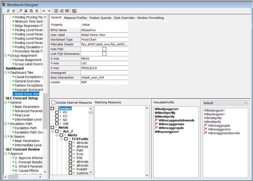
Description of "Figure 12-53 Retail Home Worksheet Added to the Regular Dashboard Workbook" -
Create the Retail Home configuration file resource.
This file resource, often called the Retail Home Dashboard Settings file, is a JSON encoded text document that contains information about the dashboard tile states and their tiles that is used by the client to organize and present the data contained within the dashboard workbook. The Deployment Tool contains an interface for the creation of the content of the Retail Home Dashboard Settings resource. Using this tool, the person performing the configuration can interact with a graphical user interface that is similar to other Configuration Tools-based interfaces and the tool will generate the appropriate JSON file content. Like other Configuration Tools interfaces, this allows the people performing the configuration to focus on what information they want to present in the configuration (as defined in terms of measures, RPASCE views, and so on) and let the tool manage the generation of the appropriate file resources.
RetailHomeConfig.json View
The RetailHomeConifgs.json View can be used to create, delete, and modify the contents of a Retail Home Dashboard Settings file resource using a set of actions represented through buttons, menu items, and text forms. This information is organized around a set of entities that describe the view layer of the Retail Home Dashboard, such as dashboard tile states and metric tiles.
By representing this information in a user interface, the tool allows users to work with an organized form of the information that can be easily navigated and modified. Then, through the Save action, the information present within the interface can be written into the appropriately formatted JSON file by the tool, allowing users to concentrate on the content and allowing the tool to manage the encoding process.
The RetailHomeConfig.json View can be accessed from the main Deployment Tool screen through the RetailHomeConfig.json item.
RetailHomeConfig.json Option in Deployment Tool
To access an existing resource, the user selects Open, located in the upper right-hand corner of the RetailHomeConfig.json entry. The user is presented with the files saved on the local system. The user can also use the New action to create a new Retail Home Dashboard Settings resource. Select New and the following window displays. The user can specify the name of the Retail Home JSON file. If the file name does not end with a .json suffix, Tools will add it automatically.
Figure 12-55 Create a New RetailHome JSON File Window

Description of "Figure 12-55 Create a New RetailHome JSON File Window"
Once a dashboard settings resource opens, its contents are loaded into the RetailHomeConfig.json View.
Figure 12-56 RetailHomeConfig.json View with Loaded Resource
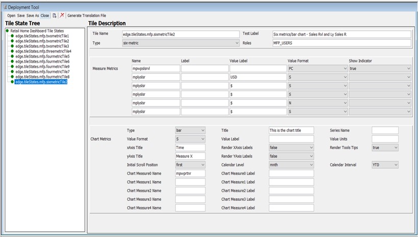
Description of "Figure 12-56 RetailHomeConfig.json View with Loaded Resource"
Within the RetailHomeConfig.json view, users are presented with a navigation pane on the left, containing a tree structure of the entities making up a Retail Home dashboard settings configuration such as dashboard tilestates and the tiles they contain. When an entity is selected within the navigation pane, its information is loaded into the content pane on the right. This allows users to view and modify that entity's information. Metric tiles can be created and deleted through actions present on the top toolbar.
RetailHomeConfig.json Resource Contents
The following elements make up the contents of the RetailHomeConfig.json resource:
-
Tile States
-
Metric Tile
Template, Worksheet, and TileStates Definition
The tree root on the left side of the Navigation pane defines the template name, worksheet view name, and the tileStates.
Example Template and Worksheet Configuration for Retail Home Dashboard
Figure 12-57 Example Template and Worksheet Configuration for Retail Home Dashboard

Description of "Figure 12-57 Example Template and Worksheet Configuration for Retail Home Dashboard"
Table 12-1 provides more detailed descriptions for each of these three parameters.
Table 12-1 Retail Home Dashboard Parameters
| Parameter | Type | Required | Description |
|---|---|---|---|
|
templateName |
String |
Y |
The template name for the dashboard workbook. For example, in MFPRCS it is pl_db. |
|
worksheetViewName |
String |
Y |
The name of the worksheet view in the dashboard workbook that has the dashboard data. It must be same as configured within the dashboard workbook. For example, in MFPRCS it is called |
|
tileStates |
Object |
Y |
An array of tile state objects. Choose a unique name field for each tile state. Only one tilestates object is supported currently. |
Here is an example of the JSON content at the top level of RetailHomeConfig.json file. Note that the templateName and worksheetViewName must be the same as configured in the Dashboard Workbook.
{
    "templateName": "pl_db",
    "worksheetViewName": "PlnDashVw",
    "tileStates":  [ ... ]
}
Metric Tile Definition
The Tilestates can contain one or more metric tile objects that are displayed in the right-side Tile Description pane.
The set of properties defined for a Metric Tile is:
-
name – A required property. It is the tile ID, string identifier. This must be unique across all the metric tiles.
-
type – A required property, indicating metric tile type. It must be two-metric, four-metric, or six-metric. Two-metric means one to two measures, and no chart. Four-metric means one to four measures and an optional chart. Six-metric means one to six measures and an optional chart. In brief, the only difference between the 4-metric type and the 6-metric type is that 6-metric displays up to six measures and 4-metric shows only the first four.
-
testLabel – A required property. Title of the tile. Used only in the test harness. In Retail Home it is the application name (same for all tiles in the application).
-
roles – A required property. A list of role names separated with a comma whose users are authorized to see this tile in Retail Home. Not used in the test harness.
-
measures – A required property. A list of JSON array objects. A list of one or more measure metrics to be displayed in the tile. Specify one to two measures for two-metric, one to four measures for four-metric, and one to six measures for six-metric.
-
chart – An optional property. An object defining a chart to be displayed underneath the metrics. The chart is only displayed in four- and six-metric tiles.
Here is an example of the JSON format illustration of a metric tile.
{
"name": "tile1",
            "type": "four-metric",
            "testLabel": "Four metrics/area chart - Sales Rvl and Ly Sales R",
            "roles":"MFP_PLANNERS, MFP_USERS",
            "measures": [ ... ],
            "chart": { ... }
},
Users can add or delete a metric tile using the top menu item.
To add a new metric tile to the Retail Home dashboard settings configuration, highlight a Metric Tile in the left navigation pane, click Add New Node (located beneath Add) from the toolbar. A new tile entry is added to the navigation pane and selected in the content pane so that its information can be entered.
To remove an existing metric pane from the Retail Home dashboard settings configuration, select the tile and click Remove from the toolbar. The confirmation window opens. Click Yes to confirm.
Measure Metrics Definition
The Measure Metrics section can contain multiple Measure objects. The properties defined for a Measure object are:
-
name - A required property. The RPASCE name of the measure. No extended measure.
-
Label - An optional property for the measure label override. If not specified, the RPASCE measure label will be used. If MultiSolutionBundle.properties has a resource key entry called
<tile-id>.<measure-name>.retailhome.measure.labelthen that is used. In other words, measure labels can be localized for retail home purposes. See “Generate Translation File" section for details about the translation of labels. -
valueLabel - An optional property. An additional label to display underneath the measure value.
-
valueFormat - An optional property for measure value Format. The drop-down list contains blank, PC, S, and N. These represent: PC - Percent (.01 = 1%), S - Short (1000 = 1K), N - Number (1000 = 1,000).
-
showIndicator - An optional property. True or False. By default, this property is false. This flag controls whether the up or the down icon is displayed in the dashboard.
Here is the JSON format for one Measure object.
{
                "name": "mplyslsr",
                "label": "Measure Label Override",
                "valueLabel": "$",
                "valueFormat": "S",
                "showIndicator": "true"
            }
Here is an example of an array of tile measure objects. Note that some optional properties are not specified for certain tile measures.
"measures": [
        {
          "name": "mpwpslsrvl",
          "valueFormat": "N"
        },
        {
          "name": "mplyslsr",
          "valueLabel": "$",
          "valueFormat": "S"
        },
        {
          "name": "mplyslsr",
          "valueLabel": "$",
          "valueFormat": "S"
        }
      ]
Figure 12-60 shows the measure definition section in the content pane.
Figure 12-60 Measure Metrics Section Example

Description of "Figure 12-60 Measure Metrics Section Example "
You can select the optional Value Format and Show Indicator from their lists.
Chart
The Chart metrics is an optional JSON object used with four-metric and six-metric types only. If no chart is configured for the Retail Home Dashboard Settings, all fields in the Chart section must be left blank.
The properties defined for a Chart object are:
-
chartType - A required property. Values include line, bar, area, or total.
-
measures - A required property. An array of chart measure objects. One or more measures to plot in the chart. Only one measure is supported for line/bar/area charts. These charts display the measure's values over the weeks or months before the current date, from the current year.
-
Totals chart is unique. You must specify at least two measures. The totals chart shows the values of the measures rolled up across all time, side by side in the horizontal bar. The maximum number of chart measures that can be specified is five. See next section for a discussion of the measure object format.
-
title - An optional property. The title displays above the chart.
-
renderTooltips - Optional. Hide or show tooltips on the chart. Default is true.
-
seriesName - Optional. True or False. By default, this property is false. This flag controls whether the up or the down icon is displayed in the Label for the tooltip. Applies to line, bar, and area charts.
-
valueFormat - Optional. Formats the output of values in the chart. Takes the same values as metrics items.
-
valueLabel - Optional. Prefix for values. Applies to total charts only.
-
valueUnits - Optional. Suffix for values. Applies to total charts only.
-
xAxisTitle - Optional. Label for the x-axis. Applies to line, bar, and area charts.
-
renderXAxisLabels - Optional. Default is false. Show or hide tick labels on the x-axis. Applies to line, bar, and area charts.
-
yAxisTitle - Optional. Label for the y-axis. Applies to line, bar, and area charts.
-
renderYAxisLabels - Optional. Default is false. Show or hide tick labels on the y-axis. Applies to line, bar, and area charts.
-
initialScrollPosition - Optional. The end of the chart to start at if there are too many items to show at once. Options are first and last. Default is first. Applies to line, bar, and area charts.
-
calendarLevel - Required if the Chart metric is configured. Defaults to the level name corresponding to month. (In MFP it is MNTH, for example). Users can select week or mnth from the drop-down list.
-
calendarInterval - Required if the Chart metric is configured. Currently, only YTD is supported.
Here is an example of the JSON format for the chart object.
"chart": {
        "chartType": "line",
        "measures": [
          {
            "name": "mpwpslsr",
            "label": "Override lbl"
          }
        ],
        "title": "Sample chart title",
        "renderToolTips": "true",
        "seriesName": "Working Plan Sales Receipts over time",
        "valueFormat": "S",
        "valueLabel": "USD",
        "valueUnits": "cents",
        "xAxisTitle": "Time",
        "renderXAxisLabels": "false",
        "yAxisTitle": "Measure X",
        "renderYAxisLabels": "false",
        "initialScrollPosition": "first",
        "calendarLevel": "mnth",
        "calendarInterval": "YTD"
      }
Measure (in chart)
The chart object can contain one or more chart measures. The properties defined for a chart measure object are:
-
name - A required property. The RPASCE name of the measure. No extended measure.
-
Label - An optional property for measure label override. If not specified, the RPASCE measure label is used. See Generate Translation File for details about the translation of labels.
Here is an example of the JSON format for one measure object.
{
                "name": "mplyslsr",
                "label": "Measure Label Override"
            }
Validation against the Application Configuration
As explained in the Deployment Tool Limitation section, the deployment tool does not automatically validate the deployment configuration with the corresponding application configuration. However, the situation for Retail Home is different. The GA planning applications come with a configuration for Retail Home out of the box. In order to support the customization of the application content in the form of the EE products, solution implementors may need to modify the GA content or to create new custom content for use in Retail Home using the Retail Home Deployment Tool.
The process of updating Retail Home is expensive, requiring the upload of the deployment configuration, sending changes to the Retail Home server, and potentially patching the PDS. As such, the more errors that can be caught within the Tool, the less time and energy implementors will waste trying to diagnose and correct problems when deploying their configurations.
Open the Application Configuration First
To validate Retail Home Dashboard Settings with its application configuration, open the application configuration first in the Configuration Tools before clicking the Open or New button in the Retail Home View of the Deployment Tool. Otherwise, a window will display to warn the User.
Figure 12-62 Cannot Validate Retail Home Configuration Window

Description of "Figure 12-62 Cannot Validate Retail Home Configuration Window"
Once the user selects OK, the File Selection Window displays. The user can either select Cancel to go back to the Configuration Tools to open an application configuration for validation or select Open or Create a Retail Home JSON File to proceed without validation.
Figure 12-64 Create a New Retail Home JSON File Window
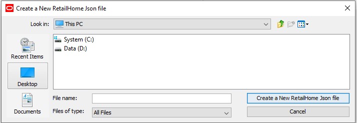
Description of "Figure 12-64 Create a New Retail Home JSON File Window"
The Retail Home Dashboard configuration contains the dashboard workbook template name. Using that information, Retail Home Deployment Tool searches open application configurations to determine which application contains the dashboard workbook and then obtain the reference to that application object. If the Retail Home dashboard workbook is configured with the same workbook template name in more than one application configurations, then the deployment tool will use the reference to the first encountered application configuration in the search path.
Validation Criteria
For both Metric Measures and Chart Measures, if they do not meet following criteria, the behavior will be flagged as an error in the TaskList pane in the RH deployment tool. The measure:
-
Does not exist within the dashboard workbook template.
-
Is hidden within the dashboard workbook template.
-
Is neither Integer nor Real type.
For both Metric Measures and Chart Measures, if they do not meet following criteria, the behavior will be flagged as a warning in the TaskList pane in the RH deployment tool. The measure:
-
Does not have a configured label in deployment tool.
For Chart Measures, if they do not meet following criteria, the behavior will be flagged as an error in the TaskList pane in the RH deployment tool. The measure:
-
Does not contain a level of the calendar dimension within its base intersection.
Note that, as for all other tools TaskList error/warning messages in general, users can still save the Retail Home Dashboard Settings before the validation Tasklist error/warnings are completely resolved.
Figure 12-65 Retail Home Dashboard Settings Validation Errors and Warnings
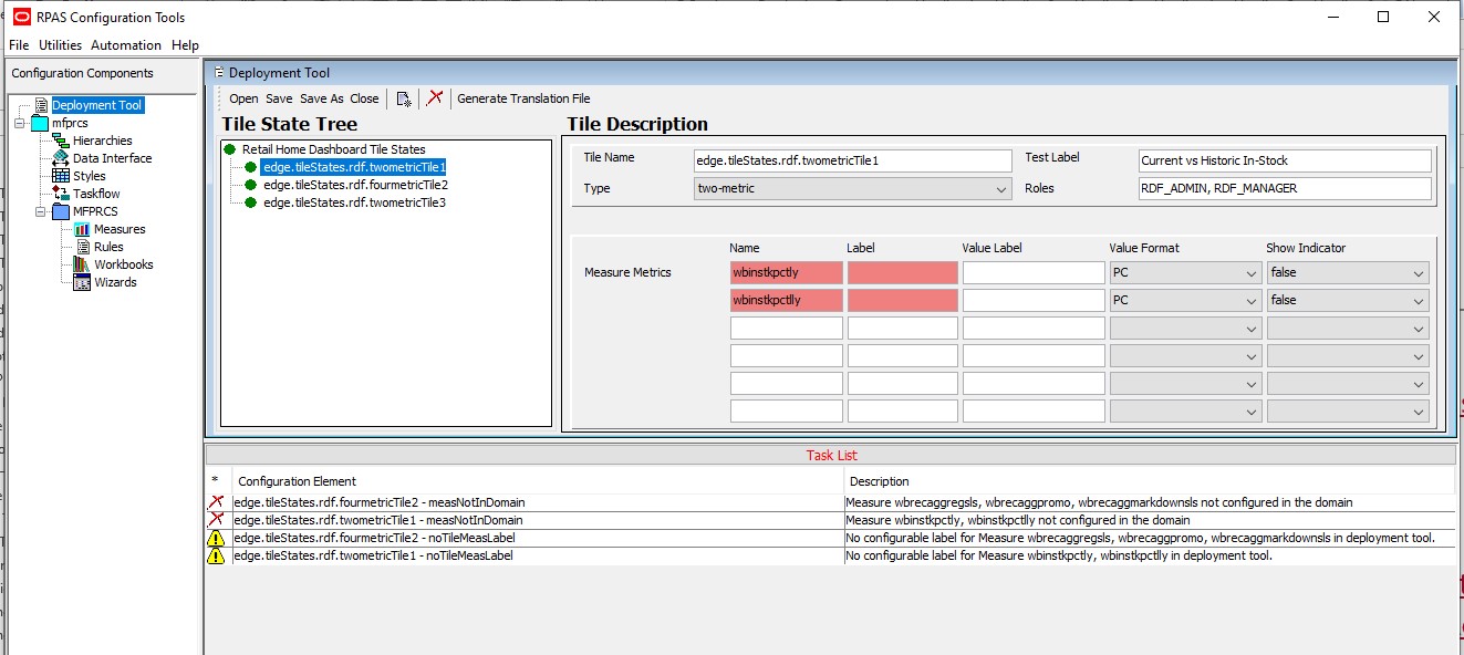
Description of "Figure 12-65 Retail Home Dashboard Settings Validation Errors and Warnings "
Retail Home Translation Resources
In order to support the localization of the strings provided to Retail Home, RPASCE must provide an extracted internationalization of the information passed by the Retail Home web service. This resource, when translated, allows the web service to retrieve strings localized into the appropriate language when serving requests and, in conjunction with any strings translated by the RPASCE Server (for strings representing metadata pulled from the PDS), allows users to view their Retail Home data in the language of their choice.
The Retail Home Dashboard Configuration tool provides a menu button Generate Translation File in the upper right menu to pull translation labels from the Retail Home Dashboard Configuration. This button must only be used when any change to the RetailHomeConfig.json has been made and saved. Click this button to generate a base resource file called RHResources.properties. This file is generated within the same directory where the RetailHomeConfig.json file is stored. The resource file RHResources.properties can be translated into various languages/locales and accessed at run-time by the Retail Home web service through the Java ResourceBundle APIs.
Figure 12-66 Generate Translation File Menu Button

Description of "Figure 12-66 Generate Translation File Menu Button"
The following table lists those strings that are set in the Retail Home JSON configuration file that require internationalization, along with the algorithmic formula to generate the key for that string in the RHResources.properties.
Table 12-2 Strings that Are Set in the Retail Home JSON Configuration File
| Property | Description | Translation Key |
|---|---|---|
|
metricLabel |
A label to be used in place of the default measure label. |
tileStates.<tile_name>.<measure_name>.label |
|
measureValueLabel |
A label provided for metrics to give UoM information. |
tileStates.<tile_name>.<measure_name>.valueLabel |
|
chartTitle |
A header for a chart in a metric tile. |
tileStates.<tile_name>.chart.title |
|
chartMeasureLabel |
A label to be used in place of the default chart measure label. |
tileStates.<tile_name>.chart.<measure_name>.label |
|
chartSeriesName |
A label shown as tooltip for chart values. |
tileStates.<tile_name>.chart.seriesName |
|
chartValueLabel |
A label provided as prefix for values in chart. |
tileStates.<tile_name>.chart.valueLabel |
|
chartValueUnits |
A label provided as suffix for values in chart. |
tileStates.<tile_name>.chart.valueUnits |
|
xAxisTitle |
A label provided to describe the x-axis of the chart. |
tileStates.<tile_name>.chart.xAxisTitle |
|
yAxisTitle |
A label provided to describe the y-axis of the chart. |
tileStates.<tile_name>.chart.yAxisTitle |
Here is an example of content within the RHResources.properties file.
tileStates.edge.tileStates.mfp.fourmetricTile5.mplyslsr.valueLabel=$
tileStates.edge.tileStates.mfp.fourmetricTile6.chart.mpwpslsr.label=Override lbl
tileStates.edge.tileStates.mfp.fourmetricTile6.chart.seriesName=Working Plan Sales Receipts over time
tileStates.edge.tileStates.mfp.fourmetricTile6.chart.title=Sample chart title
tileStates.edge.tileStates.mfp.fourmetricTile6.chart.valueLabel=USD
tileStates.edge.tileStates.mfp.fourmetricTile6.chart.valueUnits=cents
tileStates.edge.tileStates.mfp.fourmetricTile6.chart.xAxisTitle=Time
tileStates.edge.tileStates.mfp.fourmetricTile6.chart.yAxisTitle=Measure X
Deployment Tool Limitations
The following section describes a limitation of the Deployment Tool.
Validation of Resource Contents
Note that the Deployment Tool provides only the most basic validation over a deployment resource and that the validations do not reflect issues in the resource itself, but merely detect errors that could interfere with the functioning of the Deployment Tool.
The Tool only ensures that the information contained within the resource file is formatted properly for the use of the resource (for example, the Tool ensures that the tag structure of an XML resource is correct but does not prevent incorrect or incomplete information within the tags of the resource).
The reasons for this are twofold.
First, the Deployment Tool is designed to provide lightweight interfaces for the creating of resource files. It translates the structure of the information contained in the resources into a set of user interface controls that remove the need to manually edit resources in a text editor.
The Tool does not connect with a RPASCE PDS nor is it equipped to automatically read the contents of an application configuration representing an application and so does not have access to the information necessary to provide such validation. Retail Home Dashboard Configuration has been enhanced to validate certain content against the application configuration if the application configuration is open in the Tools.
Second, because the Tool operates on a user's desktop and not necessarily on the host of the RPASCE application, many categories of information are simply not available for validation, such as the legitimacy of file path locations on the RPASCE Server.
For these reasons, the content of a resource generated through the Deployment Tool must always be manually inspected to ensure the correctness prior to use of the resource in an RPASCE PDS.
