Demand Heatmap
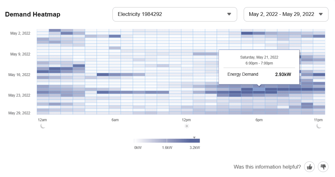
The Demand Heatmap displays a business customer's demand data in a color-coded grid, and indicates the level of energy demand during specific times, days, and weeks of the year.
Configuration Options
For each element listed in the table, indicate the desired configuration in the Input Value column. If you do not provide an input for optional configurations, the default will be used.
| Configuration Option | Input Value |
|---|---|
|
Heatmap Color Gradient The color gradient of the heatmap can be changed. There are several options available.
Default: The default is a single primary color gradient that is accessible for color-blind customers. |
Optional Choose one of the following:
|
|
Display of Operating Hours Insights The Demand Heatmap can display filters that allow customers to distinguish between a business’s operating hours and non-operating hours. When enabled, customers who have provided operating hours in their Business Profile can filter the heatmap and review their operating-hours summary. Customers who have not provided operating hours see a banner directing them to Business Profile. Default: Disabled. |
Optional Choose one of the following:
|
|
Display of Device (Meter) ID in Drop-Down Selector The device ID (meter number) can be displayed instead of the service point ID in the drop-down selector menu of relevant widgets. Displaying the device ID can be a clearer way for customers to identify the energy use patterns associated with each of their meters. Default: Disabled. |
Optional
Choose one of the following:
|
|
Display of Custom Meter or Service Point Names The ability to add custom names to meters or service points in the widget can be enabled. This lets customers define custom names for each meter or service point so they can more easily distinguish and select the appropriate one when viewing data in the widget.
Note: Your Oracle Utilities Delivery Team must complete additional setup before this option can be enabled.Default: Disabled. |
Optional Choose one of the following:
|
User Experience Variations
The user experience of the feature may vary for customers and utilities depending upon their service types, available data, locale, and other factors.