Usage Breakdown View
The Usage Breakdown view of the Data Browser allows customers to explore how their energy costs are distributed among available disaggregation or "end-use" categories over time. This helps customers see how different energy end uses (such as heating, cooling, and lighting, and appliances) contribute to their overall energy use and identify trends that may be leading to higher than normal bills.
Requirements
Same as listed in Data Browser. Additional requirements include:
- Average energy use data for households in a utility's region, as well as billing data and weather data.
- AMI data is required in order to show appliance-level insights (such as energy costs associated with an oven, refrigerator, or dishwasher). Contact Your Delivery Team for more information.
Limitations
Same as listed in Data Browser. Additional limitations include:
- The Usage Breakdown view is available for eligible solar/net-metered customers when the required data and layered solar disaggregation configuration are in place. If these requirements are not met, the Usage Breakdown experience is not shown.
- The following types of customers and utilities are not supported: Small and medium businesses (SMB) customers, commercial and industrial customers, and water and wastewater utilities.
User Experience
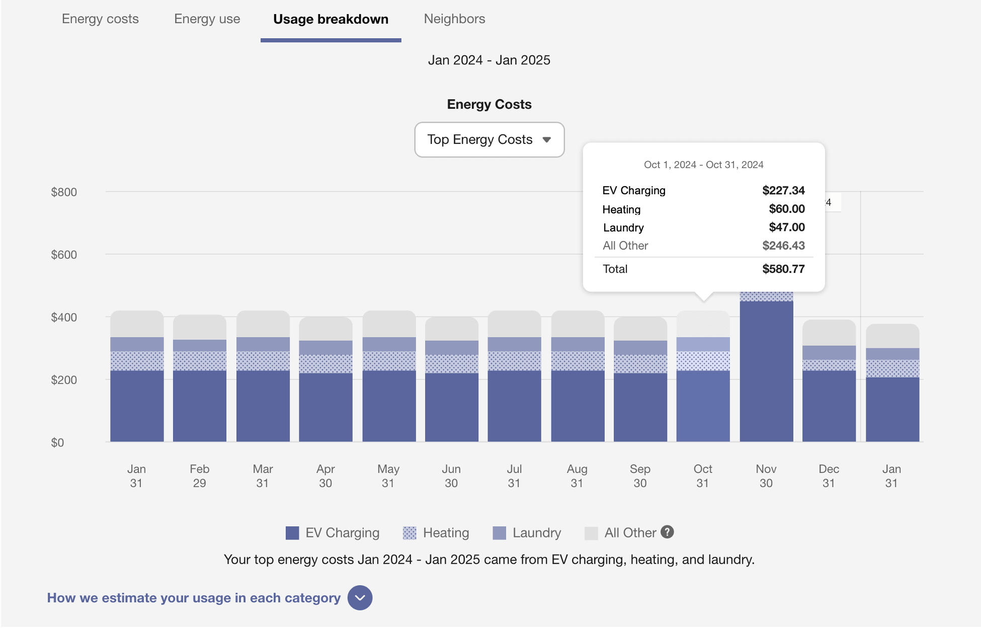
The Usage Breakdown view displays how much money a customer is spending on energy in all available end-use categories. This section describes the user experience for AMI electricity customers whose top costs are electric vehicle (EV) charging, heating, and water heating.
Date Range
A date range appears at the top of the feature to indicate the time period for the data. The range always shows the current month and the previous 12 months (for a total of 13 months), so that customers can get a full year's worth of comparison.
Energy Costs Menu
A category menu appears above the graph. By default, All categories is selected and the chart displays all available disaggregation categories for the selected period in alphabetical order. Customers can use the menu to view one category at a time. When a customer selects one category, the chart adjusts to show that category and the All Other category. Other notes about the menu's behavior include:
- Only categories that apply to the customer are available in the menu. For example, customers who own an electric vehicle (EV) may see a menu option for "EV charging," but this option will not appear for customers who do not own an EV.
- The categories in the menu match most of the categories in the customer's Home Energy Analysis breakdown. The exception is that the menu does not display an option for "Other Energy Use," since in this context it is too vague and not granular enough to be useful.
- The menu can display categories for individual appliances (instead of the generic "Appliances") depending on available data and the utility's setup and configuration. See Appliance-Level Insights below for details.
Bar Chart
The bar chart displays all available disaggregation categories for the selected period. Each category is displayed in a different color, and the All Other category is displayed in gray. Customers can use this information to understand how the categories contribute to their energy costs or energy use over time. Additional notes about the bar chart include:
- The bar chart shows top energy costs by bill period across a year. Customers cannot view data at a more granular view, such as monthly or daily.
- If a customer selects to view a single category, then the bar chart adjusts to show two colors: the color of the category selected and a gray color for all other categories.
- The top cost or costs shown in each bill period will match the disaggregation results of Home Energy Analysis for that same bill period. For example, if a customer hovers over a data point and sees that the electric heating cost was $64 for January, then the same number will be displayed in the Home Energy Analysis breakdown for January.
Tooltips
Tooltips are displayed when customers interact with a data point on the graph. The tooltip includes the date range of the selected bill period, the top usage categories, the cost associated with each category, and the total cost for the bill period. If a customer selects to view a single category, the tooltip adjusts to show just two items: the cost of the selected category and the cost of all other categories.
See Energy Tooltips for details on what the tooltips may include in other views of the Data Browser.
Legend
The legend below the bar chart shows the color of each category displayed in the chart. If a customer views a single category, the legend adjusts to show just two colors: the color of the selected category and a gray color for All Other. In this case, All Other refers to the total bill cost minus the selected category cost.
The All Other category is shown as a label in the chart legend and tooltip, but it is never shown as a selectable option in the Energy Costs menu since its contents change depending on the end-use category a customer selects.
Energy Costs Insight
An insight statement below the bar chart legend explains the customer's top costs in three categories for a specific time period. The statement remains the same even if the customer selects to view the breakdown for a single category. This is so that the customer is reminded of the top three costs when selecting to view a single category.
Table View
A table view of the usage breakdown information is available in an expandable menu below the chart. Customers can open the table view to see the amount of energy consumed for each available end-use category and the total for each bill period. The table reflects the categories and values displayed in the chart. On smaller screens, the table view displays category and total columns only.
Explainer
A message below the graph explains how the customer's breakdown is determined. The message varies slightly based on whether the customer has AMI data and has started or completed the Home Energy Analysis survey. There is also a disclaimer about how account-level charges and credits are excluded, and how minimum bill charges can impact the accuracy of the cost information. The message concludes with a link to the Home Energy Analysis survey, where customers can update their home profile so that they receive the most accurate insights.
User Experience Variations
Appliance-Level Insights
If sufficient data is available and the proper configuration has been completed, the Energy Costs Menu and chart can display specific appliances as top cost categories, rather than a general "Appliances" category. For example, the breakdown can include categories such as Laundry, Refrigeration, or Oven Use.
Requirements: Weather data, subdaily AMI data (at the hourly or quarter of an hour resolution), billing data from at least one bill period, and more. Contact Your Delivery Team for details.
Dual Fuel
For dual fuel customers, the bar chart combines the data for electricity and gas into a single bar chart. There is no toggle to see a breakdown for each fuel type. This aligns with the breakdown that dual fuel customers see in the Home Energy Analysis, in which a single graphic containing gas and electricity data is shown to dual fuel customers.
Gas-Only
Gas-only customers can receive the Usage Breakdown view in the Data Browser. The user experience can change for them in the following ways:
Disaggregation: The disaggregation only shows end-use categories for which gas is a supported fuel type. For example, categories for cooling, electric vehicle, and individual appliances would be hidden.
Two Categories: Gas-only customers may not have enough information to determine their energy use in three top categories. In such cases, two top categories can still be shown. See Two or Three Categories below for details.
Less Than 13 Months
If less than 13 months of data are available, the bar chart still shows data for bill periods in which data is available.
Missing Data
If disaggregation data is unavailable for a bill period, the chart displays an outlined bar instead of the usual stacked, color-coded bar. The height of the outlined bar represents the total cost or energy use for that bill period, depending on whether the chart has been configured to display cost or usage values.
The corresponding table view of the disaggregation data displays a dash for values that are not available.
If there are more than four bill periods with missing data, the Usage Breakdown view selector is hidden.
Multiple Accounts and Service Points
If a customer has multiple accounts and service points, a drop-down list is displayed above the graph allowing customers to choose one and view data related to it. See Multiple Billing Accounts, Premises, Service Agreements, and Service Points for details.
Customers can assign custom meter names to help distinguish their available meters or service points. See Custom Meter Names for more information.
Non-AMI Data
For customers with non-AMI (billing) data, the explanation beneath the bar chart changes slightly to say that the customer's breakdown is based on "meter data" instead of "smart meter" data.
Solar Customers with Net Metering
For AMI customers with solar power and net metering, there are several differences in the Usage Breakdown view when compared with non-solar customers.
-
The Usage Breakdown view shows top energy uses only. Top energy costs are not shown because a net metered customer's electric bill is based on net electricity drawn from the grid—not the home’s total energy use. If solar panels supply most of the home’s energy, a customer might use a lot of electricity, but only be billed for a small amount received from the grid. This means that cost information wouldn't match directly with how electricity was used inside the home.
-
The explainer below the graph mentions that all of the customer’s energy uses are accounted for regardless of whether their energy came from solar panels or the grid.
For more information about how energy disaggregation is estimated for solar customers, see Solar Generation Based on Net Usage.
Requirements:
- Subdaily AMI net usage data is required.
- Customers must be identified as having solar power. There are several ways to do this using Oracle Utilities Opower data transfer standards or a data science model. Your Delivery Team will work with you to choose the best method.
- The appropriate energy disaggregation model must be set up and configured. Contact your Delivery Team for more information.