24 Hour Chart for Flat Rates Module
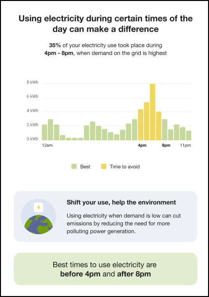
The 24 Hour Chart for Flat Rates module helps customers understand how their electricity usage is distributed throughout the day, with a specific focus on peak hours. It shows how much electricity they used during peak periods and provides a clear 24-hour view of their average usage over the past week.
The chart makes consumption patterns easy to interpret at a glance. By visualizing when energy is used most and highlighting opportunities to shift usage, this module encourages customers to make more informed decisions about when they consume electricity. These changes can help reduce strain on the grid during peak periods and support environmentally responsible energy usage.
For utilities, this module supports demand management goals and promotes energy-conscious behavior. It enhances customer engagement by delivering timely, relevant insights that encourage customers to shift usage to optimal times, improving grid efficiency and contributing to a more sustainable energy system.
Configuration Options
For each element listed in the table, indicate the desired configuration in the Input Value column. If you do not provide an input for optional configurations, the default will be used.
Table A-1 Configuration Options
| Configuration Option | Input Value |
|---|---|
|
Image Colors Colors in the images can be updated to match the utility’s color palette, if desired. |
Optional Choose one of the following:
|
|
Peak Hours Specify the hours that are considered Peak Hours. For example, 4pm - 8pm on weekdays. |
Required Specify your peak hours here: |
|
Best Times Specify the hours that are considered the best times to use electricity. For example, before 4pm and after 9pm. |
Required Specify your best times here: |