Analyze Data with Explain
Explain uses machine learning to find useful insights about your data.
What is Explain?
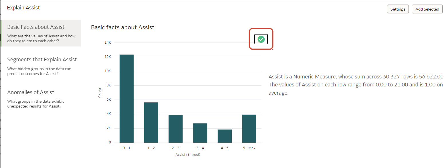
Explain analyzes the selected column within the context of its dataset and generates text descriptions about the insights it finds. For example, for any column you'll find out basic facts, key drivers, segments that explain the column, and anomalies.
Explain uses Oracle's machine learning to generate accurate, fast, and powerful information about your data, and creates corresponding visualizations that you can add to your workbook's canvas.
Explain is for data analysts who might not know what data trends they're looking for, and don't want to spend time experimenting by either dragging and dropping columns onto the canvas, or using data flows to train and apply predictive models.
Explain is also a useful starting point for data analysts to confirm a trend that they're looking for in their data, and then use that information to create and tune predictive models to apply to other datasets.
What Are Insights?
Insights are categories that describe the selected column within the context of its dataset.
The insights that Explain delivers are based on the column type or aggregation that you chose and will vary according to the aggregation rule set for the chosen metric. Explain generates only the insights that makes sense for the column type that you chose.
| Insight Type | Description |
|---|---|
| Basic Facts | Displays the basic distribution of the column's values. Column data is broken down against each of the dataset's measures.
This insight is available for all column types.
|
| Key Drivers | Shows the columns in the dataset that have the highest degree of correlation with the selected column outcome. Charts display the distribution of the selected value across each correlated attributes value.
This tab displays only when explaining attribute columns, or when explaining a metric column that has an average aggregation rule. |
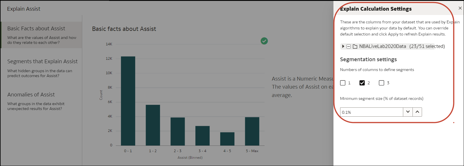
| Segments | Displays the key segments (or groups) from the column values. Explain runs a classification algorithm on the data to determine data value intersections and identifies ranges of values across all dimensions that generate the highest probability for a given outcome of the attribute.
For example, a group of individuals of a certain age range, from a certain set of locations, with a certain range of years of education form a segment that has a very high probability of purchasing a given product. This tab displays only when explaining attribute columns. |
| Anomalies | Identifies a series of values where one of the (aggregated) values deviates substantially from what the regression algorithms expect. |
Use Explain to Discover Data Insights
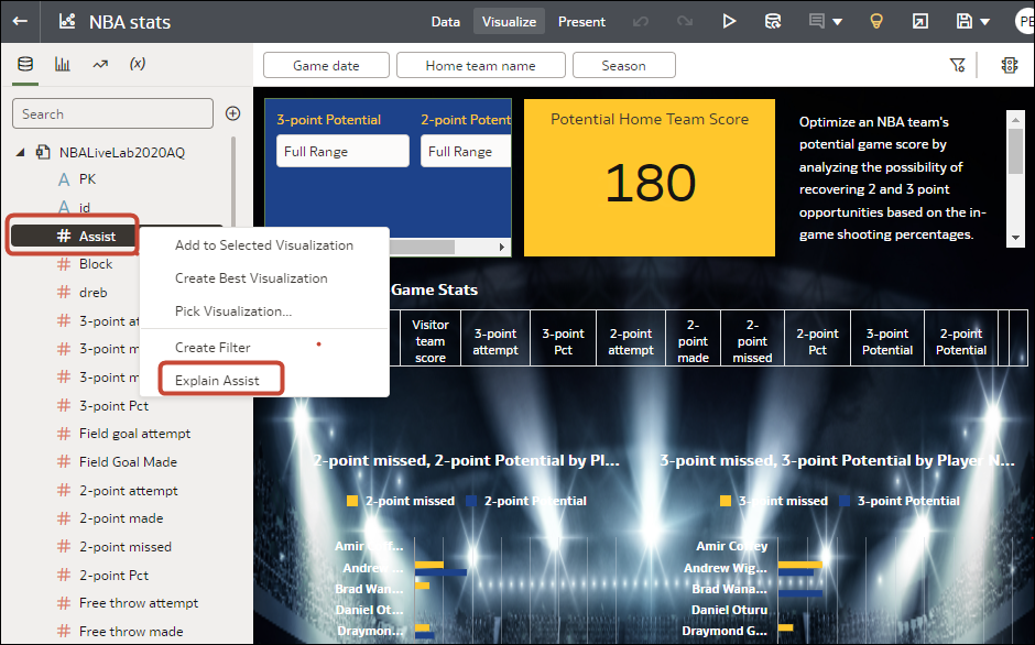
When you select a column and choose the Explain feature, Oracle Analytics uses machine learning to analyze the column in the context of the dataset. For example, Explain searches the selected data for key drivers and anomalies.
Explain is available after you install machine learning into your local Oracle Analytics Desktop directory. See How do I install Machine Learning for Desktop?


