About Designing Canvas Layouts to Display on Devices with Different Screen Sizes
You can design canvas layouts to fit different sized devices optimizing content in the browser, for example on a mobile, a tablet, or a laptop.
Optimize canvas layouts for different screen sizes
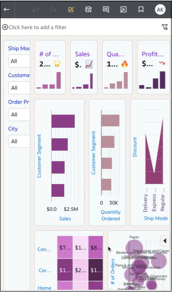
When you open a workbook on different sized devices, the canvas screen size scales to the browser screen size using the browser's defaults. Resizing the browser by decreasing its size can impact your ability to see the details in visualizations. For example, the data in a scattergraph, a heatmap, or most of the measure data in a tile visualization may become hard to read, making it impossible to see crucial information.
When you reduce the canvas size in a browser, visualizations
can become too small to display data properly.
As an author you can design canvas breakpoints so that when the canvas screen size reduces in size, the rendering of visualizations changes to fit the new screen size. For example, if the available screen size is too small to display a complete visualization, you can rearrange or hide the visualization to work better with the smaller screen size. You specify different canvas screen sizes and layouts using canvas breakpoints, where each breakpoint represents a different arrangement of visualizations displayed for each screen size.
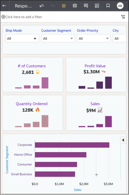
An optimized canvas for a smaller screen size breakpoint
contains visualizations that are rearranged to make viewing easier
on the smaller device.
You use a slider to define screen sizes for when consumer users display canvases on different sized devices. For example, you can change how the visualizations display by rearranging their location, size, or visibility on the canvas.
When you add a breakpoint to a canvas, the breakpoint screen size determine how visualizations display when viewed at that screen size. You can reposition, resize, or remove visualizations for a canvas breakpoint to optimize how users see visualizations. You can specify different visualization configurations for each breakpoint, and the differences for each breakpoint are only displayed to the consumer user when the browser screen size resolution matches the breakpoint screen size for which the changes are made.