Evaluate Machine Learning Models Using Lift and Gain Charts
Lift and gain charts enable you to compare different machine learning models to determine the most accurate model.
Overview to Using Lift and Gain Charts
Lift and gain charts enable you to evaluate predictive machine learning models by charting modeling statistics in a visualization in Oracle Analytics.
When you use a data flow to apply a classification model to a dataset, Oracle Analytics enables you to compute lift and gain values. You can then visualize this data in a chart to help you assess the accuracy of predictive models and determine the best one to use.

Description of the illustration ml-lift-and-gain-analysis-2.png
Prequisites
- Oracle Database or Oracle Autonomous AI Lakehouse
- A classification model that includes prediction probability (for
example, a multi-classifier model created using the Naive Bayes training
script).
You access existing predictive models in the Machine Learning area in Oracle Analytics.
Statistics Generated For Lift and Gain Analysis
Data
                        flow name
>_LIFT with these columns:
- PopulationPercentile - The dataset population split into 100 equal groups.
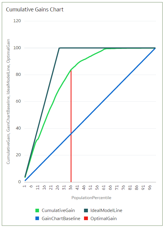
- CumulativeGain - The ratio of the cumulative number of positive targets up to that percentile, to the total number of positive targets. The closer the cumulative gains line is to the top-left corner of the chart, the greater the gain; the higher the proportion of the responders that are reached for the lower proportion of customers contacted.
- GainChartBaseline - The overall response rate : the line represents the percentage of positive records we expect to get if we selected records randomly. For example, in a marketing campaign, if we contact X% of the customers randomly, we will receive X% of the total positive response.
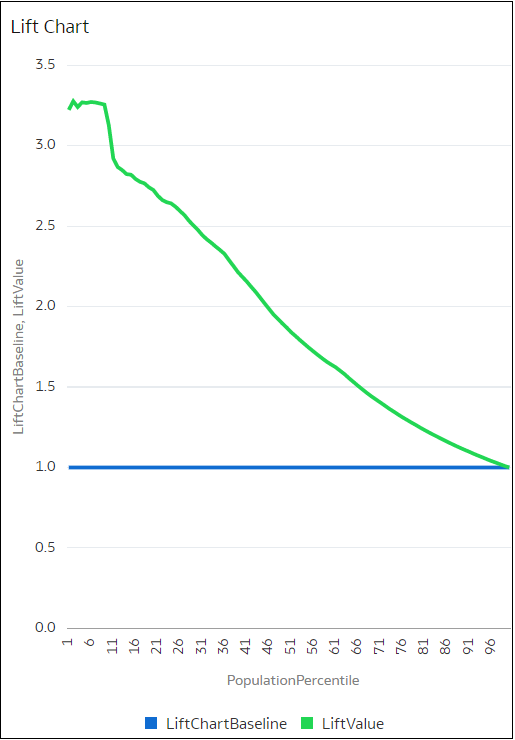
- LiftChartBaseline - Value of 1 and used as a baseline for lift comparison.
- LiftValue - The cumulative lift for a percentile. Lift is the ratio of the cumulative positive records density for the selected data, to the positive density over all the test data.
- IdealModelLine - The ratio of the cumulative number of positive targets to the total number of positive targets.
- OptimalGain - This indicates the optimum number of customers to contact. The cumulative gain curve will flatten beyond this point.
You can then visualize the <Data flow
name>_LIFT dataset in an Oracle Analytics chart. For example, to analyze gains, you might plot PopulationPercentile on the
x-axis, and CumulativeGain, GainChartBaseline, IdealModelLine, and OptimalGain on
the y-axis.

Description of the illustration ml-lift-and-gain-analysis-1.png
Generate Predictive Data for Lift and Gain Charts
When you use a data flow to apply a classification model to a dataset, Oracle Analytics enables you to compute statistics that you can visualize in lift and gain charts.
- On your home page, click Create, then click Data Flow.
- Select a data source, then click Add.
- Click Add a Step, and select Apply Model.
- At Select Model, select a classification model that includes prediction probability, then click OK.
- In Apply Model, in the
Parameters section:
- In Compute lift and gain, select Yes.
- In Target column to compute lift, select the column name of the value being predicted. For example, if your model predicts whether customers will sign up for a membership using a column named SIGNUP, select SIGNUP.
- In Positive class to compute, specify the case-sensitive data value representing the positive class (or the preferred outcome) in the prediction. For example, if your model predicts whether customers will sign-up for a membership using a column named SIGNUP with values YES or NO, specify YES.
- Add a Save Data node to your data flow.
- Execute this data flow.
Data flow
                name
>_LIFT that contains lift and gain statistics, which you can evaluate.