3 Design Responsive Apps
Oracle JET and Responsive Design
Responsive design describes a design concept that uses fluid grids, scalable images, and media queries to present alternative layouts based on the media type. With responsive design, you can configure Oracle JET apps to be visually appealing on a wide range of devices, ranging from small phones to wide-screen desktops.
Oracle JET includes classes that support a flexible box layout. In a flex layout, you can lay out the children of a flex container in any direction, and the children will grow to fill unused space or shrink to avoid overflowing the parent. You can also nest boxes (for example, horizontal inside vertical or vertical inside horizontal) to build layouts in two dimensions.
Oracle JET also provides a 12-column grid system and form layout classes that include styles for small, medium, large, and extra large screens or devices that you can use in conjunction with the flex layout classes to achieve finer control of your app’s layout. The grid system and form classes use media queries to set the style based on the width of the screen or device, and you can use them to customize your page layout based on your users' needs.
In addition, media queries form the basis for responsive helper classes that show or hide content, align text, or float content based on screen width. They are also the basis for responsive JavaScript that loads content conditionally or sets a component's option based on screen width.
Media Queries
CSS3 media queries use the @media at-rule, media type, and expressions that evaluate to true or false to define the cases for which the corresponding style rules will be applied. Media queries form the basis for Oracle JET’s responsive classes.
<style>
@media media_types (expression){
  /* media-specific rules */
}
</style>
The CSS3 specification defines several media types, but specific browsers may not implement all media types. The media type is optional and applies to all types if not specified. The following media query will display a sidebar only when the screen is wider than 767 pixels.
@media (max-width: 767px){
 .facet_sidebar {
    display: none;
  }
}
Oracle JET defines CSS3 media queries and style class custom properties to define screen widths for the themes included with Oracle JET.
| Width and Custom Property Name | Redwood Theme: Default Range in Pixels | Device Examples |
|---|---|---|
|
small
|
0-599 |
phones |
|
medium
|
600-1023 |
tablet portrait |
|
large
|
1024-1439 |
tablet landscape, desktop |
|
extra large
|
1440 and up |
large desktop |
For printing, Oracle JET uses the large screen layout for printing in landscape mode and the medium screen layout for printing in portrait mode.
Oracle JET's size defaults and media queries are defined in the Sass variables
contained in site_root/scss/oj/14.0.0/common/_oj.common.variables.scss and are used in the grid, form, and
responsive helper style classes. The following code sample shows the responsive screen width
variables and a subset of the responsive media queries. In most cases the defaults are
sufficient, but be sure to check the file for additional comments that show how you might
modify the variables for your app if needed.
// responsive screen widths
$screenSmallRange:  0, 767px !default;
$screenMediumRange: 768px, 1023px !default;
$screenLargeRange:  1024px, 1280px !default;
$screenXlargeRange: 1281px, null !default;

// responsive media queries
$responsiveQuerySmallUp:    "print, screen" !default;
$responsiveQuerySmallOnly:  "screen and (max-width: #{upper-bound($screenSmallRange)})" !default;

$responsiveQueryMediumUp:   "print, screen and (min-width: #{lower-bound($screenMediumRange)})" !default;
$responsiveQueryMediumOnly: "print and (orientation: portrait), screen and (min-width: #{lower-bound($screenMediumRange)}) and (max-width: #{upper-bound($screenMediumRange)})" !default;
$responsiveQueryMediumDown: "print and (orientation: portrait), screen and (max-width: #{upper-bound($screenMediumRange)})" !default;

$responsiveQueryLargeUp:    "print and (orientation: landscape), screen and (min-width: #{lower-bound($screenLargeRange)})" !default;
$responsiveQueryLargeOnly:  "print and (orientation: landscape), screen and (min-width: #{lower-bound($screenLargeRange)}) and (max-width: #{upper-bound($screenLargeRange)})" !default;
$responsiveQueryLargeDown:  "print and (orientation: landscape), screen and (max-width: #{upper-bound($screenLargeRange)})" !default;

$responsiveQueryXlargeUp:   "screen and (min-width: #{lower-bound($screenXlargeRange)})" !default;
$responsiveQueryXlargeOnly: null !default;
$responsiveQueryXlargeDown: null !default;

$responsiveQueryXXlargeUp:  null !default;

$responsiveQueryPrint:      null !default;
Responsive media queries are based on the screen widths defined in the $screen{size}Range variables and a range qualifier. For example:
-
$responsiveQuerySmallUpapplies to all screens in the$screenSmallRangeor wider. -
$responsiveQuerySmallOnlyapplies only to screens in the$screenSmallRange. -
$responsiveQueryXlargeDownapplies to all screens in the$screenXlargeRangeand narrower.
For additional information about Oracle JET’s use of Sass and theming, see Use CSS and Themes in Oracle JET Apps.
For additional information about CSS3 media queries, see https://developer.mozilla.org/en-US/docs/Web/Guide/CSS/Media_queries and http://www.w3.org/TR/css3-mediaqueries.
Oracle JET Flex, Grid, Form, and Responsive Helper Class Naming Convention
The Oracle JET flex, form, grid, and responsive style classes use the same naming convention which can help you identify the style size, function, and number of columns the class represents.
Each class follows the same format as shown below:
oj-size-function-[1-12]columns
Size can be one of sm, md, lg, xl, and print and are based on the media queries described in Media Queries. Oracle JET will apply the style to the size specified and any larger sizes unless function is defined as only. For example:
-
oj-lg-hidehides content on large and extra-large screens. -
oj-md-only-hidehides content on medium screens. The style has no effect on other screen sizes.
You can find a summary of the classes available to you for responsive design in Oracle JET in the Oracle® JavaScript Extension Toolkit (JET) Styling Reference.
Oracle JET Flex Layouts
Use the Oracle JET oj-flex and oj-flex-item classes to create flexible box layouts that are based on the CSS flexible box layout model.
In the flex layout model, you create flex containers with children that you can lay out in any direction or order. As the available unused space grows or shrinks, the children grow to fill the unused space or shrink to avoid overflowing the parent.
To create a basic flex layout, add the oj-flex class to a container element (HTML div, for example) and then add the oj-flex-item class to each of the container’s children.
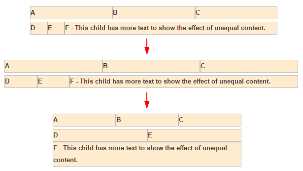
The following image shows an example of a default flex layout using the Oracle JET flex box styles. The sample contains two flex containers, each with three children. As the screen size widens, the flex container allocates unused space to each of the children. As the screen size shrinks below the width of one of the flex items, the flex container will wrap the content in that item as needed to no wider than the maximum display width. In this example, this has the effect of causing the F child to wrap to the next row.
The markup for this flex layout is shown below, with the flex layout classes highlighted in bold. The demo-flex-display class sets the color, font weight, height, and border around each flex item in the layout.
<div id="container">
  <div class="demo-flex-display">
    <div class="oj-flex">
      <div class="oj-flex-item">A</div>
      <div class="oj-flex-item">B</div>
      <div class="oj-flex-item">C</div>
    </div>

    <div class="oj-flex">
      <div class="oj-flex-item">D</div>
      <div class="oj-flex-item">E</div>
      <div class="oj-flex-item">F - This child has more text to show the effect of unequal content.</div>
    </div>
  </div>
</div>
You can customize the flex layout using styles detailed in Flex Layout Styling and described below.
About Modifying the flex Property
Oracle JET provides layout classes that you use to modify the properties of your responsive layout.
The Oracle JET layout classes are based on the CSS Flexible Box Layout Module which defines CSS flex common values for flex item sizing. By default, Oracle JET’s flex layout defaults to the auto CSS flex property which allows a flex item to shrink or grow as needed for responsive layouts. However, the CSS model sets the default flex property to initial , which allows a flex item to shrink but will not allow it to grow.
You can achieve the same effect by adding the oj-sm-flex-items-initial class to the flex container to set the flex property to initial for all child flex items, or add the oj-sm-flex-initial class to an individual flex item to set its property to initial. The following image shows the effect.
The code sample below shows the markup. In this example, padding is also added to the content using the oj-flex-items-pad class on the parent container.
<div id="container">
  <div class="demo-flex-display oj-flex-items-pad">
    <div class="oj-flex oj-sm-flex-items-initial">
      <div class="oj-flex-item">A</div>
      <div class="oj-flex-item">B</div>
      <div class="oj-flex-item">C</div>
    </div>

    <div class="oj-flex">
      <div class="oj-flex-item">A</div>
      <div class="oj-sm-flex-initial oj-flex-item">B</div>
      <div class="oj-flex-item">C</div>
    </div>
  </div>
</div>
You can also override the default auto flex property by using the oj-size-flex-items-1 class on the flex container. This class sets the flex property to 1, and all flex items in the flex container with a screen size of size or higher will have the same width, regardless of the items’ content.
To set the flex property to 1 on an individual flex item, add oj-sm-flex-1 to the flex item. The Flex Layouts section in the Oracle JET Cookbook includes the examples used in this section that you can use and modify to observe the flex layout’s responsive behavior.
About Wrapping Content with Flex Layouts
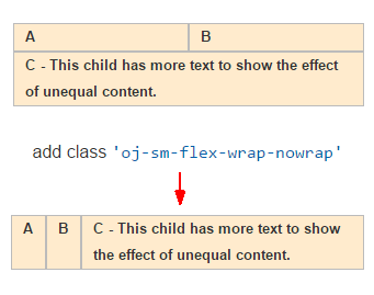
You can set the flex-wrap property to nowrap by adding oj-sm-flex-nowrap to the oj-flex container.
By default, Oracle JET sets the CSS flex-wrap property to wrap, which sets the flex container to multi-line. Child flex items will wrap content to additional lines when the screen width shrinks to less than the width of the flex item’s content. However, the CSS model sets the flex-wrap property to nowrap, which sets the flex container to single-line. When a child item’s content is too wide to fit on the screen, the content will wrap within the child.
The following image shows the effect of changing the flex-wrap property to nowrap.
About Customizing Flex Layouts
You can customize an Oracle JET flex layout by adding the appropriate style to the flex container or child. The flex layout classes support some commonly-used values.
-
flex-direction -
align-items -
align-self -
justify-content -
order
The Oracle JET Cookbook includes examples for customizing your flex layout at: Flex Layouts.
Oracle JET Grids
Use the Oracle JET grid classes with flex layouts to create grids that vary the number and width of columns based on the width of the user's screen.
The Responsive Grids section in the Oracle JET Cookbook provides several examples and recipes for using the Oracle JET grid system, and you should review them to get accustomed to the grid system.
About the Grid System
Oracle JET provides a 12-column responsive mobile-first grid system that you can use for responsive design. The grid builds upon the Oracle JET flex layout and allows you to specify the widths of each flex item using sizing classes for small, medium, large, and extra-large screens.
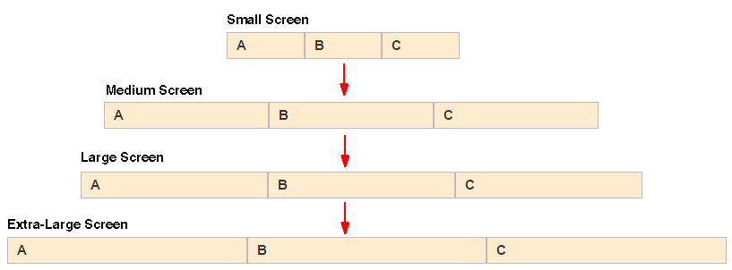
For example, you can use the grid classes to change the default display in the Flex Layouts Auto example to use different widths for the flex items when the screen size changes. As shown in the image below, the flex layout by default will allocate the unused space evenly to the three flex items regardless of the screen size.
The grid classes follow the Oracle JET Flex, Grid, Form, and Responsive Helper Class Naming Convention. Use oj-size-numberofcolumns to set the width to the specified numberofcolumns when the screen is the specified size or larger. For example:
-
oj-sm-6works on all screen sizes and sets the width to 6 columns. -
oj-lg-3sets the width to 3 columns on large and extra-large screens. -
oj-sm-6andoj-lg-3on the same flex item sets the width to 6 columns wide on small and medium screens and 3 columns wide on large and extra-large screens.
Design for the smallest screen size first and then customize for larger screens as needed. You can further customize the grid by adding one of the Grid Convenience Classes or by using one of the responsive helper classes described in Use the Responsive Helper Classes.
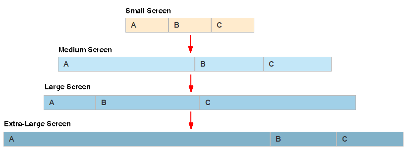
The following code sample shows the markup for the modified Flex Auto Layout display, with grid classes defined for medium, large, and extra-large screens.
<div class="oj-flex">
  <div class="oj-md-6 oj-lg-2 oj-xl-8 oj-flex-item">A</div>
  <div class="oj-md-3 oj-lg-4 oj-xl-2 oj-flex-item">B</div>
  <div class="oj-md-3 oj-lg-6 oj-xl-2 oj-flex-item">C</div>
</div>
When the screen size is small, the flex layout default styles are used, and each item uses the same amount of space. When the screen size is medium, the A flex item will use 6 columns, and the B and C flex items will each use 3 columns. When the screen size is large, The A flex item will use 2 columns, the B flex item will use 4 columns, and the C flex item will use 6 columns. Finally, when the screen size is extra large, the A flex item will use 8 columns, and the B and C flex items will each use 2 columns.
For a complete example that illustrates working with the grid system, see Responsive Grids.
The Grid System and Printing
The Oracle JET grid system applies the large styles for printing in landscape mode and the medium style for printing in portrait mode if they are defined. You can use the defaults or customize printing using the print style classes.
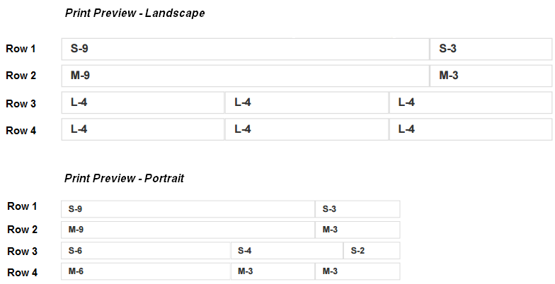
In the grid example below, Row 2 and Row 4 include the oj-md-* style classes. Row 3 and Row 4 include the oj-lg-4 style for all columns in the row.
<div class="demo-grid-sizes demo-flex-display">
  <div class="oj-flex oj-flex-items-pad">
    <div class="oj-sm-9 oj-flex-item"></div>
    <div class="oj-sm-3 oj-flex-item"></div>
  </div>
  <div class="oj-flex oj-flex-items-pad">
    <div class="oj-sm-6 oj-md-9 oj-flex-item"></div>
    <div class="oj-sm-6 oj-md-3 oj-flex-item"></div>
  </div>
  <div class="oj-flex oj-flex-items-pad">
    <div class="oj-sm-6 oj-lg-4 oj-flex-item"></div>
    <div class="oj-sm-4 oj-lg-4 oj-flex-item"></div>
    <div class="oj-sm-2 oj-lg-4 oj-flex-item"></div>
  </div>
  <div class="oj-flex oj-flex-items-pad ">
    <div class="oj-sm-8 oj-md-6 oj-lg-4 oj-xl-2 oj-flex-item"></div>
    <div class="oj-sm-2 oj-md-3 oj-lg-4 oj-xl-8 oj-flex-item"></div>
    <div class="oj-sm-2 oj-md-3 oj-lg-4 oj-xl-2 oj-flex-item"></div>
  </div>
</div>
As shown in the following print preview, when you print this grid in landscape mode, the oj-lg-4 style classes will be applied on Row 3 and Row 4. When you print the grid in portrait mode, the oj-md-* style classes apply on Row 2 and Row 4.
If you want to change the printing default, you can set the Sass $responsiveQueryPrint variable to print in a custom settings file. After you enable the print classes, you can add the oj-print-numberofcolumns style class to the column definition. This has the effect of changing the column sizes for printing purposes only. In the following example, Row 1 includes the oj-print-6 class for each column in the row.
<div class="oj-flex oj-flex-items-pad"> <div class="oj-sm-9oj-print-6oj-flex-item"></div> <div class="oj-sm-3oj-print-6oj-flex-item"></div> </div>
In normal mode, Row 1 contains two columns, one column with a size of 9 and one column with a size of 3, regardless of screen size. If you do a print preview, however, you'll see that Row 1 will print with two columns in portrait and landscape mode, both with a size of 6.
Grid Convenience Classes
Oracle JET's grid system includes convenience classes that make it easier to create two- and four- column layouts with specified widths.
-
oj-size-odd-cols-numberofcolumns: Use this in a 2-column layout. Instead of putting sizing classes on every column, you can put a single class on the flex parent. The number of columns specifies how many of the 12 columns the odd-numbered columns can use. In a 2-column layout, the even-numbered columns will take up the remainder of the columns.For example, setting
oj-md-odd-cols-4on the flex parent will have the effect of setting the odd column (col1) width to 4 and the even column (col2) width to 8 for all rows in the grid on medium-size screens and higher.The code sample below shows the grid configuration used to render the figure. The example also sets
oj-sm-odd-cols-12which will set the odd column width to 12 on small screens, displayingcol2on a new row.<div class="oj-md-odd-cols-4 oj-flex-items-pad"> <div class="oj-flex"> <div class="oj-flex-item">col 1</div> <div class="oj-flex-item">col 2</div> </div> <div class="oj-flex"> <div class="oj-flex-item">col 1</div> <div class="oj-flex-item">col 2</div> </div> <div class="oj-flex"> <div class="oj-flex-item">col 1</div> <div class="oj-flex-item">col 2</div> </div> </div>You could achieve the same effect by defining
oj-md-4for the first column's width andoj-md-8for the second column's width on each flex item.<div class="oj-flex-items-pad" <div class="oj-flex"> <div class="oj-sm-12 oj-md-4 oj-flex-item">col 1</div> <div class="oj-sm-12 oj-md-8 oj-flex-item">col 2</div> </div> <div class="oj-flex"> <div class="oj-sm-12 oj-md-4 oj-flex-item">col 1</div> <div class="oj-sm-12 oj-md-8 oj-flex-item">col 2</div> </div> <div class="oj-flex"> <div class="oj-sm-12 oj-md-4 oj-flex-item">col 1</div> <div class="oj-sm-12 oj-md-8 oj-flex-item">col 2</div> </div> </div>oj-size-even-cols-numberofcolumns: Use in a 4-column layout. In this layout, you must use both theodd-colsclass to control the width of odd-numbered columns and theeven-colsclass to control the width of the even columns.For example, setting
oj-md-odd-cols-2andoj-md-even-cols-4on the flex parent has the effect of setting the first and third column widths to 2, and the second and fourth column widths to 4.The code sample below shows the grid configuration used to render the figure.
<div class="oj-sm-odd-cols-12 oj-md-odd-cols-2 oj-md-even-cols-4 oj-flex-items-pad">
  <div class="oj-flex">
    <div class="oj-flex-item">col 1</div>
    <div class="oj-flex-item">col 2</div>
    <div class="oj-flex-item">col 3</div>
    <div class="oj-flex-item">col 4</div>
  </div>
  <div class="oj-flex">
    <div class="oj-flex-item">col 1</div>
    <div class="oj-flex-item">col 2</div>
    <div class="oj-flex-item">col 3</div>
    <div class="oj-flex-item">col 4</div>
  </div>
</div>
If you don't use the convenience classes, you must define the size classes on every column in every row as shown below.
<div class="oj-flex-items-pad">
  <div class="oj-flex">
    <div class="oj-sm-odd-cols-12 oj-md-2 oj-flex-item">col 1</div>
    <div class="oj-sm-odd-cols-12 oj-md-4 oj-flex-item">col 2</div>
    <div class="oj-sm-odd-cols-12 oj-md-2 oj-flex-item">col 3</div>
    <div class="oj-sm-odd-cols-12 oj-md-4 oj-flex-item">col 4</div>
  </div>
  <div class="oj-flex">
    <div class="oj-sm-odd-cols-12 oj-md-2 oj-flex-item">col 1</div>
    <div class="oj-sm-odd-cols-12 oj-md-4 oj-flex-item">col 2</div>
    <div class="oj-sm-odd-cols-12 oj-md-2 oj-flex-item">col 3</div>
    <div class="oj-sm-odd-cols-12 oj-md-4 oj-flex-item">col 4</div>
  </div>
</div>
Responsive Form Layouts
Oracle JET provides the oj-form-layout component that you
can use to create form layouts that adjust to the size of the user's screen. Use the
oj-input-text and oj-text-area custom elements within
the oj-form-layout component to create an organized layout.
For more information on oj-form-layout component, see Form
Layouts.
Add Responsive Design to Your App
To create your responsive app using Oracle JET, design for the smallest device first and then customize as needed for larger devices. Add the applicable app, flex, grid, form, and responsive classes to implement the design.
To design a responsive app using Oracle JET classes:
For the list of responsive design classes and their behavior, see the Responsive* classes listed in the Oracle® JavaScript Extension Toolkit (JET) Styling Reference.
For Oracle JET Cookbook examples that implement responsive design, see:
Use Responsive JavaScript
Oracle JET includes the ResponsiveUtils and ResponsiveKnockoutUtils utility classes that leverage media queries to change a component's value option or load content and images based on the user's screen size or device type.
The Responsive JavaScript Classes
The ResponsiveUtils and ResponsiveKnockoutUtils
responsive JavaScript classes provide methods that you can use in your app's JavaScript to
obtain the current screen size and use the results to perform actions based on that screen
size. In addition, the ResponsiveUtils provides a method that you can use to
compare two screen sizes, useful for performing actions when the screen size changes.
| JavaScript Class | Methods | Description |
|---|---|---|
|
|
|
Compares two screen size constants. Returns a negative integer if the first argument is less than the second, a zero if the two are equal, and a positive integer if the first argument is more than the second. The screen size constants identify the screen size range media queries. For example, the |
|
|
|
Returns the media query to use for the framework query key parameter. The framework query key constant corresponds to a Sass responsive query variable. For example, the |
|
|
|
Creates a Knockout observable that returns true or false based on a media query string. For example, the following code will return true if the screen size is 400 pixels wide or larger. var customQuery =
ResponsiveKnockoutUtils.createMediaQueryObservable(
'(min-width: 400px)'); |
|
|
|
Creates a computed Knockout observable, the value of which is one of the For example, on a small screen (0 - 767 pixels), the following code will create a Knockout observable that returns self.screenRange = ResponsiveKnockoutUtils.createScreenRangeObservable(); |
For additional detail about responsiveUtils, see the ResponsiveUtils API documentation. For more information about responsiveKnockoutUtils, see ResponsiveKnockoutUtils.
Change a Custom Element’s Attribute Based on Screen Size
You can set the value for a custom element’s attribute based on screen size using the responsive JavaScript classes. For example, you may want to add text to a button label when the screen size increases using the oj-button element's display attribute.
In this example, the oj-button element’s display attribute is defined for icons. The code sample below shows the markup for the button.
<div id="optioncontainer">
  <oj-button display="[[large() ? 'all' : 'icons']]">
    <span slot='startIcon' class="oj-fwk-icon oj-fwk-icon-calendar"></span>
    calendar
  </oj-button>
</div>
The code sample also sets the oj-button display attribute to all, which displays both the label and icon when the large() method returns true, and icons only when the large() method returns false.
The code sample below shows the code that sets the value for large() and completes the knockout binding. In this example, lgQuery is set to the LG_UP framework query key which applies when the screen size is large or up. this.large is initially set to true as the result of the call to ResponsiveKnockoutUtils.createMediaQueryObservable(lgQuery). When the screen changes to a smaller size, the self.large value changes to false, and the display attribute value becomes icons.
require(['knockout', 'ojs/ojbootstrap', 'ojs/ojresponsiveutils', 'ojs/ojresponsiveknockoututils', 'ojs/ojknockout', 'ojs/ojbutton'],
  function(ko, Bootstrap, ResponsiveUtils, ResponsiveKnockoutUtils)
  {
    function MyModel(){
      // observable for large screens
      var lgQuery = ResponsiveUtils.getFrameworkQuery(
                          ResponsiveUtils.FRAMEWORK_QUERY_KEY.LG_UP);

      this.large = ResponsiveKnockoutUtils.createMediaQueryObservable(lgQuery);
    }

    Bootstrap.whenDocumentReady().then(
       function ()
       {
         ko.applyBindings(new MyModel(), document.getElementById('optioncontainer'));
       }
    );
  });
The Oracle JET Cookbook contains the complete code for this example which includes a demo that shows a computed observable used to change the button label's text depending on the screen size. You can also find examples that show how to use custom media queries and Knockout computed observables. For details, see Responsive JavaScript Framework Queries.
Conditionally Load Content Based on Screen Size
You can change the HTML content based on screen size using the responsive JavaScript classes. For example, you might want to use a larger font or a different background color when the screen size is large.
In this example, the HTML content is defined in Knockout templates. The markup uses
Knockout's data-bind utility to display a template whose name depends on the value returned by
the large() call. If the screen is small or medium, the app will use the
sm_md_template. If the screen is large or larger, the app will use the
lg_xl_template.
<div id="sample_container">

  <!-- large template -->
  <script type="text/html" id="lg_xl_template">
    <div id="lg_xl"
         style="background-color:lavenderblush;
                padding: 10px; font-size: 22px" >
     This is the content in the <strong>lg/xl</strong> template.
    </div>
  </script>

  <!-- small template -->
  <script type="text/html" id="sm_md_template">
    <div id="sm_md"
         style="background-color:lightcyan;
                padding: 10px; font-size: 10px" >
      This is the content in the <strong>sm/md</strong> template.
    </div>
  </script>


  <!-- display template -->
  <div data-bind="template: {name: large() ? 'lg_xl_template' :
                                             'sm_md_template'}"></div>
</div>
The code that sets the value for large() is identical to the code used for setting component option changes. For details, see Change a Custom Element’s Attribute Based on Screen Size.
For the complete code used in this example, see the Responsive Loading with JavaScript demo in the Oracle JET Cookbook.
Create Responsive Images
You can use the responsive JavaScript classes to load a different image when the screen size changes. For example, you may want to load a larger image when the screen size changes from small and medium to large and up.
In this example, the image is defined in a HTML img element. The markup uses Oracle JET’s attribute binding to display a larger image when the large() call returns true.
<div id="container">
    <p>current width:
      <strong>
  <span>
    <oj-bind-text value="[[large() ? 'large' : 'not large']]"></oj-bind-text>
  </span>
      </strong>
    </p>

    <img alt="puzzle" id="puzzle"
 :src="[[large() ? 'images/responsive/puzzle.png' : 'images/responsive/puzzle_small.png']]"
 />
</div>
The code that set the value for large() is identical to the code used for setting component option changes. For details, see Change a Custom Element’s Attribute Based on Screen Size.
Note:
The image will not begin to load until the JavaScript is loaded. This could be an issue on devices with slower connections. If performance is an issue, you can use responsive CSS as described in Create Responsive CSS Images. You could also use the HTML picture element which supports responsive images without CSS or JavaScript. However, browser support is limited and may not be an option for your environment.
For the complete code used in this example, see the Oracle JET Cookbook Responsive Images demos.
Use the Responsive Helper Classes
Use the Oracle JET generic responsive utility classes to hide content, end align text, and set float in your grid.
-
oj-size-hide: Hide content at the specifiedsize. -
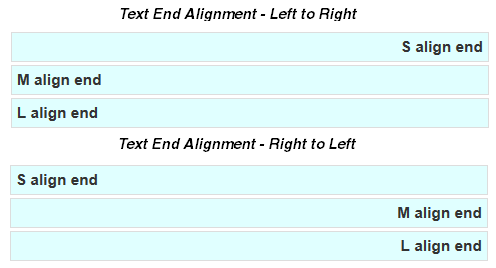
oj-size-text-align-end: In left-to-right languages, settext-alignto right. In right-to-left languages, set text-alignto left. -
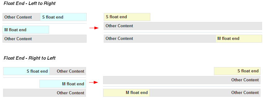
oj-size-float-end: In left-to-right languages, setfloatto right. In right-to-left languages, setfloatto left. -
oj-size-float-start: In left-to-right languages, setfloatto left. In right-to-left languages, setfloatto right.
To see examples that implement the responsive helper classes, consult the Oracle JET Cookbook at Responsive Helpers.
Create Responsive CSS Images
Use CSS generated from Sass media query variables and responsive queries to use a different, larger image when the screen width changes from small to large.
The code below shows the markup that defines the image. In this example, bulletlist is a CSS class generated from the Sass responsive variables and media queries.
<div role="img" class="oj-icon bulletlist" title="bulleted list image"></div>
The following image shows the bulletlist CSS class. When the screen is small or medium size, the icon_small.png image loads. When the screen increases to large or larger, or to print, the icon.png loads instead.
The Oracle JET Cookbook includes the Sass variables and queries used to generate the bulletlist CSS class. You can also find a Sass mixin that makes generating the CSS easier, but you are not required to use SCSS to create responsive CSS images.
In addition, the Oracle JET Cookbook includes examples that show high resolution images, sprites, button images, and more. For details, see Responsive CSS Images.
Note:
You can also use responsive JavaScript to change the images based on screen size. For details, see Create Responsive Images.
Change Default Font Size
By default, Oracle JET includes the Redwood theme, starting in JET release
9.0.0, that set a default font size of 1em (16px) on the root (html)
element. This font size is optimized for visibility and touchability on mobile devices, but
you can customize the size as needed for your app.
Change Default Font Size Across the App
The browser's font size is defined in the Sass $rootFontSize variable and included in the generated CSS html class. You can use Sass to change the variable or override the generated CSS.
Control the Size and Generation of the CSS
You can change the size of the CSS content automatically generated by Oracle JET so that unused classes or particular types of classes are compressed, removed, excluded, or not generated.
When you use the responsive framework classes, Oracle JET generates a large number of classes that you may not need. Here are some steps you can take to control the size and generation of the CSS.
-
Use compression.
The responsive classes are often repetitive and compress well. For details about compressing your CSS, see Optimize Performance of Oracle JET Apps.
-
Remove unused classes.
By default, Oracle JET generates responsive classes small, medium, large, and xlarge screens. If you know that your app will not use some of these classes, you can set the associated
$responsiveQuery*variables tonone.// If you don't want xlarge classes, you could set: $screenXlargeRange: none; $responsiveQueryLargeOnly: none; $responsiveQueryXlargeUp: none;
-
Exclude unused classes from the app layout, flex, grid, form layout, and responsive helper groups.
You can use the following variables to exclude classes from these groups altogether:
-
$includeAppLayoutClasses -
$includeAppLayoutWebClasses -
$includeFlexClasses -
$includeGridClasses -
$includeFormLayoutClasses -
$includeResponsiveHelperClasses
-
-
Stop generation of a particular responsive helper class.
For finer-grained control, there are additional variables that you can set to
falseto generation of a particular type of class.Variable Description $responsiveGenerateHideGenerate hide classes like
.oj-md-hide.$responsiveGenerateTextAlignEndGenerate text-align end classes like
.oj-md-text-align-end.$responsiveGenerateFloatStartGenerate float start classes like
.oj-md-float-start.$responsiveGenerateFloatEndGenerate float end classes like
.oj-md-float-end.
