11 Work with User Assistance
oj-checkboxset, oj-color*,
oj-combobox*,
oj-input*,
oj-radioset,
oj-select*,
oj-slider,
oj-switch, and
oj-text-area.Note:
Theoj-input* mentioned above refers to the family of input components such as oj-input-date-time, oj-input-text, and oj-input-password, among others. oj-color*, oj-combobox*, and oj-select* each represent two components.
Tip:
To add tooltips to plain text or other non-editable components, useoj-popup. See the Tooltip example in
the Oracle JET Cookbook at Popups.
Understand Oracle JET's Messaging APIs on Editable Components
Oracle JET provides a messaging API to support messaging on Oracle JET editable components.
Editable components include the following:
-
oj-checkboxset -
oj-color-palette -
oj-color-spectrum -
oj-combobox-many -
oj-combobox-one -
oj-input-date -
oj-input-date-time -
oj-input-number -
oj-input-password -
oj-input-text -
oj-input-time -
oj-radioset -
oj-select-many -
oj-select-one -
oj-slider -
oj-switch -
oj-text-area
The Oracle JET Cookbook also includes descriptions and examples for working with each component at: Form Controls.
About Oracle JET Editable Component Messaging Attributes
The following attributes impact messaging on editable elements.
| Element Attribute | Description |
|---|---|
|
|
Default |
|
|
JSON object literal that specifies the location where the element should display auxiliary content such as |
|
|
Help message displayed on an The The |
|
|
Displays text in a note window that displays when the user sets focus on the input field. You can format the text string using standard HTML formatting tags. |
|
|
List of messages that the app provides when it encounters business validation errors or messages of other severity type. |
|
|
The placeholder text to set on the element. |
|
|
Object containing all translated resources relevant to the component and all its superclasses. Use sub-properties to modify the component's translated resources. |
|
|
List of validators used by element when performing validation. Validator hints are displayed in a note window by default. |
See the Attributes section of the element's API documentation in API
Reference for Oracle® JavaScript Extension Toolkit (Oracle JET) for additional details about its messaging properties. Select the component you're interested in viewing from the API list.
About Oracle JET Component Messaging Methods
Editable value components support the following method for messaging purposes.
| Component Event | Description |
|---|---|
|
|
Takes all deferred messages and shows them. If there were no deferred messages this method simply returns. When the user sets focus on the component, the deferred messages will display inline. |
See the Methods section of the component's API documentation in the API
Reference for Oracle® JavaScript Extension Toolkit (Oracle JET) for details on how to call the method, its parameters, and return value. Select the component you're interested in viewing from the list.
Understand How Validation and Messaging Works in Oracle JET Editable Components
The actions performed on an Oracle JET component, the properties set on it, and the methods called on it, all instruct the component on how it should validate the value and what content it should show as part of its messaging.
Editable components always perform either normal or deferred validation in some situations. In other situations, the editable component decides to perform either normal or deferred validation based on the component's state. Understanding the normal and deferred validation process may be helpful for determining what message properties to set on your components.
-
Normal Validation: During normal validation, the component clears all
messagesproperties (messages-custom), parses the UI value, and performs validation. Validation errors are reported to the user immediately. If there are no validation errors, thevalueattribute is updated, and the value is formatted and pushed to the display.The editable component always runs normal validation when:
-
The user interacts with an editable component and changes its value in the UI.
-
The app calls
validate()on the component.
Note:
When the app changes certain properties, the component might decide to run normal validation depending on its current state. See Mixed Validation below for additional details.
-
-
Deferred Validation: Uses the
requiredvalidator to validate the component'svalue. Therequiredvalidator is the only validator that participates in deferred validation. During deferred validation allmessagesproperties are cleared unless specified otherwise. If thevaluefails deferred validation, validation errors are not shown to the user immediately.The editable component always runs deferred validation when:
-
A component is created. None of the
messagesproperties are cleared. -
The app calls the
reset()method on the component. -
The app changes the
valueproperty on the component programmatically.
Note:
When the app changes certain properties programmatically, the component might decide to run deferred validation depending on its current state. See Mixed Validation below for additional details.
-
-
Mixed Validation: Runs when the following properties are changed or methods are called by the app. Either deferred or normal validation is run based on the component's current state, and any validation errors are either hidden or shown to the user. Mixed validation runs when:
-
converterproperty changes -
disabledproperty changes -
readOnlyproperties change -
requiredproperty changes -
validatorsproperty changes -
refresh()method is called
-
The Oracle JET Cookbook includes additional examples that show normal and deferred validation at Validators (Component). For additional information about the validators and converters included with Oracle JET, see Validate and Convert Input.
Understand How an Oracle JET Editable Component Performs Normal Validation
An Oracle JET editable component runs normal validation when the user changes the
value in the UI or when the app calls the component's validate()
method. In both cases, error messages are displayed immediately.
About the Normal Validation Process When User Changes Value of an Editable Component
When a user changes an editable value:
-
All
messages-custommessages are cleared. AnonMessagesCustomChangedevent is triggered if applicable and if the change in value is obvious. -
If a converter is set on the component, the UI value is parsed. If there is a parse error, then processing jumps to step 5.
-
If one or more validators are set on the component:
-
The parsed (converted) value is validated in sequence using the specified validators, with the implicit required validator being the first to run if present. The value that is passed to the implicit required validator is trimmed of white space.
-
If the validator throws an error, the error is remembered, and the next validator runs if it exists.
After all validators complete, if there are one or more errors, processing jumps to step 5.
-
-
If all validations pass:
-
The parsed value is written to the component's
valueattribute, and anonValueChangedevent is triggered for thevalueattribute. -
The new value is formatted for display using the converter again and displayed on the component.
Note:
If the component's value property happens to be bound to a Knockout observable, then the value is written to the observable as well.
-
-
If one or more errors occurred in an earlier step:
-
The component's
valueproperty remains unchanged. -
Errors are displayed by default inline with the component. The user can also view the details of the error by setting focus on the component.
-
-
When the user fixes the error, the validation process begins again.
About the Normal Validation Process When Validate() is Called on Editable Component
The validate() method validates the component's current display value using the converter and all validators registered on the component and updates the value attribute if validation passes.
The method is only available on editable components where it makes sense, for example, oj-input-number. For details about the validate() method, see validate().
Understand How an Oracle JET Editable Component Performs Deferred Validation
An Oracle JET editable component runs deferred validation when the component is created, when its value or required property is changed programmatically, or when the component's reset() method is called. This section provides additional detail about the deferred validation process when an Oracle JET editable component is created and when the value property is changed programmatically.
You can also find additional detail in the API Reference for Oracle® JavaScript Extension Toolkit (Oracle JET). Select the component you’re interested in from the navigation list.
About the Deferred Validation Process When an Oracle JET Editable Component is Created
When an editable element is created, as one of the last steps, it runs deferred validation on the component's initialized value.
-
The required validator is run, and a validation error raised if the value is empty or null.
-
If a validation error is raised, the component updates the messaging framework. No messaging themes are applied on the component nor does it show the error message in the note window because the validation error message is deferred.
Note:
Page authors can call showMessages() at any time to reveal deferred messages.
About the Deferred Validation Process When value Property is Changed Programmatically
An Oracle JET editable element’s value property can change programmatically if:
-
The page has code that changes the element's value attribute, or
-
The page author refreshes the ViewModel observable with a new server value.
In both cases, the element will update itself to show the new value as follows:
-
All messages properties are cleared on the editable element and
onMessagesCustomChangedevents triggered if applicable. -
An
onValueChangedevent is triggered for thevalueattribute if applicable. -
If a converter is set on the element, the
valueattribute is retrieved and formatted before it's displayed. If there is a format error, then processing jumps to step 5. Otherwise the formatted value is displayed on the element. -
Deferred validators are run on the new value. Any validation errors raised are communicated to the messaging framework, but the errors themselves are not shown to the user.
-
If there was a formatting error, the validation error message is processed and the component's
messages-customattribute updated. Formatting errors are shown right away.
Note:
Page authors should ensure that the value you set is the expected type as defined by the component's API and that the value can be formatted without any errors for display.
Use Oracle JET Messaging
Use the Oracle JET messaging framework to notify an Oracle JET app of a component's messages and validity as well as notify an Oracle JET component of a business validation failure.
Notify an Oracle JET Editable Component of Business Validation Errors
You can notify Oracle JET editable elements of business validation errors using the messages-custom attribute and the showMessages() method.
Use the messages-custom Attribute
Your app can use this attribute to notify Oracle JET components to show new or
updated custom messages. These could be a result of business validation that originates in the
viewModel layer or on the server. When this property is set, the message shows to the user
immediately. The messages-custom attribute takes an Object that duck-types
Message with detail, summary, and severity fields.
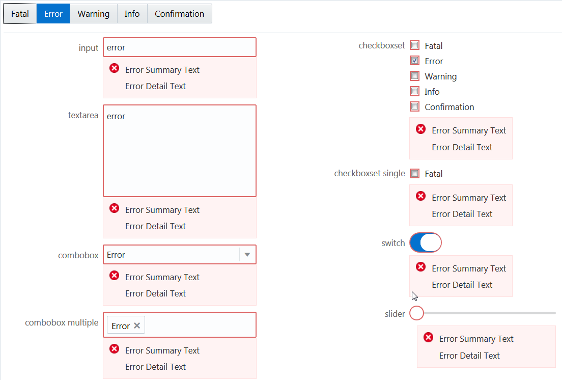
In this example, the severity type button is toggled and a message of the selected severity type is pushed onto the messages-custom array. The messages-custom attribute is set on every form control in this example. When the messages-custom attribute is changed, it is shown immediately. In this example, the user selected the Error severity type, and the associated messages are shown for the various text input and selection components.
In this example an observable, appMessages, is declared and is bound to the messages-custom attribute for various elements. The following code describes how you can associate the observable with the messages-custom attribute for the oj-switch element .
<oj-switch id="switch" value="{{switchValue}}"
           messages-custom="{{appMessages}}">
</oj-switch>
In the corresponding JavaScript file, set the severity type and pass it to the observable, appMessages, to display associated messages.
if (summary && detail)
{
 msgs.push({summary: summary, detail: detail, severity: type});
}
self.appMessages(msgs);
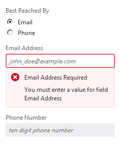
In the example below, an instance of a cross-field custom validator is associated with the emailAddress observable, ensuring that its value is non-empty when the user chooses Email as their contact preference.
In the corresponding JavaScript file you must set the messages-custom attribute as emailAddressMessages.
<oj-input-text id="emailId" type="email"  name="emailId"
               placeholder="john_doe@example.com" value="{{emailAddress}}"
               messages-custom="{{emailAddressMessages}}"
               disabled="[[contactPref() !== 'email']]">
</oj-input-text>
For the complete example and code used to create the custom validator, see Cross-Field Validation. The demo uses a custom validator to validate an observable value against another. If validation fails the custom validator updates the messages-custom attribute.
Use the showMessages() Method on Editable Components
Use this method to instruct the component to show its deferred messages. When this method is called, the Oracle JET editable component automatically takes all deferred messages and shows them. This causes the component to display the deferred messages to the user.
For an example, see Show Deferred Messages.
Understand the oj-validation-group Component
The oj-validation-group component is an Oracle JET element
that tracks the validity of a group of components and allows a page author to enforce
validation best practices in Oracle JET apps.
Apps can use this component to:
-
Determine whether there are invalid components in the group that are currently showing messages using the
invalidShownvalue of thevalidproperty. -
Determine whether there are invalid components that have deferred messages, such as messages that are currently hidden in the group, using the
invalidHiddenvalue of thevalidproperty. -
Set focus on the first enabled component in the group using the
focusOn()method. They can also focus on the first enabled component showing invalid messages usingfocusOn("@firstInvalidShown"). -
Show deferred messages on all tracked components using the
showMessages()method.
For details about the oj-validation-group component's attributes and methods, see oj-validation-group.
Track the Validity of a Group of Editable Components Using oj-validation-group
You can track the validity of a group of editable components by wrapping them in the oj-validation-group component.
The oj-validation-group searches all its descendants for a valid property, and adds them to the list of components it is tracking. When it adds a component, it does not check the tracked component’s children since the component’s valid state should already be based on the valid state of its children, if applicable.
When it finds all such components, it determines its own valid property value based on all the enabled (including hidden) components it tracks. Any disabled or readonly components are ignored in calculating the valid state.
The most invalid component's valid property value will be the oj-validation-group element’s valid property value. When any of the tracked component's valid value changes, oj-validation-group will be notified and will update its own valid value if it has changed.
The following code sample shows how an oj-validation-group can be used to track the overall validity of a typical form.
<div id="validation-usecase">
  <oj-validation-group id="tracker" valid="{{groupValid}}">
    <oj-form-layout label-edge="inside" id="fl1">

      <oj-input-text id="firstname"  required
                     autocomplete="off"
                     label-hint="First Name"
                     name="firstname" >
      </oj-input-text>
      <oj-input-text id="lastname" required
                     value="{{lastName}}"
                     autocomplete="off"
                     label-hint="Last Name">
      </oj-input-text>
      <oj-input-text id="email"
                     on-value-changed="[[firstEmailValueChanged]]"
                     autocomplete="off"
                     label-hint="Email"
                     value="{{email}}" >
      </oj-input-text>
      <oj-input-text id="email2"
                     autocomplete="off"
                     label-hint="Confirm Email"
                     validators="[[emailMatchValidator]]"
                     value="{{email2}}">
      </oj-input-text>
      <oj-checkboxset id="colors" label-hint="Favorite Colors">
        <oj-option id="blueopt" value="blue">Blue</oj-option>
        <oj-option id="greenopt" value="green">Green</oj-option>
        <oj-option id="pinkopt" value="pink">Pink</oj-option>
      </oj-checkboxset>
    </oj-form-layout>
  </oj-validation-group>
  <hr/>
  <div class="oj-flex">
    <div class="oj-flex-item"> </div>
    <div class="oj-flex-item">
       <oj-button id="submitBtn"
                  on-oj-action="[[submit]]">Submit</oj-button>
    </div>
  </div>
  <hr/>
  <span>oj-validation-group valid property: </span>
  <span id="namevalid">
    <oj-bind-text value="[[groupValid]]"></oj-bind-text>
  </span>
</div>
A portion of the script to create the view model for this example is shown below. This portion pertains to the oj-validation-group used above. The full script is contained in the Cookbook sample linked below.
require([ 'knockout', 'ojs/ojbootstrap', 'ojs/ojknockout', 'ojs/ojbutton', 'ojs/ojcheckboxset', 'ojs/ojformlayout', 'ojs/ojinputtext', 'ojs/ojvalidationgroup'],
  function (ko, Bootstrap)
  // this callback gets executed when all required modules
  // for validation are loaded
  {
    function DemoViewModel() {
      var self = this;
      self.tracker = ko.observable();

      ...

      // to show the oj-validation-group's valid property value
      self.groupValid = ko.observable();

      // User presses the submit button
      self.submit = function () {

        var tracker = document.getElementById("tracker");

        if (tracker.valid === "valid") {
          // submit the form would go here
          alert("everything is valid; submit the form");
        }
        else {
           // show messages on all the components that have messages hidden.
           tracker.showMessages();
           tracker.focusOn("@firstInvalidShown");
        }
      };
    };

    Bootstrap.whenDocumentReady().then(
       function ()
       {
         ko.applyBindings(new DemoViewModel(), document.getElementById('validation-usecase'));
       }
    );
  });
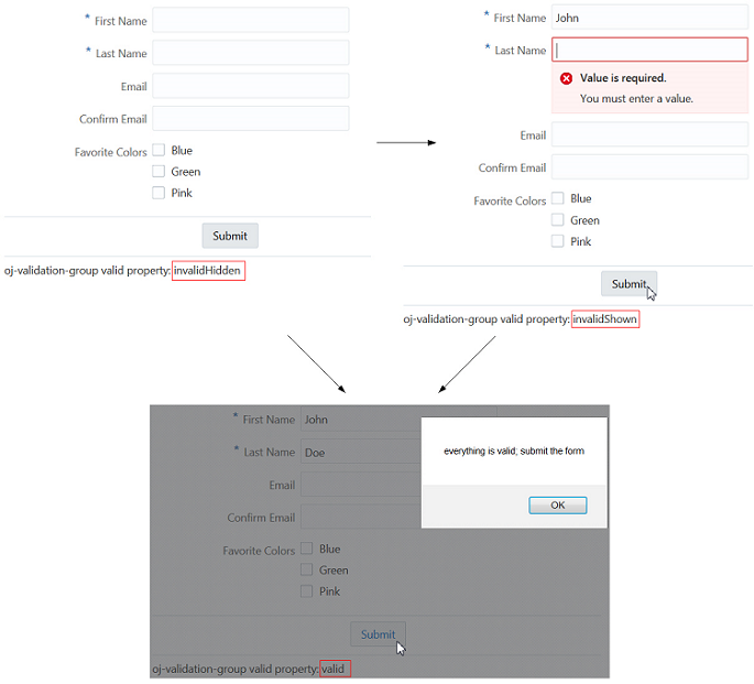
The figure below shows the output for the code sample. The status text at the bottom of each instance shows the valid state of the oj-validation-group, and by extension, the form.
The Oracle JET Cookbook contains the complete example used in this section. See Form Fields.
For an example showing the oj-validation-group used for cross-field validation, see Cross-Field Validation.
Create Page and Section Level Messaging
Oracle JET includes a Message Banner (oj-message-banner)
element. Use it to display brief, medium disruption, semi-permanent messages on your app
page or on sections within a page that communicate relevant and useful information to your
app users.
The Cookbook contains various examples that showcase usage of the
oj-message-banner element and the API doc provides
details about its attributes and methods. See Message Banner demo in the Oracle JET Cookbook
and the Message
Banner entry in the Oracle® JavaScript Extension Toolkit (JET) API Reference for
Oracle JET.
Configure an Editable Component's oj-label Help Attribute
Configure an oj-label element's help attribute to add a Help icon that displays descriptive text, includes a clickable link to a URL for additional information, or displays both the help text and clickable link when the user hovers over it.
The help attribute includes two sub-properties that control the help definition text and help icon:
-
definition: Contains the help definition text that displays when the user does one of the following:-
hovers over the help icon
-
tabs into the help icon with the keyboard
-
presses and holds the help icon on a mobile device
-
-
source: Contains the URL to be used in the help icon's link
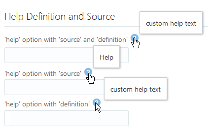
The following image shows three oj-label components configured to use the help attribute. The top component is configured with both a definition and source help sub-property, and the image shows the text and clickable pointer that displays when the user hovers over the help icon. In the middle image, the oj-label component includes a help icon that links to a URL when the user clicks it. In the bottom image, the oj-label displays custom help text when the user hovers over the label or help icon.
Before you begin:
- Familiarize yourself with the process of adding an Oracle JET element to your page. See Add an Oracle JET Component to Your Page.
To configure an oj-label element's help property:
See the Oracle JET Cookbook at Help and Title for the complete example to configure the help property on the
ojInputText component.
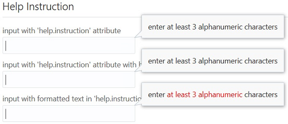
Configure an Editable Component's help.instruction Attribute
Configure an editable component's help text using the help.instruction attribute. This will display a note window with advisory text (often called a tooltip) when the input component has focus.
The following image shows two oj-input-text elements configured to display text when the user sets focus in the input field. In the first example, the help.instruction attribute is defined for the oj-input-text element without formatting. In the second example, the attribute value has HTML formatting added to the advisory text.
Before you begin:
- Familiarize yourself with the process of adding an Oracle JET element to your page. See Add an Oracle JET Component to Your Page.
To configure an editable element's help.instruction attribute:
For the complete example, see Help and Title in the Oracle JET Cookbook. For additional detail about the oj-input-text component, see the
ojInputText API documentation.
For additional information about the regular expression validator, see About Oracle JET Validators and Converters.
Control the Display of Hints, Help, and Messages
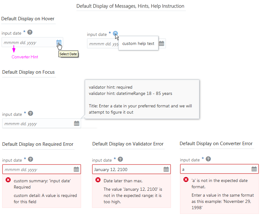
Use the display-options attribute to control the placement and visibility of converter and validator hints, messages, and help instructions.
The following image shows the default placement and visibility of help, converter and validator hints, and messages. This example uses the oj-input-date component, but the behavior is the same on all editable components where it makes sense:
-
validator
hint: Displays in a note window on focus -
converter
hint: Used as the input field's placeholder, or displays in a note window if theplaceholderattribute is defined. -
messages: Displays inline on error -
help.instruction: Displays in a note window on focus
The oj-label exclusive attribute help.definition displays in a note window on hover.
The code sample below shows the markup for the oj-input-date component used in this example. The example includes definitions for help.instruction, validator hints, and a data value for custom messages on validation failure. The sample also shows the markup for a oj-label element with the help attribute.
<div id="form-container" class="oj-form"> <h3 class="oj-header-border">Default Display of Messages, Hints, Help Instruction</h3> <oj-label for="date10"help.definition="custom help text"> Input Date</oj-label> <oj-input-date id="date10" size="30" name="date10" required placeholder="month day, year"help.instruction='enter a date in your preferred format and we will attempt to figure it out'converter="[[longDateConverter]]" value="{{birthdate}}" validators="[[validators]]" translations='{ "required": {"hint": "validator hint: required","messageSummary": "<html>custom summary: {label} <b>Required</b></html>","messageDetail": "<html>custom detail: A value is required for this field</html>"}}'> </oj-input-date>
The code sample below shows the custom messages on validation failure set in the app’s script.
function MemberViewModel()
{
   var self = this;
   self.validators = ko.computed(function()
   {
      return [{
          type: 'datetimeRange',
          options: {
            min: ValidationBase.IntlConverterUtils.dateToLocalIso(new Date(1930, 00, 01)),
            max: ValidationBase.IntlConverterUtils.dateToLocalIso(new Date(1995, 11,31)),
            hint: {
              inRange: 'Validator hint: datetimeRange: January 1, 1930 - November 30, 1995 years'},
            messageSummary:{
              rangeOverflow: 'Date later than max.',
              rangeUnderflow: 'Date earlier than min.'},
            messageDetail: {
              rangeOverflow: 'The value \'{value}\' is not in the expected range; it is too high.',
              rangeUnderflow: 'The value \'{value}\' is not in the expected range; it is too low.'}
              }}];
   });
   //...Contents Omitted

}

Bootstrap.whenDocumentReady().then(
    function ()
    {
      ko.applyBindings(new MemberViewModel(), document.getElementById('form-container'));
    }
  );
});
Using the display-options element attribute in your markup, you can
change the default behavior of the hints, help, and messaging properties of a single
editable component on your page. To control the behavior of all editable components on the
page, you can use the Component.setDefaultOptions() method in your app
script to set displayOptions values.
display-options allows you to change the default behavior as follows:
-
helpInstruction: Set tononeto turn off the help instruction display. -
converterHint: Set tononeto turn off the display or set tonotewindowto change the default placement from placeholder text to a note window. -
validatorHint: Set tononeto turn off the display. -
messages: Set tononeto turn off the display or set tonotewindowto change the default placement from inline to a note window.
Before you begin:
- Familiarize yourself with the process of adding an Oracle JET element to your page. See Add an Oracle JET Component to Your Page.
To change the default display type (inline or note window) and display options for hints, help, and messages:
The Oracle JET cookbook contains the complete code for this example at User Assistance. You can also find additional examples that illustrate hints, help, and messaging configuration.
