Controlling the Display of Hints, Help, and Messages
Use the display-options attribute to control the placement and visibility of converter and validator hints, messages, and help instructions.
The following image shows the default placement and visibility of help, converter and validator hints, and messages. This example uses the oj-input-date component, but the behavior is the same on all editable components where it makes sense:
-
validator
hint: Displays in a note window on focus -
converter
hint: Used as the input field's placeholder, or displays in a note window if theplaceholderattribute is defined. -
messages: Displays inline on error -
help.instruction: Displays in a note window on focus
The oj-label exclusive attribute help.definition displays in a note window on hover.
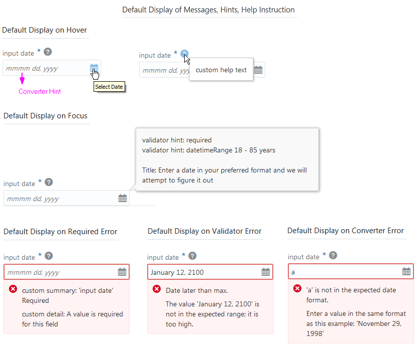
The code sample below shows the markup for the oj-input-date component used in this example. The example includes definitions for help.instruction, validator hints, and a data value for custom messages on validation failure. The sample also shows the markup for a oj-label element with the help attribute.
<div id="form-container" class="oj-form"> <h3 class="oj-header-border">Default Display of Messages, Hints, Help Instruction</h3> <oj-label for="date10"help.definition="custom help text"> Input Date</oj-label> <oj-input-date id="date10" size="30" name="date10" required placeholder="month day, year"help.instruction='enter a date in your preferred format and we will attempt to figure it out'converter="[[longDateConverter]]" value="{{birthdate}}" validators="[[validators]]" translations='{ "required": {"hint": "validator hint: required","messageSummary": "<html>custom summary: {label} <b>Required</b></html>","messageDetail": "<html>custom detail: A value is required for this field</html>"}}'> </oj-input-date>
The code sample below shows the custom messages on validation failure set in the application’s script.
function MemberViewModel()
    {
      var self = this;
      self.validators = ko.computed(function()
        {
          return [{
              type: 'datetimeRange',
              options: {
                min: oj.IntlConverterUtils.dateToLocalIso(new Date(1930, 00, 01)),
                max: oj.IntlConverterUtils.dateToLocalIso(new Date(1995, 11,31)),
                hint: {
                  inRange: 'Validator hint: datetimeRange: January 1, 1930 - November 30, 1995 years'},
                messageSummary:{
                  rangeOverflow: 'Date later than max.',
                  rangeUnderflow: 'Date earlier than min.'},
                messageDetail: {
                  rangeOverflow: 'The value \'{value}\' is not in the expected range; it is too high.',
                  rangeUnderflow: 'The value \'{value}\' is not in the expected range; it is too low.'}
                  }}];
        });
        //...Contents Omitted
  }
$(function(){
        ko.applyBindings(new MemberViewModel(), document.getElementById('form-container'));
 });
Using the display-options element attribute in your markup, you can change the default behavior of the hints, help, and messaging properties of a single editable component on your page. To control the behavior of all editable components on the page, you can use the oj.Component.setDefaultOptions() method in your application script to set displayOptions values.
display-options allows you to change the default behavior as follows:
-
helpInstruction: Set tononeto turn off the help instruction display. -
converterHint: Set tononeto turn off the display or set tonotewindowto change the default placement from placeholder text to a note window. -
validatorHint: Set tononeto turn off the display. -
messages: Set tononeto turn off the display or set tonotewindowto change the default placement from inline to a note window.
To change the default display type (inline or note window) and display options for hints, help, and messages:
The Oracle JET cookbook contains the complete code for this example at User Assistance. You can also find additional examples that illustrate hints, help, and messaging configuration.