Responsive Layout and Content Design Patterns
Oracle JET provides application layout classes to use on your page to create responsive header, content, and footer sections. In addition, Oracle JET includes support for the column drop, layout shift, view switcher, and off-canvas responsive page content design patterns.
-
Oracle JET provides the
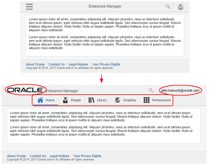
oj-web-applayout-*responsive classes that you can use in conjunction with a flex layout to configure your web page for responsive behavior. The following image shows the same page displayed on a small and large screen. When the screen size increases, the page displays the Oracle logo, user’s email address, and navigation bar. -
Hybrid Mobile Application Patterns
Oracle JET provides the
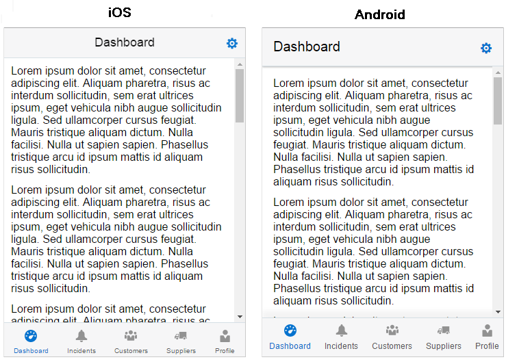
oj-hybrid-applayout-*responsive classes that you can use in conjunction with a flex layout and native theming to create hybrid mobile applications for iOS and Android mobile devices.The image below shows the hybrid mobile header navBar sample pattern displayed in a desktop browser using the Alta iOS and Android themes.
-
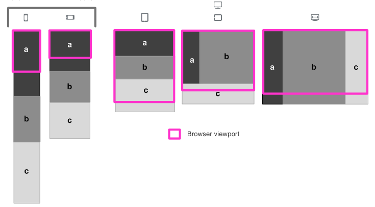
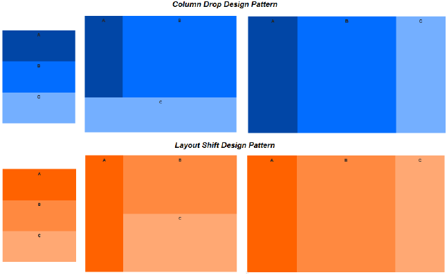
Column Drop: Columns drop below each other for smaller screens. At the widest breakpoint, content displays in columns. As the display size is reduced, columns drop from the rightmost side of the display and add as rows below the remaining column(s).
-
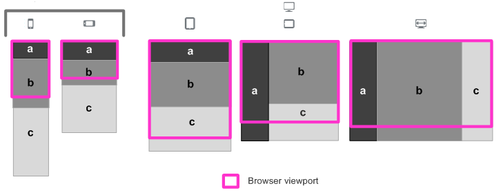
Layout Shift: Column layout changes for smaller screens. Layout shape may differ at each breakpoint as content is repositioned. Rather than simply adding or removing columns, for example, the leftmost column could transition to a row at the top of the display.
The difference between the two design patterns is subtle, and you can get a better feel for the difference by looking at the Oracle JET Cookbook examples at differing widths or on different devices. In the figure below, the column drop and layout shift patterns are shown at three different screen widths on a desktop display. In this example, the difference is noticeable in the middle figure for each pattern.
-
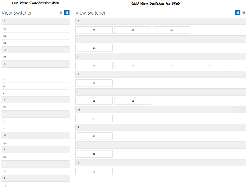
List - View Switcher The
View Switcherallows you to switch between list view and grid view.The image below shows the
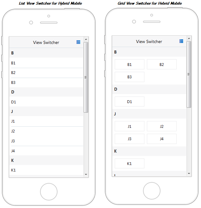
View Switcherweb layout displayed in a desktop browser. TheView Switcherswitches between list view and grid view as follows.The image below shows the list view and grid view patterns of the
View Switcherhybrid layout on a hybrid mobile application with a fixed header. -
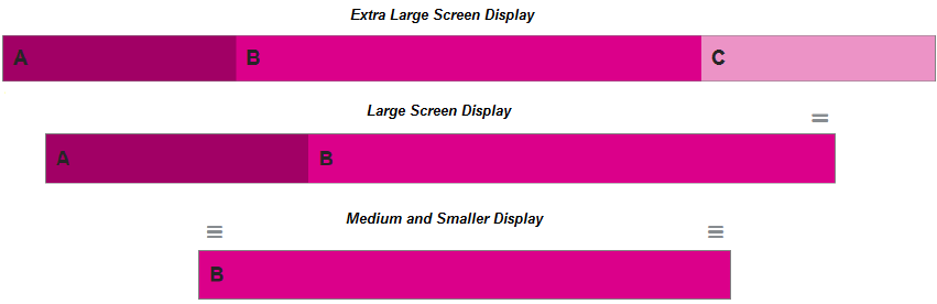
Off-Canvas Push and Off-Canvas Overlay: You can use Oracle JET’s oj.OffcanvasUtils to make an off-canvas partition that responsively change its position from off-screen to fixed inside the viewport when the browser width is changed.
In the image below, when the screen size is extra large, the off-canvas design shows three columns: the off-canvas partition on the start edge labeled
A, the main content labeledB, and the off-canvas partition on the end edge labeledC. When the screen size is large, the off-canvas position on the end edge (C) is hidden off-screen, and the launch button indicates its availability. For medium screens and smaller, both the start edge and end edge partitions are hidden off-screen, and two launch buttons indicate their availability.For additional information about using
oj.offCanvasUtilsin your application layout, see Working with offCanvasUtils.