Responsive Form Layouts
Use the Oracle JET form-specific style classes to create responsive form layouts. The classes include styles to control label placement and wrapping, column display, nesting, and grouping with headers and separators. The classes also use the responsive media query variables, allowing you to specify behavior based on screen size.
See Form Styling for the complete list of form classes. The following list shows some commonly-used styles.
-
oj-form-layout: Place around a form. In some themes it does nothing, while in others it may show borders and/or margins. For additional details, see Working with oj-form-layout. -
oj-form: Place on the parent of form controls to ensure proper spacing and padding between the controls. -
oj-form-control-group: Place around a group of form controls. The style class ensures that the correct amount of space is maintained from the last form control in the group to the next form control in the stacked layout, even if the form controls have wrapped within their container. -
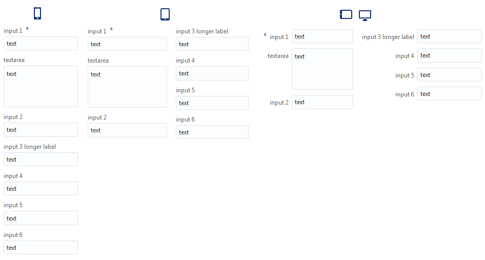
oj-form-colsandoj-form-cols-labels-inline: Display a single column on small screens, and create additional columns when there is enough space. Place on the parent of the rows, the same element where you would placeoj-form.Use these classes for forms where you expect the user to enter input down a column. For larger screens, the form will display two or more columns, and the user will enter the input down the first column and then down the remaining columns. Use
oj-form-colsto display labels in their default location above the field. Useoj-form-cols-labels-inlineto display labels inline for larger screens, as shown in the following image.When you specify
oj-form-cols, Oracle JET calculates the width of the field to determine if another column will fit in the display. When you specifyoj-form-cols-labels-inline, Oracle JET totals the field and inline label width to determine if another column will fit in the display.Tip:
If you want to restrict the display to two columns, add the
oj-form-cols-max2class to the same element where you placedoj-form-colsoroj-form-cols-label-inline.The
oj-form-colsandoj-form-cols-labels-inlineclasses use the CSS multi-column layout technique. With this method, you can display two or more columns whenever there's enough room on the page, not just at the responsive break points. You don't have to calculate programmatically where to break the fields into columns because the CSS automatically determines how to break the content into columns. Even if the individual elements have varying heights, the CSS breaks the elements into columns of fairly even heights. For additional information about the multi-column layout technique, seehttp://dev.w3.org/csswg/css-multicol.Note:
The CSS multi-column layout technique is not supported by all browsers. If the browser doesn't support the technique, the display will default to single column for all screen sizes.
-
Label placement and wrapping
-
oj-size-label-inline: Show the label inline, which is on the left side of the field in left-to-right languages and the right side of the field in right-to-left languages. By default, Oracle JET is designed to be mobile first and places labels above the field. -
oj-size-labels-inline: Use to show all labels inline. Place on the parent of the rows, the same element where you would placeoj-form. -
oj-size-label-nowrap: Use to setnowrapon a label. The label text will be truncated if it's too wide. -
oj-size-labels-nowrap: Use to setnowrapon all labels. Place on the parent of the rows, the same element where you would placeoj-form.
-
To see examples of the classes in use, consult the Oracle JET Cookbook at Form Layouts for:
-
Stacking and nesting forms
-
Inline responsive forms
-
Grouping forms
-
Column spanning