Working with Forms
Oracle JET includes classes to create responsive form layouts and components that you can add to your form to manage labels, form validation and messaging, input, and selection. The input components also include attributes to mark an input as disabled or read only when appropriate.
The Oracle JET Cookbook and JavaScript API Reference for Oracle® JavaScript Extension Toolkit (JET) include complete demos and examples for using forms, and you may also find the following tips and tricks helpful.
Topics:
Important:
When working with forms, use the HTMLdiv element to surround any Oracle JET input component. Do not use the HTML form element because its postback behavior can cause unwanted page refreshes when the user submits or saves the form.
Working with Checkbox and Radio Sets
The Oracle JET oj-checkboxset and oj-radioset components enhance a group of HTML input elements.
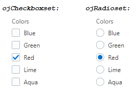
The oj-checkboxset and oj-radioset components manage the selected value of their group and add required validation. In addition, the components manage the styles of the input elements, adding and removing the Oracle JET styles depending upon state.
To create the oj-checkboxset or oj-radioset, add an oj-checkboxset or oj-radioset node that wraps a set of oj-options and creates the necessary input and label elements. The initial value of the checkbox or radio button is defined in the component's value option. Provide data with oj-option. The following code example shows the markup that defines the oj-checkboxset shown in the image above.
<div id="formId">
    <oj-label id="mainlabelid">Colors</oj-label>
    <!-- You need to set the aria-labelledby attribute
         to make this accessible.
         role="group" is set for you by oj-checkboxset. -->
    <oj-checkboxset id="checkboxSetId" labelled-by="mainlabelid"
          value="{{currentColor}}">
      <oj-option id="blueopt" name="color" value="blue">Blue</oj-option>
      <oj-option id="greenopt" name="color" value="green">Green</oj-option>
      <oj-option id="redopt" name="color" value="red">Red</oj-option>
      <oj-option id="limeopt" name="color" value="lime">Lime</oj-option>
      <oj-option id="aquaopt" name="color" value="aqua">Aqua</oj-option>
    </oj-checkboxset>
</div>
Note:
For accessibility, the oj-checkboxset and oj-radioset components require that you set the labelled-by attribute on the component element. For additional information about creating accessible Oracle JET components, see Using the Accessibility Features of Oracle JET Components.
The code that defines the currentColor value is defined in the checkboxsetModel() function, shown below.
require(['ojs/ojcore', 'knockout', 'jquery', 'ojs/ojknockout', 'ojs/ojcheckboxset', 'ojs/ojlabel'],
  function(oj, ko, $)
  {
    function checkboxsetModel()
    {
      var self = this;
      self.currentColor = ko.observable(["red"]);
    }

    var vm = new checkboxsetModel();

    $(document).ready(
      function()
      {
        ko.applyBindings(vm, document.getElementById('formId'));
      }
    );
  });
The Oracle JET Cookbook contains complete examples for configuring the oj-checkboxset and oj-radioset components. You can also find examples that show how to disable the component or one of its input elements, display the component inline, and test validation. For details, see Checkbox Sets and Radio Sets.
Working with Color Pickers
Use Oracle JET color picker components to select specific color values.
You can use Oracle JET oj-color-palette and oj-color-spectrum components to display a color palette with a predefined set of colors or to define a custom color value from a display that contains a saturation spectrum.
The value option of the color pickers is an object of the oj.Color type. You can create an oj.Color object instance from a CSS-like color string and then pass that instance.
The Oracle JET Cookbook contains the complete examples that you can use to create color pickers and define their behavior at Color Palette and Color Spectrum.
Working with oj-color-palette
Use oj-color-palette to display a predefined set of colors from which a specific color can be selected. The oj-color-palette component supports a grid layout with or without labels and a list layout with or without labels.
The following image shows the oj-color-palette component using a grid layout and large color swatches with labels.

Description of the illustration color_palette.png
The swatch size of the oj-color-palette component using a grid layout can be large, small or extra small.
The following image shows the oj-color-palette component using a list layout with small color swatches with labels.

Description of the illustration color_palette_list_layout.png
The swatch size of the oj-color-palette component using a list layout can be large or small.
To create the color palette, add the oj-color-palette element directly in the HTML file. The code sample below shows the markup for the color palette component that uses large color swatches with labels.
<div id="colorPaletteDemo">

  ... contents omitted

  <oj-label id="mainlabelid">Color palette</oj-label>
  <div class="demo-palette-panel oj-panel oj-panel-shadow-lg">
      <oj-color-palette class="demo-palette-picker" labelled-by="mainlabelid"
          palette="[[mypalette]]"
          swatch-size="[[swatchSize]]"
          label-display="[[labelDisplay]]"
          layout="grid"
          value="{{colorValue}}">
      </oj-color-palette>
  </div>
</div>
The colorValue is defined in the view model as follows:
require(['ojs/ojcore', 'knockout', 'jquery', 'ojs/ojknockout', 'ojs/ojcolorpalette', 'ojs/ojcolor', 'ojs/ojvalidation-base', 'ojs/ojbutton', 'ojs/ojlabel'],
 function(oj, ko, $)
 {
   function Model()
   {
      var self = this;
      self.colorValue = ko.observable(oj.Color.BISQUE);
      self.swatchSizes = ["lg", "sm", "xs"];
      self.labelDisplays = ["auto", "off"];
      self.swatchSize = ko.observable(self.swatchSizes[0]);
      self.labelDisplay = ko.observable(self.labelDisplays[0]);", "off"];
      self.swatchSize = ko.observable(self.swatchSizes[0]);
      self.labelDisplay = ko.observable(self.labelDisplays[0]);

      ... remaining contents omitted
To set a component to disabled, you set the disabled option in the markup.
<div id="colorPaletteDemo">

   ... contents omitted

  <oj-label id="mainlabelid">Color palette</oj-label>
  <div class="demo-palette-panel oj-panel oj-panel-shadow-lg">
    <oj-color-palette class="demo-palette-picker" labelled-by="mainlabelid"
        palette="[[mypalette]]"
        swatch-size="lg"
        label-display="auto"
        layout="grid"
        value="{{colorValue}}"
        disabled="[[paletteDisabled]]">
    </oj-color-palette>
  </div>
</div>
For additional information about adding an Oracle JET component to your page, see Color Palette.
Working with oj-color-spectrum
Use oj-color-spectrum to display a saturation spectrum with hue and opacity sliders from which you can retrieve a custom color value.
The following image shows the oj-color-spectrum component.
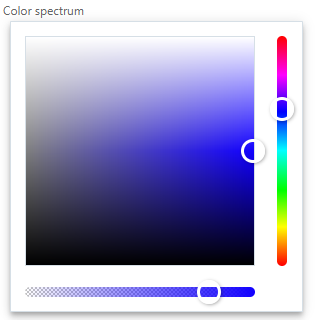
Description of the illustration color_spectrum.png
To create the color spectrum, you can add the oj-color-spectrum element directly in the HTML file.
<div id="colorSpectrumDemo">

       ... contents omitted

  <oj-label id="mainlabelid">Color spectrum</oj-label>
  <div  class="demo-color-panel oj-panel oj-panel-shadow-lg">
    <oj-color-spectrum class="demo-color-spectrum" labelled-by="mainlabelid"
      value="{{colorValue}}"
      on-value-changed="[[updatePreviewColor]]"
    </oj-color-spectrum>
  </div>
</div>
You can disable the component. To set a component to disabled, you set the disabled option in the markup.
<div id="colorSpectrumDemo">

 ... contents omitted

 <oj-label id="mainlabelid">Color spectrum</oj-label>
  <div  class="demo-color-panel oj-panel oj-panel-shadow-lg">
    <oj-color-spectrum class="demo-color-spectrum" labelled-by="mainlabelid"
      value="{{colorValue}}"
      disabled="[[spectrumDisabled]]">
    </oj-color-spectrum>
  </div>

</div>
For additional information about adding an Oracle JET component to your page, see Color Spectrum.
Working with Comboboxes
Use oj-combobox-one and oj-combobox-many to display editable dropdown lists.
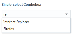
The image below shows three single-select comboboxes and one multi-select combobox. In this example, the first combobox displays the default dropdown list. The other single-select combo boxes illustrate a disabled item option and items that include images with the item text.

The user can select one of the items from the dropdown list or erase the current value and enter text in the input field to search the list of available options. The user can also enter non-matching text to add a new item. In the example below, the user typed re which matches the Internet Explorer and Firefox list items.
Tip:
You can use the Oracle JET oj-select-one component or the oj-select-many component to create read-only dropdown lists. For additional information, see Working with Select.
To create the combobox, you can use the oj-combobox-one element or the oj-combobox-many element. Use the oj-option component to display the options in the form of a data list in the combobox. The code sample below shows the markup for the single-select combobox with all option items enabled.
<div id="form1">
	<oj-label for="combobox">Single-select Combobox</oj-label>
  <oj-combobox-one id="combobox" value="{{val}}"
    style="max-width:20em">
    <oj-option value="Internet Explorer">Internet Explorer</oj-option>
		<oj-option value="Firefox">Firefox</oj-option>
		<oj-option value="Chrome">Chrome</oj-option>
		<oj-option value="Opera">Opera</oj-option>
		<oj-option value="Safari">Safari</oj-option>
  </oj-combobox-one>
  <div>
    <br/>
    <oj-label for="curr-value" class="oj-label">Curr value is: </oj-label>
    <span id="curr-value" data-bind="text: val"></span>
  </div>
</div>
The code that defines the val value is defined in the ValueModel() constructor function, shown below.
require(['ojs/ojcore', 'knockout', 'jquery', 'ojs/ojknockout', 'ojs/ojselectcombobox'],
function(oj, ko, $)
{
  $(
    function()
    {
      function ValueModel() {
          this.val = ko.observableArray(["Chrome"]);
      }
      ko.applyBindings(new ValueModel(), document.getElementById('form1'));
    }
  );
});
You can initialize the combobox with the options array. Set the element's options attribute to a knockout observableArray. The array contains objects with the value and label fields in string format. Group data is also supported by specifying the label and children, which is an array of options inside the group. You can also redefine keys used in the array by specifying them in the options-keys. The code below defines the options binding for a multi-select combobox.
require(['ojs/ojcore', 'knockout', 'jquery', 'ojs/ojknockout', 'ojs/ojselectcombobox'],
function(oj, ko, $)
{
  function comboboxModel () {
    this.optionsKeys1 = {label: 'regions', children: 'states', childKeys: {value: 'state_abbr', label: 'state_name'}};
    this.optionsKeys2 = {label: 'regions', children: 'states', childKeys: {value: 'state_abbr', label: 'state_name',
       children: 'cities', childKeys: {value: 'city_abbr', label: 'city_name'}}};
    this.browsers = ko.observableArray([
        {value: 'Internet Explorer', label: 'Internet Explorer'},
        {value: 'Firefox',    label: 'Firefox'},
        {value: 'Chrome',   label: 'Chrome'},
        {value: 'Opera',    label: 'Opera', disabled: true},
        {value: 'Safari',   label: 'Safari'}
    ]);

    this.groupData = ko.observableArray([
      {label: "Alaskan/Hawaiian Time Zone",
        children: [
          {value: "AK", label: "Alaska"},
          {value: "HI", label: "Hawaii"}
      ]},
      {label: "Pacific Time Zone",
        children: [
          {value: "CA", label: "California"},
          {value: "NV", label: "Nevada"},
          {value: "OR", label: "Oregon"},
          {value: "WA", label: "Washington"}
      ]}
    ]);

    this.groupDataWithKeys = ko.observableArray([
      {regions: "Alaskan/Hawaiian Time Zone",
        states: [
          {state_abbr: "AK", state_name: "Alaska"},
          {state_abbr: "HI", state_name: "Hawaii"}
      ]},
      {regions: "Pacific Time Zone",
        states: [
          {state_abbr: "CA", state_name: "California"},
          {state_abbr: "NV", state_name: "Nevada"},
          {state_abbr: "OR", state_name: "Oregon"},
          {state_abbr: "WA", state_name: "Washington"}
      ]}
    ]);

    this.triLevelGroupData = ko.observableArray([
      {regions: "Alaskan/Hawaiian Time Zone",
        states: [
          {state_abbr: "AK", state_name: "Alaska",
            cities: [
              {city_abbr: "AN", city_name: "Anchorage"}
          ]},
          {state_abbr: "HI", state_name: "Hawaii",
            cities: [
              {city_abbr: "HO", city_name: "Honolulu"},
              {city_abbr: "HL", city_name: "Hilo"}
          ]}
      ]},
      {regions: "Pacific Time Zone",
        states: [
          {state_abbr: "CA", state_name: "California",
            cities: [
              {city_abbr: "SF", city_name: "San Francisco"},
              {city_abbr: "LA", city_name: "Los Angeles"}
          ]},
          {state_abbr: "NV", state_name: "Nevada",
            cities: [
              {city_abbr: "LV", city_name: "Las Vegas"}
          ]},
          {state_abbr: "OR", state_name: "Oregon",
            cities: [
              {city_abbr: "PL", city_name: "Portland"},
              {city_abbr: "BD", city_name: "Bend"}
          ]},
          {state_abbr: "WA", state_name: "Washington",
            cities: [
              {city_abbr: "ST", city_name: "Seattle"},
              {city_abbr: "SK", city_name: "Spokane"}
          ]}
      ]}
    ]);
  }
  $(
    function() {
      ko.applyBindings(new comboboxModel(), document.getElementById('form1'));
    }
  );
});
You can also populate the combobox with an ArrayDataProvider. Bind the element's options attribute to an ArrayDataProvider that is created from an array containing objects with value and label fields in string format. The code below defines the ArrayDataProvider binding for the multi-select component.
require(['ojs/ojcore', 'knockout', 'jquery', 'ojs/ojknockout', 'ojs/ojselectcombobox', 'ojs/ojarraydataprovider'],

function(oj, ko, $)
{
  function selectModel () {
    this.selectVal = ko.observableArray(['CH', 'SA']);

    this.browsers = [
      {value: 'IE', label: 'Internet Explorer'},
      {value: 'FF', label: 'Firefox'},
      {value: 'CH', label: 'Chrome'},
      {value: 'OP', label: 'Opera'},
      {value: 'SA', label: 'Safari'}
    ];

    this.browsersDP = new oj.ArrayDataProvider(this.browsers, {idAttribute: 'value'});

  }

  $(
    function() {
      ko.applyBindings(new selectModel(), document.getElementById("containerDiv"));
    }
  );

});
The Oracle JET Cookbook contains complete examples for configuring the single-select and multi-select comboboxes at . You can also find examples for setting the width, handling events, adding new entries, and including images with the list items.
Understanding oj-combobox-one Search
The oj-combobox-one element can be configured to include support for search use cases.
The image below shows an example of a combobox configured for search. You can enter the new search value in the search field or click on the search field that displays a dropdown list to choose a value from.
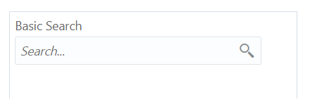
The oj-combobox-one search supports the following features:
-
Shows a custom search icon instead of the default dropdown arrow.
-
Filters the dropdown list based on the current display value.
-
Triggers events when the search value is updated by the user.
For example, when you submit a search value, the oj-combobox-one element triggers the ojValueUpdated event that contains the search value.
The following code sample shows the markup to create a basic combobox search component shown in this section.
<oj-label for="search">Basic Search</oj-label>
<oj-combobox-one id="search"
 	options="[[tagsDataProvider]]"
 	filter-on-open="rawValue"
 	on-oj-value-updated="[[search]]"
 	placeholder="Search..."
  style="max-width:20em">
  <a slot="end" id="search-button" class="demo-search-button oj-fwk-icon-magnifier oj-fwk-icon
  oj-clickable-icon-nocontext" style="width: 32px;" role="button" aria-label="search" on-click="[[search]]"></a>
</oj-combobox-one>
The Oracle JET Cookbook includes the complete code for this example at Combobox Search.
For additional information about the oj-combobox-one component's attributes, events, and methods, see the oj-comboxbox-one API documentation.
Working with Form Controls
Oracle JET components that support input, such as the oj-input-text component, provide form controls that you can use to indicate that a component is disabled or, in some cases, read only. When the component is disabled, the input fields appear grayed out, and keyboard navigation is also disabled. When the component is set to read only, the input field is not displayed, and keyboard navigation is disabled as well.
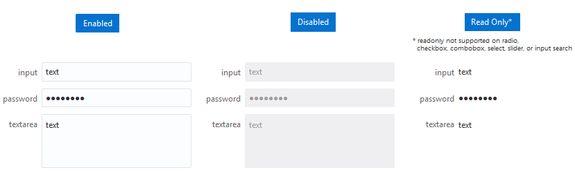
To set a component to disabled or read only, you set the disabled or readOnly option in the markup and specify the method that will be called when the component is marked disabled or readOnly. The following code sample shows the markup for the oj-input-text component.
<div class="oj-flex">
  <div class="oj-flex-item">
    <oj-label for="inputcontrol1">input</oj-label>
  </div>
  <div class="oj-flex-item">
    <oj-input-text id="inputcontrol1" placeholder="placeholder text" value='{{placeholder()? null : "text"}}'
          disabled="[[disableFormControls()]]" readonly="[[readonlyFormControls]]"
          messages-custom="{{messages}}"></oj-input-text>
  </div>
</div>
The disableFormControls() and readonlyFormControls() methods set the Knockout observable to false.
require(['ojs/ojcore', 'knockout', 'jquery', 'ojs/ojknockout', 'ojs/ojinputtext'],
  function(oj, ko, $)
  {
    function StateModel() {
      this.disableFormControls = ko.observable(false);
      this.readonlyFormControls = ko.observable(false);
    }
    $(document).ready(
      function()
      {
        ko.applyBindings(new StateModel(),
        document.getElementById('form-container'));
      }
    );
  });
Note:
You can also set disabled as an attribute on the input element. If you use this method, then disabled will only be picked up at component creation. Changing the native input element's disabled state after creation will have no effect.
The Oracle JET Cookbook at Form Controls includes the complete example for the oj-input-text component as well as the other Oracle JET components that support disabled and readOnly options. In addition, you can find examples for using placeholder text and controlling the form's width and height.
Working with Form Layout Features
Oracle JET provides style classes that you can use to create form layouts that adjust to the size of the user's screen. For additional information, see Responsive Form Layouts. For examples that illustrate best practices for form layout in Oracle JET applications, see Form Layouts.
Working with oj-form-layout
Use the Oracle JET oj-form-layout component to create a layout that responds dynamically when used on devices with different display sizes.
Use the Oracle JET oj-form-layout component to create a responsive layout. Use custom elements within oj-form-layout component as children elements and group them to create an organized layout that can be optimized for multiple display sizes. The oj-form-layout supports custom elements, such as oj-input-text and oj-text-area that supports label-hint and help-hints attributes.
For each custom element, used as a child element, with label-hint attribute, the oj-form-layout generates an oj-label element and pairs them together in the layout as a label/value pair. When an oj-label element is followed by any element, the oj-label element will be in the label area and the following element will be in the value area. An oj-label-value child component allows you to place the elements in the label or value area as label and value slot children. All other elements spans the entire width of a single label/value pair.
The image below shows a responsive layout using the oj-form-layout with various editable child components. Utilizing the oj.ResponsiveKnockoutUtils, oj-form-layout can be made to respond to different screen sizes differently. For a display area that has sufficient space, such as a desktop monitor, the form layout can be set to two columns and have the labels inline. For a smaller display area, such as a mobile device, the oj.ResponsiveKnockoutUtils can dynamically set the form layout to one column with the labels on top of their respective fields. Also, using the oj-label-value child component we have placed the Save and Cancel buttons.
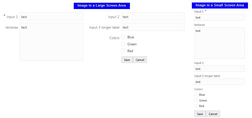
The following code sample shows the markup for the oj-form-layout component with editable value child components.
<oj-form-layout id="ofl1" label-edge="{{labelEdge}}" max-columns="{{columns}}">
  <oj-input-text id="inputcontrol" required value="text" label-hint="input 1"></oj-input-text>
  <oj-text-area id="textareacontrol" value='text' rows="6" label-hint="textarea"></oj-text-area>
  <oj-input-text id="inputcontrol2" value="text" label-hint="input 2"></oj-input-text>
  <oj-input-text id="inputcontrol3" value="text" label-hint="input 3 longer label"></oj-input-text>
  <oj-checkboxset id="checkboxSetId" label-hint="Colors">
    <oj-option id="blueopt" value="blue">Blue</oj-option>
    <oj-option id="greenopt" value="green">Green</oj-option>
    <oj-option id="redopt" value="red">Red</oj-option>
  </oj-checkboxset>
  <oj-label-value>
    <oj-button slot="value">Save</oj-button>
    <oj-button slot="value">Cancel</oj-button>
  </oj-label-value>
</oj-form-layout>
In the JavaScript file, the ResponsiveKnockoutUtils is used to define a desired oj-form-layout.
require(['ojs/ojcore', 'knockout', 'jquery', 'ojs/ojlabel',
        'ojs/ojknockout', 'ojs/ojinputtext', 'ojs/ojcheckboxset', 'ojs/ojformlayout', 'ojs/ojlabelvalue', 'ojs/ojbutton'],
  function(oj, ko, $)
  {
    function FormLayoutModel()
    {
      this.isSmall = oj.ResponsiveKnockoutUtils.createMediaQueryObservable(
                       oj.ResponsiveUtils.getFrameworkQuery(oj.ResponsiveUtils.FRAMEWORK_QUERY_KEY.SM_ONLY));
      this.isLargeOrUp = oj.ResponsiveKnockoutUtils.createMediaQueryObservable(
                        oj.ResponsiveUtils.getFrameworkQuery(oj.ResponsiveUtils.FRAMEWORK_QUERY_KEY.LG_UP));

      // For small screens: 1 column and labels on top
      // For medium screens: 2 columns and labels on top
      // For large screens or bigger: 2 columns and labels inline
      this.columns = ko.pureComputed(function() {
        return this.isSmall() ? 1 : 2;
      }, this);
      this.labelEdge = ko.pureComputed(function() {
        return this.isLargeOrUp() ? "start" : "top";
      }, this);
    }
    $(function()
    {
      ko.applyBindings(new FormLayoutModel(),
              document.getElementById('form-container'));
    });
  });
The Oracle JET Cookbook contains complete examples for configuring the form layout at Form Responsive Layout .
Working with Input Components
The Oracle JET input components enhance browser input elements. Enhancements include support for custom validation and conversion, accessibility, internationalization, and more. The Forms page in the Oracle JET Cookbook includes examples for working with the following Oracle JET input components.
| Oracle JET Component | Image | HTML5 Element |
|---|---|---|
|
|
 |
<oj-input-date id="date" value={{value}}> </oj-input-date> |
|
|
 |
<oj-input-date-time id="dateTime" value={{value}}> </oj-input-date-time> |
|
|
 |
<oj-input-number id="inputnumber-id" max= "[[max]]" min= "[[min]]" step= "[[step]] value= "{{currentValue}}"> </oj-input-number> |
|
|
 |
|
|
|
 |
|
|
|
 |
|
|
|
 |
|
The editable input components include converters and validators that you can customize as needed. For additional information, see Validating and Converting Input.
The components also support help messages that you can customize to provide user assistance in your application. For additional information, see Working with User Assistance.
Working with Labels
The oj-label component decorates the label text with a required icon and help icon. The user can interact with the help icon (on hover, on focus, etc) to display help description text or to navigate to an URL for more information.
To create a label, add the oj-label element directly in the HTML file. Use for on the oj-label element to point to the id of the JET Form component.
<oj-label for='input-text' show-required="[[isRequired]]" help.definition='[[helpDef]]' help.source='[[helpSource]]'>input</oj-label>
    <oj-input-text id="input-text" required="[[isRequired]]" value="text"></oj-input-text>
For accessibility, you must associate the oj-label component to its JET form component. For most JET form components you can do this using the oj-label's for attribute and the JET form component's id attribute.
For a few JET form components (oj-radioset, oj-checkboxset, oj-color-palette, and oj-color-spectrum), you must associate the oj-label component to its JET form component using the oj-label's id attribute and the JET form component's labelled-by attribute. For information, see the example below.
<oj-label id="radiosetlabel" show-required="[[isRequired]]" help.definition='[[helpDef]]' help.source='[[helpSource]]'>radioset</oj-label>
<oj-radioset id="radioSetId"  required="[[isRequired]]" labelled-by="radiosetlabel">
  <oj-option name="color" value="red">Red</oj-option>
  <oj-option name="color" value="blue">Blue</oj-option>
</oj-radioset>
Labels are top aligned by default, following best practices for mobile devices.
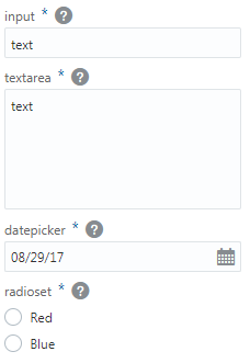
You can modify the labels to display inline by adding the oj-label-inline class to the oj-label element when you don’t want to use responsive design classes.
<div class='oj-form'>
  <div class='oj-flex-bar'>
    <div class='oj-flex-bar-start'>
      <oj-label id="radiosetlabel" show-required="[[isRequired]]" class="oj-label-inline"
       help.definition='[[helpDef]]' help.source='[[helpSource]]'>radioset</oj-label>
    </div>
    <div class='oj-flex-bar-middle'>
      <oj-radioset id="radioSetId" labelled-by="radiosetlabel" required='[[isRequired]]'>
        <oj-option id="blueopt" value="blue" name="rbb">Blue</oj-option>
        <oj-option id="greenopt" value="green" name="rbb">Green</oj-option>
        <oj-option id="redopt" value="red" name="rbb">Red</oj-option>
        <oj-option id="limeopt" value="lime" name="rbb">Lime</oj-option>
        <oj-option id="aquaopt" value="aqua" name="rbb">Aqua</oj-option>
      </oj-radioset>
    </div>
  </div>
</div>
When the user runs the page, the label for the oj-radioset component displays inline.
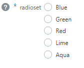
The <oj-form-layout> wraps the label and input components separately. So, if label component is an immediate child component of <oj-form-layout>, then the input component will not generate label. In this case, input component ignores label and other label related attributes.
The Oracle JET Cookbook includes additional examples for using help and required modifiers. In addition, the cookbook contains examples for displaying access keys, making multiple labels on one field accessible, and making multiple fields on one label accessible. For details, see Labels.
Working with Select
Use the Oracle JET oj-select-one and the oj-select-many custom elements to display read-only, selectable dropdown lists.

The dropdown list displays when the user does one of the following:
-
Clicks on the select box.
-
Sets focus on the select box and starts typing or presses the Enter, Arrow Up, or Arrow Down key.
If the number of options is less than the minimumResultsForSearch value, then by default the search box is not displayed when the dropdown is open. However, if the user starts typing when the select box is in focus, the dropdown will be open along with the search box displayed.
For example, there are five items in the dropdown list shown above so a search box is not displayed by default.

Tip:
If you want to provide the user with the ability to add items to the dropdown list, use the Oracle JET oj-combobox-one and the oj-combobox-many custom elements instead to create dropdown lists that support single and multiple selection respectively. For information, see Working with Comboboxes.
The code sample below shows the markup used to create the multi-select component shown in this section.
<div id="form1">
  <oj-label for="multiSelect">Select Many</oj-label>
  <oj-select-many id="multiSelect" value={{val}} style="max-width:20em">
    <oj-option value="IE">Internet Explorer</oj-option>
    <oj-option value="FF">Firefox</oj-option>
    <oj-option value="CH">Chrome</oj-option>
    <oj-option value="OP">Opera</oj-option>
    <oj-option value="SA">Safari</oj-option>
  </oj-select-many>
  <div>
    <br/>
    <oj-label for="curr-value">Current selected value is  </oj-label>
    <span id="curr-value" data-bind="text: ko.toJSON(val)"></span>
  </div>
</div>
Note:
For accessibility, the select component requires that you set the for attribute on the label element to point to the id of the oj-select-one element or the oj-select-many element. For information about creating accessible Oracle JET components, see Using the Accessibility Features of Oracle JET Components.
The code sample also defines max-width style attribute. Use max-width instead of width to ensure that the component adjusts its width automatically when the display width changes.
The code that defines the val value is defined in the ValueModel() function, shown below. val is defined as a Knockout observable, with its initial values set to Chrome and Safari.
require(['ojs/ojcore', 'knockout', 'jquery', 'ojs/ojknockout', 'ojs/ojselectcombobox'],
function(oj, ko, $)
{
  $(
    function()
    {
      function ValueModel() {
        this.val = ko.observableArray(["CH","SA"]);
      }
      ko.applyBindings(new ValueModel(), document.getElementById('form1'));
    }
  );
});
You can populate an oj-select-one component or an oj-select-many component with the options array. Set the element's options attribute to a knockout observableArray. The array contains objects with value and label fields in string format. Group data is also supported by specifying the label and children , which is an array of options inside the group. You can also redefine keys used in the array by specifying them in the options-keys. The code below defines the options binding for the multi-select component.
require(['ojs/ojcore', 'knockout', 'jquery', 'ojs/ojknockout', 'ojs/ojselectcombobox'],

function(oj, ko, $)
{
  function selectModel () {
    //simple select
    this.selectVal = ko.observableArray(['Chrome']);
    this.browsers = ko.observableArray([
      {value: 'Internet Explorer', label: 'Internet Explorer'},
      {value: 'Firefox',  label: 'Firefox'},
      {value: 'Chrome',   label: 'Chrome'},
      {value: 'Opera',    label: 'Opera'},
      {value: 'Safari',   label: 'Safari'}
    ]);

    //group
    this.groupVal = ko.observableArray(['CA']);
    this.groupData = ko.observableArray([
      {label: "Alaskan/Hawaiian Time Zone",
       children: [
          {value: "AK", label: "Alaska"},
          {value: "HI", label: "Hawaii"}
       ]},
      {label: "Pacific Time Zone",
       children: [
          {value: "CA", label: "California"},
          {value: "NV", label: "Nevada"},
          {value: "OR", label: "Oregon"},
          {value: "WA", label: "Washington"}
       ]}
    ]);

    //tri level group
    this.triLevelVal = ko.observableArray(['SF']);
    this.triLevelGroupData = ko.observableArray([
      {label: "Alaskan/Hawaiian Time Zone",
       children: [
          {value: "AK", label: "Alaska",
           children: [
                {value: "AN", label: "Anchorage"}
                ]},
          {value: "HI", label: "Hawaii",
           children: [
                {value: "HO", label: "Honolulu"},
                {value: "HL", label: "Hilo"}
                ]}
       ]},
      {label: "Pacific Time Zone",
       children: [
          {value: "CA",
           label: "California",
           children: [
                {value: "SF", label: "San Francisco"},
                {value: "LA", label: "Los Angeles"}
                ]},
          {value: "NV", label: "Nevada",
           children: [
                {value: "LV", label: "Las Vegas"}
                ]},
          {value: "OR", label: "Oregon",
           children: [
                {value: "PL", label: "Portland"},
                {value: "BD", label: "Bend"}
                ]},
          {value: "WA", label: "Washington",
           children: [
                {value: "ST", label: "Seattle"},
                {value: "SK", label: "Spokane"}
                ]}
       ]}
    ]);

    //option keys
    this.optionsKeys = {label: 'regions', children: 'states',
                        childKeys: {value: 'state_abbr', label: 'state_name'}};
    this.groupKeysVal = ko.observableArray(['CA']);
    this.groupDataWithKeys = ko.observableArray([
      {regions: "Alaskan/Hawaiian Time Zone",
       states: [
          {state_abbr: "AK", state_name: "Alaska"},
          {state_abbr: "HI", state_name: "Hawaii"}
       ]},
      {regions: "Pacific Time Zone",
        states: [
          {state_abbr: "CA", state_name: "California"},
          {state_abbr: "NV", state_name: "Nevada"},
          {state_abbr: "OR", state_name: "Oregon"},
          {state_abbr: "WA", state_name: "Washington"}
      ]}
    ]);
  }

  $(
    function() {
      ko.applyBindings(new selectModel(), document.getElementById("containerDiv"));
    }
  );
});
You can also populate an oj-select-one component or an oj-select-many component with an ArrayDataProvider. Bind the element's options attribute to an ArrayDataProvider that is created from an array containing objects with value and label fields in string format. The code below defines the ArrayDataProvider binding for the multi-select component.
Note:
A maximum of 15 rows will be displayed in the dropdown. If you have more than 15 rows, the message, More results available, please filter further., will be displayed. However, if renderMode attribute in the oj-select-one or oj-select-many component is set to native, the maximum number of rows displayed will be 15, but filtering is not available.
require(['ojs/ojcore', 'knockout', 'jquery', 'ojs/ojknockout', 'ojs/ojselectcombobox', 'ojs/ojarraydataprovider'],

function(oj, ko, $)
{
  function selectModel () {
    this.selectVal = ko.observableArray(['CH', 'SA']);

    this.browsers = [
      {value: 'IE', label: 'Internet Explorer'},
      {value: 'FF', label: 'Firefox'},
      {value: 'CH', label: 'Chrome'},
      {value: 'OP', label: 'Opera'},
      {value: 'SA', label: 'Safari'}
    ];

    this.browsersDP = new oj.ArrayDataProvider(this.browsers, {idAttribute: 'value'});

  }

  $(
    function() {
      ko.applyBindings(new selectModel(), document.getElementById("containerDiv"));
    }
  );

});
The Oracle JET Cookbook contains complete examples for configuring oj-select-one and oj-select-many at Select.
Working with Sliders
A slider component displays a horizontal or vertical bar representing a numeric value. The Oracle JET oj-slider component enhances the HTML input element to provide a slider component that is themable and WAI-ARIA compliant.
About the oj-slider Component
The oj-slider component supports horizontal or vertical sliders with one thumb. The user can use gestures, mouse, or keyboard on the thumb to adjust the value within the slider’s range.
The following image shows two oj-slider components. The two components illustrate sliders with horizontal and vertical orientation and their current value set to 100.

Creating Sliders
To create the oj-slider component, create an oj-slider element and assign an id to it. Create a HTML oj-label element to add the for attribute points to the id of the oj-slider component. Use the component's min and max attributes to set the slider range and the component’s value attribute to set the thumb’s initial value.
oj-slider component to your page:
Formatting Tips for oj-slider
The oj-slider component provides options that allow you to customize a horizontal slider’s width, change the slider’s orientation to vertical, adjust a vertical slider’s height, or disable it.
You may find the following tips helpful when working with sliders.
-
To change the horizontal slider’s width, enter a
stylevalue directly on theoj-sliderelement. The example below shows how you could specify an absolute width of 25 em on theoj-sliderused in this section.<oj-label for="slider-id"> ojSlider component </oj-label> <br> <oj-slider id="slider-id" value="{{value}}" min="[[min]]" max="[[max]]" step="[[step]]" style="max-width: 25em"> </oj-slider>To specify a width as a percentage of the maximum width available, set the max-width style to a percentage.
style:'max-width:100%' -
To create a vertical slider, set the
oj-slidercomponent’s orientation option to vertical.<oj-label for="slider-id"> ojSlider component </oj-label> <br> <oj-slider id="slider-id" orientation="vertical" value="{{value}}" min="[[min]]" max="[[max]]" step="[[step]]" style="height: 150px"> </oj-slider> -
To change the vertical slider’s height, set the
styleattribute directly on theoj-sliderelement.<oj-label for="slider-id"> ojSlider component </oj-label> <br> <oj-slider id="slider-id" orientation="vertical" value="{{value}}" min="[[min]]" max="[[max]]" step="[[step]]" style="height: 150px"> </oj-slider> -
To display a slider that displays a value but does not allow interaction, set the component’s
disabledoption totrue.
Cookbook Examples
The Oracle JET cookbook includes the complete examples shown in this section at Sliders. You can also find examples that show disabled sliders and sliders with icons on the bar to manipulate the thumb.
Working with Switches
A switch component displays two mutually exclusive choices to a user, typically ON or OFF. You can also disable a switch or make it read only using component attributes and display a switch inline using built-in style classes.
The following image shows an oj-switch component in on, off, disabled, and read only states. The display changes when the switch has focus to provide a visual clue to the user that the switch is selectable.

To create the oj-switch component, add the oj-switch element directly in the HTML file and assign it an id. Use the component's value attribute to set the initial state to true or false.
The following code sample shows the markup for the oj-switch shown in this section. For accessibility, the form container includes a label element where the for attribute points to the id of the oj-switch component. See the oj-switch API documentation for accessibility details and associated keyboard and touch end user support.
<div id="componentDemoContent" style="width: 1px; min-width: 100%;">
  <oj-label class="oj-label" for="switch">switch component</oj-label>
  <oj-switch id="switch" value="{{isChecked}}"></oj-switch><br/><br/>
  <span> switch is </span><span data-bind="text: ((isChecked()) ? 'ON' : 'OFF')"></span>
</div>
The isChecked variable specified for the oj-switch component's value attribute is defined in the application's main script, shown below. In this example, the isChecked variable is a boolean set to true by a call to the Knockout observable() function.
define(['ojs/ojcore', 'knockout', 'ojs/ojswitch'],
  function(oj, ko) {
    function SwitchModel() {
      var self = this;
      self.isChecked = ko.observable(false);
    }
  return SwitchModel;
  }
);
Tip:
You can configure oj-switch to display inline with its label.

To configure an inline switch, add the oj-label-inline class to the switch's label.
<oj-label for="switch" class="oj-label-inline">switch component</oj-label>
To disable the switch, set the component's disabled attribute to true. To make the switch read only, set the component’s readOnly attribute to true.
The Oracle JET cookbook includes the complete example shown in this section at Switches. You can also find examples that implement disabled, read only, and inline switches.
Working with Validation and User Assistance
The Oracle JET editable components display help, converter and validator hints, title, and messaging content by default. If needed, you can customize the defaults for displaying content.
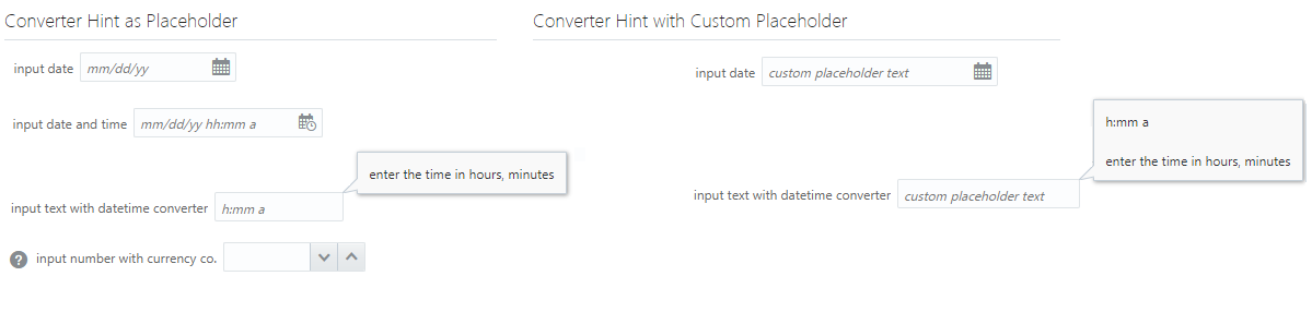
The image below shows examples of converter hints and title. The example on the left uses default converter hints, and the example on the right uses custom placeholder text. The title text by default appears in the note window.
You can create multiple validators on a component. The image below shows an example that uses multiple validators on an oj-input-number component.

The Oracle JET Cookbook contains complete examples that you can use to customize help, converter and validator hints, and messaging content. See User Assistance.
For information about validating and converting input on the Oracle JET input components, see Validating and Converting Input. For information about using and customizing Oracle JET user assistance, see Working with User Assistance.