Using Oracle JET Messaging
Use the Oracle JET messaging framework to notify an Oracle JET application of a component's messages and validity as well as notify an Oracle JET component of a business validation failure.
Notifying an Oracle JET Editable Component of Business Validation Errors
You can notify Oracle JET editable elements of business validation errors using the messages-custom attribute and the showMessages() method.
Topics:
Using the messages-custom Attribute
Your application can use this attribute to notify Oracle JET components to show new or updated custom messages. These could be a result of business validation that originates in the viewModel layer or on the server. When this property is set, the message shows to the user immediately. The messages-custom attribute takes an Object that duck-types oj.Message with detail, summary, and severity fields.
In this example, the severity type button is toggled and a message of the selected severity type is pushed onto the messages-custom array. The messages-custom attribute is set on every form control in this example. When the messages-custom attribute is changed, it is shown immediately. In this example, the user selected the Error severity type, and the associated messages are shown for the various text input and selection components.
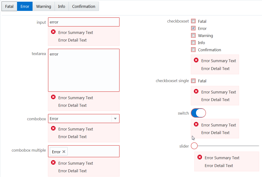
In this example an observable, appMessages, is declared and is bound to the messages-custom attribute for various elements. The following code describes how you can associate the observable with the messages-custom attribute for the oj-switch element .
<oj-switch id="switch" value="{{switchValue}}"
           messages-custom="{{appMessages}}">
</oj-switch>
In the corresponding JavaScript file, set the severity type and pass it to the observable, appMessages, to display associated messages.
if (summary && detail)
{
 msgs.push({summary: summary, detail: detail, severity: type});
}
self.appMessages(msgs);
In the example below, an instance of a cross-field custom validator is associated with the emailAddress observable, ensuring that its value is non-empty when the user chooses Email as their contact preference.
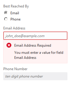
In the corresponding JavaScript file you must set the messages-custom attribute as emailAddressMessages.
<oj-input-text id="emailId" type="email"  name="emailId"
               placeholder="john_doe@example.com" value="{{emailAddress}}"
               messages-custom="{{emailAddressMessages}}"
               disabled="[[contactPref() !== 'email']]">
</oj-input-text>
For the complete example and code used to create the custom validator, see Cross-Field Validation. The demo uses a custom validator to validate an observable value against another. If validation fails the custom validator updates the messages-custom attribute.
Using the showMessages() Method on Editable Components
Use this method to instruct the component to show its deferred messages. When this method is called, the Oracle JET editable component automatically takes all deferred messages and shows them. This causes the component to display the deferred messages to the user.
For an example, see Show Deferred Messages.
Understanding the oj-validation-group Component
The oj-validation-group component is an Oracle JET element that tracks the validity of a group of components and allows a page author to enforce validation best practices in Oracle JET applications.
Applications can use this component to:
-
Determine whether there are invalid components in the group that are currently showing messages using the
invalidShownvalue of thevalidproperty. -
Determine whether there are invalid components that have deferred messages, such as messages that are currently hidden in the group, using the
invalidHiddenvalue of thevalidproperty. -
Set focus on the first enabled component in the group using the
focusOn()method. They can also focus on the first enabled component showing invalid messages usingfocusOn("@firstInvalidShown"). -
Show deferred messages on all tracked components using the
showMessages()method.
For details about the oj-validation-group component's attributes and methods, see oj-validation-group.
Tracking Validity of a Group of Editable Components Using oj-validation-group
You can track the validity of a group of editable components by wrapping them in the oj-validation-group component.
The oj-validation-group searches all its descendants for a valid property, and adds them to the list of components it is tracking. When it adds a component, it does not check the tracked component’s children since the component’s valid state should already be based on the valid state of its children, if applicable.
When it finds all such components, it determines its own valid property value based on all the enabled (including hidden) components it tracks. Any disabled or readonly components are ignored in calculating the valid state.
The most invalid component's valid property value will be the oj-validation-group element’s valid property value. When any of the tracked component's valid value changes, oj-validation-group will be notified and will update its own valid value if it has changed.
The following code sample shows how an oj-validation-group can be used to track the overall validity of a typical form.
<div id="validation-usecase">
  <oj-validation-group id="tracker" valid="{{groupValid}}">
    <oj-form-layout label-edge="start" id="fl1">

      <oj-input-text id="firstname"  required
                     autocomplete="off"
                     label-hint="First Name"
                     name="firstname" >
      </oj-input-text>
      <oj-input-text id="lastname" required
                     value="{{lastName}}"
                     autocomplete="off"
                     label-hint="Last Name">
      </oj-input-text>
      <oj-input-text id="email"
                     on-value-changed="[[firstEmailValueChanged]]"
                     autocomplete="off"
                     label-hint="Email"
                     value="{{email}}" >
      </oj-input-text>
      <oj-input-text id="email2"
                     autocomplete="off"
                     label-hint="Confirm Email"
                     validators="[[emailMatchValidator]]"
                     value="{{email2}}">
      </oj-input-text>
      <oj-checkboxset id="colors" label-hint="Favorite Colors">
        <oj-option id="blueopt" value="blue">Blue</oj-option>
        <oj-option id="greenopt" value="green">Green</oj-option>
        <oj-option id="pinkopt" value="pink">Pink</oj-option>
      </oj-checkboxset>
    </oj-form-layout>
  </oj-validation-group>
  <hr/>
  <div class="oj-flex">
    <div class="oj-flex-item"> </div>
    <div class="oj-flex-item">
       <oj-button id="submitBtn"
                  on-oj-action="[[submit]]">Submit</oj-button>
    </div>
  </div>
  <hr/>
  <span>oj-validation-group valid property: </span>
  <span id="namevalid" data-bind="text: groupValid"></span>
</div>
A portion of the script to create the view model for this example is shown below. This portion pertains to the oj-validation-group used above. The full script is contained in the Cookbook sample linked below.
 require(['ojs/ojcore', 'knockout', 'jquery', 'ojs/ojknockout',
    'ojs/ojcheckboxset', 'ojs/ojformlayout',
    'ojs/ojinputtext', 'ojs/ojbutton',
    'ojs/ojvalidationgroup'],
  function (oj, ko, $)
  // this callback gets executed when all required modules
  // for validation are loaded
  {
    function DemoViewModel() {
      var self = this;
      self.tracker = ko.observable();

      ...

      // to show the oj-validation-group's valid property value
      self.groupValid = ko.observable();

      // User presses the submit button
      self.submit = function () {

        var tracker = document.getElementById("tracker");

        if (tracker.valid === "valid") {
          // submit the form would go here
          alert("everything is valid; submit the form");
        }
        else {
           // show messages on all the components that have messages hidden.
           tracker.showMessages();
           tracker.focusOn("@firstInvalidShown");
        }
      };
    };

    $(
    function () {
      ko.applyBindings(new DemoViewModel(),
      document.getElementById('validation-usecase'));
    }
    );
  });
The figure below shows the output for the code sample. The status text at the bottom of each instance shows the valid state of the oj-validation-group, and by extension, the form.
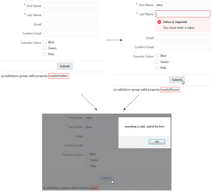
The Oracle JET Cookbook contains the complete example used in this section. See Form Fields.
For an example showing the oj-validation-group used for cross-field validation, see Cross-Field Validation.
Creating Page Level Messaging
The Oracle JET messaging framework includes the oj-messages and oj-message elements that you can use to create different types of messages on your page.
The oj-message element represents a single message. This tag can be used to create three types of messages:
-
Notification Messages: These are small popups, usually in one corner of the view port.
-
Inline Messages: These are messages in line with other components on the page, such as messages below the page header.
-
Overlay Messages: These are messages that pop up on top of other components, such as below the page header overlapping the page contents.
The oj-messages element is a wrapper tag that manages the layout of individual messages. This wrapper tag allows for mass dismissal of messages. For single page applications, it is recommended that no more than one instance of oj-messages be defined for these three layouts to avoid clutter on the page.
Inline-style messages are typically used as page level inline messages just below the page header.
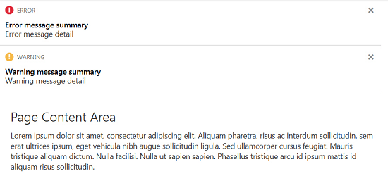
The Cookbook contains an example that showcases inline messages. See Inline messages in page layout.
Overlay-style messages are typically used as a page level overlay message just below the page header. These messages usually pertain to the page or region of the application.
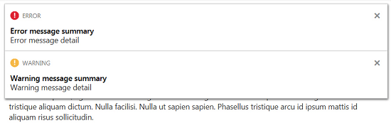
The Cookbook contains an example that showcases overlay messages. See Overlay messages in page layout.
Notification-style messages are typically used for asynchronous page-level messages in a corner of the viewport.

The Cookbook contains an example that showcases notification messages. See Notification messages in page layout.
Create Messages with oj-message
The Oracle JET messaging framework contains a number of properties to customize how messages are created and displayed.
For details about the oj-messages component's attributes and methods, see oj-messages. For oj-message, see oj-message.