Using Responsive JavaScript
Oracle JET includes the ResponsiveUtils and ResponsiveKnockoutUtils utility classes that leverage media queries to change a component's value option or load content and images based on the user's screen size or device type.
Topics:
The Responsive JavaScript Classes
The ResponsiveUtils and ResponsiveKnockoutUtils responsive JavaScript classes provide methods that you can use in your application's JavaScript to obtain the current screen size and use the results to perform actions based on that screen size. In addition, the ResponsiveUtils provides a method that you can use to compare two screen sizes, useful for performing actions when the screen size changes.
| JavaScript Class | Methods | Description |
|---|---|---|
|
|
|
Compares two screen size constants. Returns a negative integer if the first argument is less than the second, a zero if the two are equal, and a positive integer if the first argument is more than the second. The screen size constants identify the screen size range media queries. For example, the |
|
|
|
Returns the media query to use for the framework query key parameter. The framework query key constant corresponds to a Sass responsive query variable. For example, the |
|
|
|
Creates a Knockout observable that returns true or false based on a media query string. For example, the following code will return true if the screen size is 400 pixels wide or larger. var customQuery =
oj.ResponsiveKnockoutUtils.createMediaQueryObservable(
'(min-width: 400px)'); |
|
|
|
Creates a computed Knockout observable, the value of which is one of the For example, on a small screen (0 - 767 pixels), the following code will create a Knockout observable that returns self.screenRange = oj.ResponsiveKnockoutUtils.createScreenRangeObservable(); |
For additional detail about responsiveUtils, see the oj.ResponsiveUtils API documentation. For more information about responsiveKnockoutUtils, see oj.ResponsiveKnockoutUtils.
Changing a Custom Element’s Attribute Based on Screen Size
You can set the value for a custom element’s attribute based on screen size using the responsive JavaScript classes. For example, you may want to add text to a button label when the screen size increases using the oj-button element's display attribute.

In this example, the oj-button element’s display attribute is defined for icons. The code sample below shows the markup for the button.
<div id="optioncontainer">
  <oj-button display="[[large() ? 'all' : 'icons']]">
    <span slot='startIcon' class="oj-fwk-icon oj-fwk-icon-calendar"></span>
    calendar
  </oj-button>
</div>
The code sample also sets the oj-button display attribute to all, which displays both the label and icon when the large() method returns true, and icons only when the large() method returns false.
The code sample below shows the code that sets the value for large() and completes the knockout binding. In this example, lgQuery is set to the LG_UP framework query key which applies when the screen size is large or up. self.large is initially set to true as the result of the call to oj.ResponsiveKnockoutUtils.createMediaQueryObservable(lgQuery). When the screen changes to a smaller size, the self.large value changes to false, and the display attribute value becomes icons.
require(['ojs/ojcore', 'knockout', 'jquery', 'ojs/ojknockout', 'ojs/ojbutton'],
  function(oj, ko, $)
  {
  function MyModel(){
    var self = this;

    // observable for large screens
    var lgQuery = oj.ResponsiveUtils.getFrameworkQuery(
                            oj.ResponsiveUtils.FRAMEWORK_QUERY_KEY.LG_UP);

    self.large = oj.ResponsiveKnockoutUtils.createMediaQueryObservable(lgQuery);

  }

  $(function() {
    ko.applyBindings(new MyModel(), document.getElementById('optioncontainer'));

  });
});
The Oracle JET Cookbook contains the complete code for this example which includes a demo that shows a computed observable used to change the button label's text depending on the screen size. You can also find examples that show how to use custom media queries and Knockout computed observables. For details, see Responsive JavaScript Framework Queries.
For additional information about working with oj-button, see Working with Buttons.
Conditionally Loading Content Based on Screen Size
You can change the HTML content based on screen size using the responsive JavaScript classes. For example, you might want to use a larger font or a different background color when the screen size is large.
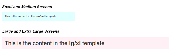
In this example, the HTML content is defined in Knockout templates. The markup uses Knockout's data-bind utility to display a template whose name depends on the value returned by the large() call. If the screen is small or medium, the application will use the sm_md_template. If the screen is large or larger, the application will use the lg_xl_template.
<div id="sample_container">

  <!-- large template -->
  <script type="text/html" id="lg_xl_template">
    <div id="lg_xl"
         style="background-color:lavenderblush;
                padding: 10px; font-size: 22px" >
     This is the content in the <strong>lg/xl</strong> template.
    </div>
  </script>

  <!-- small template -->
  <script type="text/html" id="sm_md_template">
    <div id="sm_md"
         style="background-color:lightcyan;
                padding: 10px; font-size: 10px" >
      This is the content in the <strong>sm/md</strong> template.
    </div>
  </script>


  <!-- display template -->
  <div data-bind="template: {name: large() ? 'lg_xl_template' :
                                             'sm_md_template'}"></div>
</div>
The code that sets the value for large() is identical to the code used for setting component option changes. For details, see Changing a Custom Element’s Attribute Based on Screen Size.
For the complete code used in this example, see the Responsive Loading with JavaScript demo in the Oracle JET Cookbook.
Creating Responsive Images
You can use the responsive JavaScript classes to load a different image when the screen size changes. For example, you may want to load a larger image when the screen size changes from small and medium to large and up.

In this example, the image is defined in a HTML img element. The markup uses Knockout's data-bind utility to display a larger image when the large() call returns true.
<div id="samplecontainer">
  <img alt="puzzle" id="puzzle"
       data-bind="attr: { src: large() ? 'images/responsive/puzzle.png' :
                                         'images/responsive/puzzle_small.png'}" >

</div>
The code that set the value for large() is identical to the code used for setting component option changes. For details, see Changing a Custom Element’s Attribute Based on Screen Size.
Note:
The image will not begin to load until the JavaScript is loaded. This could be an issue on devices with slower connections. If performance is an issue, you can use responsive CSS as described in Creating Responsive CSS Images. You could also use the HTML picture element which supports responsive images without CSS or JavaScript. However, browser support is limited and may not be an option for your environment.
For the complete code used in this example, see the Oracle JET Cookbook Responsive Images demos.