Working with Collections
Use Oracle JET data collection components to display data in tables, data grids, list views, or trees.
The Oracle JET data collection components include oj-table, oj-data-grid, oj-tree, and oj-list-view, and you can use them to display records of data. oj-table and oj-data-grid both display data in rows and columns, and your choice of component depends upon your use case. Use oj-tree-view to display hierarchical data such as a directory structure and oj-list-view to display a list of data. The toolkit also includes pagination and row expanders that display hierarchical data in a data grid or table row.
The Oracle JET Cookbook and JavaScript API Reference for Oracle® JavaScript Extension Toolkit (JET) include complete demos and examples for using the collection components, and you may also find the following tips and tricks helpful.
Topics:
Choosing a Table, Data Grid, or List View
Oracle JET provides the oj-table, oj-data-grid, and oj-list-view components for displaying records of data in rows and columns, and this section can help you decide which component to use in your application.
The oj-table component displays records of data on a row basis. It's best used when you have simple data that can be presented as rows of fields, and it should be your first choice as it provides a simpler layout to represent the data and also supports most of the common features, unless you require advanced features. A selection in the table provides you with the row of data and all of the fields in that row or record. The sizing of the table is based on the content itself. The height and width of the cells is adjusted for the content included. You can write templates using oj-table elements such as tr, td, th, and so on.
The oj-data-grid is designed to provide grid functionality. It provides the ability to select individual or ranges of cells of data. It's best used when you need to display totals or tallies of data across columns or rows of data. The oj-data-grid is designed to be much more flexible in its layout and functionality than the oj-table component. It's a low-level component that you can shape in your application to how you want the data to be displayed. The overall size of the data grid is not determined by its content, and the developer specifies the exact height and width of the container. The data grid acts as a viewport to the contents, and unlike a table its size is not determined by the size of the columns and rows. With this custom HTML oj-data-grid element, you can host the template content inside it.
The oj-list-view element displays a list of data or a list of grouped data. It is best used when you need to display a list using an arbitrary layout or content. You can also use oj-list-view to display hierarchical data that contains nested lists within the root element.
The table below provides a feature comparison of the oj-table, oj-data-grid, and oj-list-view components.
| Feature | oj-table | oj-data-grid | oj-list-view |
|---|---|---|---|
|
Column/Row sizing |
Controlled by content or CSS styles. Percent values supported for width and height. |
Controlled by cell dimensions. Does not support percent values for width and height. |
No |
|
User-resizable column |
Yes |
Yes |
No |
|
User-resizable row |
No |
Yes |
No |
|
Row reordering |
No |
Yes |
No |
|
Column sorting |
Yes |
Yes |
No |
|
Column selection |
Yes |
Yes |
No |
|
Row selection |
Yes |
Yes |
Yes |
|
Cell selection |
No |
Yes |
No |
|
Marquee selection |
No |
Yes |
No |
|
Row header support |
No |
Yes |
No |
|
Pagination |
Page, high water mark |
Page, high water mark, virtual scrolling (see note) |
Page, high water mark |
|
Custom cell templates |
Yes |
Yes |
No |
|
Custom row templates |
Yes |
No |
Yes |
|
Custom cell renderers |
Yes |
Yes |
No |
|
Custom row renderers |
Yes |
No |
Yes |
|
Row expander support |
Yes |
Yes |
No |
|
Cell stamping |
Yes |
Yes |
No |
|
Cell merging |
No |
Yes |
No |
|
Render aggregated cubic data |
No |
Yes |
No |
|
Base HTML element |
|
|
|
|
Custom footer template |
Yes (provides access to column data for passing to a JavaScript function) |
No (cell level renderers used for column and row data manipulations) |
No |
|
Cell content editing |
Yes |
Yes |
No |
|
Content filtering |
Yes |
Yes |
No |
Note:
True virtual scrolling is available as a feature of oj-data-grid. Modern design principles should be considered and implemented before implementing virtual scrolling. It is much more desirable to present the end user with a filtered list of data that will be more useful to them, than to display thousands of rows of data and expect them to scroll through it all. True virtual scrolling means that you can perform scrolling in both horizontal and vertical directions with data being added and removed from the underlying DOM. High water mark scrolling (with lazy loading) is the preferred method of scrolling, and you should use it as a first approach.
Working with Data Grids
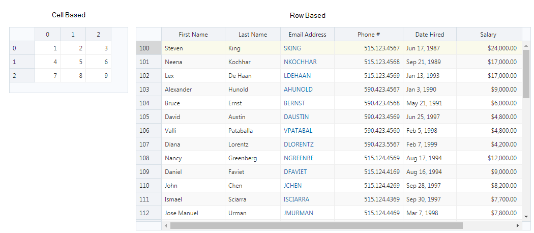
The oj-data-grid component displays data in cells inside a grid consisting of rows and columns. oj-data-grid is themable and supports WAI-ARIA authoring practices for accessibility. You can configure the oj-data-grid for cell selection with row and column headers or for row selection with column headers.
Note:
When you configure the data grid for row selection, the grid has a look and feel that is similar to the oj-table component. However, there are distinct differences in functionality between the oj-data-grid and oj-table components. For additional information, see Choosing a Table, Data Grid, or List View.
To create the data grid, define an oj-data-grid element in your HTML file and assign a meaningful id, width, and height. Also, specify the data property.
<oj-data-grid id="datagrid"
    style="width:100%;max-width:234px;height:130px"
    aria-label="Data Grid Cell Based Grid Demo"
    data="[[dataSource]]">
</oj-data-grid>
In this example, the aria-label is added to the oj-data-grid element for accessibility. oj-data-grid implicitly defines an Aria role as application, and you must add the aria-label to distinguish it from other elements defined with the Aria application role. For additional information about Oracle JET and accessibility, see Developing Accessible Applications.
The data is defined in the dataSource object and can be one of the following:
-
oj.ArrayDataGridDataSource: Use to define data in a static array.The array can be a single array where each item in the array represents a row in the data grid, or a two dimensional array where each item represents a cell in the grid. For the data grid shown in this section, the data is defined as a two dimensional array.
require(['ojs/ojcore', 'knockout', 'jquery', 'ojs/ojknockout', 'ojs/ojdatagrid', 'ojs/ojarraydatagriddatasource'], function(oj, ko, $) { function viewModel() { var self = this; var dataArray = [ ['1', '2', '3'], ['4', '5', '6'], ['7', '8', '9'] ]; self.dataSource = new oj.ArrayDataGridDataSource(dataArray); } $( function() { ko.applyBindings(new viewModel(), document.getElementById('datagrid')); } ); });oj.ArrayDataGridDataSourcealso supports custom sort behavior through itscomparatorproperty. For details, consult the oj.ArrayDataGridDataSource API documentation. -
oj.CollectionDataGridDataSource: Use to define data using the Oracle JET Common Model. The data grid will respond to events generated by the underlyingoj.Collection.For more details about
oj.CollectionDataGridDataSource, see the oj.CollectionDataGridDataSource API documentation. -
oj.PagingDataGridDataSource: Use to include pagination. For additional information, see Working with Pagination. -
oj.FlattenedTreeDataGridDataSource: Use to display hierarchical data in the data grid. The user can expand and collapse rows in the data grid. For additional information, see Working with Row Expanders. -
oj.CubeDataGridDataSource: Use to include aggregate values on column headers, row headers, or both. For additional information, see Working with oj. CubeDataGridDataSource. -
Custom data source: Use to provide your own data source for the data grid. The Oracle JET Cookbook contains examples for creating custom data sources, including an example with nested headers.
Note:
Only data grid components that use a custom data source support the use of nested row or column headers.
The Oracle JET Cookbook includes the complete example for the data grid used in this section at Data Grids. The cookbook also includes examples that show row-based data grids, editable data grids, and data grids with visualizations, end headers, custom cell renderers, merged cells, and custom data sources.
Working with oj. CubeDataGridDataSource
Use oj.CubeDataGridDataSource to render aggregated cubic data in your data grid. You can aggregate values on column headers, row headers, or both column and row headers. You can also define a page axis to filter or otherwise restrict the display.
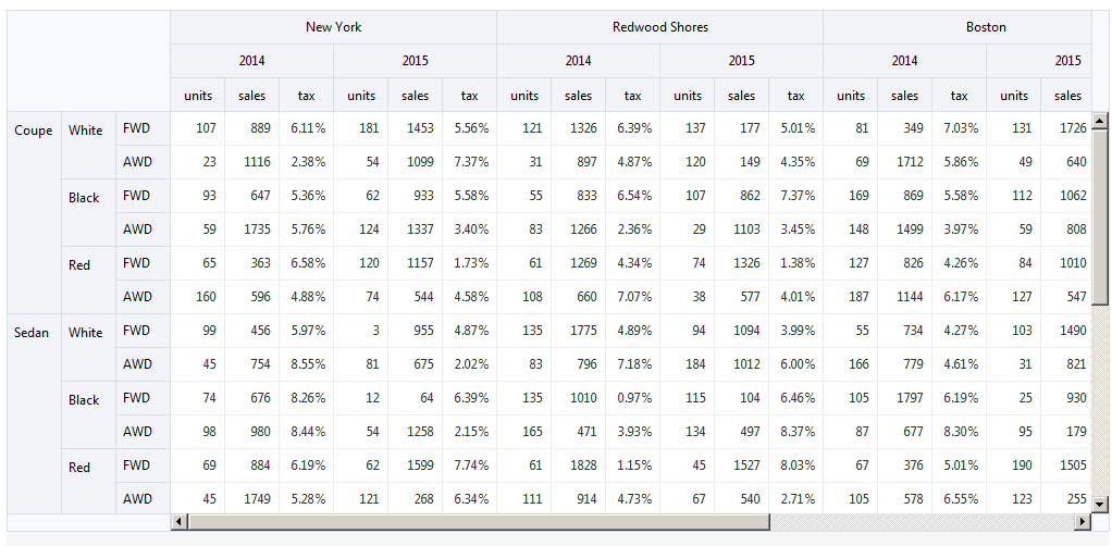
For example, you may have a collection that contains data for sales, number of units sold, and sales tax data for vehicles sold by car dealerships, and you'd like to aggregate the data to show sales, unit, and tax data by year and city. Your data also contains the type of vehicle sold, its color, and type of drive train, and you'd also like to aggregate the data to show the sales, unit, and tax data grouped by product, color, and drive train.
oj-data-grid with the oj.CubeDataGridDataSource to achieve the desired grouping. The following image shows the runtime display.
The data grid uses JSON data for its data source. The code sample below shows a portion of the JSON array.
[
  {
    "index": 0,
    "units": 80,
    "sales": 535,
    "tax": 0.0234,
    "year": "2014",
    "gender": "Male",
    "product": "Coupe",
    "city": "New York",
    "drivetrain": "FWD",
    "color": "White"
  },
  {
    "index": 1,
    "units": 95,
    "sales": 610,
    "tax": 0.0721,
    "year": "2015",
    "gender": "Male",
    "product": "Coupe",
    "city": "New York",
    "drivetrain": "FWD",
    "color": "White"
  },
  {
    "index": 2,
    "units": 27,
    "sales": 354,
    "tax": 0.0988,
    "year": "2014",
    "gender": "Female",
    "product": "Coupe",
    "city": "New York",
    "drivetrain": "FWD",
    "color": "White"
  },

]
The data also contains a column for the gender of the buyer which isn't included in the display. The totals displayed in the grid come from applying the aggregation across any JSON rows that match up on type, color, drivetrain, year, and city. For the data in this example, this has the effect of grouping the Male and Female values and applying the aggregation. For example, the units shown in the grid for the New York sales in 2014 of white FWD coupes comes from totaling the highlighted values:
80 + 27 = 107 units
The following code sample shows the markup for the data grid.
<oj-data-grid id="datagrid"
    style="width:100%;height:400px;max-width:851px;"
    aria-label="Cubic Data Source Grid Demo"
    data="[[dataSource]]"
    cell.renderer="[[cellRenderer]]"
></oj-data-grid>
In this example, the datasource is defined in the application's main script.
require(['ojs/ojcore', 'knockout', 'jquery', 'ojs/ojknockout', 'ojs/ojmodel',
     'ojs/ojcube', 'ojs/ojdatagrid'],
function(oj, ko, $)
{
  function dataGridModel() {
    var vm = this;
    var cube = null;
    var topLevelItems = [];

    var collection = new oj.Collection(null, {
        url: 'cookbook/dataCollections/dataGrid/cubeGrid/cubedata.json'
    });
    var dataArr = null;

    function generateCube(dataArr, axes) {
      return new oj.DataValueAttributeCube(dataArr, axes,
              [{attribute:'units',aggregation:oj.CubeAggType['SUM']},
                  {attribute:'sales'},
                  {attribute:'tax',aggregation:oj.CubeAggType['AVERAGE']}]);
    };

    collection.fetch({success:function() {
      dataArr = collection.map(function(model) {
        return model.attributes;
      });
      cube = generateCube(dataArr, axes);

      var topLevelItems = getItemsForLevel(2, 0);
      vm.colors(topLevelItems);

      vm.currentColor(topLevelItems[0].value);

      vm.dataSource(new oj.CubeDataGridDataSource(cube));
    }});

    var axes = [
        {axis: 0, levels: [
                {attribute: 'city'},
                {attribute: 'year'},
                {dataValue: true}]},
        {axis: 1, levels:[
                {attribute: 'product'}
                {attribute: 'color'},
                {attribute: 'drivetrain'}]}];

    this.dataSource = ko.observable();

     $(function() {
     ko.applyBindings(new dataGridModel(),
         document.getElementById('wrapper'));
  });
});
The oj.CubeDataGridDataSource parameter is instantiated with the return value of the generateCube() function, which is an oj.Cube object. The oj.Cube class provides functions for the oj.DataValueAttributeCube class which creates the object to convert the row set data into grouped, cubic data. The oj.DataValueAttributeCube constructor takes the following parameters:
-
rowset: An array of objects containing name-value pairsIn this example, the JSON data is mapped to the
dataArrobject which is defined as anoj.Collectionobject.var collection = new oj.Collection(null, { url: 'cookbook/dataCollections/dataGrid/cubeGrid/cubedata.json' }); -
layout: An array of objects that contains the axis number and levels to use for the aggregationThe axis number indicates where you want the aggregated data displayed: 0 for column headers, and 1 for row headers. The levels tell the cube which values to aggregate and the order to display them. The code sample below shows the layout used in this example. The
dataValueproperty indicates which level to display for the units, sales, and tax aggregated values.var axes = [ {axis: 0, levels: [ {attribute: 'city'}, {attribute: 'year'}, {dataValue: true}]}, {axis: 1, levels: [ {attribute: 'product'}, {attribute: 'color'}, {attribute: 'drivetrain'}]}];You can configure an additional axis that you can use to filter or otherwise restrict the display of data. For example, you can add a third axis which includes the color and drivetrain attributes, as shown in the following code sample:
var axes = [
            {axis: 0, levels: [
                    {attribute: 'city'},
                    {attribute: 'year'},
                    {dataValue: true}]},
            {axis: 1, levels: [
                    {attribute: 'product'}]},
            {axis: 2, levels:[
                    {attribute: 'color'},
                    {attribute: 'drivetrain'}]}];
When you add a third axis to the page, the axis will not be visible. However, you can use the
setPage()method to use the axis as a page axis to filter the display. For example, settingcoloranddrivetrainon the third axis has the effect of restricting the display to aggregate only those values that match both thecoloranddrivetrainattributes.In this example, you have six page combinations: White FWD, White AWD, Black FWD, Black AWD, Red FWD, and Red AWD products. If you set the
colorattribute to White and thedrivetrainattribute to 4WD as shown in the following image, when you render the page only the values for White, 4WD products (Coupe, Sedan, Wagon, SUV, Van, and Truck) display on the screen. -
dataValues: An array of objects that contains the name of the attribute in the row set that represents the data, an optional label, and the aggregation type. The aggregation type is also optional and defaults toSUM. You can also set it to one of the aggregation types shown in the following table.Aggregation Type Description AVERAGEAverage the values.
COUNTCount the number of values.
CUSTOMSpecify a custom callback function to do the aggregation.
FIRSTSubstitute the first value encountered in the collection.
MAXCalculate the maximum of the values.
MINCalculate the minimum of the values.
NONESubstitute a null for the value.
STDDEVCalculate the standard deviation of the values.
SUMTotal the values.
VARIANCECalculate the variance of the values.
The code sample below shows the function that defines the
dataValuesfor the cube used in this section. The cube will sum the units and sales data and will average the sales tax data.function generateCube(dataArr, axes) { return new oj.DataValueAttributeCube(dataArr, axes, [{attribute:'units',aggregation:oj.CubeAggType['SUM']}, {attribute:'sales'}, {attribute:'tax',aggregation:oj.CubeAggType['AVERAGE']}]); };

The Oracle JET Cookbook demos at Data Grids (Cubic Data Source) contain the complete code for the example used in this section, including the complete code for setting the page axis and rendering the cell content. The oj.CubeDataGridDataSource API documentation also contains additional detail and methods that you can use for working with the cube.
Working with List Views
The Oracle JET oj-list-view component enhances the HTML list (ul) element to provide a themable, WAI-ARIA compliant component that displays a list of data. oj-list-view supports single and multiple selection, high water mark scrolling when working with table data, and hierarchical content.
Topics:
Specifying Initial Expansion
By default, each list item’s children items are hidden upon initial display. To specify that one or more items are expanded when the ListView first loads, use the expanded attribute and specify the key set containing the keys of the items that should be expanded.
<oj-list-view id="listview"
              aria-label="list with hierarchical data"
              selection-mode="multiple"
              expanded="[[expanded]]"
              item.selectable="[[itemOnly]]">
<ul>
    <li id="a">
     <span>A</span>
     <ul>
         <li id="amybartlet">
            <span class="avatar" style="background-image: url('images/dvt/1.png')"></span>
            <div class="container">
               <div>
                   <span class="name">Amy Bartlet</span>
               </div>
               <div>
                   <span class="oj-text-xs oj-text-secondary-color">Vice President</span>
               </div>
            </div>
         </li>
...contents omitted
</oj-list-view>
In your application’s viewModel, define the key set. The following example sets the ListView to expand the cookbook item on initial display. Note that you must also add the ojkeyset module and keySet function to the require definition.
require(['ojs/ojcore', 'knockout', 'jquery', 'ojs/ojkeyset', 'ojs/ojknockout', 'ojs/ojlistview'],
function(oj, ko, $, keySet)
{
     function viewModel()
     {
         this.itemOnly = function(context)
         {
             return context['leaf'];
         };
         this.expanded = new keySet.ExpandedKeySet(['a', 'b', 'c']);
     } ...contents omitted );
You can use ExpandAllKeySet class to set all the list items in a ListView to be expanded on initial display as follows:
this.expanded = new keySet.ExpandAllKeySet();
For the complete example, see List View Using Expanded Option using expanded attribute.
Understanding Data Requirements for List Views
The data source for the oj-list-view component can be one of the following:
-
Flat or hierarchical static HTML
The following image shows examples of list views that display static content, one with flat content and one using a nested list for hierarchical content.
The following code sample shows a portion of the markup used to create the list view with hierarchical static content using the
oj-list-viewelement. The element allows multiple selection and expands both list item groups A and B upon initial display.<oj-list-view id="listview" aria-label="list with hierarchical data" selection-mode="multiple" item.selectable="[[itemOnly]]"> <ul> <li id="a"> <span>A</span> <ul> <li id="amybartlet"> <span class="avatar" style="background-image: url('images/nBox/1.png')"></span> <div class="container"> <div> <span class="name">Amy Bartlet</span> </div> <div> <span class="oj-text-xs oj-text-secondary-color">Vice President</span> </div> </div> </li> ... contents omitted </ul> </li> <li id="b"> <span>B</span> <ul> ... contents omitted </ul> </li> </ul> </oj-list-view>
The code to apply the binding is shown below.
require(['ojs/ojcore', 'knockout', 'jquery', 'ojs/ojknockout', 'ojs/ojlistview'],
function(oj, ko, $)
{
    function viewModel()
    {
        this.itemOnly = function(context)
        {
            return context['leaf'];
        };
    }

    $(
        function()
        {
            ko.applyBindings(new viewModel(), document.getElementById('listview'));
        }
    );
});
See List View Using Static Data for the complete example to create
oj-list-viewcomponents using static data and static hierarchical data. -
Oracle JET
TreeDataSource, includingoj.JsonTreeDataSourceandoj.CollectionTreeDataSource.To use a
TreeDataSource, you specify the method that returns the tree data in thedataattribute for the component.<oj-list-view id="listview" aria-label="list using json data" data="[[dataSource]]" selection-mode="single" item.renderer="[[renderer]]" item.focusable="[[itemOnly]]" item.selectable="[[itemOnly]]" drill-mode="none"> </oj-list-view>The Oracle JET Cookbook contains the complete example for creating a list view with an
oj.JsonTreeDataSourceat List View Using Hierarchical JSON Data. You can also find an example for creating a list view with anoj.JsonTreeDataSourcethat also contains an index at Indexer. -
Oracle JET
TableDataSource, includingoj.CollectionTableDataSourceandoj.PagingTableDataSourceUse the
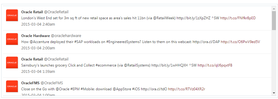
TableDataSourcedataattribute whenoj.Collectionis the model for the underlying data, or you want to add scrolling or pagination to youroj-list-view. The following image shows a list view using anoj.CollectionTableDataSourceobject for its data.In this example, high water mark scrolling is enabled through the component attribute’s
scroll-policy.<oj-list-view id="listview" aria-label="list using collection" style="width:100%;height:300px;overflow-x:hidden" data="[[dataSource]]" item.renderer="[[oj.KnockoutTemplateUtils.getRenderer('tweet_template')]]" selection-mode="single" scroll-policy="loadMoreOnScroll" scroll-policy-options.fetch-size="15"> </oj-list-view>For the complete example, including the script that creates the
oj.CollectionTableDataSourceobject, see List View Using oj.Collection.You can also find cookbook examples that add Pull to Refresh and Swipe to Reveal touch capability to an
oj-list-viewcreated with theoj.CollectionTableDataSourceobject. -
Oracle JET
oj.ArrayDataProviderUse the
oj.ArrayDataProviderwhen you want to use an observable array or array as data for List View.The following example shows the HTML markup using the
dataattribute in theoj-list-viewelement:<oj-list-view id="listview" aria-label="list using observable array" data="[[dataProvider]]" selection-mode="multiple" selection="{{selectedItems}}" item.renderer="[[renderer]]"> </oj-list-view>In the following JavaScript sample code, data in an array is passed to a variable,
dataProvider, using theoj.ArrayDataProviderobject:this.dataProvider = new oj.ArrayDataProvider(this.allItems, {'idAttribute': 'id'});For the complete example, see List View Using and oj.ArrayDataProvider .

Note:
If you do not specify a data source in the list view component's data attribute, Oracle JET will examine the child elements inside the root element and use it for static content. If the root element has no children, Oracle JET will render an empty list.
Working with List Views and Inline Templates
Use inline templates to specify what gets rendered inside the list items.
You can use an inline template to contain the markup for your list item content and reference the name of the template in the <template> element's slot attribute. Unlike specifying the <li> elements to display the content in the list format, you must specify only the content to be rendered within the list and not the <li> elements. When the inline template is executed for each value passed to it, the inline template will have access to the binding context containing the following properties:
-
$current- an object that contains information for the current item being rendered-
componentElement- the<oj-list-view>custom element -
data- the data for the current item being rendered -
index- the zero-based index of the current item being rendered -
key- the key of the current item being rendered -
depth(available when hierarchical data is provided) - the depth of the current item being rendered. The depth of the first level children under the invisible root is 1 -
leaf(available when hierarchical data is provided) - whether the current item is a leaf node or not -
parentKey(available when hierarchical data is provided) - the key of the parent item. The parent key is null for root nodes
-
-
alias- ifasattribute is specified, the value will be used to provide an application-named alias for$currentvalue.
In the following image, an inline template specifies the content to be rendered within the list created using oj-list-view.

The HTML code sample below shows a portion of the markup for a list view using an inline template.
<oj-list-view id="listview" aria-label="list using observable array"
      data="[[dataProvider]]" selection-mode="multiple" selection="{{selectedItems}}">
   <template slot="itemTemplate">
       <span>
           <oj-bind-text value='[[$current.data.item]]'></oj-bind-text>
       </span>
   </template>
</oj-list-view>
The selection attribute monitors the current selection value in the array.
In the following JavaScript sample code, array data in a variable, allItems, is passed to a variable, dataProvider, using the oj.ArrayDataProvider object:
this.itemToAdd = ko.observable("");
this.allItems = ko.observableArray([{"id": 1, "item": "Milk"},
                                    {"id": 2, "item": "Flour"},
                                    {"id": 3, "item": "Sugar"},
                                    {"id": 4, "item": "Vanilla Extract"}
                                    ]);
this.selectedItems = ko.observableArray([]);
var lastItemId = this.allItems().length;

this.dataProvider = new oj.ArrayDataProvider(this.allItems, {'idAttribute': 'id'});
See List View Using Inline Template for the complete example to create a list view using an inline template.
Working with Pagination
Use the oj-paging-control component to add pagination to the oj-table and oj-data-grid components or the HTML list element. Pagination displays the number of pages and rows in the table or grid, and the user can use pagination to move between pages, jump to a specific page, or navigate to the first or last page of data.
In the following image, oj-paging-control element is added to the oj-table element and initialized with the default display.
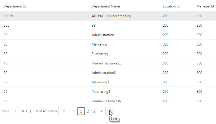
To add pagination to a table, define the table's data as a PagingTableDataSource object, and add the oj-paging-control using the same PagingTableDataSource object for its data attribute. Specify the number of rows to display in the oj-paging-control element's page-size attribute. The code sample below shows the markup defining the table and pagination components. In this example, page-size is set to 10.
<div id="pagingControlDemo">
    <oj-table id="table" summary="Department List" aria-label="Departments Table"
              data='[[pagingDatasource]]'
              columns='[{"headerText": "Department Id", "field": "DepartmentId"},
                        {"headerText": "Department Name", "field": "DepartmentName"},
                        {"headerText": "Location Id", "field": "LocationId"},
                        {"headerText": "Manager Id", "field": "ManagerId"}]'
              style='width: 100%;'>
        <oj-paging-control id="paging" data='[[pagingDatasource]]' page-size='10' slot='bottom'>
        </oj-paging-control>
    </oj-table>
</div>
The script that populates the pagingDatasource with data and completes the Knockout binding is shown below. In this example, the table's data is defined in an ArrayDataProvider object, and the pagingDatasource defines the PagingTableDataSource as a new ArrayDataProvider object.
require(['ojs/ojcore', 'knockout', 'jquery', 'ojs/ojknockout', 'ojs/ojcheckboxset', 'ojs/ojtable', 'ojs/ojpagingcontrol',
 'ojs/ojpagingtabledatasource', 'ojs/ojarraydataprovider'],
function(oj, ko, $)
{
  function viewModel()
  {
    var self = this;

    var deptArray = [{DepartmentId: 10015, DepartmentName: 'ADFPM 1001 neverending', LocationId: 200, ManagerId: 300},
        {DepartmentId: 556, DepartmentName: 'BB', LocationId: 200, ManagerId: 300},
        {DepartmentId: 10, DepartmentName: 'Administration', LocationId: 200, ManagerId: 300},
        {DepartmentId: 20, DepartmentName: 'Marketing', LocationId: 200, ManagerId: 300},
        ...contents omitted
        {DepartmentId: 13022, DepartmentName: 'Human Resources15', LocationId: 200, ManagerId: 300}];
    self.pagingDatasource = new oj.PagingTableDataSource(new oj.ArrayDataProvider(deptArray, {idAttribute: 'DepartmentId'}));
  }

  var vm = new viewModel;

  $(document).ready
  (
    function()
    {
      ko.applyBindings(vm, document.getElementById('pagingControlDemo'));
    }
  );
});
To add a paging control to oj-data-grid, define the data grid's data as a oj.PagingDataGridDataSource object, and add the oj-paging-control element using the same oj.PagingDataGridDataSource object for its data attribute. Set the page-size attribute equal to the fetch size for the data collection, if creating the data grid from an oj.CollectionDataGridDataSource object.
The Oracle JET Cookbook contains complete examples for adding pagination to oj-table, oj-data-grid, and HTML lists at Pagination. You can also find the link to the oj-paging-control API documentation as well as examples that show different options for customizing the paging display.
For additional information about working with the oj-table component, see Working with Tables. For more information about working with the oj-data-grid component, see Working with Data Grids.
Working with Row Expanders
Use the Oracle JET oj-row-expander component to expand or collapse rows in a data grid or table to display hierarchical data. oj-row-expander renders the expand/collapse icon with the appropriate indentation and works directly with the flattened data source. In the following image, the row expander is used with an oj-data-grid component, and the user can expand the tasks to display subtasks and dates.
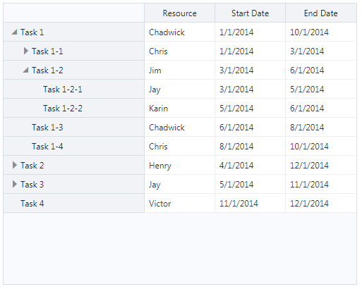
To use oj-row-expander with oj-data-grid, create an oj-data-grid element and assign a meaningful ID to it and specify properties on the oj-data-grid. In the HTML file, specify a row header template that adds the oj-row-expander element to the row header. Specify the grid’s data in an oj.FlattenedTreeDataGridDataSource object. In the code sample below, the oj-row-expander is defined in the data grid’s row template. The context option references the object obtained from the data grid’s column renderer.
<oj-data-grid
    id="datagrid"
    style="width:100%;max-width:502px;height:400px"
    aria-label="Data Grid with Row Expander"
    data="[[dataSource]]"
    selection-mode.cell="single"
    header.column.renderer="[[oj.KnockoutTemplateUtils.getRenderer('column_header_template')]]"
    header.column.style="width:100px;"
    header.column.resizable.width="enable"
    header.row.renderer="[[oj.KnockoutTemplateUtils.getRenderer('row_header_template')]]"
    header.row.style="width:200px;"
    cell.class-name="oj-helper-justify-content-flex-start"
></oj-data-grid>

<script type="text/html" id="column_header_template">
    <!-- ko if: $context.key=='resource' -->
        <span data-bind="text: 'Resource'"></span>
    <!-- /ko -->
        <!-- ko if: $context.key=='start' -->
        <span data-bind="text: 'Start Date'"></span>
    <!-- /ko -->
        <!-- ko if: $context.key=='end' -->
        <span data-bind="text: 'End Date'"></span>
    <!-- /ko -->
</script>

<script type="text/html" id="row_header_template">
    <oj-row-expander context="[[$context]]"></oj-row-expander>
    <span data-bind="text: $context.data"></span>
</script>
The data for the oj.FlattenedTreeDataGridDataSource object can come from local or fetched JSON, or an oj.Collection object. In the example in this section, the data is read from a JSON file. The code sample below shows a portion of the JSON.
[
    {"attr": {"id": "t1",
              "name": "Task 1",
              "resource": "Chadwick",
              "start": "1/1/2014",
              "end": "10/1/2014"
             },
     "children": [
                     {"attr": {"id": "t1:1",
                               "name": "Task 1-1",
                               "resource": "Chris",
                               "start": "1/1/2014",
                               "end": "3/1/2014"
                              },
                      "children": [
                                      {"attr": {"id": "t1:1:1",
                                                "name": "Task 1-1-1",
                                                "resource": "Henry",
                                                "start": "1/1/2014",
                                                "end": "2/1/2014"
                                               }
                                      },
                                      {"attr": {"id": "t1:1:2",
                                                "name": "Task 1-1-2",
                                                "resource": "Victor",
                                                "start": "2/1/2014",
                                                "end": "3/1/2014"
                                               }
                                      }
                                  ]
                     },

                     ...contents omitted

                 ]
    },
    ... contents omitted
    {"attr": {"id": "t4",
              "name": "Task 4",
              "resource": "Victor",
              "start": "11/1/2014",
              "end": "12/1/2014"
             }
    }
]
The script that reads the JSON file and defines the datasource object as an oj.FlattenedTreeDataGridDataSource is shown below.
require(['ojs/ojcore', 'knockout', 'jquery', 'ojs/ojknockout', 'ojs/ojdatagrid',
    'ojs/ojrowexpander', 'ojs/ojflattenedtreedatagriddatasource', 'ojs/ojjsontreedatasource'],
function(oj, ko, $)
{
    function viewModel()
    {
        var self = this;

        var options = {
            'rowHeader': 'name',
            'columns': ['resource', 'start', 'end']
        };
        self.dataSource = ko.observable();

        $.getJSON( "cookbook/dataCollections/rowExpander/dataGridRowExpander/projectData.json",
            function(data)
            {
                self.dataSource(new oj.FlattenedTreeDataGridDataSource(new oj.JsonTreeDataSource(data), options));
            }
        );
    }

    $(
        function()
        {
            ko.applyBindings(new viewModel(), document.getElementById('datagrid'));
        }
    );
});
To use the row expander with oj-table, add the oj-row-expander element to the HTML markup, and specify the table’s data in an oj.FlattenedTreeTableDataSource object. The Oracle JET Cookbook at Row Expanders contains an example that uses the row expander with oj-table. The cookbook also contains the complete code for the example in this section and a link to the API documentation for oj-row-expander. In addition, you can find examples that use an oj.Collection object for the table's data and initialize the row expander with one or more rows expanded.
For additional information about working with the oj-data-grid component, see Working with Data Grids. For more information about working with the oj-table component, see Working with Tables.
Working with Tables
The Oracle JET oj-table component enhances the HTML table element to provide support for accessibility, custom cell and row templates and renderers, theming, row expansion, pagination, and editable array and collection tables.
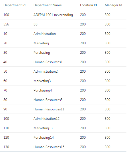
The Tables demos in the Oracle JET Cookbook include the complete example for this table and a link to the oj-table API documentation. The cookbook also includes an example that creates the oj-table component using data defined in an oj.CollectionTableDataSource object and examples that show tables with custom row and cell templates, selection, sorting, reordering, scrolling, custom cell renderers, and drag and drop support.
Understanding Data Requirements for Table
You can define the table's data in an array using the oj.ArrayDataProvider object, in a Collection using the oj.CollectionTableDataSource object, in a row expander using oj.FlattenedTreeTableDataSource, or in a paging functionality using oj.PagingTableDataSource.
The data source for the oj-table component can be one of the following:
-
Oracle JET
oj.ArrayDataProviderUse the
oj.ArrayDataProviderwhen you want to use an observable array or array as data for the table.The following example shows the HTML markup using the
dataattribute in theoj-tableelement:<oj-table id='table' aria-label='Departments Table' data='[[dataprovider]]' columns-default.sortable='disabled' columns='[{"headerText": "Department Id", "field": "DepartmentId", "headerClassName": "oj-sm-only-hide", "className": "oj-sm-only-hide"}, {"headerText": "Department Name", "field": "DepartmentName"}, {"headerText": "Location Id", "field": "LocationId", "headerClassName": "oj-sm-only-hide", "className": "oj-sm-only-hide"}, {"headerText": "Manager Id", "field": "ManagerId"}]' style='width: 100%; height:100%;'> </oj-table>In the following JavaScript sample code, array data in a variable,
deptArray, is passed to a variable,dataprovider, using theoj.ArrayDataProviderobject:var deptArray = [{DepartmentId: 1001, DepartmentName: 'ADFPM 1001 neverending', LocationId: 200, ManagerId: 300}, {DepartmentId: 556, DepartmentName: 'BB', LocationId: 200, ManagerId: 300}, {DepartmentId: 110, DepartmentName: 'Marketing13', LocationId: 200, ManagerId: 300}, {DepartmentId: 120, DepartmentName: 'Purchasing14', LocationId: 200, ManagerId: 300}, {DepartmentId: 130, DepartmentName: 'Human Resources15', LocationId: 200, ManagerId: 300}]; self.dataprovider = new oj.ArrayDataProvider(deptArray, {idAttribute: 'DepartmentId'});For the complete example, see Table using oj.ArrayDataProvider.
-
Oracle JET
oj.CollectionTableDataSourceUse the
oj.CollectionTableDataSourcefor a table when you want to use the data available from anoj.Collectionobject, such as an external data source.The following example shows the HTML markup using the
dataattribute in theoj-tableelement:<oj-table id="table" aria-label="Departments Table" data='[[datasource]]' columns='[{"headerText": "Department Id", "field": "DepartmentId"}, {"headerText": "Department Name", "field": "DepartmentName"}, {"headerText": "Location Id", "field": "LocationId"}, {"headerText": "Manager Id", "field": "ManagerId"}]' style='width: 100%; height:100%;'> </oj-table>In the following JavaScript sample code, data from an external data source is passed to a variable,
DeptCollection, using theoj.CollectionTableDataSourceobject:self.DeptCollection = oj.Collection.extend({url: self.serviceURL + "?limit=50",model: self.myDept}); self.DeptCol(new self.DeptCollection()); $.getJSON("cookbook/dataCollections/table/ojCollectionTable/departments.json", function (data) { new MockRESTServer(data, {id:"DepartmentId", url:/^http:\/\/mockrest\/stable\/rest\/Departments(\?limit=([\d]*)?)$/i, idUrl:/^http:\/\/mockrest\/stable\/rest\/Departments\/([\d]+)(?:\\?limit=([\\d]*))$/i}); self.datasource(new oj.CollectionTableDataSource(self.DeptCol())); });For the complete example, see Table using oj.Collection. -
Oracle JET
oj.FlattenedTreeTableDataSourceUse the
oj.FlattenedTreeTableDataSourcefor a table when you want to pass data to anoj-row-expandercomponent to expand or collapse rows to display hierarchical data.The following example shows the HTML markup using the data attribute in the
oj-tableelement andoj-row-expanderin the table definition element:<oj-table id="table" aria-label="Tasks Table" data="[[datasource]]" row-renderer='[[oj.KnockoutTemplateUtils.getRenderer("row_template", true)]]' columns='[{"headerText": "Task Name", "sortProperty": "name"}, {"headerText": "Resource", "sortProperty": "resource"}, {"headerText": "Start Date", "sortProperty": "start"}, {"headerText": "End Date", "sortProperty": "end"}]'> </oj-table> <script type="text/html" id="row_template"> <tr> <td> <oj-row-expander context="[[$context.rowContext]]"></oj-row-expander> <span data-bind="text: name"></span> </td> </tr> </script>In the following JavaScript sample code, the
datasourcevariable is instantiated as theoj.FlattenedTreeTableDataSource:self.datasource(new oj.FlattenedTreeTableDataSource( new oj.FlattenedTreeDataSource( new oj.JsonTreeDataSource(data), options) ) );For the complete example, see Table using oj.FlattenedTreeTableDataSource.
-
Oracle JET
PagingTableDataSourceUse the
oj.PagingTableDataSourceto add paging functionality to a table.The following example shows the HTML markup using the
dataattribute in theoj-paging-controlelement within anoj-tableelement:<oj-table id='table' aria-label='Departments Table' data='[[pagingDatasource]]' columns='[{"headerText": "Department Id", "field": "DepartmentId"}, {"headerText": "Department Name", "field": "DepartmentName"}, {"headerText": "Location Id", "field": "LocationId"}, {"headerText": "Manager Id", "field": "ManagerId"}]' style='width: 100%;'> <oj-paging-control id="paging" data='[[pagingDatasource]]' page-size='15' slot='bottom'> </oj-paging-control> </oj-table>In the following JavaScript sample code, the table data is defined in a JavaScript array,
deptArray, which is passed into the definition for theoj.ArrayTableDataSource. Theself.pagingDatasourceis then defined as anoj.PagingTableDataSourcewhich gets its data from theoj.ArrayTableDataSource.var deptArray = [{DepartmentId: 10015, DepartmentName: 'ADFPM 1001 neverending', LocationId: 200, ManagerId: 300}, {DepartmentId: 556, DepartmentName: 'BB', LocationId: 200, ManagerId: 300}, {DepartmentId: 10, DepartmentName: 'Administration', LocationId: 200, ManagerId: 300}, {DepartmentId: 20, DepartmentName: 'Marketing', LocationId: 200, ManagerId: 300}, {DepartmentId: 30, DepartmentName: 'Purchasing', LocationId: 200, ManagerId: 300}, {DepartmentId: 13022, DepartmentName: 'Human Resources15', LocationId: 200, ManagerId: 300}]; self.pagingDatasource = new oj.PagingTableDataSource(new oj.ArrayTableDataSource(deptArray, {idAttribute: 'DepartmentId'}));For the complete example, see Table using oj.PagingTableDataSource.
Understanding oj-table and Sorting
oj-table enables single column sorting by default if the underlying data supports sorting. Using the sortable property of the oj-table component's columnDefaults attribute, you can control sorting for the entire table, or you can use the sortable property of the columns attribute to control sorting on specific columns.
When you configure a column for sorting, the column header displays arrow indicators to indicate that the column is sortable when the user hovers over the column header. In the following image, the Department ID is sortable, and the sort indicator is showing a down arrow to indicate that the sort is currently descending. The user can select the down arrow to change the sort back to ascending.
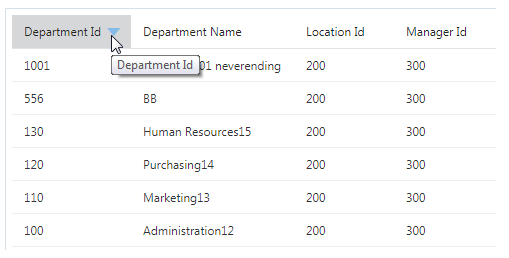
The sortable attribute supports the following options:
-
auto: Sort the table or indicated column if the underlying data supports sorting. -
disabled: Disable sorting on the table or indicated column. -
enabled: Enable sorting on the entire table or indicated column.
To enable sorting on specific columns:
-
Set the
sortableproperty tononeon the table'scolumnDefaultsattribute to remove theautodefault behavior. -
Set the
sortableproperty toenabledon the columns that you want to sort.
The following code sample shows the markup to create the department table shown in this section. In this example, the table is configured to enable sorting on only the Department Id column.
<oj-table id="table"
          aria-label="Departments Table"
          data='[[datasource]]'
          columns-default='{"sortable": "disabled"}'
          columns='[{"headerText": "Department Id",
                     "field": "DepartmentId",
                     "sortable": "enabled"},
                    {"headerText": "Department Name",
                     "field": "DepartmentName"},
                    {"headerText": "Location Id",
                     "field": "LocationId"},
                    {"headerText": "Manager Id",
                     "field": "ManagerId"}]'>
</oj-table>
oj-table sorting uses standard JavaScript array sorting. If your application requires custom sorting, you can use ArrayDataProvider and its sortComparator property. For an example, see Tables - Custom Sort.
For additional information about oj-table and sorting options, see the oj-table API documentation.
For examples in the Oracle JET Cookbook that implement tables and table sorting, see Tables.
Working with Tables and Inline Templates
Use inline templates to specify what gets rendered inside the tables.
You can use an inline template to contain the markup for your table content and reference the name of the template in the <template> element's slot attribute. Unlike specifying the table elements, such as column header and column footer to display the content in the table format, you must specify only the content to be rendered within the table and not the <td> elements. When the inline template is executed for each value passed to it, the inline template will have access to the binding context containing the following properties:
-
$current- an object that contains information for the current item being rendered-
componentElement- the<oj-table>custom element -
data- the data for the current item being rendered -
index- the zero-based index of the current item being rendered -
key- the key of the current item being rendered -
row- the data for the current item
-
-
alias- ifasattribute is specified, the value will be used to provide an application-named alias for$currentvalue.
In the following image, an inline template specifies the content to be rendered within the table created using oj-table.
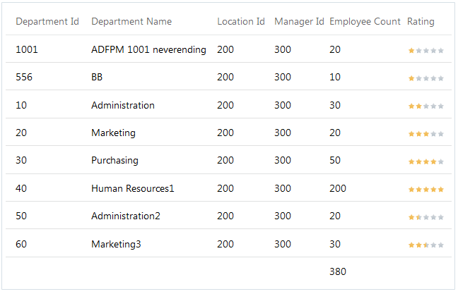
The HTML code sample below shows a portion of the markup for a table using various inline templates for column header, column footer, data for table cells and others.
<oj-table id='table' aria-label='Departments Table'
        data='[[dataprovider]]'
        columns='{{columnArray}}'
        columns-default='{"template": "cellTemplate",
            "headerTemplate": "headerTemplate"}'
        style='width: 100%;'>
  <template slot="cellTemplate">
      <oj-bind-text value="[[$current.data]]"></oj-bind-text>
  </template>
  <template slot="ratingCellTemplate">
      <oj-rating-gauge value='[[$current.data]]' readonly style="width:60px;height:15px;">
      </oj-rating-gauge>
  </template>
  <template slot="headerTemplate">
      <oj-bind-text value="[[$current.data]]"></oj-bind-text>
      </template>
  <template slot="totalFooterTemplate">
      <div id="table:emp_total"><oj-bind-text value="{{emp_total_func($current)}}"></oj-bind-text></div>
  </template>
</oj-table>
The selection attribute monitors the current selection value in the array.
In the following JavaScript sample code, array data in a variable, deptArray, is passed to a variable, dataprovider, using the oj.ArrayDataProvider object:
var deptArray = [{DepartmentId: 1001, DepartmentName: 'ADFPM 1001 neverending', LocationId: 200, ManagerId: 300, EmployeeCount: 20, Rating: 1},
    {DepartmentId: 556, DepartmentName: 'BB', LocationId: 200, ManagerId: 300, EmployeeCount: 10, Rating: 1},
    {DepartmentId: 10, DepartmentName: 'Administration', LocationId: 200, ManagerId: 300, EmployeeCount: 30, Rating: 2},
    {DepartmentId: 20, DepartmentName: 'Marketing', LocationId: 200, ManagerId: 300, EmployeeCount: 20, Rating: 3},
    {DepartmentId: 30, DepartmentName: 'Purchasing', LocationId: 200, ManagerId: 300, EmployeeCount: 50, Rating: 4},
    {DepartmentId: 40, DepartmentName: 'Human Resources1', LocationId: 200, ManagerId: 300, EmployeeCount: 200, Rating: 5},
    {DepartmentId: 50, DepartmentName: 'Administration2', LocationId: 200, ManagerId: 300, EmployeeCount: 20, Rating: 1.5},
    {DepartmentId: 60, DepartmentName: 'Marketing3', LocationId: 200, ManagerId: 300, EmployeeCount: 30, Rating: 2.5}];
self.dataprovider = new oj.ArrayDataProvider(deptArray, {idAttribute: 'DepartmentId'});

self.columnArray = [{"headerText": "Department Id",
    "field": "DepartmentId"},
    {"headerText": "Department Name",
    "field": "DepartmentName"},
    {"headerText": "Location Id",
    "field": "LocationId"},
    {"headerText": "Manager Id",
    "field": "ManagerId"},
    {"headerText": "Employee Count",
    "field": "EmployeeCount",
    "footerTemplate": "totalFooterTemplate"},
    {"headerText": "Rating",
    "field": "Rating",
    "template": "ratingCellTemplate"}];
See Table Using Inline Template for the complete example to create a table using an inline template.
Working with Tree Views
The oj-tree-view component displays the hierarchical relationship between the items of a tree.
Each element in the tree is called a node, and the top levels of the hierarchy are referred to as the root nodes. The descendents of the root nodes are its children, and each child node can also contain children. Users select a node to display its children.
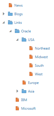
In this example, the expanded Links node is a root node, and the Oracle, IBM, and Microsoft nodes are its children. The Oracle child node contains the USA, Europe, and Asia nodes which also contain child nodes. The USA node is expanded to show its Northeast, Midwest, South, and West child nodes.
To create the oj-tree-view component, add the oj-tree-view element to the HTML markup. Assign it a meaningful ID and specify attributes on the oj-tree-view element. Construct the tree using a predefined HTML unordered list (ul) element in the oj-tree-view element.
Understanding Data Requirements for Tree Views
You can supply data to the tree view using static HTML content or a TreeDataSource object. The method you choose will depend upon the type of data you provide.
-
static HTML content: Use when you want to define your data within HTML views. The code sample below shows the static HTML content used to render the tree view above.
<oj-tree-view id="treeview" data-oj-binding-provider="none" aria-label="Tree View with Static HTML">
  <ul>
    <li id="news">
      <span class="oj-treeview-item-icon"></span
      ><span class="oj-treeview-item-text">News</span>
    </li>
    <li id="blogs">
      <span class="oj-treeview-item-icon"></span
      ><span class="oj-treeview-item-text">Blogs</span>
      <ul>
       ... contents omitted
      </ul>
    </li>
    <li id="links">
      <span class="oj-treeview-item-icon"></span
      ><span class="oj-treeview-item-text">Links</span>
      <ul>
        <li id="oracle">
          <span class="oj-treeview-item-icon"></span
          ><span class="oj-treeview-item-text">Oracle</span>
          <ul>
            <li id="usa">
              <span class="oj-treeview-item-icon"></span
              ><span class="oj-treeview-item-text">USA</span>
              <ul>
                <li id="northeast">
                  <span class="oj-treeview-item-icon"></span
                  ><span class="oj-treeview-item-text">Northeast</span>
                </li>
                <li id="midwest">
                  <span class="oj-treeview-item-icon"></span
                  ><span class="oj-treeview-item-text">Midwest</span>
                </li>
                <li id="south">
                  <span class="oj-treeview-item-icon"></span
                  ><span class="oj-treeview-item-text">South</span>
                </li>
                <li id="west">
                  <span class="oj-treeview-item-icon"></span
                  ><span class="oj-treeview-item-text">West</span>
                </li>
              </ul>
            </li>
            <li id="europe">
              <span class="oj-treeview-item-icon"></span
              ><span class="oj-treeview-item-text">Europe</span>
            </li>
            <li id="asia">
              <span class="oj-treeview-item-icon"></span
              ><span class="oj-treeview-item-text">Asia</span>
              <ul>
              ... contents omitted
              </ul>
            </li>
          </ul>
        </li>
        <li id="ibm">
          <span class="oj-treeview-item-icon"></span
          ><span class="oj-treeview-item-text">IBM</span>
        </li>
        <li id="microsoft">
          <span class="oj-treeview-item-icon"></span
          ><span class="oj-treeview-item-text">Microsoft</span>
        </li>
      </ul>
    </li>
  </ul>
</oj-tree-view>
Tip:
To ensure that there is no extra white space between the icon and the text in the display, place the icon
spanand the textspanelements on a single line or use the broken closing bracket notation.<li id="news"> <span class="oj-treeview-item-icon"></span ><span class="oj-treeview-item-text">News</span> </li> -
oj.JsonTreeDataSource: Use when the underlying data is a JSON object.In this example below, the tree view uses JSON data. The sample code also shows the Knockout
applyBindings()call to complete the component binding.require(['ojs/ojcore', 'knockout', 'jquery', 'ojs/ojknockout', 'ojs/ojtreeview', 'ojs/ojjsontreedatasource' ], function(oj, ko, $) { function TreeViewModel() { var jsonData = [{ "attr": { "title": "News", "id": "news" } }, { "attr": { "title": "Blogs", "id": "blogs" }, "children": [{ "attr": { "title": "Today", "id": "today" } }, { "attr": { "title": "Yesterday", "id": "yesterday" } }, { "attr": { "title": "Archive", "id": "archive" } }] }, { "attr": { "title": "Links", "id": "links" }, "children": [{ "attr": { "title": "Oracle", "id": "oracle" }, "children": [{ "attr": { "title": "USA", "id": "usa" }, "children": [{ "attr": { "title": "Northeast", "id": "northeast" } }, { "attr": { "title": "Midwest", "id": "midwest" } }, { "attr": { "title": "South", "id": "south" } }, { "attr": { "title": "West", "id": "west" } }] }, { "attr": { "title": "Europe", "id": "europe" } }, { "attr": { "title": "Asia", "id": "asia" }, "children": [{ "attr": { "title": "Japan", "id": "japan" } }, { "attr": { "title": "China", "id": "china" } }, { "attr": { "title": "India", "id": "india" } }] }] }, { "attr": { "title": "IBM", "id": "ibm" } }, { "attr": { "title": "Microsoft", "id": "microsoft" }, }] }]; this.data = new oj.JsonTreeDataSource(jsonData); } $(document).ready(function() { ko.applyBindings(new TreeViewModel(), document.getElementById('treeview')); }); } ); -
oj.CollectionTreeDataSource: Use when your data is coming from anoj.Collectionobject, typically representing an external data source.
Specifying Initial Expansion
By default, each node’s children are hidden upon initial display. To specify that one or more nodes are expanded when the tree view first loads, use the expanded attribute and specify the key set containing the keys of the items that should be expanded.
<oj-tree-view id="treeview"
              data="[[data]]"
              item.renderer="[[renderer]]"
              expanded="{{expanded}}"
              aria-label="Tree View Expansion Demo">
</oj-tree-view>
In your application’s viewModel, define the key set. The example below sets the tree view to expand the Links node on initial display. Note that you must also add the ojknockout-keyset module and keySet function to the require definition.
require(['ojs/ojcore', 'ojs/ojknockout-keyset', 'knockout', 'jquery',
    'ojs/ojknockout', 'ojs/ojbutton', 'ojs/ojtreeview',
    'ojs/ojjsontreedatasource'
    ],
    function(oj, keySet, ko, $, jsonData) {
      function TreeViewModel() {
        var self = this;

        self.data = new oj.JsonTreeDataSource(JSON.parse(jsonData));
        self.expanded = new keySet.ObservableExpandedKeySet().add(['links']);
        ... contents omitted
);
Examples
The Oracle JET Cookbook contains the complete recipe and code for the samples used in this section at Tree Views. The cookbook also includes a link to the oj-tree-view API documentation which includes additional examples for creating tree views.